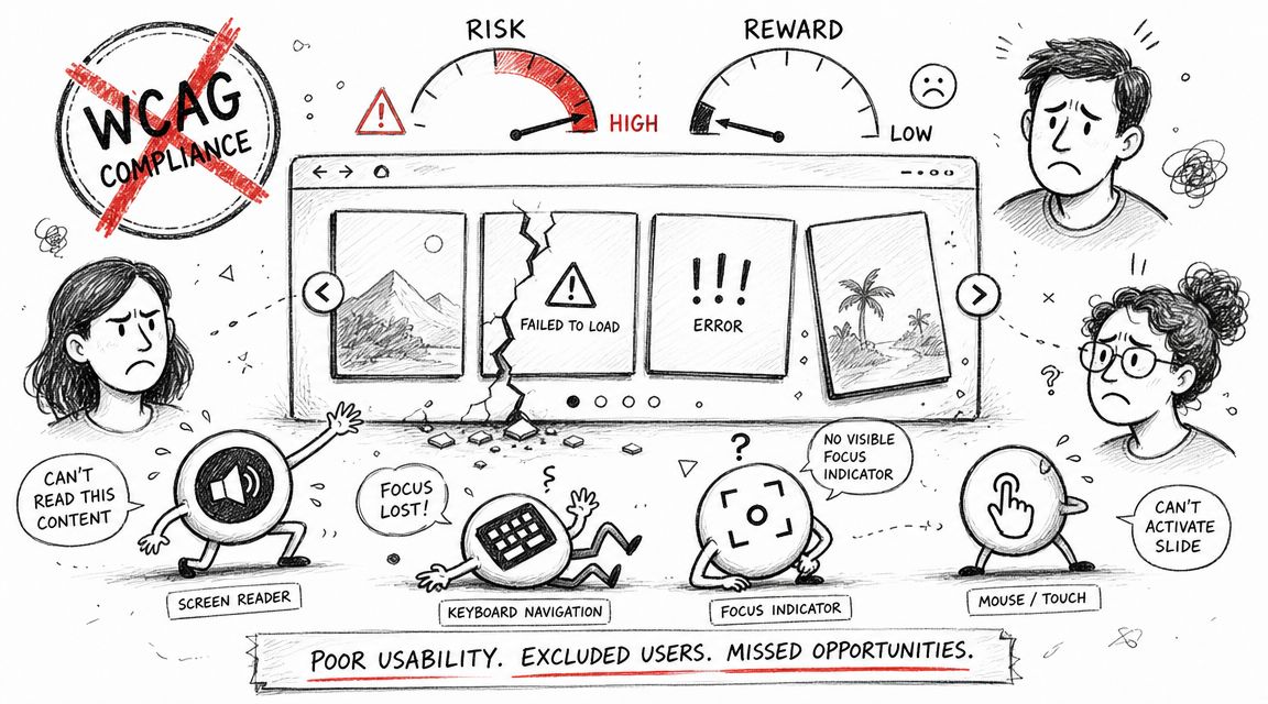
A homepage carousel often looks like a tidy way to promote multiple priorities. In practice, it often does the opposite. It hides content, creates keyboard and screen reader problems, and introduces one of the easiest ways for a team to fail an accessibility audit on a high-traffic page.
The business case is even worse than the technical one. A field study found carousel links were clicked less than 1% of the time, and only one in 500 unique visitors interacted with a slide on the tested homepage, according to Adrian Roselli’s carousel usage data. If your team is taking on legal and remediation risk for a component that users mostly ignore, the right question usually isn’t “how do we perfect this slider?” It’s “why are we still shipping it?”
An accessible carousel is possible. It’s also one of the more fragile UI patterns you can put into production. If you keep one, build it like a regulated component, not a marketing decoration.
Why Most Carousels Are a Compliance and Usability Failure
Carousel links often attract almost no interaction, as noted earlier in the article. That matters because every extra interactive pattern on a page adds build cost, QA time, regression risk, and legal exposure. If usage is low and failure modes are common, the component has to justify itself with measurable business value. Many do not.
Low ROI meets high compliance exposure
The common justification for sliders is simple. Stakeholders want to promote multiple campaigns in one visible slot without fighting for homepage real estate.
That is a content governance decision disguised as a UI pattern.
In practice, the first slide gets the opportunity. Later slides are hidden behind timing, motion, controls, and user patience. At the same time, the carousel adds moving content, scripted state changes, custom navigation, focus management, announcement logic, and often swipe behavior. Each part is another place to fail WCAG and another item your team has to maintain through redesigns, CMS changes, and third party script conflicts.
If the message matters, publish it in a format users can reach and review.
The recurring failures are predictable:
- Auto-advancing content: users lose text before they finish reading it.
- Weak or missing pause controls: motion continues without a clear way to stop it.
- Focus loss: keyboard users move into the component and cannot tell where they are.
- Unreadable state changes for screen readers: slide updates occur without clear context or announcement.
- Inactive content that still receives focus: users tab into hidden links, buttons, or forms.
Horizontal movement patterns create a related risk. Teams often combine scrollable regions, swipe gestures, and custom key handling without testing how they work together. Use this guide to make scrollable content keyboard accessible if your carousel behaves more like a scrolling panel than a simple set of slides.
Why auditors and plaintiff firms care
Carousels produce defects that are easy to capture in screenshots, screen recordings, and keyboard test logs. A missing label, a control that cannot be reached by keyboard, or motion that cannot be paused does not require a complicated argument. It is visible. It is repeatable. It reads badly in an audit report and even worse in a demand letter.
That is why I treat carousel decisions as risk management, not decoration. If the business goal is to turn website friction into conversions, a static hero, a card grid, or prioritized content block is often cheaper to build, easier to test, and more likely to perform. An accessible carousel is possible. It is just rarely the highest return option once legal risk, engineering effort, and user behavior are counted together.
Core Requirements for a WCAG Compliant Carousel
An accessible carousel has to follow established accessibility patterns. This isn’t a matter of preference. Accessible carousel guidance is formally codified through W3C WAI and the ARIA Authoring Practices Guide, and those patterns map directly to WCAG requirements. As summarized in Smashing Magazine’s guide to building accessible carousels, teams need a labeled region, defined roles for controls and content panels, and explicit keyboard support. If those pieces are missing, the component can fail multiple Level A and AA criteria in an audit.
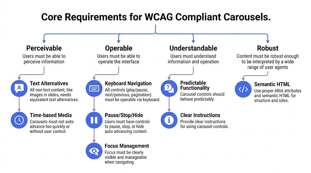
Keyboard support has to be explicit
A carousel that only works with a pointer is already in trouble. Every interactive part has to work from the keyboard. That usually includes previous, next, pause or resume, and any slide picker controls.
The interaction model also has to be predictable. If you use tabs for slide selection, the keyboard behavior needs to match a tab pattern. If you use buttons, they need clear labels and state. If arrow keys move between items, that behavior has to be intentional and tested, not bolted on.
What this means in practice:
- Reachable controls: Users must be able to tab to every control in a logical order.
- Reliable activation: Enter and Space should work where expected.
- Visible focus: Users must always be able to see where keyboard focus is.
- No traps: Focus can’t get stuck inside the widget.
For teams that need a refresher on naming controls correctly, this reference on accessible names for ARIA links, buttons, and menu items helps prevent some of the most common implementation mistakes.
Semantics and naming have to be intentional
A carousel should be exposed to assistive technology as a meaningful, labeled component. The container generally needs to be treated as a region or group with an accessible name so screen reader users can identify it quickly.
Inside that container, controls and panels need structure that matches their actual behavior. If your implementation claims a tabbed interface, the relationships between tabs and panels have to be valid. If it’s a group of buttons and panels, name it that way and keep the pattern simple.
A carousel isn’t accessible because it has ARIA. It’s accessible when native HTML, roles, names, states, and behavior all agree with each other.
Many third-party libraries often fail teams in regulated environments, including organizations dealing with public sector procurement or ADA compliance for contractors. The library may animate nicely, but if the semantics are wrong, your team still owns the defect.
Autoplay is where many teams fail
Auto-rotation creates risk immediately. Moving content can interfere with reading, distract users, and change context before the user asks for it.
If a carousel rotates automatically, users need a visible way to pause and resume it. That control must itself be keyboard accessible and clearly labeled. The timing behavior also has to be predictable. Pausing can’t be hidden behind hover-only behavior or a buried settings icon.
A quick compliance review should ask:
| Requirement | What to verify |
|---|---|
| Labeled container | The carousel has a clear accessible name |
| Keyboard operation | All controls work without a mouse |
| Focus visibility | Focus indicators are obvious on every interactive element |
| Clear structure | Controls and panels use consistent semantics |
| Pause control | Auto-rotation can be paused and resumed by the user |
If your team can’t pass that table confidently, the component isn’t ready.
A Practical Approach to Building an Accessible Carousel
The safest way to build an accessible carousel is to treat it as progressive enhancement. Start with content and controls that make sense in plain HTML. Then add styling. Then add behavior. Don’t start with animation and try to layer accessibility on top later.
The W3C carousel tutorial lays out the right order clearly: semantic container with an accessible name, native <button> controls, visible focus indicators and logical tab order, live-region announcements for slide changes, and a tested auto-rotation stop or resume behavior, as described in the W3C carousel tutorial.
Start with HTML that works before JavaScript
Use a labeled container. Use real buttons. Use real headings inside slides. If JavaScript fails, users should still be able to access the content.
A stripped-down starting point might look like this:
<section aria-label="Featured resources" class="carousel">
<div class="carousel__slides">
<article id="slide-1">
<h3 id="guide-to-procurement-accessibility">Guide to procurement accessibility</h3>
<p>Documentation and audit prep for enterprise teams.</p>
<a href="/resources/procurement-guide">Read the guide</a>
</article>
<article id="slide-2" hidden>
<h3 id="developer-training">Developer training</h3>
<p>Practical remediation patterns for product teams.</p>
<a href="/resources/developer-training">View details</a>
</article>
</div>
<div class="carousel__controls">
<button type="button" aria-label="Previous slide">Previous</button>
<button type="button" aria-label="Next slide">Next</button>
<button type="button" aria-pressed="false" aria-label="Pause carousel">Pause</button>
</div>
<p aria-live="polite" class="sr-only" id="carousel-status"></p>
</section>
That structure avoids one of the most common mistakes I see in audits. Teams build clickable div elements, then try to re-create button behavior with JavaScript. That nearly always leads to keyboard and name issues.
Add CSS that protects focus and visibility
Design teams often weaken focus indicators because they want cleaner visuals. That choice creates legal risk fast. Carousel controls are small, repeated, and often placed on busy imagery. If focus styling is faint, users lose orientation immediately.
Your CSS should make focus obvious and consistent:
.carousel button:focus-visible,
.carousel a:focus-visible \{
outline: 3px solid #1a73e8;
outline-offset: 3px;
\}

.carousel [hidden] \{
display: none;
\}
Two additional checks matter here:
- Control contrast: Icons, borders, and focus styles need enough visual distinction to remain usable.
- Layout stability: Controls shouldn’t jump, shift, or disappear when focus lands on them.
If your designers need practical standards for these UI states, keep these guides nearby on focus indicators, non-text contrast for UI components and icons, and skip links and landmarks.
Use JavaScript for state, not for faking semantics
JavaScript should manage which slide is active, update control states, and announce meaningful changes. It shouldn’t be responsible for inventing the widget’s accessibility model after the fact.
A minimal pattern looks like this:
<script>
const slides = Array.from(document.querySelectorAll('.carousel__slides > article'));
const status = document.getElementById('carousel-status');
let current = 0;

function showSlide(index) \{
slides.forEach((slide, i) => \{
slide.hidden = i !== index;
\});

current = index;
const heading = slides[index].querySelector('h3');
status.textContent = heading ? `Showing $\{heading.textContent\}` : 'Slide changed';
\}
</script>
That example is intentionally simple. Production code has more responsibilities:
- State sync: If you have pagination controls, active state must update every time the slide changes.
- Pause logic: Auto-rotation must stop when users activate pause, and many teams also stop rotation when the user interacts.
- Focus discipline: Changing slides shouldn’t throw focus to random places.
- Announcement restraint: Live region messaging should be useful, not noisy.
If your developers are adding ARIA attributes reactively to “make the scanner happy,” they’re usually solving the wrong problem.
This is why accessible carousel work benefits from manual review. The component can look compliant in code review and still fail in actual use.
How to Test Your Carousel for Accessibility Failures
Most carousels pass a superficial browser check and still fail real user interaction. That’s why testing has to go beyond “the arrows work” or “Lighthouse found no major issues.” A carousel needs keyboard testing, screen reader testing, and automated scanning. In that order.
Start with the visual checklist below before you open your dev tools.
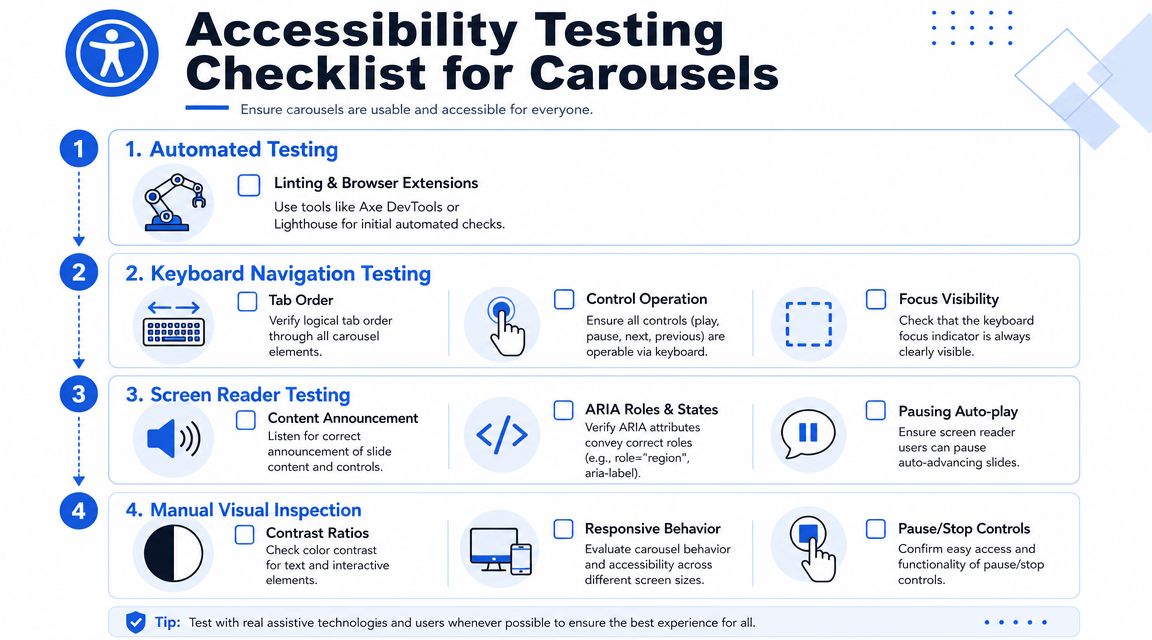
Manual keyboard testing
Unplug the mouse. Reload the page. Then move through the carousel with Tab, Shift+Tab, Enter, Space, and any documented arrow key interactions.
Look for failures like these:
- Skipped controls: Pause or slide picker buttons are unreachable.
- Invisible focus: Focus lands on elements, but users can’t tell where.
- Bad order: Tabbing jumps illogically between hidden or off-screen elements.
- Unexpected motion: Slides advance while the user is still interacting.
A serious audit also checks whether hidden slides remain in the tab order and whether focus enters content that is visually concealed. Automated tools rarely catch that reliably.
For a broader process your QA and product teams can repeat, use this guide on how to test digital accessibility on your website.
Screen reader verification
Next, test with screen readers such as NVDA, JAWS, or VoiceOver. The goal isn’t just technical exposure of the widget. The goal is comprehension.
Ask these questions while listening:
| Check | Failure sign |
|---|---|
| Is the carousel identified clearly? | It sounds like an unlabeled region or generic group |
| Are controls named well? | Buttons are announced vaguely or redundantly |
| Do slide changes make sense? | The user gets no feedback, or far too much |
| Can the user stop movement? | Pause control is missing, unclear, or hard to reach |
This walkthrough video is a useful companion while you review interaction details:
Where automation helps and where it doesn’t
Use Axe DevTools, Lighthouse, browser accessibility panes, linting, and component tests. They help catch missing names, invalid ARIA patterns, and obvious markup defects.
They do not tell you whether the carousel is understandable, whether motion interrupts reading, whether announcements are helpful, or whether keyboard flow becomes exhausting after repeated interaction.
Automated tools are useful for finding code defects. They are weak at judging interaction quality.
That gap matters in lawsuits, audits, and procurement reviews. The issue is rarely just “does the element have an ARIA attribute.” It’s “can a disabled user operate this thing without friction or confusion.”
Safer and More Effective Alternatives to Carousels
The most reliable accessible carousel is often no carousel at all. If your team’s objective is to surface important content, simpler patterns usually do it better with lower maintenance cost and less audit exposure.
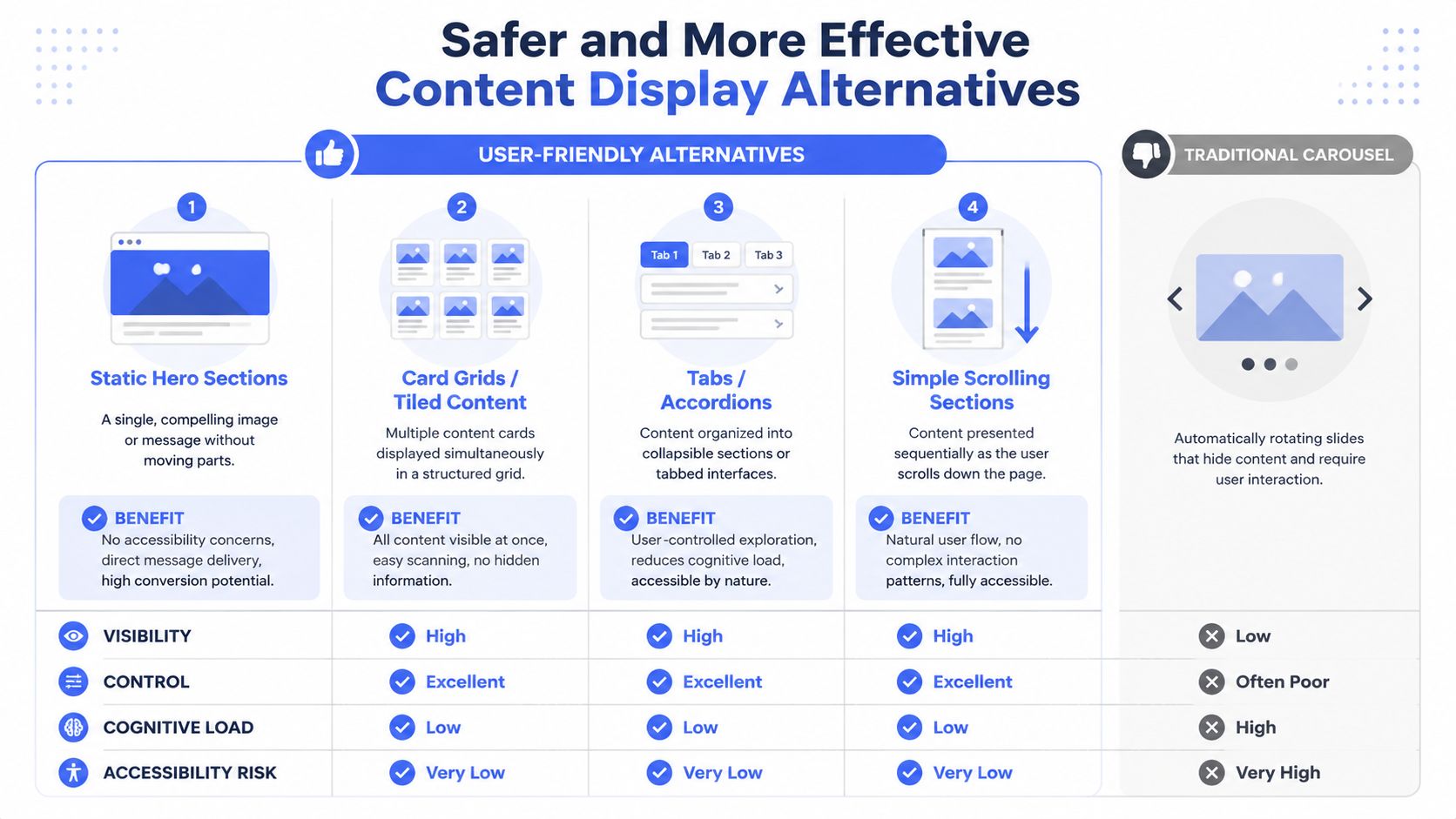
Use a static hero for the top priority
If one message matters most, give it the space. A single hero with one headline, one supporting sentence, and one primary call to action is easier to scan, easier to code, and easier to govern.
This also forces better prioritization. Instead of asking users to chase moving promotions, the business decides what deserves the top slot.
Show multiple options at once
Card grids and tiled layouts solve the “we need to feature several items” problem without hiding anything behind rotation. Users can compare options immediately. Keyboard users can move predictably. Screen reader users don’t have to manage an artificial slideshow model.
Good uses include:
- Featured products
- Recent articles
- Case studies
- Service categories
Let users reveal content on demand
Tabs and accordions can work well when content is related and users benefit from controlling what opens next. They still require careful implementation, but they’re usually easier to make reliable than a moving carousel.
A simple vertical stack is often even better. It respects natural page flow, works across breakpoints, and avoids the interaction debt that comes with animation-heavy UI.
The strategic point is straightforward. If the same business goal can be met with a static hero, a grid, or a user-controlled disclosure pattern, the carousel usually loses the risk-reward comparison.
Frequently Asked Questions about Accessible Carousels
A carousel can meet WCAG. That does not make it a good business decision.
I tell teams to treat this pattern like any other high-risk component. If it carries revenue-driving content, legal exposure, and ongoing maintenance cost, it needs a stronger case than “marketing wanted more promos above the fold.”
Are all carousels inaccessible?
No. Some are built well enough to pass manual testing.
The problem is reliability over time. A carousel can start in decent shape, then fail after a redesign, a library update, a new autoplay setting, or a content change that breaks labels and focus order. That maintenance risk is one reason many teams are better served by a simpler pattern.
Is there a difference between a carousel and a slider?
In accessibility work, the label matters less than the behavior.
If the component rotates panels, scrolls through featured content, exposes previous and next controls, or advances content automatically, it creates the same audit questions. Can users operate it by keyboard? Is the current state clear? Does motion stop when needed? Can assistive technology understand what changed?
Can I rely on a third-party carousel library?
Only after manual verification.
Vendor claims are marketing. Your legal and product teams inherit the actual risk. I regularly see libraries advertised as accessible ship with weak defaults, unlabeled controls, poor focus handling, or features that become inaccessible once a team customizes the styling and interaction model.
Do mobile swipe gestures make a carousel accessible?
No.
Swipe support helps some touch users, but it does nothing for keyboard users, screen reader users, switch users, or people who need visible controls and predictable focus. A component is not accessible because it works on a phone with a finger.
Should autoplay ever be used?
Use it only if the business case is unusually strong and the team is prepared to test it carefully.
Autoplay increases failure risk fast. It adds motion, timing, pause requirements, and more opportunities for users to lose context. In many cases, removing autoplay improves both accessibility and message comprehension, which is a better ROI than trying to defend a rotating banner that few users control successfully.
What usually fails first in audits?
The first failures are often operational, not theoretical.
Common examples include missing or hard-to-find pause controls, focus moving in ways users do not expect, controls with vague names, inactive slides still exposed to keyboard navigation, and announcements that are noisy or unclear. These are the issues that turn a “mostly fine” carousel into a ticket backlog and a compliance problem.
Can automated scans confirm my carousel is compliant?
No.
Automated tools can catch missing attributes and some structural errors. They cannot tell you whether the interaction makes sense in practice, whether focus behavior is predictable, or whether announcements help users instead of interrupting them. For a carousel, manual testing is the part that protects the business.
When should we replace a carousel instead of fixing it?
Replace it when the component is expensive to maintain, carries noncritical content, or performs the same job a simpler pattern can handle.
That decision is often the right one. If the team cannot commit to regression testing after design and content updates, the carousel becomes a recurring source of compliance debt. At that point, replacement is usually cheaper than another round of remediation.
What is the safest replacement?
A static hero is usually the safest option for one priority message.
If the page needs to feature several items, a card grid is usually the better choice. Both patterns reduce hidden content, simplify keyboard behavior, and lower the chance that an update reintroduces accessibility defects.
An accessible carousel is possible. It is rarely cheap to build, test, and govern well. If your homepage slider carries important business content, treat it as a risk decision, not a design flourish.
If your team needs a defensible answer on whether to fix, replace, or formally audit an accessible carousel, ADA Compliance Pros can help with manual accessibility testing, WCAG-mapped findings, remediation guidance, and procurement-ready documentation.