A team ships a polished FAQ page. The accordion animates smoothly, the chevrons rotate, and the layout looks clean in design review. Then the accessibility audit starts. A keyboard user tabs into the component and loses track of focus. A screen reader user hears a label but not the state change. Collapsed content is still reachable in the virtual cursor. What looked finished turns out to be a compliance problem.
That scenario is common because accordions sit in the gap between visual design and interaction semantics. They seem simple, so teams often treat them as a styling exercise. They aren’t. An accordion is an interactive disclosure pattern, and if the structure, state, and focus behavior are wrong, the component can fail WCAG review and create avoidable ADA and Section 508 risk.
For development teams, product managers, and compliance leads, accordion accessibility is less about memorizing ARIA attributes and more about understanding why the pattern exists. The right implementation has to work for keyboard users, screen reader users, zoom users, touch users, and people who need predictable interaction. It also has to keep working once it’s placed inside a real page with analytics scripts, design system overrides, and custom JavaScript.
The Hidden Risk in Common UI Patterns
Most failed accordion implementations don’t look broken. They look modern.
A design team approves the component because the visual behavior is clear. A developer wires up a click handler on a heading or a styled div. QA checks that the panel opens and closes with a mouse. The release goes live. Then a procurement review, VPAT request, or legal review asks a different question: can someone operate this reliably without seeing the screen or using a mouse?
That’s where the hidden risk shows up. A visually collapsed panel may still expose links and form controls to assistive technology. A fake button might respond to clicks but not behave correctly from the keyboard. A custom script might close the panel while focus stays inside hidden content. Those failures aren’t edge cases. They’re exactly the kinds of defects that turn a routine UI pattern into an audit finding.
Practical rule: If an accordion only works well for sighted mouse users, it isn’t finished.
The business problem is straightforward. Accordions often appear in high-value parts of a site: FAQs, pricing details, onboarding steps, support content, forms, and policy pages. If one of those areas blocks access, the issue affects both compliance and conversion. Teams investing in design systems or custom web development services should treat accordion behavior as a core interaction requirement, not a cosmetic enhancement.
Another reason this pattern causes trouble is false confidence. Teams often assume a reusable component is safe once it works in Storybook or a style guide. In practice, the live page changes the outcome. Heading levels, surrounding landmarks, focus order, and script collisions can all undermine an otherwise decent component.
The Anatomy of a Compliant Accordion
An accessible accordion has two parts that must work together: the trigger and the panel. If either part is implemented with the wrong semantics, the whole pattern becomes fragile.
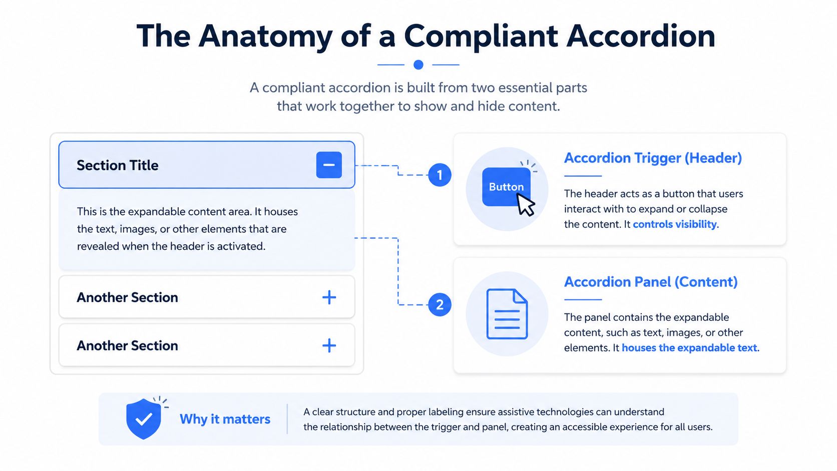
The trigger is the control
The header users activate must be a native <button>. That isn’t a stylistic preference. It’s what gives you keyboard support, focus behavior, and control semantics without extra repair work.
A div with click events can look identical on screen and still fail users. An anchor can also be the wrong choice if it doesn’t move the user to a new location. When teams substitute non-native elements, they usually end up rebuilding behavior the browser already provides, and they often miss details under deadline pressure.
Accessibility experts emphasize that a technically sound accordion starts with semantic structure and observable state changes. The trigger should be a native <button>, the control relationship should be conveyed with aria-controls, and the expanded panel should use role=“region” when appropriate so assistive technologies can announce it as a discrete area, as discussed in this accordion accessibility review.
The panel is a controlled region
The content area isn’t just a box that appears and disappears. It is the controlled part of the interaction. Users need to know whether that panel is currently available, and assistive technology needs a reliable relationship between the button and the content it reveals.
A compliant implementation gives the panel an identity and a name. That’s what lets assistive technology present it as a meaningful part of the page instead of a vague chunk of text.
The panel also has to disappear correctly when collapsed. Visual hiding alone is not enough. If the user can still tab into a hidden link or a screen reader can still reach hidden controls, the component creates a mismatch between what users see and what they experience.
A few practical checks catch many failures early:
- Use a real button: It should receive focus naturally and activate with standard keyboard behavior.
- Expose state changes: Users need to know whether the panel is expanded or collapsed.
- Tie control to content: The trigger and panel should have a clear programmatic relationship.
- Keep hidden content unreachable: When collapsed, interactive content inside the panel shouldn’t remain available.
Good accordion accessibility starts with the HTML contract. CSS and animation come later.
ARIA Implementation The W3C-Approved Pattern
The safest starting point is the WAI-ARIA Authoring Practices Guide example. It gives teams a documented pattern they can implement, test, and defend during review.
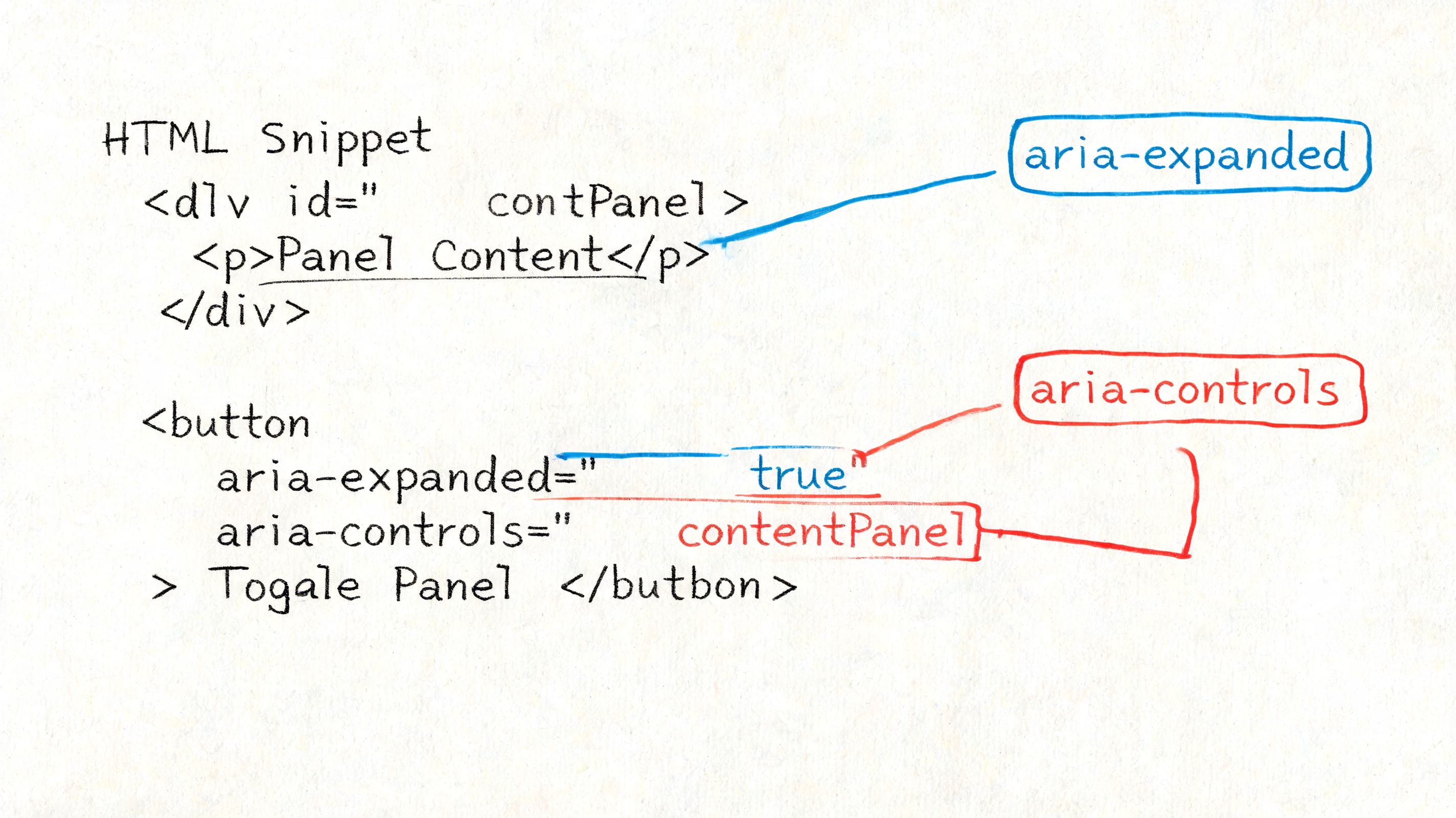
A minimal pattern that holds up in audits
Use a simple structure first. Then add styling and animation after the semantics are stable.
<h3 id="shipping-and-returns">
<button
id="accordion-header-1"
aria-expanded="false"
aria-controls="accordion-panel-1">
Shipping and returns
</button>
</h3>

<div
id="accordion-panel-1"
role="region"
aria-labelledby="accordion-header-1"
hidden>
<p>Orders can be returned according to the policy described here.</p>
</div>
This pattern aligns with the W3C APG accordion example, which formalizes the use of aria-expanded on the header button and uses role=“region” with aria-labelledby on the expanded panel in its documented pattern at the WAI-ARIA accordion example.
If your team needs a refresher on ARIA naming and relationships before implementing this, keep a concise reference to ARIA roles and attributes nearby during development.
Why each attribute matters
aria-expanded is the state announcement. When the button changes from false to true, screen reader users get the critical update that sighted users get from movement and layout change. Without that state change, the control becomes guesswork.
aria-controls tells assistive technology which panel the button affects. Not every user will notice that relationship directly, but it helps define the component as a real control pair instead of two unrelated nodes in the DOM.
hidden matters because collapsed content must not stay available in the accessibility tree and tab order. If your JavaScript only applies a class like .is-collapsed and leaves the content otherwise reachable, the UI becomes inconsistent.
The panel naming matters too. The APG pattern uses aria-labelledby so the panel inherits a meaningful label from the controlling header. That gives users context when the content is exposed as a region.
Here’s the implementation logic teams should follow when the user activates the button:
- Toggle the state by updating
aria-expandedon the button. - Reveal or hide the panel by adding or removing
hidden. - Keep the relationship stable so the button ID and panel ID remain unique and paired.
- Avoid DOM tricks that break reading order such as moving panels around after activation.
If the state changes visually but not programmatically, the component is only half built.
For teams trying to tighten implementation discipline across components, it can also help to keep a practical checklist on hand to improve your WCAG compliance. Just treat broad checklists as support material, not a substitute for pattern-specific testing.
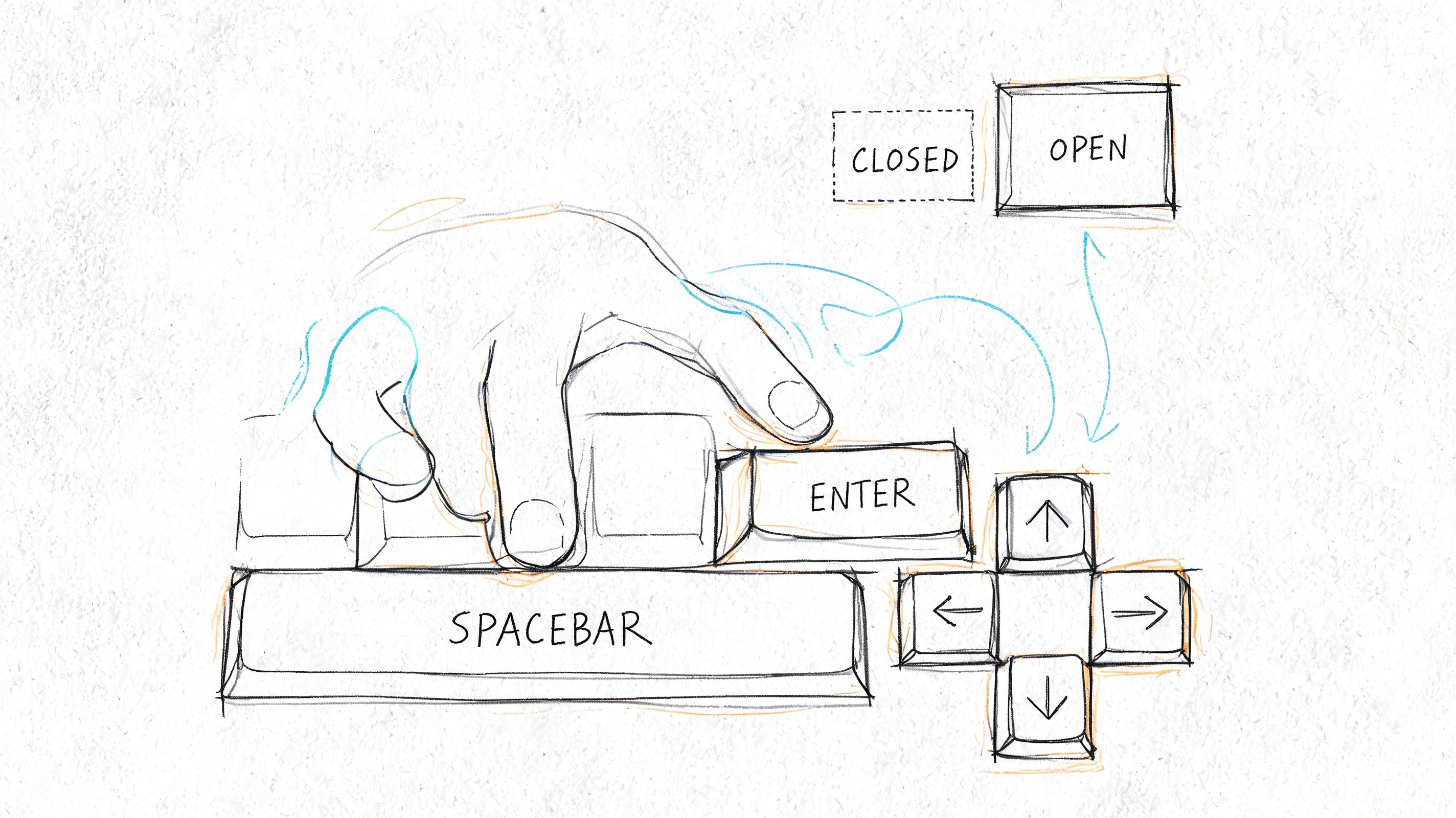
Keyboard Interactions and Focus Management
Keyboard behavior is where many accordion defects become obvious. A component can have the right ARIA attributes and still fail users if focus moves unpredictably or disappears after collapse.
What keyboard users should be able to do
Start with the baseline interaction model:
- Tab to each header button: Every accordion trigger must be reachable in normal tab order.
- Activate with Enter or Space: The user should be able to expand or collapse the section from the keyboard without custom workarounds.
- See visible focus: The active control needs a clear focus indicator at all times.
- Move on without traps: Once a panel opens, users should continue tabbing into the revealed content and then out of the component naturally.
Those basics matter more than clever keyboard shortcuts. Some accordion sets also support arrow key movement between headers, but teams shouldn’t use optional navigation to excuse broken Tab behavior.
The term to keep in mind during QA is keyboard navigation accessibility. If a tester cannot predict where focus goes next, the component needs work.
Where focus usually breaks
The most common failure happens on collapse. A user opens a panel, tabs into a link or form control inside it, then activates the same accordion to close it. If the panel disappears and focus is still left inside content that no longer exists visually, the user loses orientation fast.
A sound implementation returns focus to the activating button when a panel collapses and ensures visible focus indicators remain on all focusable elements. That same operational guidance is part of the practitioner advice in the source cited earlier in the article.
This video is a useful reminder that keyboard interaction has to be observed, not assumed.
Focus management issues in accordions are related to the same broader problem teams hit in dialogs, menus, and flyouts: custom scripting changes what is visible, but no one manages where the user is. The mechanics differ, but the principle is the same as in accessible modal dialog focus management.
A compact QA checklist helps:
- Open a panel from the keyboard: Confirm the state changes and the content becomes reachable.
- Collapse while focus is inside: Confirm focus lands on the correct header button.
- Tab through the full page: Check that the accordion doesn’t create jumps, dead ends, or hidden focus.
- Review focus styling in all themes: Dark mode, high zoom, and design-system overrides often remove outlines by accident.
Accordions vs Single Disclosures
Teams often use the word accordion for any show and hide interaction. That creates unnecessary complexity in some places and not enough structure in others.
When a disclosure is enough
A single disclosure is one button controlling one content area. Think of a single “Show advanced filters” control or one expandable answer under a standalone question. You still need the same core pattern: a real button, an exposed state, and collapsed content that becomes programmatically unreachable when hidden.
That last point is not optional. Nielsen Norman Group states that the accordion heading should function as a button and that collapsed panel content should be both visually hidden and programmatically unreachable, as described in their guidance on accordion behavior.
A single disclosure is often the better choice when:
- Only one item expands: There’s no grouped navigation problem to solve.
- The content is secondary: The page still makes sense without opening it immediately.
- You want less scripting: A simpler widget creates fewer opportunities for focus bugs.
When you need a true accordion
A true accordion is a set of related sections presented as one pattern. It usually appears in FAQs, policy summaries, onboarding steps, or product detail pages where users scan a list of headings and open the sections they need.
The distinction matters because grouped accordions introduce additional design questions:
| Pattern | Best use | Common risk |
|---|---|---|
| Single disclosure | One optional reveal on a page | Overengineering with unnecessary keyboard logic |
| Accordion set | Multiple related sections under one interaction model | Treating each item as isolated and forgetting group behavior |
| Tabs | Switching between peer panels that remain structurally tied | Using tabs when users need stacked, skimmable headings |
If users need to compare several sections at once or jump between fixed categories, tabs may be the better component. If they need stacked headings with optional expansion, an accordion is more appropriate. Teams evaluating that choice should compare it with the accessible tabs pattern before they commit the design.
Choose the pattern based on the user task, not the animation your design system already has.
How to Manually Test Accordion Accessibility
Automated scans can catch missing attributes and some obvious markup defects. They can’t tell you whether the accordion is understandable, predictable, and efficient on the live page.
That’s why manual review matters. The U.S. Web Design System reports that its accordion component passed 23 manual tests mapped to WCAG 2.1 AA, and USWDS also recommends re-testing the component in the context of the live site using keyboard, screen reader, and zoom checks in its accordion accessibility test documentation.
A fast manual test on the live page
Run this on the actual page, not just in a component library:
- Keyboard-only pass
Unplug the mouse mentally and use Tab, Enter, and Space. Can you reach every header? Can you open and close each panel? Does focus stay visible? - Collapsed content check
Close a panel that contains links, buttons, or form fields. Try tabbing again. If focus enters hidden content, the accordion fails. - Screen reader spot check
Listen for the control label and whether the expanded or collapsed state is announced. Then confirm the revealed content is understandable in context. - Zoom review
Test the page at 200% zoom, which USWDS recommends including in real-world validation. Make sure headers remain readable, operable, and not clipped by responsive layout changes. - Context test Check the component where users encounter it. A page with sticky headers, injected banners, or custom focus styles can break an accordion that looked fine in isolation.
Why component demos are not enough
The hard problems usually come from integration. Teams drop a good component into a CMS template, attach analytics listeners, restyle buttons to remove outlines, or lazy-load panel content. That’s when defects appear.
A manual review also exposes problems automated tools don’t judge well:
- State clarity: The markup may validate while the user experience remains confusing.
- Focus recovery: Tools rarely tell you whether a collapse action leaves the user stranded.
- Reading order: Screen reader output can become awkward when the surrounding page structure is poor.
- Usability under magnification: Layout compression can make an otherwise compliant control hard to operate.
For organizations relying too heavily on scanning software, a comparison between manual and automated accessibility testing becomes useful. Syntax matters. User experience matters more.
Frequently Asked Questions about Accordion Accessibility
Can a div with role button replace a button
It can be made to behave more like a button, but it’s still the wrong default. A native <button> gives you built-in semantics, expected keyboard behavior, and less custom code to maintain. If a team starts with a div, they usually spend time recreating behavior the browser would have provided for free.
Are nested accordions accessible
They can be, but they increase cognitive load and make focus management much harder. Nested accordions are also more difficult to test with screen readers and keyboard-only navigation because users must keep track of multiple disclosure levels. In most products, clearer headings or separate pages are a better solution.
What about animation and reduced motion
Animation isn’t the problem. Uncontrolled animation is.
If panels slide open slowly, shift content aggressively, or move focus targets while the user is interacting, the accordion becomes harder to use. Keep motion restrained, and make sure the component still works cleanly when a user prefers reduced motion. The state change must remain obvious even without animation.
Do mobile users need different treatment
Yes. Keyboard semantics are only part of modern accordion accessibility. Eleken’s summary recommends tap targets of at least 44px for mobile users in its accordion UI guidance. That aligns with a practical reality many teams miss: a control can be technically compliant and still be frustrating if labels are vague, hit areas are too small, or the expanded content becomes exhausting to scan on a phone.
Should accordion state changes use live regions
Usually, no. The control’s state should already be communicated through the button and panel relationship. Adding announcements on top of that can create noise. If your team is considering extra announcements elsewhere in the interface, review when ARIA live regions help and when they don’t.
If your team needs defensible validation for accordion accessibility, ADA Compliance Pros provides manual audits, WCAG-mapped findings, remediation guidance, Section 508 support, and procurement-ready documentation such as VPATs. When a component looks correct but still behaves inconsistently in the live product, a hands-on review is the fastest way to reduce risk and fix the underlying issue.