
Color contrast mistakes that hurt your website’s digital accessibility


.svg)

Did you know that color contrast is one of the most common reasons websites fail WCAG standards?
People don’t think about color contrast until someone points it out. Have you ever considered that the modern light gray text on a white background will be a total fail as per the norms of digital accessibility compliance? It might make half your audience squint.
The good news is that color contrast is the easiest thing to fix once you know that it is going wrong.
If you’re wondering whether your own website has these contrast issues, don’t guess.
Let ADACP run a quick contrast check for you. Schedule a free consultation with our experts to learn more about it.
What is the importance of color contrast in digital accessibility compliance?
Color contrast rules matter because people don’t all see color, brightness, or text the same way.
Some users may have low vision or color blindness. People may struggle with brightness sensitivity so they need the right color contrast to access your content. In addition to this, small screens, outdoor glare and older monitors are some reasons you need an accessibility compliance consultant by your side.
A color combination that “looks fine” to you might be unreadable to thousands of your users. An expert can tell you where you fall short and how to resolve such issues.
Q: What is color contrast in digital accessibility?
Color contrast refers to the visual difference between text (or important elements) and the background behind it. Better contrast makes text easier to read and improves accessibility for users with visual impairments.
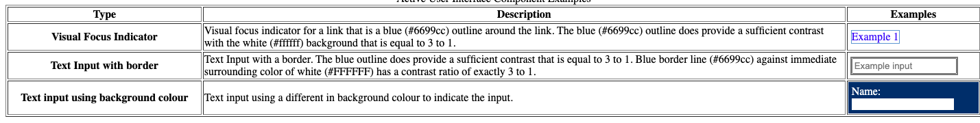
WCAG Requirements for Color Contrast
In the table above, 4.5:1 is the safe “don’t get sued, don’t lose accessibility” zone.
Related reading: Learn more about WCAG guidelines and proper color contrast to make your website compliant in this blog [The Beginners Guide to WCAG: Making the Web Accessible for Everyone].
Q: What contrast ratio does WCAG require?
WCAG requires a minimum contrast ratio of 4.5:1 for normal text and 3:1 for large text or UI components.
The Most Common Color Contrast Mistakes
Below are the most common mistakes found in well-designed websites. You can easily find these mistakes through digital accessibility testing.
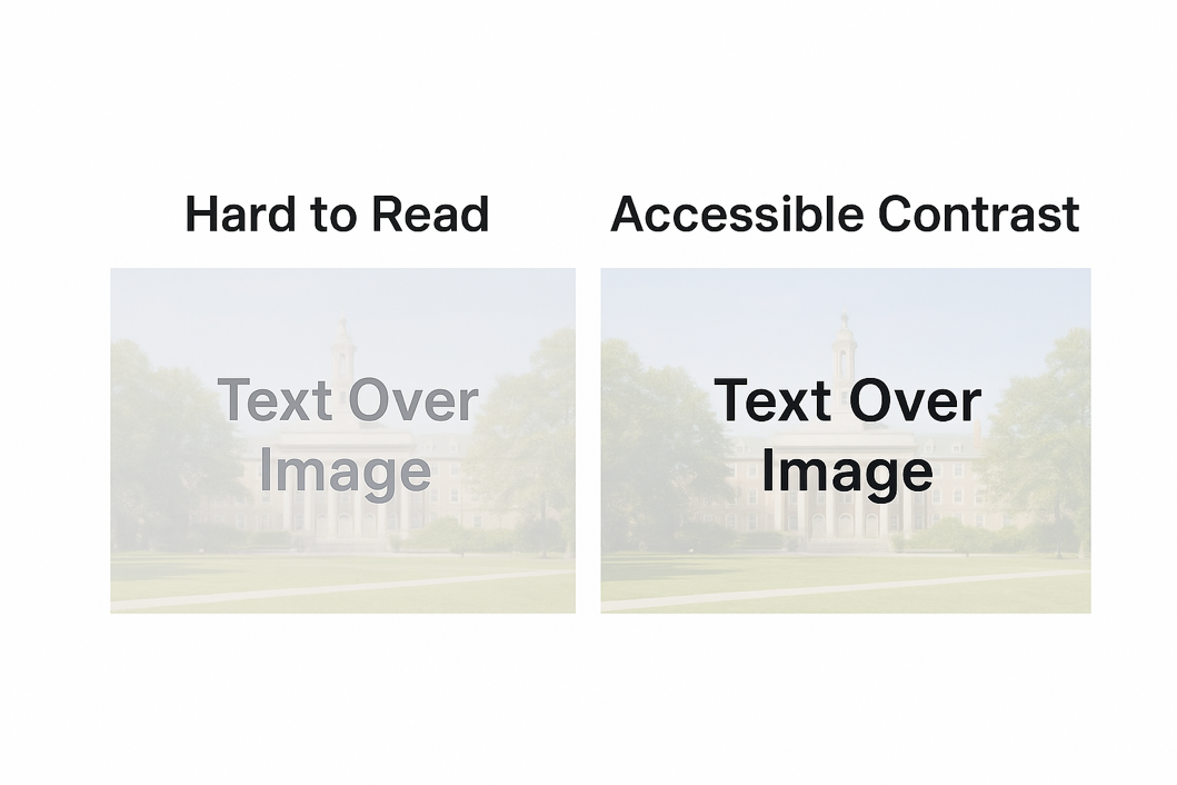
1. Light Gray Text on White Backgrounds
This one is everywhere. Design teams often pick #9B9B9B, #A6A6A6 or #BEBEBE to look stylish. The clean look does look good but it fails contrast instantly.
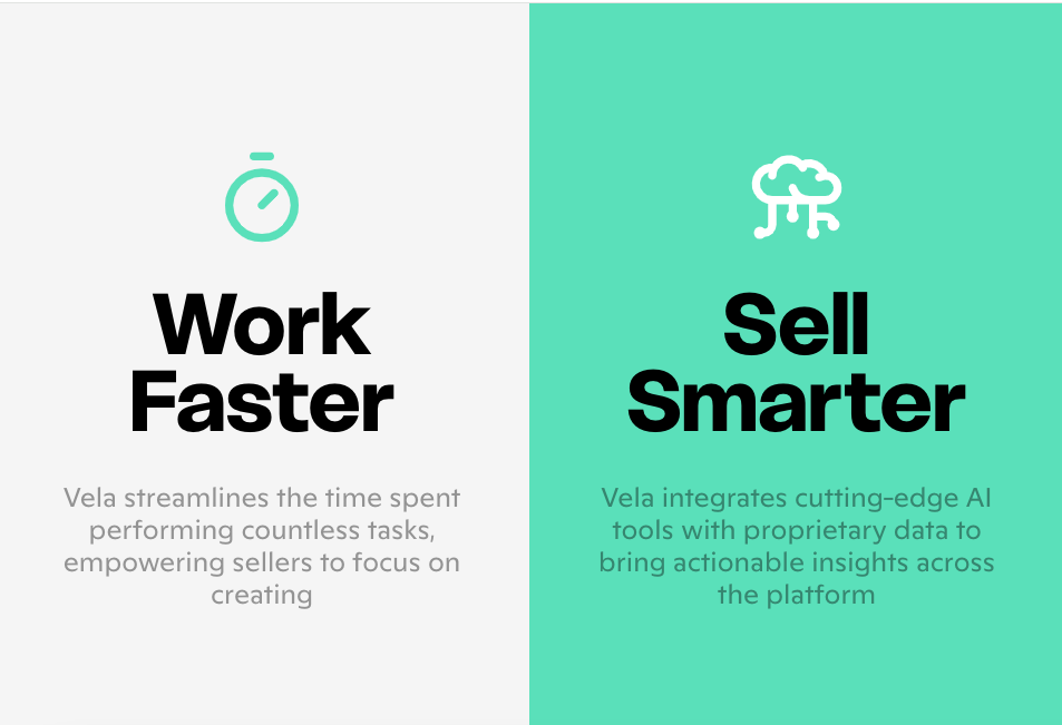
Source: https://welcome.getvela.com/
People with low vision or age-related vision changes simply can’t read it.
Quick Fix
Go just a couple of shades darker and you don’t have to go full black.
2. Colored Text on Colored Backgrounds
Blue on blue. Red on orange. Green on teal. Designers love these combinations. Screen readers don’t care but humans absolutely do.
It is a problem for people with color blindness. Especially red-green loses contrast completely because hues blend.
Quick Fix
Test combinations with free tools and choose accessibility over style if you aim for an inclusive design.
3. Relying on Color Alone to Convey Information
Sometimes, valid fields are highlighted in green and errors are highlighted in red. On some websites, we even see that buttons change color on hover. It can hurt accessibility because color-blind users may not notice the difference at all.
How to fix this:
A digital accessibility provider would suggest adding icons, borders, or helper text to achieve WCAG 2.2 AA level accessibility.
4. Low-Contrast Buttons and CTAs
A button is only useful if people can see it. Many websites use pastel buttons or very subtle outlines.
Low-vision users miss important actions that drive conversions.
Fix it by making the text on the button high contrast, not just the button color.
5. Tiny Text With Low Contrast
Even acceptable colors become unreadable when the text is too small. Fix it by increasing the font size or increasing the contrast.
6. Light Placeholder Text Inside Forms
Form placeholders are often way too faint and it is a major accessibility issue. Such forms become unusable for older users or people with cataracts.
Use proper labels not placeholders to fix this issue. Ideally, medium contrast is good for helper text.
7. Using “Disabled” Elements That Are Too Faded
Some designers fade disabled buttons so much that nobody can even tell they are disabled or they exist. It is best to use a subtle style change but maintain some visibility.
Q: What color combinations fail accessibility most often?
Light gray text on white, pastel buttons, and color-on-color backgrounds (like blue text on blue) are the most common contrast failures.
How to Check Color Contrast
Indeed a full-fledged digital accessibility compliance audit is essential to confirm total compliance. Still, you can check your site’s contrast in less than 30 seconds with some free tools:
● WebAIM Contrast Checker
● Chrome Lighthouse
● axe DevTools
● Stark for Figma and Adobe XD
Color Oracle for color blindness simulation
Quick Table: Good vs Bad Contrast Examples
Q: Why do most websites fail color contrast tests?
Most websites fail because designers use light gray text, pastel buttons, thin fonts, or rely on color-only signals that don’t meet WCAG ratios.
Explore step-by-step digital accessibility testing methods to ensure your site meets WCAG standards in this blog [Accessibility Audits vs WCAG Testing: What is the Difference?].
How Poor Color Contrast Impacts Your Business
Bad contrast doesn’t just hurt accessibility. It hits your business directly:
● Lower conversions because users can’t see those pastel or faded CTAs
● Higher bounce rates because one in four Americans is struggling with some form of disability
● Poor mobile readability for reasons like low brightness on mobile screens or outdoor glare
● Bad SEO signals because even search engines prefer WCAG and ADA compliant websites
● Higher risk of ADA lawsuits
In the US especially, accessibility lawsuits are increasing every year. Color contrast violations show up in almost all of them.
Q: Can I keep my brand colors and still pass WCAG?
A: Most brand palettes can be made accessible by slightly adjusting brightness or using a darker shade for text and buttons.
How to fix Contrast Issues Without Ruining your Design
Good accessibility doesn’t mean making the design ugly with loud colors. You can keep your brand colors by adjusting:
● Text opacity
● Font thickness
● Background brightness
● Button outlines
● Hover states
● Gradient angles
One or two tweaks usually make a failing combination pass.
If you need help optimizing your color contrast, get a free consultation from us. ADACP can make your designs accessible without compromising your brand style.

Source: https://w3c.github.io/wcag21/understanding/21/non-text-contrast.html
Color Contrast Best Practices
Follow the below tips if you want to achieve ADA, Section 508 or VPAT accessibility compliance.
● Stick to a minimum 4.5:1 ratio for body text.
● Make your main text dark enough to be readable everywhere.
● Don’t rely on color alone—use icons or borders.
● Use labels instead of pale placeholder text.
● Test your color combinations before publishing.
● Check mobile screenshots—outdoor glare makes contrast worse.
● Keep accessibility in mind before finalizing brand colors.
● Consult with ADACP and prevent color contrast accessibility issues.
Conclusion
Color contrast is a usability requirement. If your site has low contrast, people will struggle, conversions will drop, and your website won’t meet WCAG or ADA expectations.
The best part? Color contrast is one of the easiest fixes. Get a free consultation with us to fix your color contrast issues and meet WCAG standards while your design still looks great.
FAQs
1. What is the easiest way to check color contrast?
Use a free tool like WebAIM’s Contrast Checker or Chrome Lighthouse. Both give instant results. But remember, only automated tools cannot assure you total compliance. It is best to consult a digital accessibility provider to find a color contrast suitable for your brand as well as your compliance goals.
2. Does color contrast affect SEO?
Poor readability increases bounce rates. So yes, bad color contrast is also bad for SEO. It tells search engines your page isn’t user-friendly.
3. Is color contrast required by law in the US?
Under ADA Title III and Section 508, websites are expected to meet WCAG standards. These standards also include contrast rules.
4. How do I fix low-contrast text without changing my whole design?
Adjust brightness, use darker shades of your brand colors, or slightly increase the font weight. For more guidance, you can consult the accessibility experts at ADACP.
5. Do images and icons also need good contrast?
Buttons, icons and form fields must have a contrast ratio of at least 3:1. Book a digital accessibility compliance audit with ADACP to ensure all elements that a user interacts with on your website have the right contrast levels.
Did you know that color contrast is one of the most common reasons websites fail WCAG standards?
People don’t think about color contrast until someone points it out. Have you ever considered that the modern light gray text on a white background will be a total fail as per the norms of digital accessibility compliance? It might make half your audience squint.
The good news is that color contrast is the easiest thing to fix once you know that it is going wrong.
If you’re wondering whether your own website has these contrast issues, don’t guess.
Let ADACP run a quick contrast check for you. Schedule a free consultation with our experts to learn more about it.
What is the importance of color contrast in digital accessibility compliance?
Color contrast rules matter because people don’t all see color, brightness, or text the same way.
Some users may have low vision or color blindness. People may struggle with brightness sensitivity so they need the right color contrast to access your content. In addition to this, small screens, outdoor glare and older monitors are some reasons you need an accessibility compliance consultant by your side.
A color combination that “looks fine” to you might be unreadable to thousands of your users. An expert can tell you where you fall short and how to resolve such issues.
Q: What is color contrast in digital accessibility?
Color contrast refers to the visual difference between text (or important elements) and the background behind it. Better contrast makes text easier to read and improves accessibility for users with visual impairments.
WCAG Requirements for Color Contrast
In the table above, 4.5:1 is the safe “don’t get sued, don’t lose accessibility” zone.
Related reading: Learn more about WCAG guidelines and proper color contrast to make your website compliant in this blog [The Beginners Guide to WCAG: Making the Web Accessible for Everyone].
Q: What contrast ratio does WCAG require?
WCAG requires a minimum contrast ratio of 4.5:1 for normal text and 3:1 for large text or UI components.
The Most Common Color Contrast Mistakes
Below are the most common mistakes found in well-designed websites. You can easily find these mistakes through digital accessibility testing.
1. Light Gray Text on White Backgrounds
This one is everywhere. Design teams often pick #9B9B9B, #A6A6A6 or #BEBEBE to look stylish. The clean look does look good but it fails contrast instantly.
Source: https://welcome.getvela.com/
People with low vision or age-related vision changes simply can’t read it.
Quick Fix
Go just a couple of shades darker and you don’t have to go full black.
2. Colored Text on Colored Backgrounds
Blue on blue. Red on orange. Green on teal. Designers love these combinations. Screen readers don’t care but humans absolutely do.
It is a problem for people with color blindness. Especially red-green loses contrast completely because hues blend.
Quick Fix
Test combinations with free tools and choose accessibility over style if you aim for an inclusive design.
3. Relying on Color Alone to Convey Information
Sometimes, valid fields are highlighted in green and errors are highlighted in red. On some websites, we even see that buttons change color on hover. It can hurt accessibility because color-blind users may not notice the difference at all.
How to fix this:
A digital accessibility provider would suggest adding icons, borders, or helper text to achieve WCAG 2.2 AA level accessibility.
4. Low-Contrast Buttons and CTAs
A button is only useful if people can see it. Many websites use pastel buttons or very subtle outlines.
Low-vision users miss important actions that drive conversions.
Fix it by making the text on the button high contrast, not just the button color.
5. Tiny Text With Low Contrast
Even acceptable colors become unreadable when the text is too small. Fix it by increasing the font size or increasing the contrast.
6. Light Placeholder Text Inside Forms
Form placeholders are often way too faint and it is a major accessibility issue. Such forms become unusable for older users or people with cataracts.
Use proper labels not placeholders to fix this issue. Ideally, medium contrast is good for helper text.
7. Using “Disabled” Elements That Are Too Faded
Some designers fade disabled buttons so much that nobody can even tell they are disabled or they exist. It is best to use a subtle style change but maintain some visibility.
Q: What color combinations fail accessibility most often?
Light gray text on white, pastel buttons, and color-on-color backgrounds (like blue text on blue) are the most common contrast failures.
How to Check Color Contrast
Indeed a full-fledged digital accessibility compliance audit is essential to confirm total compliance. Still, you can check your site’s contrast in less than 30 seconds with some free tools:
● WebAIM Contrast Checker
● Chrome Lighthouse
● axe DevTools
● Stark for Figma and Adobe XD
Color Oracle for color blindness simulation
Quick Table: Good vs Bad Contrast Examples
Q: Why do most websites fail color contrast tests?
Most websites fail because designers use light gray text, pastel buttons, thin fonts, or rely on color-only signals that don’t meet WCAG ratios.
Explore step-by-step digital accessibility testing methods to ensure your site meets WCAG standards in this blog [Accessibility Audits vs WCAG Testing: What is the Difference?].
How Poor Color Contrast Impacts Your Business
Bad contrast doesn’t just hurt accessibility. It hits your business directly:
● Lower conversions because users can’t see those pastel or faded CTAs
● Higher bounce rates because one in four Americans is struggling with some form of disability
● Poor mobile readability for reasons like low brightness on mobile screens or outdoor glare
● Bad SEO signals because even search engines prefer WCAG and ADA compliant websites
● Higher risk of ADA lawsuits
In the US especially, accessibility lawsuits are increasing every year. Color contrast violations show up in almost all of them.
Q: Can I keep my brand colors and still pass WCAG?
A: Most brand palettes can be made accessible by slightly adjusting brightness or using a darker shade for text and buttons.
How to fix Contrast Issues Without Ruining your Design
Good accessibility doesn’t mean making the design ugly with loud colors. You can keep your brand colors by adjusting:
● Text opacity
● Font thickness
● Background brightness
● Button outlines
● Hover states
● Gradient angles
One or two tweaks usually make a failing combination pass.
If you need help optimizing your color contrast, get a free consultation from us. ADACP can make your designs accessible without compromising your brand style.
Source: https://w3c.github.io/wcag21/understanding/21/non-text-contrast.html
Color Contrast Best Practices
Follow the below tips if you want to achieve ADA, Section 508 or VPAT accessibility compliance.
● Stick to a minimum 4.5:1 ratio for body text.
● Make your main text dark enough to be readable everywhere.
● Don’t rely on color alone—use icons or borders.
● Use labels instead of pale placeholder text.
● Test your color combinations before publishing.
● Check mobile screenshots—outdoor glare makes contrast worse.
● Keep accessibility in mind before finalizing brand colors.
● Consult with ADACP and prevent color contrast accessibility issues.
Conclusion
Color contrast is a usability requirement. If your site has low contrast, people will struggle, conversions will drop, and your website won’t meet WCAG or ADA expectations.
The best part? Color contrast is one of the easiest fixes. Get a free consultation with us to fix your color contrast issues and meet WCAG standards while your design still looks great.
FAQs
1. What is the easiest way to check color contrast?
Use a free tool like WebAIM’s Contrast Checker or Chrome Lighthouse. Both give instant results. But remember, only automated tools cannot assure you total compliance. It is best to consult a digital accessibility provider to find a color contrast suitable for your brand as well as your compliance goals.
2. Does color contrast affect SEO?
Poor readability increases bounce rates. So yes, bad color contrast is also bad for SEO. It tells search engines your page isn’t user-friendly.
3. Is color contrast required by law in the US?
Under ADA Title III and Section 508, websites are expected to meet WCAG standards. These standards also include contrast rules.
4. How do I fix low-contrast text without changing my whole design?
Adjust brightness, use darker shades of your brand colors, or slightly increase the font weight. For more guidance, you can consult the accessibility experts at ADACP.
5. Do images and icons also need good contrast?
Buttons, icons and form fields must have a contrast ratio of at least 3:1. Book a digital accessibility compliance audit with ADACP to ensure all elements that a user interacts with on your website have the right contrast levels.

.svg)
.svg)
.svg)

We will contact you shortly.
.webp)


.svg)

.svg)
.svg)