A user reaches your signup form, fills out every field, clicks Create account, and gets a red outline plus “Invalid input.” No field is focused. Nothing is announced clearly by a screen reader. On a modern React or Vue app, the component rerenders, the toast disappears, and the user tries again until they quit.
That failure isn’t just a UX defect. It’s a conversion problem, a support burden, and a compliance risk. If your form blocks account creation, checkout, intake, or payment, your error handling sits directly on the path to revenue and directly inside the scope of ADA and WCAG review.
Accessible error messages are where theory collides with implementation. Teams usually know they need labels, ARIA, and validation. The hard part is deciding when to validate, where to move focus, how to announce changes without creating noise, and how to prove the flow works in a real browser with a real screen reader. That’s where most forms break.
Why Vague Error Messages Create Business Risk
A vague error message usually looks small in a sprint ticket. In production, it blocks money.
A checkout form that says “There was a problem” forces users to hunt for the issue. A healthcare intake form that marks fields in red without text leaves screen reader users guessing. A B2B trial form that wipes entered data after a failed submission tells a buyer your product isn’t ready for serious use.
Three business problems follow quickly:
- Abandonment rises: Users hit friction at the exact moment they’re trying to convert.
- Trust drops: People assume the system is unstable when it won’t explain what failed.
- Legal exposure increases: If an automatically detected input error isn’t identified and described in text, you have a WCAG problem on a critical workflow.
Practical rule: If a user can’t tell what failed, where it failed, and how to fix it within seconds, the form is not ready.
The risk is higher on revenue paths and regulated workflows. Think account creation, payment, loan applications, patient portals, quote requests, and procurement forms. These aren’t decorative pages. They’re transactional controls. If error handling fails there, the impact reaches sales, operations, and compliance.
Teams also underestimate how often JavaScript frameworks make this worse. A component rerender can drop focus. A toast can fire without any programmatic relationship to the field. A debounced validator can announce every keystroke. Each issue is individually fixable. Together, they create a form that passes a quick visual review and still fails real users.
That’s why accessible error messages shouldn’t be treated as copy polish. They’re part of risk management, form completion, and defensible WCAG conformance.
The Anatomy of a WCAG-Compliant Error Message
Accessible error handling has to do more than display red text. The implementation has to work visually, semantically, and programmatically.
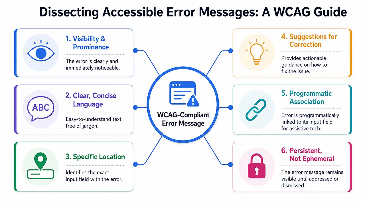
What compliant error handling must do
The most defensible workflow is defined in the W3C explanation of WCAG error identification. It requires teams to detect the error automatically, identify the exact field in error, describe the problem in text, and preserve a logical recovery path so the user can correct and resubmit.
That leads to four practical requirements:
- Detect it Validation has to catch the problem reliably, whether it happens client-side or server-side.
- Point to the exact field Users shouldn’t have to inspect the whole form. The erroneous control must be clearly identified.
- Describe the problem in text Color, border changes, and icons can support the message, but they can’t carry it alone.
- Keep recovery obvious Users need a clear path to edit the field and resubmit without losing context or data.
W3C also notes that common browser and screen reader combinations announce the error together with the focused field’s programmatic name when the relationship is built correctly. That’s why the technical pattern matters so much: use a semantic label, set aria-invalid=“true” when the field is invalid, and bind the inline message with aria-describedby.
A weak pattern looks like this:
- Red border only
- Generic toast at top of page
- No text tied to the field
- Focus remains on submit button
A stronger pattern looks like this:
- Inline message adjacent to the control
- Text that names the field and the problem
- Programmatic association to the input
- Recovery path that lets the user fix and resubmit
Relevant WCAG criteria
| WCAG Success Criterion | Level | Core Requirement |
|---|---|---|
| 3.3.1 Error Identification | A | Automatically detected input errors must be identified and described in text |
| 4.1.2 Name, Role, Value | A | UI components need programmatically determinable name, role, state, and value so assistive tech can interpret error state |
| 3.3.3 Error Suggestion | AA | When known, provide suggestions for correction |
| 1.3.1 Info and Relationships | A | Labels, instructions, and error associations must be conveyed structurally, not only visually |
Don’t audit form errors by asking whether the message is visible. Audit whether the field, error state, message text, and correction path are all exposed in a way assistive technology can actually use.
Writing Error Copy That Actually Helps Users
A technically compliant message can still fail if the text is lazy.
“Invalid input” is the classic example. It identifies that something is wrong, but it doesn’t tell the user what to do next. That drives repeat failures, support tickets, and form abandonment.
Bad messages create repeat failures
Strong accessible error messages do three jobs at once:
- Name the field
- Explain the problem
- Give the fix
That sounds basic, but many products stop after job one. They flag the field and call it done.
The copy should also sound like product guidance, not server output. Avoid internal terms like “format violation,” “schema mismatch,” or “authentication failure” unless your users are technical administrators and the context requires it.
For teams working on broader form UX, this also overlaps with accessible content writing practices. Error text is interface content. It needs the same discipline as labels, helper text, and instructions.
Before and after examples
Here are common failures and better replacements.
| Weak message | Better message |
|---|---|
| Error | Enter your email address |
| Invalid input | Enter your phone number using digits only |
| Invalid email | Enter an email address in the format name@example.com |
| Required field | First name is required |
| Password error | Use a password with the required characters shown below |
| Submission failed | We couldn’t submit the form because some fields need attention. Review the errors below. |
A few writing rules help consistently:
- Lead with the action: “Enter your billing ZIP code” is faster to process than “The ZIP code field cannot be empty.”
- Use the user’s language: Say “email address,” not “identifier.”
- Offer the next step when relevant: If the email already exists, say the account may already be registered and point toward sign in or reset password.
- Keep examples local to the format: If a field expects a date or number format, the example should match the product’s locale and input rules.
A good error message shortens the distance between failure and recovery.
Tone matters too. Error copy shouldn’t blame the user. “You entered this incorrectly” creates friction. “Enter the date in MM/DD/YYYY format” keeps the interaction neutral and productive.
When teams review form content, they often spend time on marketing copy and almost none on validation copy. That’s backwards. Error text appears at the highest-friction moment in the entire workflow.
Technical Implementation with HTML ARIA and JavaScript
Many accessible error messages succeed or fail based on this: The content might be fine, but the field state, associations, and focus behavior break once JavaScript gets involved.
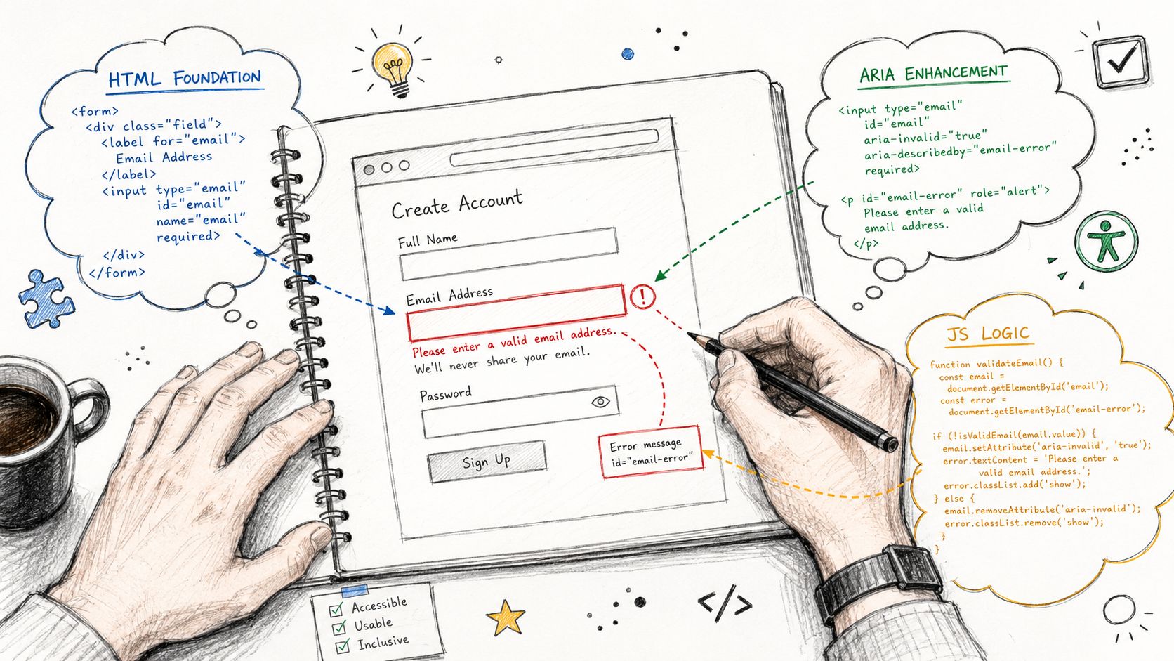
Start with semantic HTML
Use native form controls first. Then add ARIA only where it carries useful state and relationships.
<form novalidate id="signup-form">

<div class="form-field">
<label for="email">Work email</label>
<input
id="email"
name="email"
type="email"
aria-describedby="email-help"
/>
<p id="email-help">Use your company email address.</p>
<p id="email-error" class="error" hidden></p>
</div>

<button type="submit">Create account</button>
</form>
When validation fails, update the field state and bind the message:
<input
id="email"
name="email"
type="email"
aria-invalid="true"
aria-describedby="email-help email-error"
/>

<p id="email-error" class="error">Enter an email address in the format name@example.com.</p>
This pattern works because the input keeps its accessible name from the <label>, and the error becomes part of the field’s accessible description. If your team needs a deeper review of naming and association patterns, this guide to ARIA input fields and accessible names is the right reference point.
A minimal validation script might look like this:
const form = document.getElementById('signup-form');
const email = document.getElementById('email');
const emailError = document.getElementById('email-error');

form.addEventListener('submit', (e) => \{
e.preventDefault();

const value = email.value.trim();
const valid = /\S+@\S+\.\S+/.test(value);

if (!valid) \{
email.setAttribute('aria-invalid', 'true');
email.setAttribute('aria-describedby', 'email-help email-error');
emailError.hidden = false;
emailError.textContent = 'Enter an email address in the format name@example.com.';
email.focus();
return;
\}

email.removeAttribute('aria-invalid');
email.setAttribute('aria-describedby', 'email-help');
emailError.hidden = true;
emailError.textContent = '';

form.submit();
\});
Submission validation and SPA trade-offs
Modern interfaces complicate the timing question. The discussion of real-time accessible form error messaging captures a real engineering gap. WCAG requires that users know an error exists and what is wrong, but it doesn’t prescribe exactly when reactive validation should fire in complex forms.
That means product teams need rules.
Use real-time validation carefully:
- Validate on blur for many fields: This avoids announcing errors while the user is still typing.
- Reserve live feedback for high-value patterns: Password requirements and known format constraints can benefit from progressive feedback.
- Don’t announce every keystroke: A chatty live region becomes noise fast.
- Keep server-side validation in the loop: Client-side checks help, but the final system of record still has to return usable errors.
In React, Vue, Angular, or Svelte, preserve stable IDs across rerenders. If the error node’s id changes or disappears between state transitions, aria-describedby relationships break. Also watch conditional rendering. If you unmount the error element immediately after the field changes, screen reader users may lose the message before they can review it.
One practical rule for SPAs is to separate validation state from announcement state. A field can be invalid without firing a fresh alert every time state updates. That reduces duplicate announcements and makes the experience calmer.
Managing Keyboard Focus and Screen Reader Announcements
A common failure looks like this. A user submits a checkout form, nothing appears to happen in a way they can perceive, focus stays on the button, and the screen reader never reaches the new errors. That is not just a usability bug. It is a failed recovery path under WCAG and a direct abandonment risk.
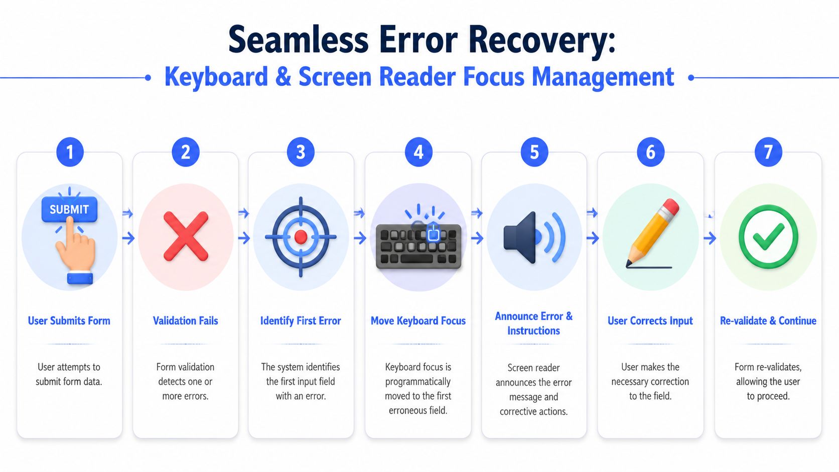
Modern JavaScript forms make this harder than older guidance suggests. In a server-rendered form, the page reload often gives you a natural announcement point. In React, Vue, Angular, or Svelte, state changes can update the UI without moving focus or creating an announcement that assistive technology will pick up. Teams need to design that behavior deliberately.
Two recovery patterns that work
Use one of two post-submit focus patterns, based on form length and error density.
Pattern one is an error summary at the top of the form. This works well for long forms, multi-error submissions, and workflows where users need to understand the full set of problems before editing.
<div id="error-summary" tabindex="-1" hidden>
<h2 id="there-is-a-problem">There is a problem</h2>
<ul>
<li><a href="#email">Enter a valid work email</a></li>
<li><a href="#phone">Enter your phone number</a></li>
</ul>
</div>
const summary = document.getElementById('error-summary');

function showSummary(errors) \{
const list = summary.querySelector('ul');
list.innerHTML = errors.map(err =>
`
<li><a href="#$\{err.id\}">$\{err.message\}</a></li>
`
).join('');

summary.hidden = false;
summary.focus();
\}
This pattern helps screen reader users if the summary receives focus, has a clear heading, and each link moves to the affected control. It also helps keyboard users who need a predictable starting point after failed submission.
Pattern two is moving focus directly to the first invalid field. This is usually the better choice for short forms, sign-in flows, and checkout steps where the user is likely to fix one thing and continue.
const firstInvalid = document.querySelector('[aria-invalid="true"]');
if (firstInvalid) firstInvalid.focus();
That choice has a trade-off. Fast correction is good, but users can miss additional errors farther down the page unless the form also exposes them visually and programmatically.
| Pattern | Best for | Main risk |
|---|---|---|
| Error summary | Long forms, multiple errors, server-side validation | User still needs clear field-level association to each error |
| Focus first invalid field | Short forms, quick correction flows | User may not realize other fields also failed |
In practice, the strongest pattern is often a combination. Show inline errors for each field. Move focus to a summary for multi-error submissions, or to the first invalid control for short forms. Keep the summary links functional either way. Deque and WebAIM both support this recovery model in principle, and it aligns well with WCAG requirements around error identification, relationships, and keyboard operability.
A separate keyboard trap appears when teams try to repair a broken flow with custom tab order. That usually makes the recovery path less predictable, not more. Follow guidance on avoiding tabindex values greater than 0 in forms and error flows so focus order stays aligned with the DOM and users can recover consistently.
Announcements that help instead of interrupting
Screen reader announcements need restraint and timing discipline.
Use role=“alert” or a live region only when a newly introduced error needs immediate announcement, such as a failed submit or a significant dynamic validation result. Do not fire assertive announcements on every input event. In SPAs, that creates duplicate speech, interrupted typing, and inconsistent behavior across screen readers and browsers.
<p id="email-error" class="error" role="alert"> Enter an email address in the format name@example.com. </p>
For many teams, the practical split looks like this:
- Inline associated text for persistent field-level error content
- Programmatic focus movement after submit, either to a summary or the first invalid control
- Live region announcement only for state changes that the user would otherwise miss
I usually advise teams to test these flows with real assistive technology before they ship. Automated checks can confirm missing attributes and some relationship failures, but they do not tell you whether the announcement order is understandable, whether focus lands in the right place after rerender, or whether a framework update caused the same alert to fire twice.
For broader training context, this short demo is useful because it shows the user-side effect of poor error recovery and announcement timing:
If validation speaks more often than the UI changes in a way the user can act on, the implementation is miscalibrated.
Advanced Topics Internationalization and Complex Forms
The baseline pattern breaks down quickly in global products and long workflows.
Localization changes the message design
A major gap in common guidance is multilingual error handling. The Harvard accessibility note on form error communication points to the practical problem clearly: most examples assume English, but translation changes message length, tone, and format examples such as dates or numbers.
That affects both design and engineering.
A compact inline message in English may wrap across multiple lines in German or French. A date example that helps US users may confuse users in another locale. A machine-translated phrase may technically describe the issue but still leave the user uncertain about the required correction.
For multilingual products, teams should review:
- Locale-specific examples: Date, number, currency, and phone guidance should match the user’s region.
- Message expansion: Components need room for longer translated strings.
- Plain-language review: Don’t assume a direct translation preserves clarity.
- Announcement quality: Screen readers need the same field association and understandable message in every supported language.
Multi-step and conditional workflows
Complex forms introduce another trap. The user completes step one, moves to step three, and a final server-side check reveals an issue from an earlier step. If your product only shows the error on the old screen without a clear route back, recovery is broken.
A better pattern is to keep three layers in sync:
- A step-level summary that tells the user which section contains the problem.
- A direct link or navigation action back to the invalid control.
- A persistent inline message on the field once the user returns.
Conditional forms need the same discipline. If a hidden field becomes required based on a prior selection, the UI must expose the field, label it clearly, and announce the new error state in a predictable way. Hidden validation without visible context is one of the fastest ways to create inaccessible friction.
Testing Remediation and Mitigating Legal Risk
A user fills out a checkout form, presses submit, and nothing useful happens. The page refreshes. Focus stays at the top. A red border appears somewhere below the fold. Your scanner still reports a low issue count.
That gap is where teams get exposed. WCAG conformance for error handling depends on behavior across states, not just valid markup. Modern JavaScript frameworks make this harder because component tests can pass while focus breaks after hydration, live regions announce at the wrong time, or client-side validation behaves differently from server responses.
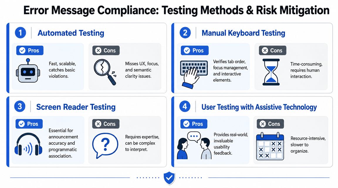
What automation misses
Automated tools are useful for catching missing labels, invalid ARIA patterns, and other code-level defects. They do not prove that a person using a keyboard or screen reader can find the error, understand it, and recover without friction. As noted earlier, guidance from WebAIM reflects the same limitation. Form validation still requires manual testing with assistive technology and real user flows.
A clean scan can still miss problems that drive abandonment and create legal risk:
- Focus stays on the submit button after failure
- Error summary links point to hidden or unmounted fields
- Inline errors exist in the DOM but are never announced
- Real-time validation fires on every keystroke and creates noise
- Error copy names the issue without telling the user how to fix it
This is also why SaaS product testing and analysis belongs in the process. Accessibility defects in validation often show up first as task failure, drop-off, and support volume.
A practical test routine
Use a repeatable routine tied to the form states your product ships.
- Keyboard-only pass: Move through the full form, submit invalid data, and confirm visible focus, error discovery, and a clear path back to each field.
- Screen reader pass: Test with NVDA or VoiceOver. Verify that the label, error state, and message are announced in a logical order.
- Framework-state pass: Trigger validation inside the SPA flow, not only in Storybook or isolated component demos. Confirm that rerenders, route changes, and async updates do not break
aria-describedby, focus targets, or live region announcements. - Server-side failure pass: Force backend validation errors and check the title, summary, field mapping, and whether user input is preserved.
- Localization pass: Review translated messages in context. Confirm that examples, field formats, and reading order still make sense.
One sentence in an audit report matters less than one failed remediation test on a real form.
For teams that need defensible evidence, document the result of each pass with screenshots, screen reader notes, browser and AT combinations, and the exact reproduction steps. That record helps engineers fix the issue faster, and it helps legal and compliance teams show that remediation was tested rather than assumed.
ADA Compliance Pros is one example of a vendor that performs WCAG-mapped audits, remediation guidance, and retesting for web apps and transactional forms. The vendor matters less than the method. The work needs hands-on testing with assistive technology, code-level findings developers can act on, and verification that users can recover after an error.
Treat accessible error handling as a workflow under test. That is how teams reduce abandonment, tighten WCAG coverage, and lower the chance that a form defect turns into a complaint, demand letter, or lost customer.
FAQ
What makes an error message accessible under WCAG
An accessible error message identifies the exact field in error, describes the problem in text, and supports recovery so the user can correct and resubmit. It also needs a programmatic relationship to the field, typically through semantic labels plus attributes such as aria-invalid and aria-describedby.
Should forms validate in real time or only on submit
It depends on the field and the risk of interruption. Real-time validation can help with constrained formats, but aggressive live announcements during typing often create noise. Many teams get better results by validating on blur for individual fields and using a clear summary plus focus management after failed submission.
Is aria-invalid enough for accessible error handling
No. aria-invalid exposes state, but it doesn’t explain the problem by itself. Users still need error text tied to the control, plus a clear recovery path after submission failure.
Do automated accessibility scanners catch form error issues
Only partially. Automated tools can flag some code-level issues, but they can’t reliably confirm whether error text is announced correctly, whether focus moves appropriately, or whether the message is understandable and actionable for assistive technology users.