Your team already has the audit report. It flags missing labels, broken error handling, and keyboard problems across signup, checkout, intake, and support forms. The harder question isn’t what WCAG expects. It’s what to fix first so the product becomes usable, legally safer, and ready to ship.
That’s where many remediation efforts stall. Developers jump straight into ARIA, product teams debate edge cases, and QA runs automated scans that miss the failures users hit. For accessible forms WCAG work, the fastest path is usually the most boring one: fix native markup first, then grouping, then validation, then keyboard and focus behavior, then verify everything manually in realistic flows.
Forms are where accessibility failures become business failures. A user can’t create an account, request a quote, pay an invoice, submit a job application, or complete onboarding. If you’re tightening governance, reviewing ADA exposure, or preparing for procurement questions, this is one of the highest-risk surfaces to remediate. If you need broader context on governance and public-facing commitments, Circle Monkeys’ digital accessibility information is a useful example of how organizations communicate accessibility expectations externally, and ADACP also explains what happens if your business ignores WCAG guidelines legal risks explained.
Why Inaccessible Forms Create Business and Legal Risk
Most organizations don’t discover form accessibility problems in design review. They discover them when a customer can’t check out, a patient can’t submit intake information, or an applicant can’t finish an employment form without assistance.
That creates two problems at once. The first is operational. The transaction fails, support volume rises, and the team starts treating accessibility as a bug queue instead of a product requirement. The second is legal. A broken form can block access to a core service, and that makes it much harder to argue that the experience is meaningfully usable.
Forms fail at the point of conversion
A decorative homepage can be annoying. An inaccessible form is a hard stop.
When labels are missing, screen reader users don’t know what a field is for. When focus jumps unpredictably, keyboard users lose their place. When validation appears only in red text or an icon, many users never get the instruction they need to recover. Those aren’t cosmetic issues. They prevent completion of tasks your business depends on.
Practical rule: If a form controls revenue, onboarding, hiring, support, or compliance, treat its accessibility defects as production risks, not content polish.
The legal risk isn’t separate from usability
Teams sometimes split accessibility into two buckets: user experience and compliance. On forms, that distinction collapses. The same issue that blocks a user also weakens your compliance position.
W3C’s forms guidance has anchored accessible form practice for more than two decades and emphasizes explicit labels, grouped controls, instructions, validation, and error recovery in its WAI forms tutorial. It also notes that users generally prefer forms to be simple and short, which matters in real remediation work because bloated forms create both accessibility friction and avoidable abandonment.
A common pattern in demand-letter scenarios isn’t exotic code. It’s basic failure on a core workflow. The organization had a form. The form looked finished. It wasn’t operable for everyone.
What leadership should ask for
A raw defect list won’t solve this. Product and engineering need a prioritized workflow:
- Fix task blockers first: Account creation, login recovery, checkout, scheduling, and intake come before preference centers and low-traffic forms.
- Address code-level semantics before visual refinements: Missing labels and broken focus are higher risk than visual spacing issues.
- Require manual verification: Teams need proof the form works with keyboard and assistive technology, not just proof that a scanner ran.
Foundational Markup for Form Accessibility
Most form remediation projects go off track because the team starts with ARIA or JavaScript. Start lower. Native HTML gives you the strongest baseline support, and a WCAG-aligned implementation order is to use native controls first, then visible labels, then grouping with <fieldset> and <legend>, then helper text and inline errors with aria-describedby, then aria-invalid=“true” so assistive technologies announce purpose and error state, as outlined in DigitalA11Y’s accessible forms checklist.
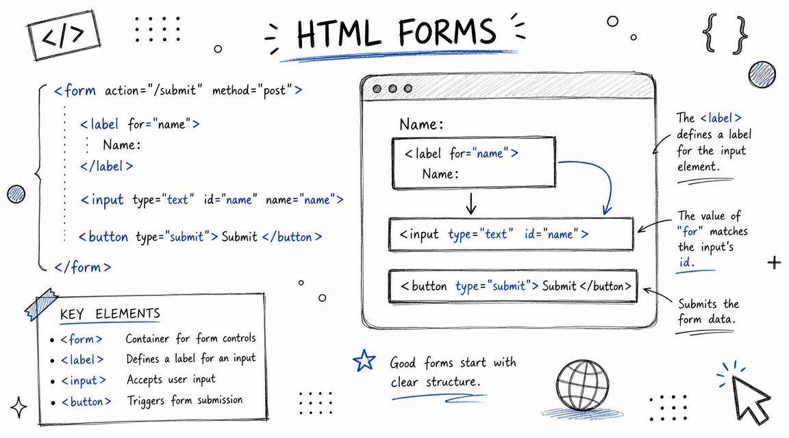
Start with native controls
If you’re building a text input, use <input type=“text”>. If it’s a checkbox, use <input type=“checkbox”>. If it’s a select menu, start with <select> before you build a custom combobox.
Native elements already expose core semantics to browsers and assistive technologies. That reduces the amount of repair work you need later. It also gives QA a more stable target.
Here is a basic pattern that works:
<form>

<div>
<label for="email">Work email</label>
<input id="email" name="email" type="email" autocomplete="email" />
</div>


<div>
<label for="company">Company name</label>
<input id="company" name="company" type="text" autocomplete="organization" />
</div>

<button type="submit">Request demo</button>
</form>
That looks simple because it is simple. In many audits, this level of markup is exactly what’s missing.
For a deeper check against one of the most common audit failures, ADACP’s guide on every form element has label is a practical reference for developers and QA teams.
Labels must be visible and programmatic
A field needs an actual label. Placeholder text isn’t a label. It disappears on input, it often has weak contrast in design systems, and it doesn’t reliably provide the same clarity to assistive technology users as a proper programmatic label.
Bad pattern:
<input type="text" placeholder="First name" />Better pattern:
<label for="first-name">First name</label>
<input id="first-name" name="firstName" type="text" />
If design wants a minimal interface, solve that in layout and styling, not by removing the label.
When a screen reader lands on a form control, the user needs to hear what the field is. If that relationship isn’t in the markup, the form is already failing.
A few markup rules prevent a lot of downstream bugs:
- Use one clear label per control: Don’t create competing names through stray ARIA unless you have a specific reason.
- Keep labels visible: Hidden labels often create maintenance mistakes and hurt users with cognitive or low-vision needs.
- Match IDs carefully: A typo between
for=“email”andid=“eamil”breaks the relationship completely. - Don’t wrap everything in generic divs and rebuild semantics later: That approach usually creates more ARIA debt.
Structuring Complex Forms with Grouping
A common remediation scenario goes like this. The audit team clears label issues, the UI looks clean, and the form still fails for screen reader users because related fields were never grouped in the markup.
That is usually the next high-risk fix after labels. If a user can hear each control name but cannot tell which question the controls belong to, the form still creates avoidable errors.
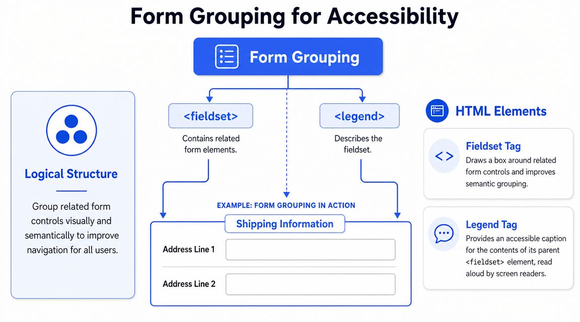
Group related controls before you refine anything else
In practice, I prioritize grouping early because it fixes meaning, not just presentation. Teams often spend time polishing spacing, helper text, and responsive layout while leaving the actual question structure flat in the DOM. That creates a form that looks organized to sighted users and sounds fragmented to assistive technology.
Radio buttons are the clearest example. If a form presents:
- Standard
- Express
- Overnight
the user still needs the parent question. Without it, those options could describe shipping, support tiers, or delivery notifications. The control labels are present, but the intent is missing.
Use <fieldset> to define the group and <legend> to provide the group question.
A radio group pattern that works
<fieldset>
<legend>Shipping method</legend>
<div>
<input id="ship-standard" name="shippingMethod" type="radio" value="standard" />
<label for="ship-standard">Standard</label>
</div>
<div>
<input id="ship-express" name="shippingMethod" type="radio" value="express" />
<label for="ship-express">Express</label>
</div>
<div>
<input id="ship-overnight" name="shippingMethod" type="radio" value="overnight" />
<label for="ship-overnight">Overnight</label>
</div>
</fieldset>
This pattern gives the browser and assistive technology a reliable structure. Users hear the group label and then the individual options in context.
That same approach applies to any set of controls that answers one question or belongs to one subtask:
- Checkbox groups: marketing preferences, notification channels, feature selections
- Address blocks: shipping address, billing address, service location
- Payment sections: card details, invoice details, purchase order details
The mistake that keeps showing up in audits
Development teams often place a heading above a cluster of controls and assume that visual proximity is enough. It is not. A heading can help sighted users scan the page, but it does not automatically create a programmatic relationship between the question and its controls.
That trade-off matters in component libraries. Design systems frequently use generic wrappers like <div class=“form-group”> because they are flexible and easy to style. Flexibility is useful, but not if the component strips out native semantics and forces the team to rebuild them later with ARIA. Native grouping is cheaper to maintain and harder to break.
A practical rule: if removing the surrounding CSS would also remove the meaning of the group, the markup is carrying too little semantic information.
| Pattern | What works | What fails |
|---|---|---|
| Radio group | <fieldset><legend>…</legend>…</fieldset> | Heading text above radios with no semantic group |
| Checkbox cluster | Shared group label in <legend> | Series of boxes with only individual labels |
| Address section | Logical grouped structure | Flat list of inputs with visual borders only |
One more implementation detail matters here. Keep the <legend> short and specific. Long instructional copy inside the legend makes screen reader output noisy and repetitive. Put the question in the legend, then place supporting help text after it and associate that help text only where needed.
Grouping tells assistive technology that several controls answer one question. Without that relationship, users have to infer structure that should already be in the code.
Implementing Accessible Error Validation
A common remediation failure looks like this. QA submits a form with three invalid fields, sees red borders, and marks the story done. Then keyboard and screen reader testing starts. Focus stays on the submit button, the new errors are not announced reliably, and the only clue is color. The form passed visual review but still fails at the point users need help most.
Error handling is usually one of the highest-risk form issues to fix first because it affects task completion directly. If users cannot find the problem, understand it, and recover quickly, the form is functionally broken even when the underlying fields have labels and instructions.
A pattern that works in production is a two-layer error experience: inline feedback on the field plus a summary at the top of the form. Reform recommends this approach in its accessible form validation best practices, including moving focus either to the first invalid control or to an error summary with a clear heading and links back to each problem field.
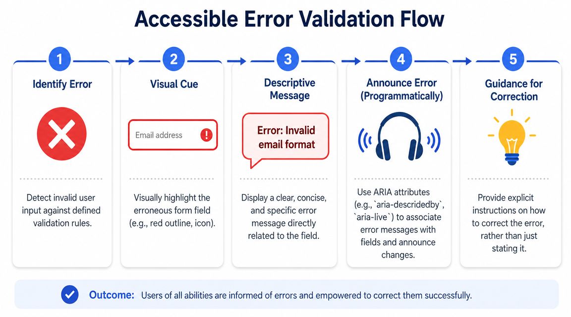
The order matters.
Teams usually get better results when they implement validation in this sequence:
- Make the message text specific. “Enter a valid work email” is better than “Invalid input.”
- Associate the message with the field. Use
aria-describedbyso assistive technology reads the error with the control. - Expose invalid state programmatically. Set
aria-invalid=“true”only when the field has failed validation. - Add a summary for failed submissions. This gives users a fast recovery path on long or multi-step forms.
- Set focus intentionally after submit. Move it to the summary or first invalid field, then test the behavior in the browser.
That sequence closes the biggest usability gaps first and avoids a common team mistake: building a polished error summary before the field-level relationships exist.
Later in the section, this implementation video can help teams compare code patterns with behavior in the browser.
Use the two-layer error pattern
Inline errors answer the immediate question: what is wrong with this field? The summary answers the larger one: why did submission fail, and where do I go next?
This matters on long forms, in modals, and in step-based flows where a user may not see the changed field without scrolling back through the page.
A good implementation includes:
- A clear error summary near the top. Give it a heading that includes the word “Error” so the state change is obvious.
- Links from the summary to each invalid field. Users should be able to jump straight to the control that needs attention.
- Inline guidance beside the field. Keep the message close in the DOM and on screen.
- A machine-readable invalid state. Mark the field invalid so assistive technology can announce it.
A code pattern teams can ship
<div id="error-summary" tabindex="-1">
<h2 id="error-please-correct-the-following-fields">Error. Please correct the following fields.</h2>
<ul>
<li><a href="#email">Enter a valid work email</a></li>
</ul>
</div>

<div>
<label for="email">Work email</label>
<input
id="email"
name="email"
type="email"
aria-describedby="email-error"
aria-invalid="true"
/>
<div id="email-error" tabindex="0">
Enter a valid work email.
</div>

</div>
This pattern is shippable because each piece has a job. The label names the field. aria-invalid=“true” exposes the error state. aria-describedby ties the message to the input so the user gets the error in context. The summary gives a fast route back into the form after a failed submit.
There is one trade-off to decide early. Some teams move focus to the summary after submit because it announces the overall failure and gives linked navigation to all errors. Others move focus to the first invalid field because it gets the user to correction faster. Both can work. The wrong choice is leaving focus where it was and hoping the user notices what changed.
What usually breaks in SPAs
Single-page apps often fail here because validation, rendering, and focus are handled by different layers of the stack. The result is familiar: the user activates Submit, errors render, and focus remains on a button that no longer explains the current state.
Common failures include:
- Disabling submit until every field is valid. That prevents users from reaching a full error review and can block assistive technology users from understanding what needs fixing.
- Rendering the error far from the field. Users then have to search for the missing context.
- Replacing the input node during re-render. Focus disappears because the original element no longer exists.
- Using color or iconography without text. Users need an explicit message, not just a visual cue.
For SPA teams, the practical rule is simple: keep the invalid field stable in the DOM, update its state and description, then move focus with intent. If the framework re-mounts the control, accessibility bugs follow quickly.
A validation state is only accessible when users can locate the error, understand the instruction, and fix it without searching the whole form again.
Ensuring Full Keyboard and Focus Management
A form that can’t be completed with a keyboard is broken, even if every field has a label. Keyboard access is a core requirement, and WebAIM’s guidance stresses that forms must be understood and operated with the keyboard alone, while the University of Washington checklist says tab order must be logical and recommends tabindex=“0” for discoverable error feedback in its forms accessibility guidance.
Natural order beats custom order
The cleanest tab order usually comes from the DOM itself. Build the form in the same order users should complete it, and the browser does most of the work.
What causes trouble is custom focus choreography:
- Positive
tabindexvalues that force an unnatural order - CSS layouts that visually rearrange fields while DOM order stays messy
- Custom widgets that intercept arrow keys, Tab, or Escape incorrectly
A keyboard test should feel boring. Press Tab and focus moves in a sensible sequence. Press Shift+Tab and it moves back the same way. Select radio buttons with arrow keys when appropriate. Activate buttons with Enter or Space, depending on the control.
Focus should move with intent
There are times when moving focus programmatically is correct. Error handling is one. Opening a modal step in a form flow is another. Revealing hidden content that requires action can also justify it.
The rule is simple: move focus when the interface changes in a way the user must address, and move it to the most useful target.
A practical decision table:
| Scenario | Good focus target | Bad focus target |
|---|---|---|
| Submit reveals errors | First invalid field or error summary | Leave focus on submit button |
| Modal form opens | Modal heading or first actionable control | Background page content |
| Dynamic helper panel opens | The panel only if action is required there | Arbitrary wrapper div |
| Step advances | New step heading or first field | Browser body or hidden node |
A few engineering habits reduce keyboard bugs quickly:
- Keep interactive elements native where possible: Buttons should be
<button>, not clickable divs. - Avoid keyboard traps: Users must always be able to tab out of a component unless it’s a managed modal context.
- Test backward navigation: Teams often test Tab and forget Shift+Tab, which is where focus traps show up.
- Watch re-renders closely: Framework updates can remove focused nodes and strand users.
Testing, Auditing, and Prioritizing Remediation
A passing scan doesn’t prove a form is usable. It only proves a tool didn’t detect certain machine-testable failures. Forms usually break in interaction: after submit, inside conditional steps, during focus shifts, or when a screen reader needs context that the code never exposed.
That gap is especially visible in long, multi-step, and SPA-based workflows. Tabnav notes that accessible post-submission validation is often less well explained in mainstream guidance and that implementation consistency across dynamic UIs is the hard part, particularly because automated tools often fail to test it reliably in its forms accessibility analysis.
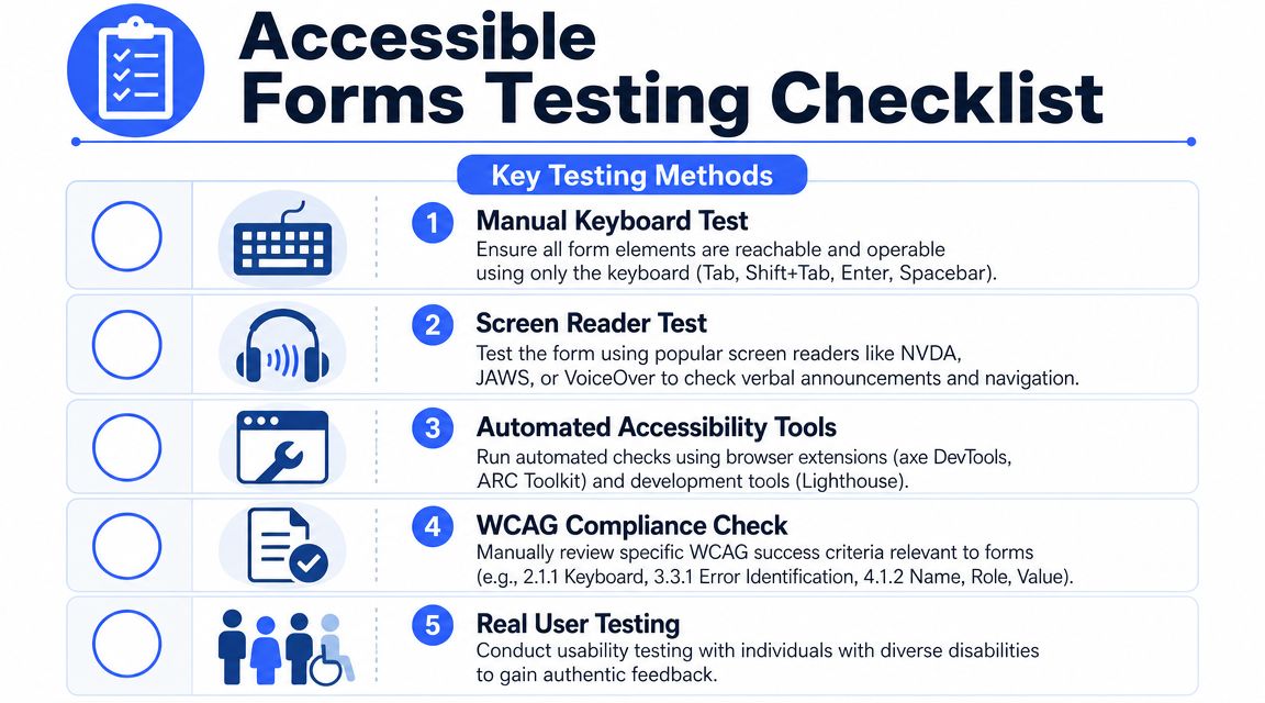
What to test manually every time
You don’t need a giant lab setup to catch high-risk issues. A disciplined manual pass finds many of them quickly.
Start with these checks:
- Keyboard-only completion: Tab through the form, fill it out, make mistakes on purpose, submit, and recover without touching a mouse.
- Screen reader announcement quality: Use NVDA on Windows or VoiceOver on macOS and iOS to verify labels, group names, instructions, error states, and summary links.
- Zoom and reflow behavior: Increase page zoom and confirm fields, helper text, and errors remain readable and connected.
- Conditional logic behavior: Trigger hidden fields, accordion sections, or step transitions and verify focus lands where users need it.
Automated tools still have value. axe DevTools, ARC Toolkit, and Lighthouse can catch missing labels, some ARIA misuse, and other low-hanging issues. They just can’t judge whether the full user journey works.
A practical companion for that tooling review is ADACP’s overview of accessibility testing tools, especially when teams need to understand where automation ends and manual verification begins.
How to triage a forms audit
Not every issue deserves the same urgency. Teams ship faster when they group findings by task impact, not by whichever component someone touched last.
A remediation queue for forms usually works best in this order:
- Task blockers first
Missing labels, broken keyboard access, inaccessible submit flows, and unreadable error recovery go to the top because they stop completion. - Context failures next
Ungrouped radio sets, ambiguous instructions, and disconnected helper text confuse users and increase error rates. - Dynamic state defects after that
Focus loss in SPAs, hidden validation messages, and modal traps often require more engineering coordination but still affect real transactions. - Consistency and design system cleanup last
Once the core journey works, standardize reusable field, hint, and error components so teams stop reintroducing defects.
If a scanner says the page improved but a keyboard user still can’t recover from a failed submission, the form isn’t remediated.
For organizations dealing with procurement reviews, ADA risk, or formal compliance obligations, manual audits are the defensible path because they validate behavior, not just markup snapshots. One option in that process is ADA Compliance Pros, which provides manual and automated testing, WCAG-mapped findings, remediation guidance, and VPAT or ACR documentation for digital products, including forms.
Frequently Asked Questions About Accessible Forms
Can placeholders replace labels
No. Placeholders are supporting text at best. They aren’t a durable substitute for a visible, programmatic label.
They disappear when users type, which removes context during review and correction. They also create problems for users with memory, attention, or low-vision needs because the field can become unlabeled in practice. Keep the label. If you need an example format, add helper text below the field.
When should you use aria-label instead of label
Use a native <label> for standard form controls whenever you can. That’s the default and usually the right answer.
aria-label makes sense when a control has no visible text label and adding one would break the interaction pattern, such as an icon-only close button inside a custom component. In ordinary forms, it shouldn’t be your first choice. Visible labels help everyone, not just assistive technology users, and they’re easier for QA to verify.
How should required fields be marked
Use a visible indicator and plain language. An asterisk alone is often too ambiguous unless you also explain what it means.
A solid pattern is:
- visible label text
- a required indicator
- clear instruction near the form start if needed
- programmatic required state where appropriate
Teams also need restraint. Required-field sprawl creates friction. Deque’s discussion of required fields points back to W3C’s note that users prefer simple and short forms and that excessive or irrelevant fields increase abandonment in its accessible required form fields article. In practice, reducing unnecessary inputs is often both a usability fix and an accessibility fix.
What should teams do about CAPTCHA
Treat CAPTCHA as a risk area. Many implementations create barriers for screen reader users, keyboard users, users with cognitive disabilities, and people who struggle with visual or audio challenges.
If you need abuse prevention, review alternatives that don’t place the burden entirely on the user. If you must use a challenge, make sure there is an accessible path, clear instructions, and a support fallback. This is one of those areas where legal defensibility depends on the whole workflow, not just the widget.
Do multi-step forms need anything special
Yes. They need stronger state communication and better focus management than short single-page forms.
When the user advances a step, the interface should clearly expose where they are, what changed, and what happens next. Preserve entered data when validation fails. Move focus to the new step heading or first actionable control. If errors appear after submission, make sure users can find the first failure quickly and continue without losing progress.
Is custom UI always a problem
No, but custom form components raise the cost of accessibility. A custom select, date picker, or combobox can work if the team fully implements semantics, keyboard interaction, focus behavior, naming, value exposure, and validation messaging.
That effort is often underestimated. If a native control meets the product requirement, use it. Save custom components for cases where there is a real business or usability reason.
What’s the fastest way to improve a legacy form
Start with the transaction-critical paths and apply a strict sequence:
- restore labels
- fix grouping
- connect help and errors programmatically
- repair keyboard order
- test failed submission flows manually
That order usually removes the highest-risk barriers with the least wasted effort. It also turns a long audit report into a workable engineering backlog.
If your team needs help turning an audit into a remediation plan, ADA Compliance Pros can support manual accessibility audits, form-specific WCAG remediation guidance, Section 508 and VPAT documentation, and re-testing for public websites, SaaS products, and enterprise applications.