A familiar accessibility failure looks small in a sprint review. A card grid ships with twelve identical “Read more” links. An icon in the header has no text label. A pricing page uses “click here” because the final copy wasn’t ready. None of those issues feels severe in isolation.
But for someone navigating by keyboard or screen reader, those links can turn a straightforward purchase path into guesswork. The user doesn’t see your surrounding layout cues, your card design pattern, or the visual hierarchy your team debated. They get a list of links, an announced accessible name, and whatever behavior the control triggers.
That’s why accessible link text matters to product, engineering, legal, and procurement teams. It’s not just a content polish issue. It sits directly inside WCAG conformance, affects ADA risk, and shows up in audits quickly because poor link naming is easy to spot and easy to test.
Why Vague Links Create Business Risk
Vague links create failure at the exact moment a user is trying to move forward. If a shopper tabs through “learn more,” “read more,” and “click here” across a product page, they have to guess which destination matters. If a screen reader user opens a links list and hears the same generic label repeated, your navigation stops being navigable.
This is also a scale problem, not an edge case. AudioEye’s 2026 accessibility statistics report that 64% of pages have links that aren’t clear to people with disabilities, 80% of sites had at least one page with an inaccessible link, and about 5% of pages had links that fail accessibility checks in some way. For an issue this visible and this fixable, those numbers should concern any CTO or product owner.
Where risk shows up first
Poor link text creates problems in three places at once:
- User flow: People can’t tell where a link goes, so they hesitate, backtrack, or abandon the task.
- Compliance review: Auditors flag link purpose issues quickly because they map directly to WCAG expectations.
- Legal exposure: Small defects become part of a broader pattern of inaccessible interaction design.
Practical rule: If a link only makes sense when a user can see the surrounding card, paragraph, or visual design, it’s already risky.
For leadership teams, this matters because accessible link text is one of the clearest examples of preventable noncompliance. It’s inexpensive to fix compared with deeper application refactoring, yet it can still undermine a public claim of accessibility maturity. That’s one reason teams reviewing the business impact of WCAG non-compliance often prioritize link remediation early.
Why teams miss it
Teams usually miss link issues for ordinary reasons. Content authors optimize for brevity. Designers prefer minimal labels in dense layouts. Developers reuse components that look clean visually but don’t expose a useful accessible name. None of that is malicious. It’s just how accessibility debt gets introduced in normal production.
Understanding Accessible Link Text and WCAG 2.4.4
Think of a screen reader’s links list like a table of contents. If every chapter were labeled “Chapter,” the book would be unusable. Link lists work the same way. Users need labels that tell them where each link goes or what it does, without requiring detective work.
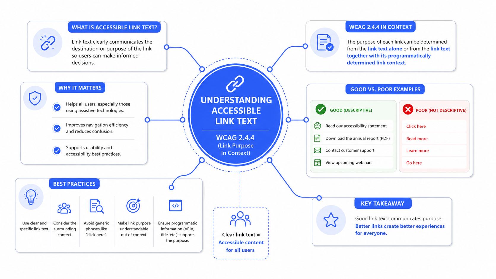
The formal rule is longstanding. W3C’s understanding document for WCAG Success Criterion 2.4.4 explains that accessible link text became a formal accessibility requirement in WCAG 2.0, published in December 2008, and that the purpose of each link must be determinable from the link text alone or from the link text together with its programmatically determined context.
What compliant link text actually does
Accessible link text does not need to be long. It needs to be clear.
Good link text usually does one or more of the following:
- Names the destination: “View enterprise pricing”
- Names the resource type: “Download onboarding checklist PDF”
- Names the action in context: “Open account settings”
Bad link text usually borrows meaning from the sentence around it instead of carrying its own weight.
What WCAG cares about in practice
In audits, the question isn’t whether the link sounds polished. The question is whether a user can determine its purpose reliably. That distinction matters in templates, component libraries, and SPAs where developers often assume context is obvious.
A few practical interpretations help:
- “Click here” fails often because it says nothing about destination.
- “Read more” may fail when repeated across cards with no unique accessible name.
- A bare URL is weak unless it is short, recognizable, and useful as announced text.
The safest pattern is simple: write the link people need to hear, not the link your layout can get away with showing.
If your team wants a broader design perspective alongside WCAG mechanics, DesignStack’s UK web accessibility guide is a useful reference because it connects accessibility standards to real design and build decisions rather than treating compliance as a copy-only problem.
Good vs Bad Link Text Examples
The fastest way to improve accessible link text is to stop debating the rule in the abstract and compare real examples. Most failures are obvious once they’re placed side by side.
Accessible vs Inaccessible Link Text
| Inaccessible Link Text (Avoid) | Accessible Link Text (Use) | Why It’s Better |
|---|---|---|
| Click here | View the implementation guide | States the destination instead of a generic action |
| Read more | Read more about enterprise SSO setup | Gives the repeated link a unique purpose |
| Learn more | Learn more about SOC 2 reporting | Tells the user what topic follows |
| More | View pricing plan details | Removes ambiguity in dense interfaces |
| https://example.com/files/doc.pdf | Download the product specifications PDF | Announces both destination and file type |
| Details | View invoice status | Helps users navigating out of context |
| Shop now | Shop winter safety boots | Preserves marketing intent while adding meaning |
| Link attached icon with no text | View cart | Gives the control a usable name |
| Read article | Read the guide to keyboard accessibility | Distinguishes this destination from other articles |
Patterns that usually fail
These show up repeatedly in enterprise sites, SaaS dashboards, and marketing CMS templates:
- Generic repeated labels: “Read more,” “details,” “more”
- Instructional text instead of purpose: “click here”
- Raw destination strings: pasted URLs or filenames
- Mismatched wording: visible text says one thing, accessible name says another
A related failure is inconsistency. If two links go to the same destination but are labeled differently in the same module, users have to spend extra effort figuring out whether they’re different.
Patterns that work
Teams get better results when they standardize around these habits:
- Use noun-led labels when the destination is a page or resource.
- Use action-led labels when the user is opening, downloading, or revealing something specific.
- Mention file type or changed behavior when the link doesn’t behave like normal page navigation.
Clear links reduce decision friction for everyone, not just assistive technology users.
This is one of the rare accessibility fixes that almost always improves UX copy at the same time.
Code and ARIA for Accessible Links
Accessible link text moves beyond being a writing guideline and into an implementation discipline. In real products, many links aren’t simple inline text links. They’re icons, cards, linked images, SPA route changes, or repeated calls to action inside reusable components.
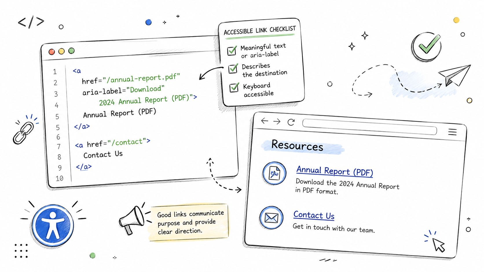
Yale’s accessible links guidance makes the core point clearly: link appearance and accessible name need to work together, and when space is limited, the accessible name may need to come from alternative text, hidden text, or ARIA so the control still has a unique purpose.
Icon-only links
If the control is a link, it still needs a usable accessible name.
<a href="/cart" aria-label="View cart">
<svg aria-hidden="true" focusable="false" width="24" height="24">
<!-- icon -->
</svg>
</a>
This works because the SVG is hidden from assistive tech and the link exposes a clear name. What doesn’t work is assuming the icon itself communicates meaning.
Use this pattern carefully. If there’s visible text available, visible text is usually the better source of the accessible name.
Repeated links in card grids
Card layouts are where many teams get into trouble. Designers want a short visible CTA. Screen reader users need each link to be unique.
A practical pattern is short visible text plus hidden context:
<a href="/blog/wcag-audit-checklist">
Read more<span class="sr-only"> about the WCAG audit checklist</span>
</a>
A common visually hidden utility class looks like this:
.sr-only \{
position: absolute;
width: 1px;
height: 1px;
padding: 0;
margin: -1px;
overflow: hidden;
clip: rect(0, 0, 0, 0);
white-space: nowrap;
border: 0;
\}
That preserves a clean UI while giving the link a unique, understandable name.
Linked images and computed names
If an image alone is the link, the image alternative text usually becomes the accessible name.
<a href="/products/thermal-printer">
<img src="printer.jpg" alt="Thermal printer product page" />
</a>
If the image is decorative and adjacent text already names the same destination, don’t create two separate links when one combined link will do.
For teams building component libraries, it helps to document accessible naming rules centrally. A detailed reference on accessible names for links, buttons, and menu items can save a lot of rework across design system variants.
SPA navigation and link versus button decisions
Modern interfaces blur semantics. That creates accessibility mistakes fast.
Use a link when the control leads to a new URL, route, or destination. Use a button when it opens a modal, filters content in place, expands a panel, or triggers an application action. If a React, Vue, or Angular component looks like a link but acts like a button, users get the wrong expectation and assistive technology gets the wrong semantic signal.
If it goes somewhere, use a link. If it does something, use a button.
That rule prevents a surprising number of audit findings.
Embedding Accessible Links in Your Content Workflow
Most link failures aren’t introduced by malicious code. They’re introduced by ordinary publishing habits. A marketer duplicates a card pattern. A product manager shortens CTA copy to fit a component. An editor highlights “here” because it reads naturally in a sentence. Unless the workflow catches those decisions, the same issues repeat every release.
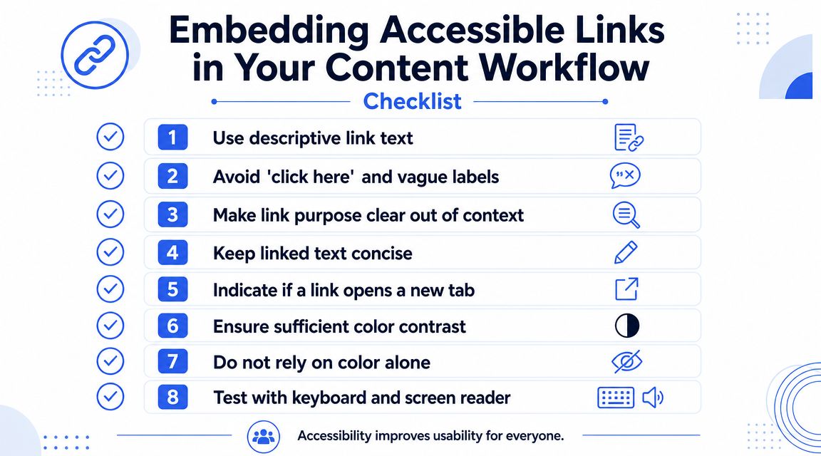
Vision Australia’s guidance on “Read more” links is especially useful for content operations because it recommends hidden text or aria-label to make repetitive links unique and meaningful out of context. That’s the kind of rule teams should formalize in a CMS playbook, not leave to individual judgment.
A workflow checklist teams can actually use
Add these checks to editorial QA, design review, and component acceptance:
- Describe the destination: The link should tell users where they’ll land or what they’ll open.
- Check uniqueness on the page: Repeated labels need unique accessible names when destinations differ.
- Note nonstandard outcomes: If the link downloads a file or changes context, say so in the label.
- Review linked images and icons: Every interactive visual needs a meaningful accessible name.
- Avoid split links to the same target: If an image and nearby title go to one place, combine them when possible.
Process beats cleanup
The most impactful fix is usually procedural, not technical. Put accessible link text rules into the design system, the CMS authoring guide, and the content review checklist. Make “link purpose clear out of context” a publishing standard, the same way you already enforce heading hierarchy or brand voice.
For content teams, accessible content writing guidance is often the missing operational layer because it translates accessibility rules into everyday editorial decisions.
Who should own it
Ownership should be shared, but not vague:
- Designers choose patterns that leave room for meaningful labels.
- Developers implement reliable naming and semantic behavior.
- Editors write link text that survives out-of-context reading.
- QA verifies the rendered experience, not just the mockup.
That division of responsibility is what keeps accessible link text from becoming another issue everyone assumes someone else handled.
How to Test Links for Accessibility Compliance
You can catch many link issues quickly, but only if you test the way users interact with content. Visual review alone won’t tell you whether a screen reader hears twelve identical links, whether an icon-only control has no name, or whether a component exposes the wrong role.
Start with manual keyboard testing
Use the Tab key and move through the page in order.
Check for these questions as you go:
- Can you tell where focus is? If focus styling is weak, users may miss links entirely.
- Does each link make sense when focused alone? Dense card layouts expose weak labels fast.
- Do repeated components stay consistent? One corrected card in a grid doesn’t fix the pattern.
This test is simple, but it surfaces practical problems that static review often misses.
Use a screen reader links list
Open the page with VoiceOver or NVDA and review links out of context. Here generic labels fail hardest. A links list strips away the surrounding paragraph and exposes what the accessible name communicates.
Listen for problems like:
- duplicate “read more” links
- unnamed icon links
- labels that don’t match the visible purpose
- links that sound like buttons because the wording describes an action but the control goes elsewhere
Automated scanners can catch empty links. They often can’t judge whether “Learn more” is acceptable in a specific interface. That takes human review.
Where automation helps and where it stops
Automated tools are useful for catching obvious defects such as empty links, some ARIA mistakes, and certain structural patterns. They’re not reliable judges of context, clarity, or naming quality. A scanner may see text inside an anchor and mark it as present. It can’t always tell whether the text is meaningful enough for a real user.
That’s why mature accessibility programs treat automation as a first pass, not a final decision. For a definitive assessment of compliance risk, especially on high-value templates and authenticated product flows, consider a professional WCAG audit that includes manual testing with assistive technologies.
Frequently Asked Questions About Link Accessibility
Do links have to make sense out of context?
As a rule, yes. If a screen reader user encounters the link in a links list, the purpose should still be understandable. Programmatically determined context can help in some cases, but teams shouldn’t rely on fragile context when a clearer label would solve the problem.
Should a link say when it opens a new tab?
Yes. Berkeley’s web accessibility guidance reflects the recommendation from authoritative sources such as Yale and Berkeley that when a link changes context, such as opening a new tab or window, that behavior should be communicated within the accessible name so users aren’t surprised.
What about PDF or document downloads?
Say what the resource is. “Download pricing guide PDF” is better than “download” or the raw file name. It sets user expectation before activation.
Can an image be a link?
Yes, but the linked image needs a meaningful accessible name. If the image alone is clickable, its alternative text must communicate the destination or function.
When should I use a button instead of a link?
Use a link for navigation. Use a button for actions such as opening a modal, applying a filter, submitting a form, or expanding content. This distinction matters for both semantics and user expectation.
If your team needs a defensible answer on whether your website or web app meets WCAG expectations, ADA Compliance Pros can help with manual accessibility audits, remediation guidance, VPAT support, and retesting grounded in real assistive technology use.