
Build Ecommerce Accessibility Filters: WCAG & ADA Guide
Product filters decide whether shoppers can reach the right results at all. That makes them one of the highest-risk accessibility components on an ecommerce site. Baymard’s benchmark found that 94% of the 33 top-grossing ecommerce sites they evaluated were not compliant with WCAG 2.1 AA, and 64% had keyboard-navigation issues, while 58% had form-field markup issues, according to Baymard Institute’s accessibility benchmark.
For development teams, that data changes the conversation. Filters aren’t a cosmetic enhancement. They sit inside category pages, search results, mobile drawers, and faceted navigation patterns that drive product discovery. If those controls fail for keyboard users or screen reader users, people can’t narrow results, confirm applied facets, or recover when the interface updates dynamically.
The hard part is that many ecommerce accessibility filters look fine in automated scans. The UI may expose labels, pass basic ARIA checks, and still fail in use because focus disappears after an update, the result count changes without indication, or a custom control traps keyboard users inside a panel. Those are implementation failures, not theory.
Why Inaccessible Filters Create Business Risk
Filters sit near the top of the shopping journey, and a failure there cuts off product discovery before a customer ever sees the right SKU. On large category pages, shoppers depend on filters to reduce hundreds of options to a workable set by size, price, brand, color, rating, or availability.
That makes filter accessibility a revenue problem and a legal exposure at the same time. If a shopper cannot operate the controls, cannot tell which filters are selected, or does not get clear feedback after results refresh, the catalog becomes harder or impossible to use. Automated scans often catch missing labels or low-contrast text. They are less reliable at catching the dynamic failures that matter just as much in faceted search, such as silent result updates, focus dropping to the wrong place, or a mobile filter drawer closing without returning the user to a predictable location.
Why filters create disproportionate risk
- They block product discovery early: A broken filter can stop a shopper before product comparison even starts.
- They combine several failure types in one component: Forms, names, states, keyboard support, dynamic updates, and mobile overlays often converge in the same UI.
- They fail in ways automated tools miss: A scan may pass while a screen reader user still gets no announcement that results changed, or a keyboard user loses track of focus after applying a facet.
One inaccessible filter can turn a browsable category page into a dead end.
Technical teams must also consider the legal dimension. Under ADA Title III, Section 508 in procurement contexts, and EU accessibility requirements, filters are part of the purchase path, not optional decoration. If users cannot refine products, confirm what changed, or recover focus after an update, that is not a minor defect. It demonstrates that a core shopping task is unusable. If your team needs a legal baseline, review what ADA compliance means for websites.
The business impact is usually straightforward. A shopper selects “size 10,” the page refreshes, and nothing is announced. Or focus jumps back to the top of the DOM. Or the results count changes visually but never reaches assistive technology. At that point, the user has to guess whether the filter worked, repeat the action, or leave. I see teams miss this because the happy path works fine with a mouse and a visible screen. In production, that gap shows up as abandonment, support friction, and avoidable remediation cost after launch.
This is also why filter work should be scoped as conversion work, not only compliance work. Teams that fix filter accessibility usually improve findability, reduce interaction errors, and strengthen the broader benefits of web accessibility for e-commerce websites.
Building a Foundation with Semantic HTML
Most broken filter experiences start with the wrong markup. Teams build a visually polished sidebar or mobile drawer, then wire generic div elements to click handlers and try to patch the result with ARIA. That approach is expensive to maintain and fragile under assistive technology.
The safer pattern is to start with native HTML and only add complexity when the component needs it. The European Accessibility Act lists e-commerce among the services it covers, and its requirements began to apply on June 28, 2025. The Act itself sets functional accessibility requirements rather than naming a version of WCAG; conformance is demonstrated in practice against the harmonised standard EN 301 549, whose web provisions track WCAG 2.1 Level AA. If your filters are part of an EU shopping flow, native semantics are no longer optional engineering hygiene. They’re part of regulatory readiness.
Use native controls before custom widgets
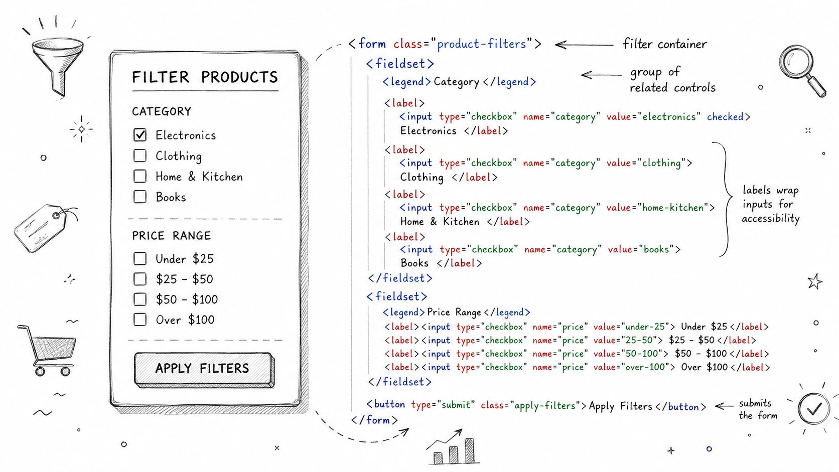
Checkboxes and radio buttons already expose role, state, and keyboard behavior to browsers and assistive technologies. You don’t need to recreate that.
Use these rules:
- Group related filters with
fieldset: A screen reader needs a programmatic group name, not just a styled heading above a cluster of controls. - Use
legendfor the group label: This gives the set a proper accessible name. - Associate every control with a real
label: Placeholder text or nearby text nodes aren’t a substitute. - Keep the input in the DOM and focusable: Hiding native inputs incorrectly often breaks keyboard access.
If your team is already reviewing labels across search, sort, and form controls, this guide on when select elements need accessible labels is a useful reference for common naming mistakes.
A solid baseline pattern
<form aria-label="Product filters">
<fieldset>
<legend>Color</legend>
<div>
<input type="checkbox" id="color-blue" name="color" value="blue" />
<label for="color-blue">Blue</label>
</div>
<div>
<input type="checkbox" id="color-black" name="color" value="black" />
<label for="color-black">Black</label>
</div>
</fieldset>

<fieldset>
<legend>Sort by</legend>
<div>
<input type="radio" id="sort-price-low" name="sort" value="price-asc" />
<label for="sort-price-low">Price low to high</label>
</div>
<div>
<input type="radio" id="sort-newest" name="sort" value="newest" />
<label for="sort-newest">Newest</label>
</div>
</fieldset>

<button type="submit">Apply filters</button>
<button type="reset">Clear all filters</button>
</form>
That baseline solves several recurring failures immediately. The group has a name. Each control has a name. The browser understands the control type. Keyboard users can tab to each input without extra scripting. Screen readers can announce the option and its state.
Practical rule: If a filter can be built with native form elements, do that first and style them second.
For teams working through broader control behavior, error handling, and naming, the same principles appear in this guide to accessible forms, labels, errors, and validation. Filters are still forms. Many teams forget that because they treat faceted navigation as a visual widget instead of a structured input flow.
Ensuring Flawless Keyboard Navigation and Focus
A filter isn’t keyboard accessible because you can tab into it once. It’s keyboard accessible when the user can complete the whole task without a mouse. That includes opening the filter panel, moving through options, toggling selections, clearing choices, applying changes, and continuing into refreshed results without losing orientation.
Research on product filters shows that keyboard support is still inconsistent across real-world ecommerce implementations, according to the evaluation published in the CEUR workshop paper. That matches what many teams see in audits. The visible checkbox may exist, but the custom wrapper steals focus, arrow-key behavior is partial, or the mobile filter drawer traps the user after opening.
Keyboard support means the whole interaction works
A working model usually includes the following expectations:
- Tab and Shift+Tab move into and out of filter controls in a predictable order.
- Space toggles checkboxes.
- Arrow keys work where the widget pattern requires them, such as radio groups or sliders.
- Enter activates buttons like Apply or Show Results.
- Escape closes a dismissible filter drawer or popover when that interaction is part of the UI.
The easiest way to fail this is to create a custom control that only listens for click.
<button
type="button"
aria-expanded="false"
aria-controls="filter-panel"
id="filter-toggle">
Filter products
</button>

<div id="filter-panel" hidden>
<!-- filter controls -->
</div>
const toggle = document.getElementById('filter-toggle');
const panel = document.getElementById('filter-panel');

toggle.addEventListener('click', () => \{
const expanded = toggle.getAttribute('aria-expanded') === 'true';
toggle.setAttribute('aria-expanded', String(!expanded));
panel.hidden = expanded;
\});
This is a workable start because button already supports keyboard activation. Compare that to a clickable div, which would require extra scripting and still be easier to break.
Focus has to land somewhere logical after updates
Focus management is where many ecommerce accessibility filters collapse. A user selects “Blue”, the product grid refreshes asynchronously, and nothing announces what happened. Focus may stay on a removed element, jump back to the top of the document, or disappear into the browser chrome.
A better pattern is to decide, in advance, where focus should move after a meaningful update. Usually that means one of these targets:
| Situation | Better focus target |
|---|---|
| Full page refresh after submit | Main heading or updated results heading |
| AJAX results refresh in place | Updated results summary |
| Mobile drawer closes after apply | Results count button or first result heading |
| Validation or load problem | Inline message or summary container |
<h2 id="results-heading" tabindex="-1">Results</h2>

<p id="results-summary">Showing products</p>
function updateResultsSummary(message) \{
const heading = document.getElementById('results-heading');
const summary = document.getElementById('results-summary');

summary.textContent = message;
heading.focus();
\}
That tabindex=“-1” isn’t for tab order. It creates a focus target you can move to programmatically after the results change.
If your filter updates content without moving focus or announcing the change, the interface is only accessible for sighted mouse users.
Also test the failure paths. Can users leave the filter drawer with Shift+Tab? Does focus return to the toggle when the panel closes? If a selected facet disappears because inventory changes, does the interface preserve a sensible reading order? Those are the details automated tools rarely validate, but users hit them immediately.
Implementing Advanced Patterns with ARIA
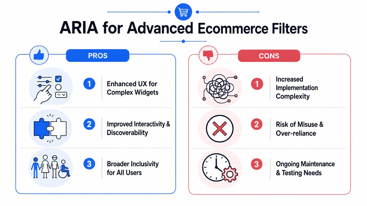
Native HTML gets you far, but ecommerce teams often need richer patterns. Filter categories collapse into accordions. Swatches act like option pickers. Price controls become custom sliders. Multi-select chips update a product grid without a submit button. That’s where ARIA can help, but only when it mirrors a complete interaction model.
Incorrect ARIA is often worse than no ARIA. It can tell assistive technology that a component behaves like a widget when the keyboard and state logic don’t support that promise.
Accordion filters need state and control relationships
Collapsible sections are common on category pages and essential on mobile. The trigger needs an accessible name, an expanded state, and a programmatic relationship to the region it controls.
<button
type="button"
aria-expanded="false"
aria-controls="brand-panel"
id="brand-toggle">
Brand
</button>

<div id="brand-panel" role="region" aria-labelledby="brand-toggle" hidden>
<fieldset>
<legend class="visually-hidden">Brand</legend>
<div>
<input type="checkbox" id="brand-1" name="brand" value="acme" />
<label for="brand-1">Acme</label>
</div>
</fieldset>
</div>
This pattern tells assistive technology what the button controls and whether the panel is open. It also gives the panel a name through aria-labelledby.
Custom widgets need complete semantics
Some teams replace checkboxes with pill buttons or visual tiles. If you do that, you need to expose selected state and keyboard interaction intentionally. In many cases, keeping the native input and styling the label is still the better choice.
A simple selected-chip pattern might look like this:
<ul aria-label="Selected filters">
<li> <button type="button" aria-pressed="true"> Blue </button> </li>
</ul>
That can work for removable active facets because the button exposes a pressed state. But it should not replace the actual filter control unless the whole component supports a complete and predictable keyboard model.
For custom price sliders, teams often underestimate the work. A slider needs value semantics and keyboard handling, not just drag behavior.
<div
role="slider"
tabindex="0"
aria-label="Maximum price"
aria-valuemin="0"
aria-valuemax="500"
aria-valuenow="200"
aria-valuetext="$200">
</div>
That role declaration is only the beginning. The control also needs keyboard support for increment and decrement, visual focus indication, and synchronized visible output. If any of that is missing, a native number input pair or select menu may be the safer and more maintainable choice.
A common source of errors is weak naming on dynamic toggles and custom control wrappers. This reference on ARIA toggle fields and accessible names is useful when teams are converting visual controls into accessible interactive elements.
ARIA doesn’t add usability by itself. It only exposes the usability you’ve already implemented.
The best engineering trade-off is usually simple. Use native controls for standard facets. Use ARIA for advanced patterns only when the design system requires a custom interaction, and then test that pattern manually across keyboard and screen reader flows.
Announcing Dynamic Updates to Screen Readers
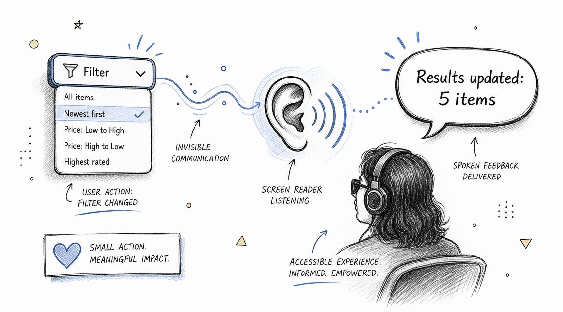
The biggest gap in many ecommerce accessibility filters isn’t whether the control can be reached. It’s whether the user is told what happened after they changed it. That gap matters because filter interactions often update the product grid asynchronously, remove unavailable options, change counts, and reorder content without a page load.
Much mainstream guidance stops at keyboard operability and never addresses the consequence of the interaction, but WCAG does cover it. SC 4.1.3 Status Messages, Level AA, requires that status messages “can be programmatically determined through role or properties such that they can be presented to the user by assistive technologies without receiving focus.” W3C draws the line precisely where filters live: the list of results is not itself a status message, but a short message about the search — its example is literally “18 results returned” — is one, and it must be announced without stealing focus.
What users need to hear after a filter changes
A useful announcement usually answers three questions:
- What changed
- What is currently active
- What happened to the results
Examples of useful messages include:
- “Blue filter selected.”
- “Two filters applied.”
- “Results updated.”
- “No products match the selected filters.”
What usually doesn’t work is dumping the entire result summary into a live region after every keypress. That creates noise and interrupts the user too often.
A practical live region pattern
Use a dedicated live region outside the product grid and update it only when the system state changes in a meaningful way.
<div id="filter-status" aria-live="polite" aria-atomic="true" class="visually-hidden"></div>
function announceFilterStatus(message) \{
const region = document.getElementById('filter-status');
region.textContent = '';
window.setTimeout(() => \{
region.textContent = message;
\}, 50);
\}
Use aria-live=“polite” for most filter updates because the change is important but usually not urgent enough to interrupt the current speech output. Reserve assertive for cases where the user must know immediately, such as a blocking error or a state that prevents continuation.
A simple comparison helps:
| Live region setting | Best use in filters |
|---|---|
polite | Result count updates, applied facet confirmations, sort changes |
assertive | Critical errors, unavailable action feedback, interrupted workflows |
There’s also a sequencing issue. If the live region announces “Results updated” but focus remains in a collapsed or removed control, the message still leaves the user disoriented. Screen reader messaging and focus management have to work together. Teams often implement one without the other, which is why dynamic filter testing needs real user-flow validation rather than only static code review.
A Practical Checklist for Testing and Remediation
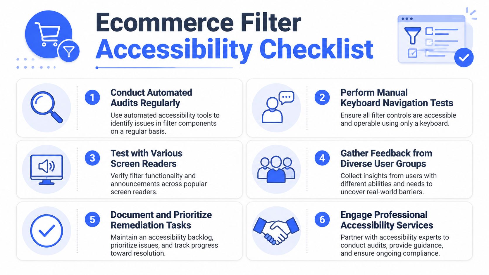
Automated checks have to be paired with manual testing, because operability and state changes have to be verified in real use rather than inferred from markup. That is W3C WAI’s own position in its guidance on evaluating web accessibility: tools assist the process, but “no tool alone can determine if a site meets accessibility standards.” Filters are a good illustration — a scanner can confirm a checkbox has a label, but only a person can confirm the result count was announced after it changed. Use a manual checklist that mirrors how customers filter products, trigger result updates, and recover when the interface changes under them.
What to verify manually
- Keyboard-only operation: Open the filter UI, move through every control, select and clear options, apply changes, and return to product results without needing a mouse.
- Visible focus: Verify that focus remains visible on trigger buttons, checkboxes, chips, close controls, and any “Apply” or “Clear all” actions in every state.
- Programmatic naming: Confirm that each control exposes a clear accessible name, role, state, and group relationship to screen readers.
- Dynamic updates: Check whether applied facets, changed result counts, zero-results states, and loading states are announced at the right time.
- Logical focus movement: After AJAX refreshes, drawer closes, or filter removal, confirm that focus lands somewhere predictable and useful. A heading, result summary, or the control that triggered the change are common targets.
- Mobile drawer behavior: Test filter drawers on touch devices with a keyboard and screen reader. Opening, applying, closing, and returning to results must preserve orientation.
This is the part automated tools usually miss. A scanner may flag a missing label or low contrast. It will not tell you whether focus disappears after results reload, whether a live region speaks too often, or whether a customer using VoiceOver can tell that 24 products became 3 after selecting a size.
Those failures have business consequences. If a shopper cannot tell what changed, they abandon the session. If the same issue blocks disabled users from completing a key ecommerce task, it also creates legal exposure under WCAG-based requirements and accessibility laws tied to online retail.
What automated tools won’t confirm
Automated tools are still useful for catching baseline issues such as missing labels, contrast failures, and invalid structure. Use them early. Use them in CI. Then run manual checks on the flows that generate revenue.
A practical pass should include these user-flow questions:
- Can a keyboard user open the filter, make a selection, and continue browsing without getting trapped?
- After results update, does focus stay in a place that still exists and still makes sense?
- Does the screen reader hear a useful status message, not silence and not repeated noise?
- If the user gets zero results, is that state announced clearly with a path to recover?
- If the filter UI is reused across templates or brands, do the same interaction bugs appear everywhere?
Teams usually bring in external review when faceted search is heavily customized or shared across a design system. For teams needing external validation, consultancies like ADA Compliance Pros provide manual accessibility assessments to verify interaction details that automated scanners miss. For a broader process reference beyond filters, 8 key steps for web accessibility is a useful companion resource.
eCommerce Filter Accessibility FAQ
Are Shopify or BigCommerce filters accessible out of the box
Sometimes, but not reliably enough to assume compliance. The base platform may provide a workable starting point, but theme customizations, faceted search apps, and third-party filter widgets are common failure points. If you’re running Shopify, this Shopify accessibility checklist is a practical place to review recurring issues.
Do accessible filters help SEO
Usually, yes in indirect but meaningful ways. Clear semantics, labeled controls, and logical page structure support crawlability and reduce UI friction. Search performance isn’t a substitute for compliance, but accessible implementation tends to align with cleaner markup and more understandable content architecture.
What mistake do teams make most often
They test for appearance and mouse behavior, then stop. A filter can look polished and still fail because keyboard users can’t exit a drawer, screen reader users aren’t told which facets are active, or focus disappears after results refresh.
For teams that want a broader process reference beyond filters alone, this checklist of 8 key steps for web accessibility is a useful companion resource.
Which WCAG success criteria usually apply
The most common mappings include:
- WCAG 1.3.1 Info and Relationships: Filter groups, labels, and structure must be programmatically conveyed.
- WCAG 2.1.1 Keyboard: Every filter interaction must work without a mouse.
- WCAG 2.4.3 Focus Order: Focus needs to move in a logical sequence, especially after dynamic updates.
- WCAG 4.1.2 Name, Role, Value: Custom controls must expose what they are and what state they’re in.
If filter issues continue into cart or checkout states, review the full purchase flow too. This checkout accessibility guide helps teams extend the same discipline into conversion-critical screens.
If your ecommerce filters rely on custom facets, dynamic updates, or mobile drawers, a manual accessibility audit is the fastest way to find the failures that automated scans miss. ADA Compliance Pros helps teams test real shopping flows, map issues to WCAG, and ship remediation plans that are defensible for ADA, Section 508, and EAA requirements.