
Consistent Help WCAG 3.2.6: Your 2026 Compliance Guide
A lot of teams already have help on their site. A live chat launcher sits in the corner. A “Contact Us” link lives in the footer. A help center link appears in account pages. The problem starts when those mechanisms drift. The homepage shows chat in one place, the pricing page hides it, and the support link moves once the user enters checkout or logs in.
That creates more than a usability annoyance. It creates friction at the exact moment a customer, patient, applicant, or employee needs reassurance. For users who rely on predictable patterns, inconsistent help can turn a simple question into a dead end. For product teams, that means avoidable abandonment, more support escalations, and a compliance issue that often slips through release cycles because no one tested it as a pattern across templates.
WCAG 2.2 added a rule aimed squarely at this problem. If your website repeats help mechanisms across a set of pages, those mechanisms need to stay in a consistent relative order. That sounds simple until you apply it to responsive layouts, support widgets, logged-in experiences, A/B tests, and modern chatbot triggers.
The Business Risk of Inconsistent Help
One common failure looks harmless in a sprint review. Marketing adds a chatbot to the homepage. Product keeps a help center link in the app footer. Support adds a contact panel on billing pages. Each choice makes sense locally. Together, they create a fragmented support experience.
A user lands on your homepage, sees “Live Chat,” then moves to a pricing or checkout page and can’t find it again. Another user opens an account settings page and sees only a help center link with no clear way to contact a person. Someone in a multi-step flow needs clarification but the support mechanism has moved, collapsed, or disappeared. That’s not just a UX inconsistency. It’s a trust problem.
For organizations trying to meet current accessibility expectations, consistent help WCAG 3.2.6 should be treated as a business control, not a cosmetic requirement. It sits inside WCAG 2.2, which many teams are already reviewing as they update accessibility roadmaps, procurement responses, and remediation plans. If you need a broader view of what changed, ADA Compliance Pros has a useful overview of what WCAG 2.2 AA changed and which rules require it.
Where teams usually get exposed
- Revenue-critical paths: Help disappears in checkout, pricing, quote request, signup, or renewal flows.
- Template drift: Different business units own different page templates, so support links move without anyone noticing.
- Widget sprawl: Chat, AI assistants, FAQs, and contact options stack up without a clear placement standard.
- Compliance documentation gaps: Teams say they “have support available” but can’t show that users can reliably find it.
Practical rule: If a help mechanism is important enough to repeat, it’s important enough to standardize.
The legal and procurement angle matters too. WCAG issues that affect predictable navigation are hard to defend when they appear across multiple templates. The fix usually isn’t expensive. The costly part is discovering late that your design system never defined where help belongs.
Defining WCAG 3.2.6 Consistent Help
WCAG 3.2.6 Consistent Help was introduced in WCAG 2.2 as a Level A success criterion. The W3C says repeated help mechanisms must appear in the same relative order across pages within a set, unless the user initiates a change, and it applies to four categories: human contact details, human contact mechanisms, self-help options, and fully automated contact mechanisms (W3C Understanding Consistent Help).
That definition matters because teams often misread the requirement. The rule does not say you must add live chat, phone support, or a help center. It says that if you already provide help on multiple pages, users should be able to find it in a predictable place.
What the rule actually covers
Think in terms of repeated support affordances, not just a page called “Help.”
Covered examples include:
- Human contact details such as a support email address or phone number.
- Human contact mechanisms such as a contact form or callback request.
- Self-help options such as an FAQ, knowledge base, or help center.
- Fully automated contact mechanisms such as a chatbot or support assistant.
That last category is where many modern sites get tripped up. Chat launchers and support widgets now sit inside the scope of the criterion when they function as repeated help mechanisms. A good companion read for teams updating to WCAG 2.2 is this Uxia blog on WCAG 2.2, especially if you’re mapping new criteria into design and QA workflows.
What same relative order means in practice
“Same relative order” doesn’t mean every page must look identical. It means the help mechanisms should maintain their order relative to one another across the relevant set of pages. If your footer lists “Help Center,” then “Contact Support,” then “Chat,” that order shouldn’t randomly change on other pages in the same experience.
A simple analogy works well with design and engineering teams: keep the salt and pepper in the same place on the table. People stop hunting for them. The same principle applies to support.
Predictable help reduces the effort users spend searching. That’s the whole point of the criterion.
The W3C also notes that evaluation happens within the same page variation, which means comparable views such as the same zoom level and orientation. In practice, that pushes teams to verify consistency across the templates and responsive states users encounter.
Success and Failure Examples What Auditors Look For
Auditors rarely flag this criterion because a single page looks bad. They flag it because a pattern breaks across a page set. The work is comparative. You inspect the homepage, product pages, account pages, checkout, support articles, and mobile layouts to see whether repeated help mechanisms stay where users expect them.
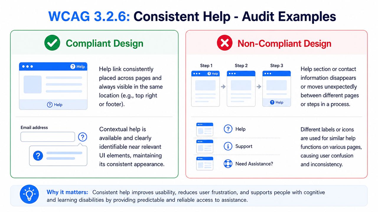
Patterns that usually pass
The cleanest implementations use shared templates and don’t improvise by page.
| Scenario | What auditors see | Likely outcome |
|---|---|---|
| Site-wide footer repeats help links in the same order | “Help Center,” “Contact Us,” and chat trigger remain stable across core pages | Pass |
| Mobile layout collapses content but keeps the same help order | The links move into an accordion or stacked footer, but their relative order stays the same | Pass |
| A chatbot appears on all relevant pages with the same launcher position | The trigger remains visually and programmatically consistent | Pass |
| A user opens or reorders a help panel by choice | The user initiated the change | Usually acceptable |
A strong example is a design system that defines one support zone for global templates. The header might include a “Contact” link, while the footer repeats “Help Center” and “Live Chat” in a fixed order. On mobile, the presentation can change, but the sequence still holds.
Patterns that commonly fail
Most failures come from disconnected ownership, not bad intent.
- Homepage-only chat: Marketing enables a support widget on landing pages, but product disables it inside pricing, signup, or account flows.
- Header on one page, footer on another: A “Help” link moves between regions depending on template.
- Label switching: One page says “Support,” another says “Help,” another uses only a chat icon with no stable cue.
- Experiment drift: An A/B test inserts or hides help options for some pages in the same flow.
- Responsive disorder: Desktop shows “FAQ,” then “Contact,” then “Chat,” while mobile flips the order.
A related usability signal often appears alongside poor support placement: users hit errors and can’t find recovery paths. That’s why teams reviewing support consistency should also examine accessible error messages, especially in forms and transactional flows.
If your help mechanism changes location when the page template changes, an auditor will treat that as a consistency problem, not a branding choice.
Automated scanning has limits here. A tool may detect the presence of links or widgets on individual pages, but it won’t reliably judge whether the same help mechanism stayed in the same relative order across a set of pages and breakpoints. That’s why this criterion is often missed until a manual review.
How to Remediate and Implement Consistent Help
The practical fix is to stop treating help as page-specific decoration. Treat it as infrastructure. If support is part of the user journey, it belongs in shared components and design standards.
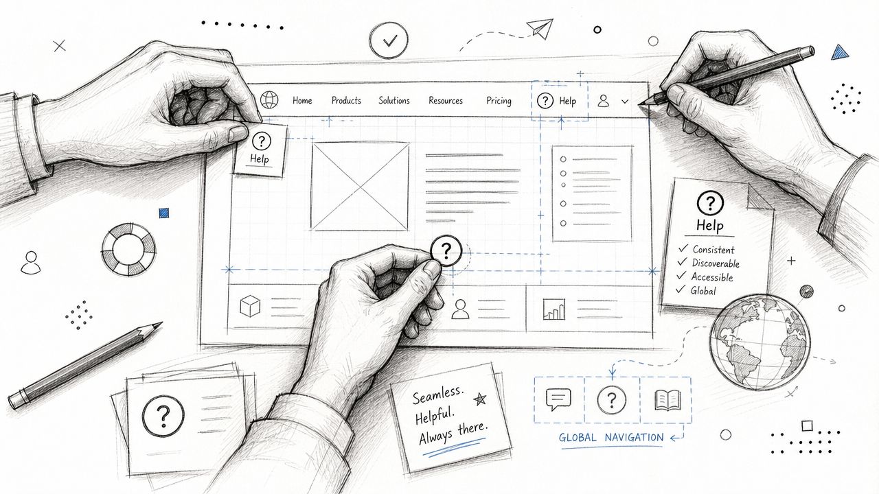
Build help into shared components
The safest pattern is to define help placement at the template level. Put repeated support options in the header, footer, account shell, or another reusable region, then make that region part of the design system and component library.
A lightweight implementation can be as simple as a templated footer:
<footer>

<nav aria-label="Help">

<ul>
<li><a href="/help-center">Help Center</a></li>
<li><a href="/contact">Contact Support</a></li>
<li><button type="button" aria-controls="chat-widget">Live Chat</button></li>
</ul>

</nav>

</footer>
That snippet isn’t enough by itself. The primary requirement is consistency across templates, states, and breakpoints. The component has to survive redesigns, CMS overrides, and campaign pages. Content teams also need clear naming rules, which is why support copy should be governed just like UI labels. This is closely tied to accessible content writing, because inconsistent labels create findability problems even when placement is stable.
Handle chatbots and support widgets deliberately
Recent explainers now explicitly include chatbots and support widgets as examples of help mechanisms, which tells teams this criterion applies to modern support interfaces too, even though edge cases are still underexplained (Aaardvark Accessibility on Consistent Help).
That matters for AI-assisted support. A widget that appears only for some locales, only when a user is logged in, or only on selected templates can create a compliance problem if it functions as repeated help but isn’t consistently presented within that page set.
Use this checklist when implementing dynamic help:
- Choose one trigger pattern: If chat opens from a launcher, keep the launcher in the same place across relevant pages.
- Control personalization carefully: Don’t let experimentation or user-state rules inadvertently remove repeated help from critical pages.
- Preserve labels and icons: A speech bubble on one page and “Ask AI” text on another can confuse users if they represent the same help path.
- Review z-index and overlap issues: A widget that technically exists but hides other content can create separate accessibility failures.
A quick visual primer can help teams align before implementation:
What works best in practice is boring. Stable launcher position, stable label, stable availability, and documented exceptions only when the user actively changes the interface.
Testing for 3.2.6 and Documenting in a VPAT
WCAG 3.2.6 is best tested as a template-level consistency rule. Read the criterion carefully before you write the test, because what it fixes is narrower than “the help link looks like it moved.” SC 3.2.6 Consistent Help, a Level A criterion, requires that where help mechanisms appear across a set of pages, “they occur in the same order relative to other page content, unless a change is initiated by the user.” W3C is explicit that this means serialized content order, not pixel position, and that a user-initiated change such as zoom, orientation or a different breakpoint does not break it. So test each page in the set at each breakpoint, but judge against DOM order.
That’s why procurement-ready documentation can’t come from a quick scan. You need a reviewer to decide what counts as a page set, which mechanisms repeat, whether mobile preserves order, and whether dynamic states change the result.
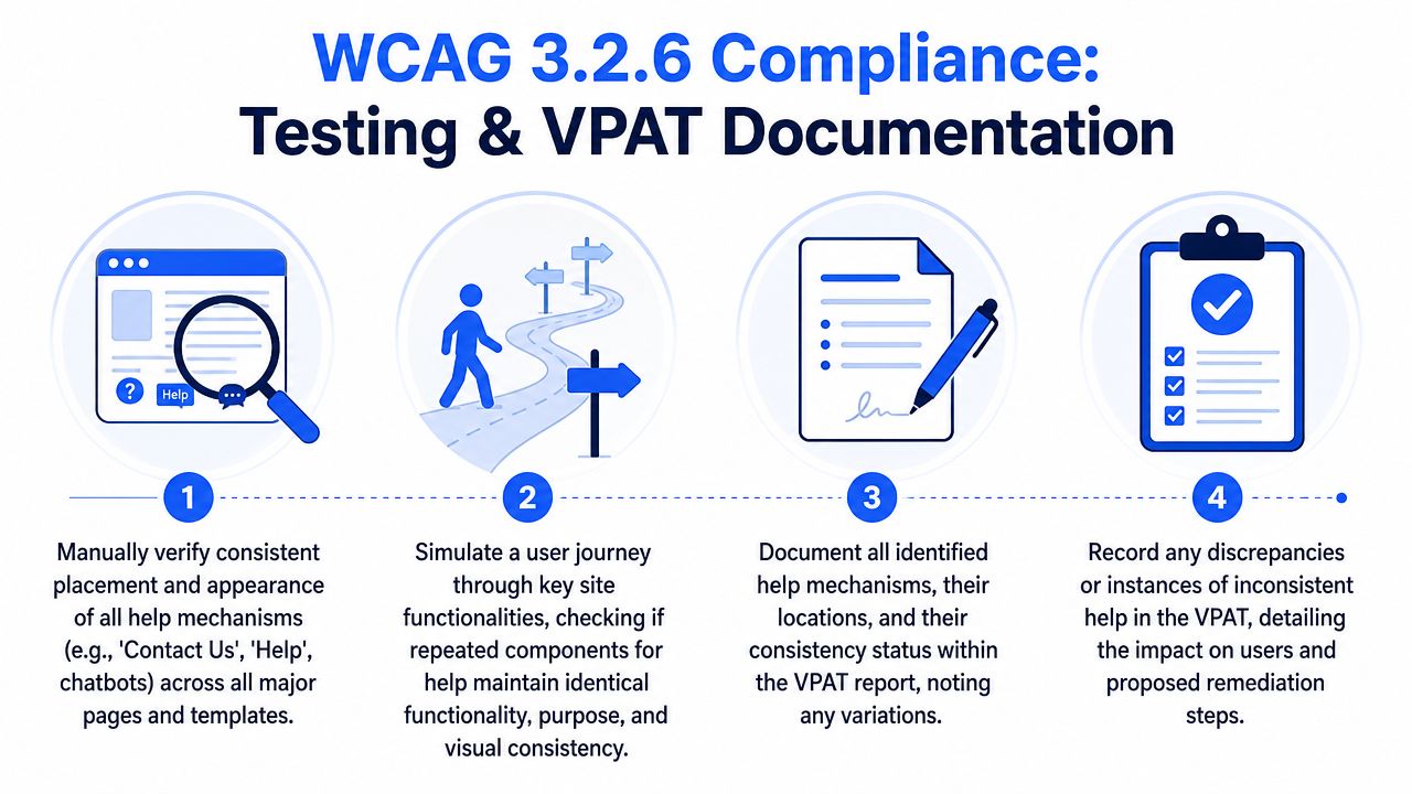
What to test manually
A strong review usually includes:
- Template inventory: Identify all recurring help mechanisms across public pages, app shells, authenticated areas, and transactional flows.
- Breakpoint review: Compare desktop and mobile layouts at the breakpoints your product supports.
- Order check: Confirm the same help options appear in the same relative order where they repeat.
- Programmatic review: Inspect DOM order and accessible names, not just what appears visually.
- State review: Test logged-in, logged-out, localized, and experiment-driven views where support behavior may differ.
If your compliance program also includes downloadable documents, don’t separate those efforts too sharply. Teams maintaining VPATs often need parallel documentation for web and document accessibility. For document workflows, this overview of PDF accessibility best practices is a useful companion reference.
Manual review is what turns “we think it’s consistent” into “we can defend this in an audit, procurement review, or remediation plan.”
Sample VPAT language
A concise VPAT or ACR entry should describe the actual repeated mechanisms, where they appear, and any exceptions.
You might document it like this:
Supports: The product provides repeated help mechanisms through a Help Center link, Contact Support link, and chat launcher within shared page templates. Across reviewed pages in the same user flows and tested responsive views, these mechanisms maintained consistent relative order. User-initiated interface changes were excluded from failure analysis.
If there are issues, say so plainly:
Partially Supports: Repeated help mechanisms are consistent on primary marketing and account templates. Variations were identified on selected campaign pages and mobile views where the contact and self-help options changed order. Remediation is planned through template standardization.
For teams building formal reports, ADA Compliance Pros has a practical guide on how to create an accessibility conformance report ACR.
Common Questions About Consistent Help
Does this rule require a help feature
No. If your site doesn’t provide a repeated help mechanism, this criterion doesn’t force you to add one.
The obligation starts when help exists across multiple pages in the same set. At that point, users should be able to find it predictably.
How does this work for different user roles
Evaluate consistency within each relevant experience. A public visitor, a logged-in customer, and an admin may each have different page sets and different support options.
What matters is internal consistency within the experience being tested. If admins see a support panel and public users see a help center link, that can be acceptable if each experience stays consistent on its own terms.
Can an automated scanner catch this
Not reliably. Automated tools can detect elements on a page, but they struggle with relative order across page sets, breakpoint shifts, and user-state changes.
That’s especially true when help mechanisms are injected by tag managers, chatbot vendors, personalization tools, or application state. Manual review is what catches the drift.
Does a chatbot count as help
Yes, it can. Modern accessibility guidance now treats chatbots and support widgets as help mechanisms when they provide repeated assistance across pages.
The key question isn’t whether the interface is AI-powered. The question is whether users encounter it as a recurring support mechanism and whether its placement and ordering stay predictable.
What should product teams do first
Start with a cross-functional inventory. UX, engineering, support, and marketing should identify every repeated help mechanism across templates. Then decide which ones are global, which ones are contextual, and where each belongs.
For a wider remediation program, it also helps to review your broader accessibility backlog. ADA Compliance Pros has additional resources on WCAG compliance services, a beginner’s guide to WCAG, a WCAG 2.2 cheat sheet, and common patterns in the top WCAG violations found on business websites.
If you need a defensible review of consistent help, chat widgets, template drift, or VPAT language, ADA Compliance Pros can help you audit user experience, validate conformance against WCAG 2.2, and document findings in a way your dev team and procurement reviewers can use.