
Mastering Dragging Movements Wcag 2.5.7: Compliance Guide
If your product team ships modern UI patterns, you probably have at least one feature that depends on dragging. A Kanban board. A reorderable table. A slider used in pricing filters. A dashboard users can rearrange with a mouse or touch.
That design may feel standard now. Under WCAG 2.2, it can also be a clear accessibility defect if dragging is the only practical way to complete the task. For teams responsible for ADA risk, procurement reviews, or enterprise sales, that matters because these aren’t edge-case interactions. They often sit inside core workflows.
The issue is WCAG 2.5.7 Dragging Movements, a Level AA requirement in WCAG 2.2. Level AA is the conformance level most organizations target for public-facing websites and applications. If your product relies on drag and drop without an equivalent single-pointer alternative, you’re exposing users to avoidable barriers and your business to avoidable compliance problems.
The Hidden Compliance Risk in Modern UIs
A product team launches a polished board interface. Users can drag cards from one column to another, reprioritize backlog items, and organize work visually. Stakeholders love the demo because it feels fast and modern.
Then accessibility testing starts, and the problem becomes obvious. A user who can click but can’t perform a sustained press-and-move action can’t complete the workflow. The interface looks complete, but the task isn’t operable for everyone who needs to use it.
That gap is easy to miss because many teams still evaluate interaction quality through a visual lens first. If the drag handle looks obvious and the component works with a mouse, it passes internal review. Compliance doesn’t work that way. The question is whether the same functionality is available without requiring the dragging motion itself.
For decision-makers, design debt escalates into business risk. If the blocked workflow sits inside account setup, task management, shopping, scheduling, or reporting, the defect doesn’t stay isolated. It affects conversions, support burden, procurement confidence, and legal exposure.
Drag-only interactions often survive multiple release cycles because they look intuitive to the team that built them.
The broader issue is that modern interfaces often fail in partial ways. One feature works by keyboard. Another works only with pointer dragging. Another has an alternative, but it’s buried or incomplete. That pattern is exactly why partial conformance creates operational and legal risk, as discussed in this breakdown of the hidden costs of partial WCAG compliance and why Level AA isn’t always enough.
What this means in practice
- Core workflows are the danger zone: Reordering, moving, resizing, and adjusting values often sit inside business-critical features.
- Polished UI can still fail: A component can be visually refined and still be inaccessible.
- Late discovery is expensive: If drag alternatives aren’t planned at design-system level, remediation often touches UX, front-end logic, QA, and documentation.
Understanding WCAG 2.5.7 Dragging Movements
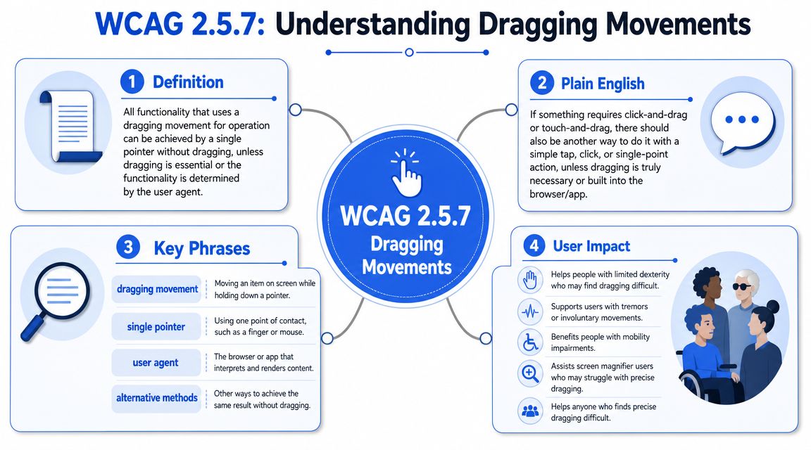
WCAG 2.5.7 Dragging Movements was introduced in WCAG 2.2 as a Level AA success criterion. The rule is straightforward: if functionality uses dragging for operation, users must also be able to perform that same function with a single pointer such as a click or tap, unless dragging is essential or the behavior is controlled by the user agent, according to the W3C Understanding document for Dragging Movements.
What the rule actually says
The phrase single pointer matters. It doesn’t mean “mouse-only.” It means an action targeting one point at a time, like a click, tap, or stylus activation, without the need to hold, move, and release in a controlled path.
A simple way to think about it is this: if dragging is like carrying a glass of water across a room without spilling it, a compliant alternative is like pressing an elevator button. The user should be able to trigger the same result through a more stable, simpler action.
This criterion applies to web content that interprets pointer actions. It doesn’t apply to actions required to operate the browser or assistive technology itself. For authored interfaces, that usually puts custom widgets and application controls squarely in scope.
Common examples that usually need a non-drag alternative include:
- Sortable lists
- Sliders
- Drag-and-drop cards
- Custom pointer-based widgets
What counts as essential
The exception is narrower than many teams assume. Dragging is only exempt when it’s essential, meaning the function would fundamentally change if dragging were removed, or when the behavior is determined by the user agent.
Practical rule: If the user’s goal is “move this item there,” dragging usually isn’t essential. If the user’s goal is “create a free-form path,” dragging may be essential.
That distinction matters. Reordering a priority list rarely requires dragging. A drawing tool may. Map panning may also qualify in some cases, though teams should be careful about overusing that rationale when other controls can achieve similar outcomes.
For product teams, the operational takeaway is simple. Don’t argue from visual design intent. Argue from the user’s actual task and whether the same result can be achieved without the drag path.
Identifying Affected Components in Your Product
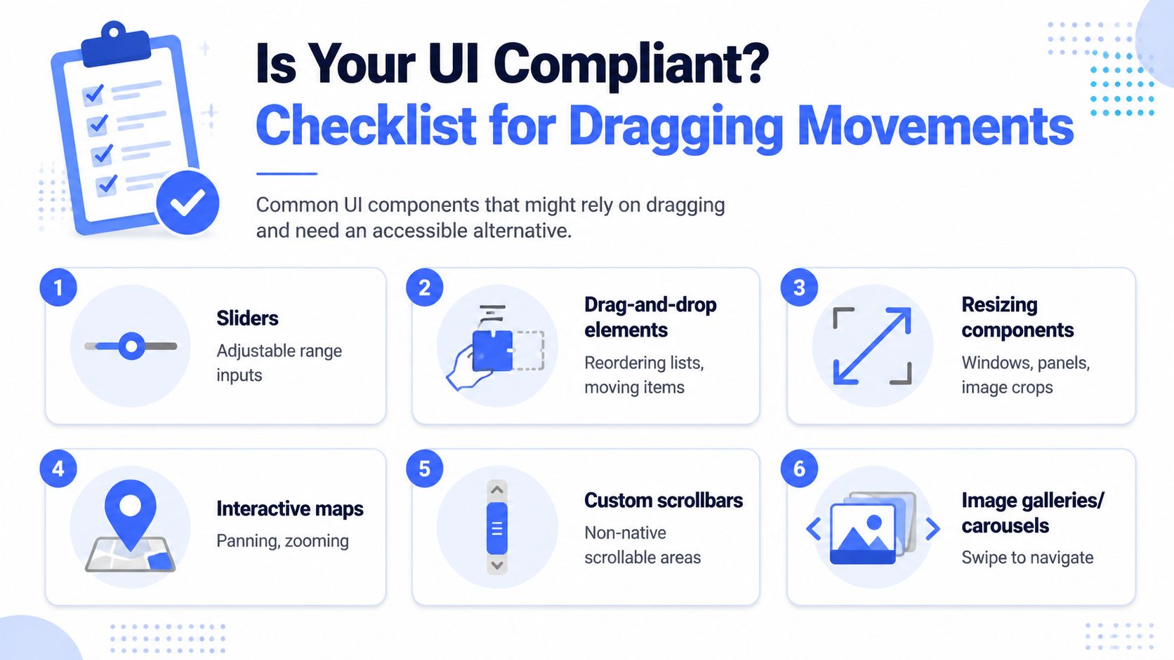
Teams often don’t miss this requirement because they’ve never heard of it. They miss it because draggable behavior spreads gradually across products. It starts with one Kanban board, then shows up in sortable tables, carousels, dashboard layouts, image galleries, and mobile interactions built around swipe or drag.
Where teams usually miss this
The obvious cases are boards and lists. The less obvious cases are components where dragging feels secondary, but still controls an outcome.
A few examples show up repeatedly in audits:
| Component | Typical failure | Why it matters |
|---|---|---|
| Kanban board | Cards can only be moved by drag and drop | Users can see destination columns but can’t complete the move |
| Sortable list or table rows | Reorder depends on drag handle only | Priority-setting becomes inaccessible |
| Slider | Thumb must be dragged to set value | Fine motor control becomes a barrier |
| Resizable panel or crop area | Border or corner must be dragged | Adjustment is impossible without sustained movement |
| Carousel or gallery | Content changes only by swipe or drag | Navigation becomes unreliable or hidden |
| Custom scroll region | Interaction depends on dragging a visual thumb | Native alternatives may be bypassed or obscured |
Some teams also forget that custom upload zones can create drag-heavy expectations. If the visible workflow strongly implies “drop files here” but the click-based selection path is weak, hidden, or inconsistent, discoverability becomes part of the problem.
A fast inventory for product teams
A practical review starts with your design system and highest-traffic workflows. Don’t ask only whether a component is “draggable.” Ask whether any important outcome depends on dragging as the primary or only usable method.
Use a quick internal checklist:
- Review custom components first: Anything built outside native browser controls deserves inspection.
- Check high-value flows: Onboarding, checkout, reporting, scheduling, task management, and account configuration should come first.
- Inspect mobile parity: A desktop alternative doesn’t help if the mobile experience reverts to swipe-only.
- Look for hidden drag logic: Reordering, resizing, rearranging, and moving items often live behind icons rather than explicit labels.
If a tester has to ask, “How else would I do this without dragging?” the design probably needs work.
A good inventory usually surfaces related issues too. Drag alternatives often fail because supporting interaction cues are weak. If your replacement controls don’t expose clear purpose, visible focus, or understandable structure, users still struggle. That’s where adjacent guidance on ARIA basics and best practices becomes relevant during remediation.
Designing and Implementing Compliant Alternatives
The fastest way to fail WCAG 2.5.7 is to treat “alternative available” as a box-checking exercise. A hidden overflow menu that technically moves an item but is difficult to find won’t hold up well in real use. The alternative has to be functional and discoverable.
The requirement itself is short. SC 2.5.7, Level AA, states that “all functionality that uses a dragging movement for operation can be achieved by a single pointer without dragging,” unless dragging is essential or the behavior comes from the user agent. So provide a non-drag path — buttons, menus, or other single-pointer controls that perform the same operation — and check it is equally functional and discoverable. Up, down, top and bottom actions for reordering, and menu-based destination selection, both work. One trap is worth naming: W3C is explicit that keyboard support does not satisfy this criterion. Keyboard operability lives in SC 2.1.1 and 2.1.3, and “it is possible to create an interface that works with dragging and keyboard controls, but still does not work using only clicks or taps.” You owe both.
Patterns that usually work
For sortable content, the strongest pattern is often boring on purpose. Add explicit controls.
- Reorder buttons: “Move up,” “Move down,” “Move to top,” and “Move to bottom” are predictable and testable.
- Destination menus: For cards or tiles, a “Move to…” button that opens a list of valid destinations works well.
- Step controls for sliders: Add plus/minus buttons, a numeric field, or both.
- Preset size options: For resizable elements, offer predefined sizes or direct value entry.
These approaches reduce ambiguity. They also create cleaner state handling than many bespoke drag systems.
A simple comparison helps:
| Interaction | Weak approach | Stronger approach |
|---|---|---|
| Card movement | Drag handle only | “Move to…” button with destination menu |
| List reordering | Drag row grip only | Up/down controls plus keyboard support |
| Slider adjustment | Thumb drag only | Native range input with step controls or number input |
| Resizing | Drag corner only | Size presets or editable dimensions |
Later in the remediation process, documentation quality matters more than teams expect. If you need product walkthroughs for developers, QA, or client-facing teams, it helps to learn to create tutorials people finish so the new interaction patterns are consistently adopted instead of reimplemented inconsistently.
The video below is a useful companion when you’re reviewing interaction behavior with design and engineering:
Implementation details that decide pass or fail
The design pattern is only half the job. Teams still fail this criterion when the replacement control exists but isn’t operable, labeled, or visible enough.
Focus on these details:
- Use semantic controls first: Native
<button>elements usually outperform scripted divs in reliability and accessibility. - Expose a clear name: “Move up” is better than an unlabeled chevron icon.
- Announce state changes: If reordering updates content dynamically, users should get meaningful feedback.
- Keep alternatives near the draggable object: Don’t force users to hunt through unrelated toolbars.
- Preserve keyboard operation: This intersects with broader operability requirements and visible focus expectations.
Related criteria often become blockers during remediation. If your replacement controls can receive keyboard focus but users can’t see where they are, fix that too. The same goes for control styling and icon contrast. Supporting guidance on focus indicators, non-text contrast for UI icons, and component-specific issues like the accessible carousel can prevent a narrow fix from creating fresh failures elsewhere.
Auditing Testing and VPAT Reporting
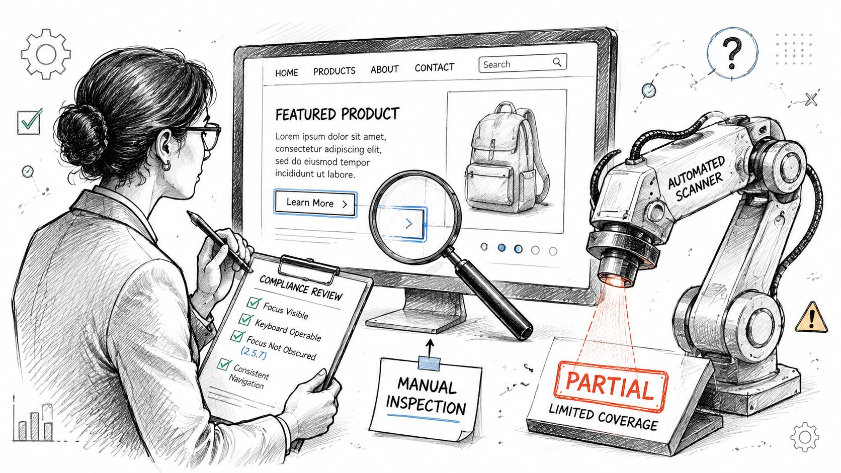
A drag interaction is one of the clearest examples of where automated scanning has limits. A scanner may detect buttons, menus, or keyboard focusable elements. It usually can’t determine whether those controls provide the same result, whether users can discover them, or whether the drag path remains the only practical way to complete the action.
Why automated scanning is not enough
Take a Kanban board. An automated tool might confirm that each card includes a button in the DOM. That doesn’t answer the true compliance question.
A human tester still has to verify:
- whether the button moves the card
- whether all valid destinations are available
- whether the control is easy to locate
- whether the result matches the drag workflow
- whether keyboard users can operate the same path
That’s why manual review is the reliable method for this criterion. The defect is often about interaction equivalence, not markup presence alone.
A drag alternative that exists in code but fails in workflow is still a business problem.
How to test a draggable workflow manually
Start with the assumption that dragging is unavailable. Then try to complete the task anyway.
For a board, list, or slider, use a basic test sequence:
- Identify the task outcome
Example: move a card to another column, reorder a row, or set a value. - Avoid dragging completely
Use click or tap only. If no path is visible, that’s already a strong finding. - Verify the same result
The alternative must complete the same operation, not a reduced substitute. - Check discoverability
If the control is tucked inside an obscure menu or appears only on hover, users may still miss it. - Test keyboard operation too
WCAG 2.5.7 is about pointer input, but products still need full operability across related criteria. - Capture evidence clearly
Document the component, page state, expected behavior, actual behavior, and user impact.
You should also test whether the component remains understandable during navigation. If custom movement controls disrupt reading order or landmark navigation, adjacent structural issues may surface. For larger applications, that’s where foundational patterns like skip links and landmarks support more efficient testing and cleaner remediation.
Practical VPAT language
VPAT and ACR reporting needs precision. Avoid vague statements like “dragging may be difficult for some users.” Say what the component does, what alternative exists, and whether the result is equivalent.
Examples of defensible phrasing:
Supports: Components that allow item movement by dragging also provide adjacent single-pointer controls, such as move buttons or destination menus, that achieve the same result.
Partially Supports: Some draggable components provide a single-pointer alternative, but the alternative is not consistently discoverable or is not fully operable by keyboard.
Does Not Support: Certain functions rely on dragging movements without an equivalent single-pointer method to achieve the same result.
For procurement teams and vendors, that level of specificity is what makes a report useful. If you need a stronger framework for documenting findings and conformance statements, this guide to creating an accessibility conformance report ACR is a practical reference point.
Prioritization and Long-Term Compliance Strategy
Teams usually discover dragging issues in clusters. The wrong response is to fix the loudest complaint first and leave the rest for later. The right response is to prioritize based on user impact, business exposure, and how often the pattern appears across the product.
What to fix first
Start with components that meet all three conditions: they’re common, they affect task completion, and they appear in customer-facing or regulated workflows.
A practical order looks like this:
- Public-facing and transactional flows first: If users can’t complete a core task, the risk is immediate.
- Design-system components next: A single fix at component level can remove repeated defects across products.
- High-visibility product areas after that: Boards, filters, dashboards, and account management screens tend to drive complaints and audit findings.
- Lower-usage edge cases last: Specialized admin tools still matter, but they shouldn’t block remediation of more exposed issues.
This is also where product leadership should stop treating accessibility as a one-off bug queue. WCAG 2.5.7 is a Level AA criterion, which puts it inside the baseline many organizations are expected to meet for mainstream digital products. If your current product standards still allow drag-only interaction patterns, the issue isn’t just in code. It’s in governance.
How to keep this from returning
The durable fix is procedural.
Add “non-drag alternative required” to design reviews for any component involving movement, arrangement, resizing, or value adjustment. Build QA test cases that explicitly prohibit reliance on drag as the only path. Require component documentation to describe click, tap, and keyboard behavior separately.
For many teams, the biggest improvement comes from making accessible interaction patterns the default option in the design system, not a special remediation layer added after launch. That shortens review cycles, reduces repeated debate over “essential” exceptions, and gives procurement and legal teams stronger documentation when customers ask for accessibility evidence.
If your product includes complex application interfaces, custom widgets, or a large backlog of legacy components, a professional manual audit is usually the fastest way to identify where drag-dependent patterns exist, how severe they are, and what to fix first.
If your team needs a defensible path for WCAG 2.2 conformance, ADA Compliance Pros can help with manual accessibility audits, remediation guidance, VPATs, ACRs, and prioritized compliance roadmaps for websites, web apps, and enterprise products.