You’ve been tasked with making your website ADA compliant. The goal is clear, but the path usually isn’t. Teams start with WCAG checklists, run a scanner, fix a few labels, and still end up unsure whether the site is usable, legally defensible, or procurement-ready.
That uncertainty makes sense. Accessibility maturity isn’t visible from a homepage alone. It shows up in how a site handles forms, error states, navigation, support channels, release practices, documentation, and accountability. That’s why the best examples of ADA compliant websites aren’t just polished interfaces. They’re organizations that treat accessibility as an operating function.
The broader situation explains why that matters. In a large-scale analysis of 10 million web pages by accessiBe, 89% of websites failed ADA and WCAG 2.1 compliance. For B2B teams, that means “average” market practice is not a safe benchmark.
If you’re evaluating your own roadmap, start with real implementations and documented programs, not abstract theory. This guide breaks down 10 examples of ada compliant websites that show what mature accessibility looks like in practice. It focuses on front-end patterns, yes, but also on governance, transparency, and the kinds of public commitments that reduce legal risk and help win enterprise deals. For a standards refresher, this overview of WCAG 2.2 for product teams is a useful companion.
1. VA.gov
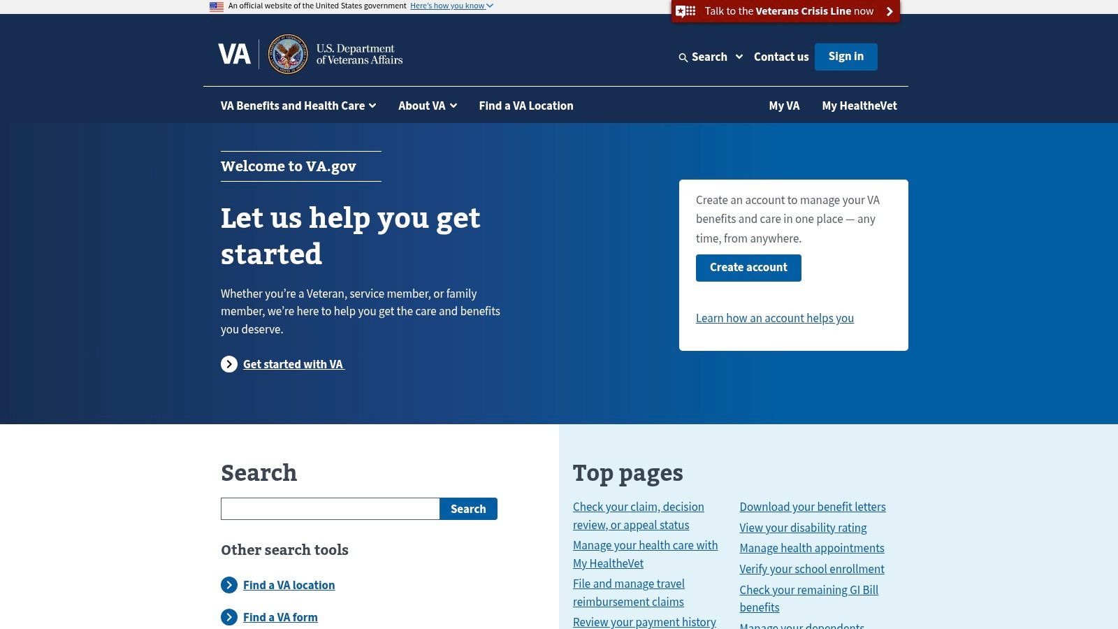
VA.gov is one of the best public examples of accessibility as a system, not a patch. It serves complex user needs, including benefits, healthcare, forms, and account-related tasks, so it can’t rely on simple brochure-site patterns. What makes it valuable is the visible connection between design system discipline and delivery.
You can see that maturity in how the site communicates expectations. Accessibility isn’t hidden in legal copy. It’s tied to support paths, standardized components, and team responsibility. For organizations with many product squads, that matters more than any single widget or scan score.
Why it stands out
VA.gov is a strong reference for transaction-heavy experiences because it treats accessible forms and service flows as core product work. Error handling, plain language, and predictable navigation are part of the interaction model, not cleanup items left for QA.
A few things stand out in practice:
- Governance is visible: Product teams appear to work within a structured system rather than inventing patterns page by page.
- Complex journeys are prioritized: Authentication, forms, and benefits flows are exactly where many enterprise sites break.
- Support is part of accessibility: Good programs tell users what standard they aim for and how to report issues.
Practical rule: If your team can’t explain who owns accessibility before launch, you don’t have a program yet. You have a backlog.
The trade-off is familiar. Large federal estates often contain legacy pages, older documents, and embedded content that don’t always reflect the standard of the modernized experience. That doesn’t weaken VA.gov as an example. It makes it realistic. Mature accessibility programs still manage uneven inventories, and they document the gap instead of pretending it doesn’t exist.
2. USA.gov
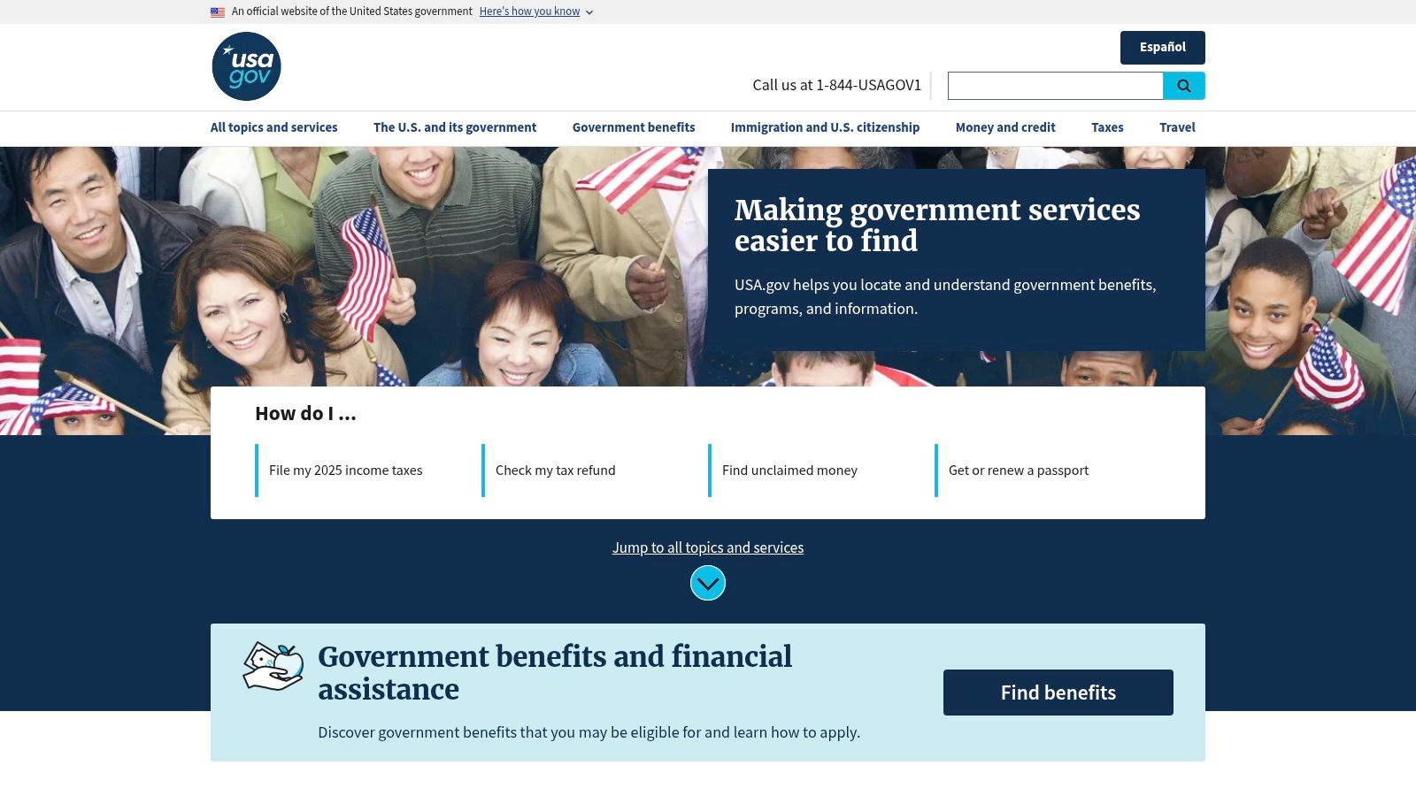
USA.gov is the kind of site executives should review before they approve another redesign, content migration, or vendor handoff. It shows what accessibility looks like when it is treated as an operating standard for a large information estate, not a design-layer retrofit.
That distinction matters for B2B teams. Many organizations can fix a homepage. Fewer can keep search, navigation, templates, translated content, and support information aligned across hundreds or thousands of pages. USA.gov is a better benchmark for that kind of discipline.
What B2B teams should copy
The visible lesson is consistency. The more useful lesson is the system behind it.
USA.gov works because the content model appears governed. Labels are predictable. Wayfinding patterns repeat. Pages are structured for people who need to scan, listen, zoom, translate, or return later and still recognize where they are. For accessibility programs, that usually points to documented standards, shared templates, editorial rules, and review practices that survive beyond one launch cycle.
That is the part procurement and compliance teams should pay attention to. A polished interface helps, but documentation is what makes accessibility defensible. Accessibility statements, conformance records, content standards, and issue-reporting paths give legal, product, and operations teams something they can verify and maintain. They also make vendor expectations easier to enforce.
A few practical strengths stand out:
- Stable wayfinding: Navigation, search, and page labeling feel standardized across the site.
- Content discipline: Headings and page structure support comprehension instead of filling space.
- Multilingual consistency: The experience suggests that localization includes structural and support requirements, not only translated copy.
- Program visibility: The site reflects an organization that likely treats accessibility as an ongoing content and governance function.
There is also a trade-off worth naming. Central portals often perform better than the external sites they link to. That creates a gap many enterprises know well. Your primary domain can meet a high standard while partner tools, regional properties, archived documents, or third-party workflows lag behind it.
That does not make USA.gov a weak example. It makes it honest. Strong accessibility programs do not assume control where they do not have it. They document scope, set requirements for linked services, and keep improving the parts they own.
3. IRS.gov
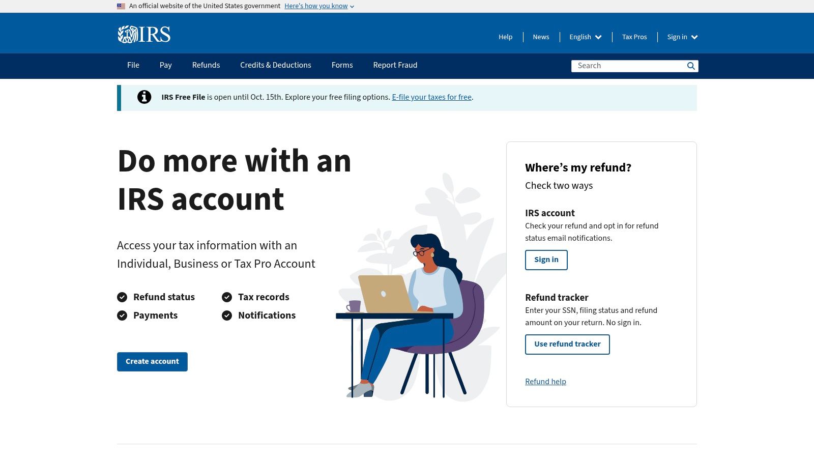
IRS.gov is a useful model because it doesn’t stop at a general accessibility statement. It also provides practical guidance for people using assistive technologies. That’s an underrated sign of maturity.
Many organizations publish a compliance page and consider the job done. IRS.gov goes further by helping users understand how to complete tasks, find resources, and work with a high-volume information site that includes forms, instructions, and multilingual content.
What makes it useful
For B2B teams, the lesson is straightforward. Accessibility documentation should help both buyers and users. Buyers need evidence of standards alignment. Users need support that reflects how they use the site.
IRS.gov is especially instructive if your content estate includes:
- Dense information pages: Tax, legal, insurance, and policy content all create similar structural risks.
- Document-heavy workflows: Historical PDFs and embedded assets often create uneven accessibility across a large archive.
- Task support content: Guidance for assistive technology users can reduce friction that generic FAQs miss.
Good accessibility statements do two jobs. They state the target standard, and they give people a usable path when something isn’t working.
The trade-off is one many large institutions share. Legacy documents and older embedded resources can lag behind current standards. When teams study examples of ada compliant websites, they should pay attention to that reality. Strong programs don’t require every historical asset to be perfect on day one, but they do require a plan for remediation, support, and prioritization.
4. Social Security Administration
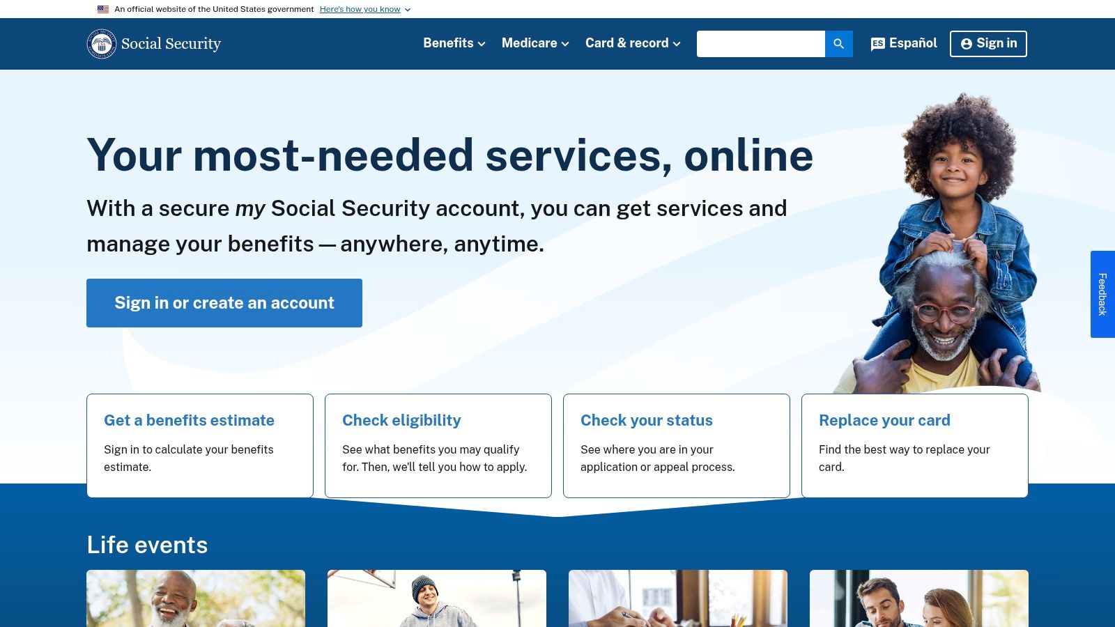
SSA.gov is a strong example because it frames accessibility as service delivery, not just technical conformance. That distinction matters. A site can satisfy many technical checks and still leave users stuck when they need help, clarification, or an alternative way to complete a task.
SSA’s public posture is useful for teams managing sensitive or high-stakes workflows. Benefits and account-related tasks carry real consequences for users, so the experience has to support completion, not just pass code review.
The lesson here
What’s most worth copying is the combination of standards language and accessible contact paths. That signals an organization that understands conformance and accommodation as related responsibilities.
In practice, this looks like:
- Clear scope communication: Users get a sense of what standards the organization is working toward.
- Multiple support routes: Phone and email alternatives matter when web friction interrupts a critical task.
- Inclusive service framing: The site communicates that accessibility includes help, escalation, and continuity.
This is also a reminder that accessibility claims should be specific without sounding absolute. Large service ecosystems naturally include legacy sections, third-party tools, and uneven templates. Mature teams acknowledge that and keep improving.
Accessibility isn’t only about whether a component works. It’s also about whether a person can still complete the task when that component fails.
For product leaders, that means your remediation roadmap should include support operations, not just front-end fixes.
5. HealthCare.gov
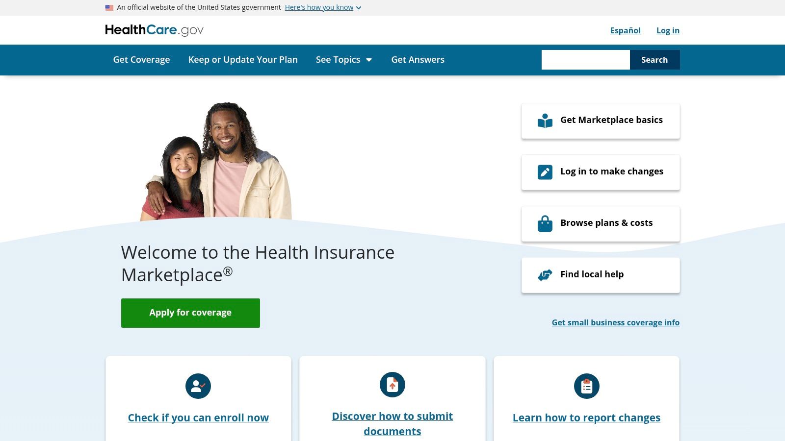
Open enrollment is live. Content changes daily, plan data updates across connected systems, and a user is trying to compare coverage on a deadline with a screen reader or keyboard alone. That is the kind of operational pressure that exposes whether accessibility is built into delivery or treated as a cleanup task.
HealthCare.gov is useful because it operates in exactly that environment. The site has to support eligibility questions, plan comparison, account tasks, and high-volume seasonal traffic while keeping language understandable. For B2B teams, the bigger lesson is not just front-end execution. It is the visible process around accessibility, including public support paths and the kind of documentation posture procurement, legal, and compliance teams look for when they assess risk.
That matters in healthcare. Users are making decisions with financial and medical consequences, and organizations are coordinating across content teams, product managers, engineers, policy owners, and outside vendors. A site like this shows what accessibility looks like when it is tied to service delivery and governance.
Teams can study this model in four areas:
- Plain-language content: Accessibility work is stronger when users can understand eligibility rules, plan terms, and next steps without decoding dense copy.
- Documented support paths: Public Section 508 reporting channels show that the organization expects issues to surface and has a process for handling them.
- High-change release discipline: Enrollment periods and policy updates create steady regression risk, which means accessibility has to be checked repeatedly, not once.
- Vendor and integration oversight: Plan data, tools, and embedded services often create the biggest gaps, so governance has to extend beyond the core CMS.
The trade-off is clear. Large service platforms rarely fail because the homepage is inaccessible. They fail when connected tools, older templates, or third-party components break the user journey. Strong teams account for that in audit scope, acceptance criteria, and remediation tracking.
For decision-makers, this is the strategic takeaway. If your company sells into regulated buyers or manages complex customer workflows, accessibility documentation matters almost as much as interface quality. Buyers want evidence that your team tests regularly, records findings, assigns fixes, and gives users a way to report barriers. HealthCare.gov is a good example of accessibility as an operating function, not a one-time project.
6. Bank of America
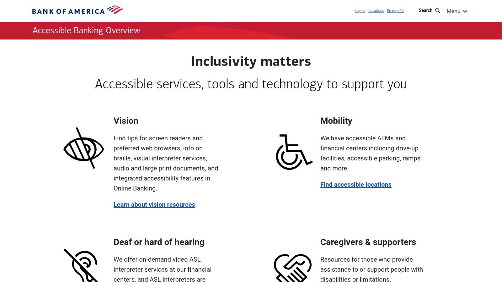
Bank of America’s accessible banking pages are useful because they show how a major financial institution presents accessibility as an enterprise program across channels, not just on a marketing site. That matters in banking, where secure areas, statements, disclosures, and alerts create much harder accessibility problems than a simple homepage.
This is one of the better examples for fintech and financial services teams that need public-facing evidence of standards alignment plus accommodation support. In regulated industries, your accessibility posture often gets reviewed by legal, procurement, security, and customer operations at the same time.
What to borrow from this model
The strongest signal is program framing. Bank of America doesn’t treat accessibility like an isolated UX initiative. It appears as part of how customers access banking services more broadly.
That approach is useful for organizations with authenticated experiences because it pushes teams to think beyond static content:
- Secure workflows need testing: Sign-in, alerts, statements, and disclosures must work with assistive tech.
- Support channels matter: Some users will need accommodations or help outside the digital flow.
- Cross-channel consistency matters: A compliant web page is less meaningful if the follow-up document or connected service is inaccessible.
The obvious risk area is the same one many banks and insurers face. PDFs, embedded tools, and third-party widgets can undermine an otherwise mature program. That’s why accessibility reviews in finance need to look at the full journey, including documents and post-login interactions, not just the public site shell.
7. Target.com
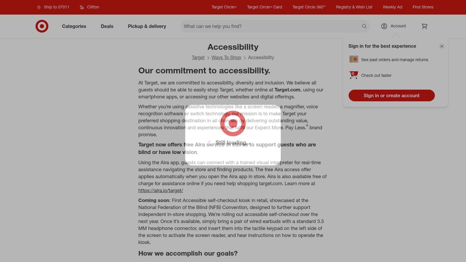
A retail launch goes live on Friday. By Monday, customer support is fielding complaints about filters, cart updates, and a promo module that does not work well with keyboard or screen reader use. That pattern is common in eCommerce, which is why Target’s accessibility page stands out as more than a policy page. It gives decision-makers a public record of standards alignment, contact paths, and ongoing accountability.
That documentation matters as much as the interface itself. For B2B leaders, especially those managing legal review, vendor oversight, or digital operations, the signal here is process maturity. A current WCAG target and visible support options suggest that accessibility is being handled as an operational function, not left to isolated design fixes.
Target is also a useful model because retail accessibility breaks in predictable places. Product grids, size selectors, image galleries, store pickup flows, offers, and cart interactions often rely on several teams plus third-party components. A company that publishes an accessibility statement in that environment is effectively saying it is willing to be measured against a standard while those moving parts continue to change.
What is worth borrowing from this model is the connection between customer experience and program governance:
- A published standard creates internal accountability: Teams know what they are expected to meet.
- Support channels create a fallback path: Users can report issues or request help when a flow fails.
- Public documentation helps with cross-functional review: Legal, procurement, marketing, and engineering can align around the same stated commitment.
- Ongoing maintenance is implied: In retail, accessibility holds only if updates, campaigns, and third-party tools are reviewed continuously.
The trade-off is speed. Merchandising teams want rapid releases. Accessibility needs regression testing, design review, and someone who owns defects after launch. Target is a good example because it points to a program that has to survive frequent content changes, not just a polished homepage.
8. Microsoft
Microsoft’s accessibility compliance resources stand out for one reason above all others. Documentation. For enterprise buyers, procurement teams, and public-sector vendors, that’s often the difference between a reassuring website and a usable compliance program.
A centralized library of Accessibility Conformance Reports gives buyers something concrete to review. It also signals organizational maturity. Teams that can publish ACRs consistently usually have stronger internal testing practices, release discipline, and cross-functional ownership.
Why procurement teams pay attention
If your company sells software into enterprise or government environments, Microsoft is one of the strongest examples of how to operationalize transparency. Buyers don’t just want a promise that a product is accessible. They want structured disclosures, known exceptions, and a support path.
That’s why Microsoft is such a strong model for B2B teams:
- ACRs support vendor review: Legal and procurement teams need something more formal than marketing copy.
- Standards alignment is public: Section 508, WCAG, and EN 301 549 references help buyers map requirements.
- User support is documented: Escalation channels matter when accessibility issues affect real work.
A VPAT or ACR doesn’t prove perfection. It proves your team can document reality clearly enough for a buyer to assess risk.
The trade-off is healthy and expected. Detailed ACR programs often disclose partial support, caveats, or version-specific exceptions. That’s not a weakness. It’s what credible accessibility reporting looks like. For procurement-heavy markets, honest documentation is more valuable than broad claims with no evidence.
9. Salesforce
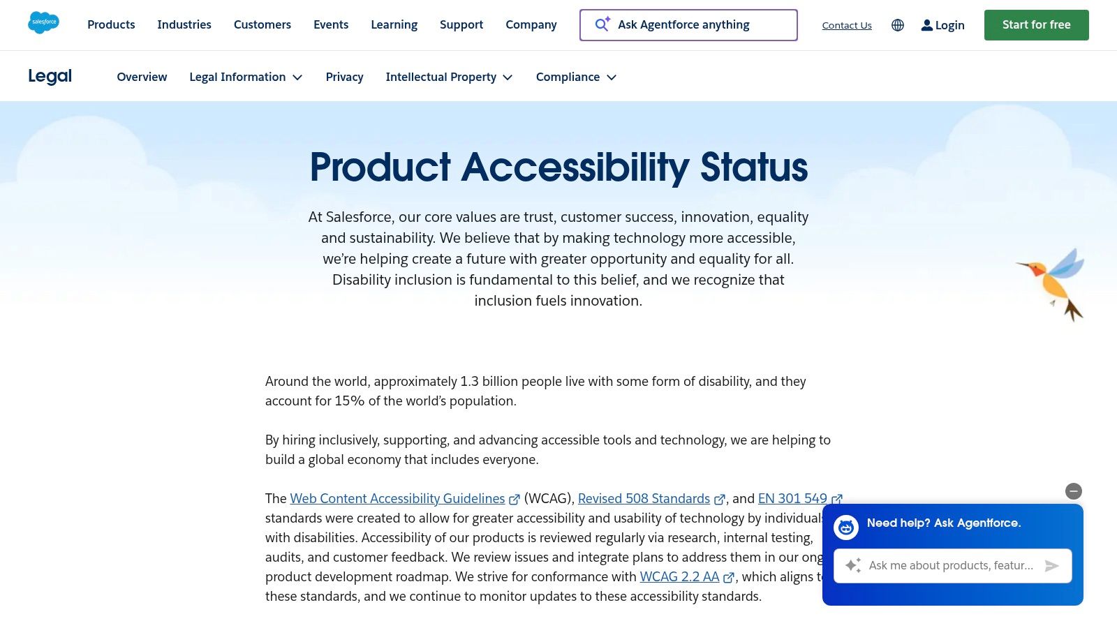
Salesforce accessibility resources are especially relevant for SaaS teams. Complex web apps create different accessibility risks than public websites. Tables, builders, filters, modals, dashboards, and configuration interfaces all require disciplined component design and testing over time.
Salesforce is worth studying because it pairs public product accessibility status information with ACR-style documentation. That combination is what many enterprise software buyers expect during security and compliance review.
What SaaS leaders should notice
For SaaS organizations, the front-end example is only half the story. The more important lesson is how accessibility gets communicated release after release.
Many teams struggle at this point. They can remediate a homepage or public marketing site, but they can’t explain the status of authenticated product features, or they publish a VPAT once and never maintain it. Salesforce points toward a better model.
Useful takeaways include:
- Centralized status communication: Buyers need one place to understand accessibility posture.
- Documented conformance reporting: RFPs and enterprise reviews often require it.
- Acknowledged exceptions: Complex products evolve, and credible teams document caveats instead of hiding them.
There’s a direct connection here to modern web app patterns. In other accessibility example discussions, Ahrefs is highlighted for keyboard-safe dashboards and Coca-Cola for semantic structure and skip-link-friendly content experiences. Those examples show different sides of the same principle. Accessibility survives scale only when component patterns are maintained, tested, and documented.
10. Adobe
Adobe accessibility resources are valuable because Adobe operates on both sides of the accessibility equation. It publishes its own digital properties and products, and it also provides platform guidance for teams building on Adobe tools. That makes it a useful reference for content teams, CMS owners, and enterprise marketing operations.
Adobe is one of the better examples of ada compliant websites when you care about process and platform governance, not just one polished implementation. Public ACRs, product guidance, and support materials give teams a more complete picture of how accessibility is handled across a broader ecosystem.
Why this is a strong platform example
For organizations using a CMS or digital experience platform, accessibility failures often start in authoring patterns. Editors upload inaccessible PDFs, create heading jumps, misuse components, or publish campaign content that bypasses tested templates. Adobe’s materials are useful because they connect conformance to authoring and platform decisions.
That makes this example relevant for:
- Enterprise marketing teams
- CMS administrators
- Content operations leaders
- Platform governance owners
The limitation is the same one you see in any large product family. Versions change, product documentation evolves, and older content can vary in quality. That’s normal. What matters is whether the organization gives customers enough guidance and documentation to manage those realities responsibly.
ADA Compliance Comparison: 10 Example Websites
| Site | Core Accessibility Focus | UX/Quality ★ | Value/Procurement 💰 | Target Audience 👥 | Unique Strength ✨/🏆 |
|---|---|---|---|---|---|
| VA.gov | Design system + component testing, governance, ADE support | ★★★★☆ | 💰 High, gov compliance & complex flows reference | 👥 Federal product teams, benefits services | ✨ Robust forms/auth patterns; 🏆 Mature accessibility program |
| USA.gov | USWDS patterns, content hierarchy, multilingual parity | ★★★★☆ | 💰 High, model for content‑heavy portals | 👥 Content teams, public info portals | ✨ Navigation/search wayfinding; 🏆 Multilingual policy consistency |
| IRS.gov | Section 508 + WCAG commitment, AT user guides, multilingual pages | ★★★☆☆ | 💰 Practical, strong user‑help & form guidance | 👥 Tax filers, support/UX teams | ✨ Task‑based AT guides; 🏆 Concrete user assistance |
| SSA.gov | Transactional services, exceeds baseline WCAG, inclusive support channels | ★★★★☆ | 💰 High, authenticated service workflow exemplar | 👥 Transactional service teams, contact centers | ✨ Multiple contact alternatives; 🏆 Service‑oriented accessibility |
| HealthCare.gov | Section 508 feedback channel, plain‑language FAQs, seasonal ops | ★★★★☆ | 💰 Strong, managing high‑traffic, time‑bound content | 👥 Enrollment teams, public health ops | ✨ Dedicated 508 feedback; 🏆 Seasonal content handling |
| Bank of America | WCAG 2.1 A/AA program, cross‑channel accommodations, secure flows | ★★★★☆ | 💰 High, financial/regulated UX reference | 👥 Financial services, secure‑auth teams | ✨ Accessible statements & secure areas; 🏆 Enterprise compliance model |
| Target.com | WCAG 2.2 AA aim, accessible eCommerce patterns (filters, cart, media) | ★★★★☆ | 💰 Strong, retail/catalog UX blueprint | 👥 eCommerce/product teams, retailers | ✨ Accessible catalog & filtering; 🏆 Rigorous post‑litigation practices |
| Microsoft | Central ACR/VPAT library, standards disclosures, Disability Answer Desk | ★★★★☆ | 💰 Excellent, procurement/transparency resource | 👥 Enterprise buyers, legal & procurement | ✨ Centralized ACRs; 🏆 Gold‑standard vendor transparency |
| Salesforce | Product Accessibility Status + ACRs, WCAG 2.2 AA aim for SaaS | ★★★★☆ | 💰 Strong, auditable SaaS compliance for RFPs | 👥 SaaS product teams, enterprise procurement | ✨ Status hub + ACRs; 🏆 Clear vendor disclosures |
| Adobe | ACRs + product guidance (AEM), CMS/marketing accessibility docs | ★★★☆☆ | 💰 Useful, CMS implementation & content authoring guide | 👥 CMS authors, marketing & enterprise teams | ✨ AEM implementation guidance; 🏆 Transparent conformance notes |
From Example to Action Building Your Compliant Future
A common B2B scenario looks like this. Procurement asks for a VPAT. Legal wants to see an accessibility statement. Product says the site passed an automated scan. Then an enterprise buyer tests a key workflow with a screen reader and finds basic failures. At that point, the problem is no longer a design issue. It becomes a sales risk, a contract risk, and an operations issue.
That is the main lesson from the examples above. The stronger models are not just visually polished or technically cleaner on the front end. They show evidence of an accessibility program. Standards targets are published. Feedback channels are available. ACRs, VPATs, or accessibility statements exist. Teams can explain ownership, review cycles, exceptions, and remediation status.
As noted earlier, the broader web still performs poorly on accessibility. That is why copying common design patterns from peer sites is risky. The safer approach is to study organizations that document how accessibility is handled, not just how pages look after launch.
For B2B decision-makers, this matters well beyond ADA exposure.
Good accessibility documentation supports procurement reviews, shortens security and legal back-and-forth, and gives enterprise buyers something concrete to evaluate. It also forces internal discipline. A team that has to maintain an accessibility statement or produce an ACR usually has to answer harder questions. Which standard applies. Which products are in scope. How are issues tested. Who approves conformance claims. What happens when a release introduces a regression.
That is why quick-fix widgets are rarely persuasive to serious buyers or auditors. They do not replace testing across real user journeys, authenticated areas, PDFs, embedded tools, or third-party components. They also do not create the paper trail many organizations need for RFPs, vendor reviews, or regulated contracts.
Automated testing still has a clear role. It catches recurring code errors, helps monitor regressions, and gives engineering teams a faster feedback loop. But it does not verify whether a customer can complete a quote request, recover from a form error, move focus through a modal in the right order, or use a complex app with assistive technology. Those are the gaps that create business risk even when a dashboard looks clean.
Manual accessibility audits are what turn policy into an operating process. A useful audit should do more than list defects. It should map findings to WCAG, identify severity and affected flows, clarify whether issues stem from code, content, design, or vendor dependencies, and give teams a remediation order they can execute. For organizations selling into enterprise or public sector accounts, that work also supports VPATs, ACRs, Section 508 responses, and internal sign-off.
The best examples of ada compliant websites reflect sustained governance. They show what happens when accessibility has owners, documentation, release checks, and executive support. That is the standard worth copying.
If you need that kind of roadmap, ADA Compliance Pros helps organizations assess websites, web apps, and ICT products against ADA, WCAG 2.2, Section 508, EN 301 549, and related procurement requirements. Their work goes beyond automated scans, with manual testing, WCAG-mapped findings, prioritized remediation guidance, and defensible VPAT/ACR documentation for teams that need real compliance, not shortcuts.