Beyond “Image Description” sits the issue that usually forces action. A demand letter lands in legal. A procurement review stalls because a government buyer flags inaccessible PDFs. An enterprise client’s security and accessibility team rejects a platform after testing only a handful of pages. Very often, the image problem isn’t that alt text is missing everywhere. It’s that the alt text that does exist is vague, redundant, or functionally wrong.
That creates real compliance exposure. Section 508 guidance makes clear that without alt text, people who use screen readers can’t access image content, and public-sector guidance has turned alt text from a nice-to-have into an operational requirement for digital accessibility in websites, documents, and multilingual content (Section 508 alternative text guidance). In practice, that means your team needs more than a CMS field labeled “image description.”
This playbook gives you practical alt text examples for websites, PDFs, and social media, with the trade-offs that matter in audits. It’s built for product teams, compliance leads, and content owners who need repeatable standards, not one-off fixes. If you’re already seeing inconsistent output from templates, marketing uploads, or AI alt text generation features, the answer is tighter review criteria and better workflow design.
A professional accessibility audit can find these gaps before a buyer, regulator, or plaintiff does.
1. Descriptive Alt Text for Complex Images
A quarterly review deck goes out with a dashboard screenshot, and leadership can follow the trend in seconds. A screen reader user hears only “analytics dashboard.” That is not a minor copy issue. It hides the finding, weakens the document’s usefulness, and creates avoidable WCAG risk.
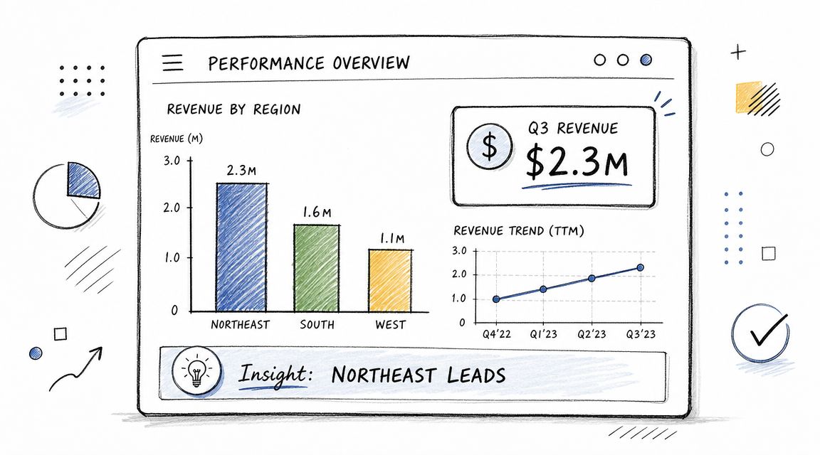
For complex images, the job is to preserve the business meaning. A chart, map, dashboard, or annotated process graphic usually supports a decision, a status update, or a documented finding. If the alt text names only the format, users get the container and miss the point.
A workable pattern looks like this:
- Weak alt text: “Chart”
- Better alt text: “Bar chart comparing quarterly revenue across regions. Northeast leads. Midwest trails.”
- If exact figures matter: keep the alt text brief and place the detailed figures in nearby text or a linked description
That approach aligns with established guidance on alt text requirements and usage. Short alt text is fine for simple images. Complex visuals need a summary that carries the conclusion, plus supporting detail elsewhere when decisions depend on the underlying numbers.
What strong complex-image alt text does
In audits, I map this image type to two recurring failure points. First, teams write for appearance instead of meaning. Second, they force all the detail into the alt attribute, which produces long, hard-to-use output and still leaves out context. The lower-risk pattern is a short summary in alt text and a fuller explanation in nearby content, a caption, or a linked long description.
Use this checklist:
- Identify the image type: “Line chart,” “dashboard screenshot,” “regional map,” “process diagram”
- Name the subject: what the image covers, such as churn, revenue, incidents, or workflow status
- State the takeaway: the trend, comparison, exception, or status a user needs to know
- Place detailed values nearby: especially if those values support a financial, legal, operational, or compliance decision
This section usually ties back to WCAG 1.1.1 Non-text Content. For business teams, the practical question is simpler: can someone who does not see the image still act on the same information?
Practical rule: If a stakeholder would make a decision from the chart, the accessible text needs to expose that decision-making information too.
What fails is predictable. Style notes, color commentary, and layout trivia consume space without improving access. “Blue bars with modern styling” does not help a user understand performance, risk, or next steps. During reviews, I ask teams to read the alt text aloud without showing the image. If the decision or takeaway disappears, the alt text is too shallow and the workflow needs a better template.
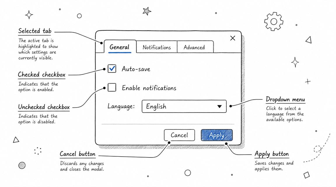
2. Functional Alt Text for Icon and Button Images
A user opens your billing portal, tabs to a row of icon buttons, and hears “button, button, button.” At that point, the issue is no longer cosmetic. The user cannot tell which control downloads the invoice, which one opens details, and which one deletes the record. That creates task failure, support burden, and unnecessary risk for any workflow tied to payments, records, or account access.
Functional alt text has one job. Give the control an accessible name that matches the action and the context. For icon-only controls, that name often comes from alt, aria-label, visible text, or an associated label. The implementation varies. The standard does not. Users need to know what will happen when they activate the control.
Examples:
- Menu icon: “Open navigation menu”
- Search icon: “Search”
- Trash icon on a row action: “Delete invoice”
- PDF icon linked to a file: “Download annual report PDF”
- X icon in a modal: “Close dialog”
This maps directly to WCAG 1.1.1 Non-text Content and often affects 4.1.2 Name, Role, Value in practice. During audits, I also treat it as a workflow issue. If product, design, and engineering do not agree on naming rules for common actions, vague labels spread fast across templates and components.
The common failure pattern is predictable. Teams label the image instead of the function. “Magnifying glass,” “trash can,” and “X icon” describe appearance, but they do not tell a screen reader user what the control does. In a destructive flow, that is more than a quality miss. It raises the chance of user error.
Context matters too. “Delete” may be acceptable in a tightly scoped button group, but “Delete invoice” is safer in tables, dashboards, and admin tools where several actions sit side by side. The same icon can require different accessible names depending on location, consequence, and whether the destination or file type matters.
A practical review rule is simple: if the visible icon disappeared, would the accessible name still let a user complete the task with confidence? If not, the label needs work.
I recommend handling this in the design system, not one ticket at a time. Define approved names for common icon actions, decide when context must be appended, and document which pattern each team should use for <img>, inline SVG, and icon-only buttons. For teams that still blur the line between functional and decorative treatment, this guide on when images need alt text or should be decorative helps set the boundary.
Test the result the way users experience it. Tab to the control. Listen to the announced name. Confirm the role. Activate it and verify the outcome matches the label. That audit step catches the failures that a basic code scan misses, especially in component libraries where the same naming mistake can affect every product surface at once.
3. Alt Text for Decorative Images and Spacers
Some images shouldn’t be described at all. Decorative flourishes, background textures, divider graphics, and old spacer GIFs add visual polish, but they don’t add meaning. If a screen reader announces them, they create noise and slow navigation.
That’s why decorative handling is as important as descriptive handling. I see just as many failures from over-describing decoration as from missing alt text on informative images.
What to remove from the accessibility tree
Use an empty alt attribute for decorative images, or better yet, move purely visual treatment into CSS. The key distinction is simple. If removing the image doesn’t remove information or function, it’s probably decorative.
Examples that should usually be hidden from assistive technology:
- Section divider flourish: use CSS, or
alt="" - Background pattern behind a hero block: CSS background
- Shadow, border, or gradient asset: CSS
- Decorative bullet image: use semantic list markup instead
- Spacer image in old templates: replace with padding or margin
A lot of remediation work starts with teams using the wrong pattern. They set alt=“decorative” or alt=“spacer”, thinking they’re helping. They’re not. A screen reader still reads those values out loud. The correct implementation is an empty alt attribute, not a descriptive one. This guide on when images need alt text or should be decorative is a useful rulebook for content and dev teams.
Universities and accessibility organizations also note that standard brevity advice breaks down for complex visuals, but it remains appropriate for decorative treatment because those images should be skipped, not summarized (WCAG.com discussion of good and bad alt text).
Audit note: Missing
altand emptyalt=""are not the same outcome. One creates noise or filename announcements. The other intentionally removes decoration from the reading experience.
4. Alt Text for Data Tables and Complex Information Graphics
A CFO opens an annual report on a screen reader and lands on a chart image with alt text that says, “Revenue graph.” The board gets the trend in a glance. The screen reader user gets almost nothing. That gap creates real risk because the missing content is usually the point of the visual.
Complex visuals need an access pattern, not a clever alt string. Charts, matrices, and table images often carry exact values, comparisons, outliers, and timing. A short alt attribute can name the asset and its purpose. It cannot carry the full analytical load.
For audits, I map these issues to both compliance and workflow failure. If the image contains meaningful information, it falls under WCAG 1.1.1 Non-text Content. If the same content is tabular but published as an image, the team has also created an avoidable maintenance problem because the data cannot be reused, sorted, or checked easily by QA.
The safer pattern is two layers:
- Alt text: identify the chart or graphic and the subject
- Adjacent text: summarize the key takeaway, comparison, or exception the reader needs
- Accessible source data: provide a real HTML table, tagged PDF table, or other text equivalent when exact values matter
- Document handling: in PDFs, tag the figure correctly and place the detailed explanation in the reading order
Examples work best when they match the business task:
- Line chart: “Line chart of monthly support ticket volume and average resolution time.”
- Heat map: “Heat map of customer satisfaction by region, with higher scores concentrated in the Northeast.”
- System diagram: “Architecture diagram showing authentication service linked to API gateway, database, cache, and logging service.”
- Table image: “Pricing comparison table for Basic, Pro, and Enterprise plans.” Then provide the actual table in accessible markup elsewhere.
The trade-off is straightforward. Short alt text keeps the screen reader experience efficient. The longer explanation carries the insight. Trying to force both into one alt attribute usually fails both goals.
This issue shows up often in PDFs because reporting teams export a slide, chart, or spreadsheet snapshot and assume the alt text solves it. It does not. If your organization publishes reports, use a documented remediation workflow such as this step-by-step PDF accessibility workflow. If the file includes interactive elements or form-like structures, the same controls apply to accessible PDF forms.
One audit rule catches a lot of defects. If the content is tabular, build a real table. If the value lies in the visual pattern, write short alt text for identification and put the interpretation and data in accessible text nearby. That division of responsibility gives content teams a repeatable template, gives QA something concrete to test, and reduces the chance that the same failure returns in the next reporting cycle.
5. Alt Text for Screenshots and UI Documentation
A support article says, “Click Save in Settings,” but the screenshot alt text reads only “Screenshot of settings page.” That is the kind of miss that creates avoidable support friction and accessibility risk at the same time. In audits, I treat screenshots as task content, not decoration, because the missing detail usually maps to the exact step a user is trying to complete.
For screenshots, the job of alt text is to identify the interface state that matters to the task. That usually means selected tabs, visible errors, entered values, disabled controls, confirmation messages, or the step the user is expected to take next. Listing every control on screen creates noise. Omitting the state creates ambiguity.
This matters for WCAG conformance and for documentation quality. If the screenshot communicates instructions or status that are not available in nearby text, weak alt text can leave nonvisual users without the same information. It also breaks team workflows. Writers draft one version, product teams update the UI, and the screenshot survives with stale alt text that no longer matches the procedure.
A practical rule works well here. Write alt text for the task outcome, then put the full instruction in body copy.
- Weak alt text: “Screenshot of registration form”
- Better alt text: “Registration form showing email validation error above the submit button”
- For a settings workflow: “Notifications tab selected with weekly summary toggle turned off”
- For troubleshooting: “Billing page showing expired card alert and Update payment method button”
The same screenshot can need different alt text in a help article, release note, or training deck because the business purpose changes. In one audit, a reused onboarding screenshot described the page title but ignored the temporary warning banner that explained why a button was disabled. The alt text was technically present. The instruction still failed.
That is why screenshot governance matters. Assign ownership for three checks before publication: the writer confirms the task goal, the product owner confirms the UI state is current, and QA verifies the alt text matches both the image and the surrounding instruction. This reduces repeat defects and gives teams a review standard they can apply in CMS articles, slide decks, and exported documents.
If your process includes Word, PowerPoint, or PDF-based documentation, keep screenshot review inside the same document accessibility workflow rather than treating it as a separate content task. The existing Word and PowerPoint accessibility guide is a useful operational reference for that handoff.
For teams producing video tutorials alongside screenshots, image alt text is only one control. Captions, transcripts, keyboard access, and player behavior still need review.
The safest pattern for screenshot-heavy documentation is text-first instructions with screenshots as reinforcement. Then if the interface changes after a release, the procedure still works, QA can spot outdated images faster, and remediation does not depend on rewriting alt text alone.
6. Alt Text for Infographics and Illustrations
A common audit failure looks like this: marketing publishes an infographic to summarize a report, the alt text says “infographic,” and the only place the findings appear is inside the image. The page passes an internal content review. It still fails users who cannot access the visual layout or embedded text.
Infographics need a two-layer treatment. Use the alt field to name the asset and its purpose. Put the actual content in page text, a caption, a structured list, or an adjacent summary that can be read, translated, searched, and maintained without editing the image file itself.
That approach reduces risk on three fronts. It supports WCAG 1.1.1 by providing a text alternative. It helps teams avoid publishing business claims that are only available in an image. It also creates a cleaner workflow for legal review, localization, and future content updates.
Match the alt text type to the infographic’s job
If the image summarizes a process, the alt text should identify the process.
- Process infographic alt text: “Infographic summarizing the employee onboarding process from application to orientation.”
- Timeline illustration alt text: “Timeline showing major company milestones in chronological order.”
- Comparison infographic alt text: “Infographic comparing plan features across three service tiers.”
Then publish the steps, milestones, or feature differences as real text below or beside the image. For teams managing campaign landing pages, this is the safer pattern because design revisions often happen after copy signoff. If the text lives only inside the artwork, every late-stage visual change becomes an accessibility and QA issue.
Illustrations need a different decision. Some are decorative and should be hidden from assistive technology. Others explain a concept, sequence, or relationship and need short alt text plus supporting copy. The test is simple. If removing the image would remove meaning, the meaning has to exist in text somewhere on the page.
This also affects conversion content. Product education graphics, room planners, and feature comparison illustrations often do sales work, not just brand work. If an illustration is helping a buyer compare options, the comparison should be available in text for everyone. Teams writing retail and catalog content can see the same principle in FurnitureConnect on perfect listings, where structured product information supports clearer decisions and cleaner merchandising.
A practical governance rule helps prevent repeat defects: require content owners to submit three fields for every infographic asset. One, brief alt text. Two, a plain-language text summary. Three, the source owner for any data or claims shown in the image. That gives designers room to create strong visuals without turning the alt field into a paragraph, and it gives QA a repeatable review standard instead of a subjective judgment call.
7. Alt Text for Product Images in eCommerce and Catalogs
Product alt text has two jobs. It needs to support accessibility, and it needs to distinguish one product image from another without duplicating the entire product description. Most catalogs fail because every gallery image gets the same alt text copied across front, side, detail, and variant views.
That creates a poor experience for shoppers using screen readers. It also weakens merchandising because the image set stops communicating what each view adds.
Different product views need different alt text
Use the product name and the visible differentiator.
Examples:
- Primary image: “Navy cotton button-down shirt, front view”
- Back view: “Navy cotton button-down shirt, back view”
- Detail image: “Close-up of navy shirt cuff and button detail”
- Variant swatch image: “Button-down shirt in forest green”
- Lifestyle image: “Navy button-down shirt worn with khaki pants in office setting”
Commercial teams tend to overstuff. They try to turn alt text into SEO copy. The result is bloated, repetitive strings that frustrate users. Keep the alt text aligned with what the image uniquely shows. Let the surrounding product title, price, and description do the rest.
A useful quality check is to compare image-by-image announcements in a product carousel. If five images all announce nearly the same thing, the gallery isn’t accessible enough. Each item should help the customer understand angle, feature, material detail, or variation.
For catalog teams working on furniture or configurable inventory, clear image differentiation also improves listing quality and content governance. The product listing discipline discussed in FurnitureConnect’s guide to strong listings maps well to alt text review because both depend on consistency and accurate attribute labeling.
In audit work, I also flag thumbnails that function as controls. If a color swatch or alternate image selector changes the product state, its accessible name should identify the result, not just the visual tile.
8. Alt Text Strategy and Governance for Large Organizations
Most alt text problems aren’t writing problems. They’re governance problems. Teams publish through different systems, different departments own different assets, and nobody has a single rule for charts, icons, screenshots, PDFs, and social posts.
That’s why a few remediated pages don’t hold. New content reintroduces the same issues.
Build governance into publishing workflows
A workable governance model has three parts. Standards, ownership, and QA.
Standards should define what your team does with common image types. Content authors shouldn’t guess whether a chart needs long description support or whether a decorative flourish should use empty alt. Put those rules in writing and align them with your content operations. This accessible content writing guidance is a good place to anchor that work.
Ownership matters just as much. Designers should specify intent. Content owners should draft page-context alt text. Developers should implement it correctly. QA should validate the accessible name, context, and reading order. If everyone assumes someone else owns alt text, nobody does.
The best AI-assisted workflows also reflect that reality. A digital collections case study recommended local model deployment for security and reproducibility, processing one image set at a time with human review, and using prompt engineering to improve task-specific output. The takeaway is straightforward. Scaled generation still depends on controlled curation and final QA (Choice case study on creating alt text with AI).
Governance check: Automated checks can flag missing alt attributes. They can’t tell you whether “team photo” is adequate for a procurement-critical leadership page or whether “download” is the right label for the specific file action.
For larger programs, I also recommend tying alt text rules into broader governance and control frameworks so accessibility doesn’t live as an isolated editorial issue. Even a high-level review of IT governance framework comparisons can help compliance leaders place accessibility controls in a more durable operating model.
8-Point Alt Text Comparison
| Approach | Complexity (🔄) | Resources & Speed (⚡) | Expected Outcomes (📊) | Ideal Use Cases (💡) | Key Advantages (⭐) |
|---|---|---|---|---|---|
| Descriptive Alt Text for Complex Images | High 🔄🔄🔄 | High effort; subject-matter writing; slow ⚡⚡ | Strong comprehension, SEO, WCAG compliance 📊 ⭐ | Dashboards, detailed charts, contextual images in reports 💡 | Conveys full meaning; reduces liability; aids cognitive access ⭐ |
| Functional Alt Text for Icon and Button Images | Low–Medium 🔄🔄 | Low effort; quick to implement; fast ⚡⚡⚡ | Clear interaction semantics; improved usability, WCAG Level A 📊 | Navigation icons, buttons, toolbar controls in UIs 💡 | Clarifies actions; minimal text; boosts keyboard/screen-reader UX ⭐ |
| Alt Text for Decorative Images and Spacers | Low 🔄 | Minimal resources; very fast; use CSS/alt=” ⚡⚡⚡ | Reduced screen reader noise; better performance 📊 | Background patterns, separators, purely decorative elements 💡 | Streamlines assistive output; improves load performance ⭐ |
| Alt Text for Data Tables & Complex Info Graphics | Very High 🔄🔄🔄🔄 | Significant effort; expert review and long descriptions; slow ⚡ | Accurate data comprehension; legal/industry compliance 📊 ⭐ | Financial reports, healthcare dashboards, technical visualizations 💡 | Preserves relationships; enables alternative formats and conversions ⭐ |
| Alt Text for Screenshots and UI Documentation | High 🔄🔄🔄 | Moderate–high maintenance; frequent updates; moderate speed ⚡⚡ | Accessible step-by-step guidance; better training outcomes 📊 ⭐ | Tutorials, help centers, internal training materials, PDFs 💡 | Makes procedural content usable; supports validation and compliance ⭐ |
| Alt Text for Infographics and Illustrations | High 🔄🔄🔄 | High editorial effort; may need supplementary pages; moderate speed ⚡⚡ | Preserves narrative and key data; improves discoverability 📊 ⭐ | Marketing assets, educational graphics, timelines, statistical visuals 💡 | Translates visual storytelling to text; serves diverse audiences ⭐ |
| Alt Text for Product Images in eCommerce & Catalogs | Medium 🔄🔄 | Scalable effort across SKUs; templating helps; moderate speed ⚡⚡ | Better SEO, conversions, accessibility for shoppers 📊 ⭐ | Product listings, variant views, detail shots in eCommerce 💡 | Improves discovery and purchase confidence; supports variant clarity ⭐ |
| Alt Text Strategy & Governance for Large Organizations | Very High 🔄🔄🔄🔄 | Very high investment: policy, training, automation; ongoing ⚡ | Consistent compliance at scale; measurable auditability 📊 ⭐ | Enterprise sites, regulated industries, multi-product organizations 💡 | Ensures uniform quality, reduces risk, integrates into workflows ⭐ |
From Examples to Execution Implementing a Defensible Alt Text Strategy
A client usually recognizes the problem only after it reaches procurement, legal review, or customer support. An automated scan shows a handful of image issues. Then a buyer asks for accessibility documentation, counsel asks who approves image descriptions, and the content team discovers that marketing, product, documentation, and PDF remediation all use different rules. At that point, the risk is operational, not editorial.
Examples help teams write better alt text. Audit readiness depends on something else. Teams need a repeatable model that ties each image type to user impact, the relevant WCAG requirement, the review step, and the person accountable for the decision. That is the difference between a style preference and a process you can defend during an audit, remediation effort, or vendor security review.
The harder failures usually come from context-dependent images. A chart on a sales page, an icon-only control in a product UI, a screenshot in a help article, a social graphic reused in email, and a dashboard exported to PDF may all require different treatment. The same file can need different alt text in different places because the business purpose changes.
Automated testing still matters. It finds missing alt attributes, repeated template defects, and implementation errors across large sites. It does not decide whether “chart,” “graphic,” or “button” gives a nonvisual user equivalent access to the same information or function. It also does not determine whether an image is decorative, whether nearby text already covers the content, or whether a complex visual needs short alt text plus a longer text alternative.
That is where audit exposure grows.
A workable alt text program makes four decisions for every image category. Define the business risk first. A mislabeled purchase control creates transaction risk. A vague chart summary creates reporting risk. An incomplete screenshot description creates training and support risk. Then map the requirement to the right WCAG outcome, usually around text alternatives and equivalent access to information or function. Assign ownership next. Authors draft. Designers clarify intent. Developers implement correctly. QA checks code and usefulness. Finally, document exceptions such as long descriptions for complex visuals, approved templates for product images, and rules for decorative assets.
This reduces the common failure where teams argue about wording but never assign responsibility.
Large organizations also need standards that survive handoffs between systems. CMS fields, design system components, DAM metadata, document remediation workflows, and social publishing tools all affect what gets written and what gets dropped. If those systems do not align, teams start copying filenames, repeating captions, or reusing alt text that worked in one channel and fails in another.
A practical standard is usually easy to explain and strict enough to audit:
- Set rules by image type. Separate standards for informative images, functional controls, decorative assets, screenshots, charts, infographics, and product photos reduce guesswork.
- Review alt text in page context. The reviewer checks what the image does on that page, not whether the sentence sounds acceptable on its own.
- Use templates where volume is high. Product catalogs, report libraries, and knowledge bases benefit from approved patterns with room for page-specific edits.
- Define long-description handling. Teams need a documented rule for when short alt text is enough and when supporting text, linked detail, table data, or surrounding explanation is required.
- Audit every publishing channel. Websites are only part of the exposure. PDFs, slide decks, email, training modules, and social assets often carry the same defects.
- Track root causes. If problems come from a component, workflow, or training gap, fix that source instead of rewriting the same alt text one page at a time.
AI can help draft alt text for large media libraries. It still needs human approval. Reviewers have to confirm function, context, accuracy, duplication with nearby text, and whether the image should be described at all. In audit work, AI-generated alt text breaks down fastest on screenshots, charts, branded graphics, and images where page purpose matters more than object recognition.
For teams that need outside support, ADA Compliance Pros provides manual accessibility audits, WCAG-mapped findings, remediation guidance, and documentation support for procurement and compliance reviews. The more important issue is the operating model. Pick a process that gives your team standards, owners, QA criteria, and a record of how decisions were made.
Frequently Asked Questions about Alt Text
1. What is the ideal length for alt text?
Use the shortest text that preserves the image’s purpose on that page. For a simple product photo or icon, that may be a few words. For a chart or process diagram, short alt text should identify the asset and point users to the full explanation placed in nearby content, a data table, or another approved text alternative. The useful measure is coverage, not character count.
2. How do automated accessibility checkers handle alt text?
They catch missing alt attributes, empty attributes used in the wrong place, and some repeated coding defects. They do not judge whether the text communicates function or meaning. A page can pass automated checks and still fail a manual review because the alt text is vague, redundant, inaccurate, or disconnected from the task the user is trying to complete.
3. Is AI-generated alt text good enough for WCAG compliance?
AI is a drafting tool, not an approval step. It can help clear large backlogs and speed up first-pass descriptions for low-risk images. It still needs review by someone who understands the page purpose, the image type, and the user task. For governance, treat AI output as unapproved content until a reviewer confirms it meets your standard.
4. What’s the difference between alt="" and a missing alt attribute?
alt="" tells assistive technology that the image is decorative and can be skipped. A missing alt attribute leaves the user with whatever fallback the browser or screen reader exposes, which may be a filename, URL fragment, or inconsistent announcement. From a risk perspective, one is a deliberate decision. The other usually signals an implementation defect or an incomplete content workflow.
5. How does alt text affect SEO?
Search engines use multiple signals to understand images, and alt text is one of them. The safer practice is to write alt text for equivalent access first. That usually produces better search support anyway because the description is specific, relevant to the page, and tied to the image’s actual role instead of stuffed with keywords. Teams that chase search terms often create accessibility defects and weak metadata at the same time.
If your team needs help turning scattered alt text examples into a reviewable standard, ADA Compliance Pros can help with manual accessibility audits, remediation guidance, Section 508 support, and documentation that stands up better in procurement and compliance reviews.