
Email Accessibility: 2026 Compliance & Best Practices
Nearly every marketing team treats email accessibility as a design QA issue. That framing is too small.
The bigger issue is legal exposure and operational risk. The Email Markup Consortium’s 2025 accessibility report analyzed 443,585 emails and found that 99.89% contained accessibility issues rated “Serious” or “Critical.” Only 0.11% avoided those high-severity problems. For a CTO or compliance lead, that number changes the conversation. Email isn’t a side channel. It’s part of your digital estate, part of your customer journey, and often part of regulated communications.
If your team sends product updates, invoices, renewal notices, onboarding steps, healthcare messages, or procurement communications, inaccessible email can block access to core information. That creates avoidable ADA risk, procurement friction, and customer failure points. It also means email accessibility is still a practical differentiator because the market baseline is so poor.
The High Stakes of Email Accessibility and Legal Risk
The 99.89% failure rate for email accessibility noted earlier is not just a usability metric. It signals unmanaged legal and operational risk.
For CTOs and compliance leaders, that risk usually hides in plain sight. Web properties tend to get formal audits, remediation budgets, and legal review. Email often stays inside marketing operations, where launch dates, rendering quirks, and brand approvals drive decisions more than accessibility does. That split creates exposure across the messages that matter most: password resets, billing notices, product updates, renewals, and other communications a recipient may need to read and act on independently.
Email can also create a documented record of exclusion. If a customer can show that your organization sent a promotion they could not read, an invoice they could not interpret, or a required account notice they could not access with assistive technology, that is more than a design flaw. It is evidence that an established communication channel was not usable for disabled recipients.
This matters under ADA risk analysis. It also matters in Section 508 procurement reviews, vendor assessments, and internal governance programs that evaluate whether digital communications meet the same standard as websites, apps, and documents. If your team is still mapping legal obligations across channels, this guide to which accessibility laws apply, including ADA, EAA, and WCAG is a useful starting point.
The technical failure modes are familiar to anyone who has audited production email. Screen readers can announce layout tables with meaningless structure. Key copy may be embedded in images with poor or missing alternative text. Calls to action can become unreadable because of low contrast or client color changes. Attachments may carry the primary content while the email body provides no accessible equivalent. One message can fail in several ways at once.
Treat business-critical email as a regulated digital touchpoint.
That approach lowers legal exposure and prevents avoidable performance loss. If a prospect cannot understand the offer, a customer cannot review an account notice, or a buyer cannot access a proposal attached to the message, the campaign did not merely underperform. The organization failed to deliver information in a usable form.
Why Email Accessibility Is Harder Than Web Accessibility
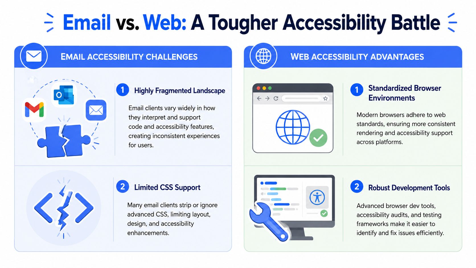
Email development is less forgiving than web development. On the web, teams usually work inside modern browser environments with stronger developer tooling and more predictable standards support. Email doesn’t offer that comfort.
Fragmented rendering breaks clean assumptions
A web component can be tested in a small set of browsers with reasonable confidence. An email template gets transformed by inbox clients, mobile apps, rendering engines, security layers, and user settings before anyone reads it. That means the message your team approved in the editor may not be the message the recipient experiences.
The practical result is that email accessibility depends on resilience, not just correctness. A heading hierarchy that looks clean in one client can collapse visually in another. A button that passes design review can become low contrast after dark mode treatment. Hidden content blocks can create a confusing reading experience when assistive technology exposes both versions.
Client transformations create accessibility failures after send
Modern guidance on email accessibility increasingly points to a problem many automated checkers underplay. Real-world accessibility has to survive image blocking, dark mode, and client-level rendering changes. Litmus makes this point clearly in its guidance on accessible emails and rendering behavior.
That changes how teams should think about compliance. Passing checks in the ESP editor isn’t enough. The actual test is whether a recipient can still read, interact with, and act on the email after the inbox client modifies it.
An email can look compliant in a builder and still fail the user in the inbox.
For technical teams, this is why email code should stay conservative. Keep the structure simple. Avoid making a single visual treatment carry meaning. Assume some CSS support will be inconsistent. Design for content durability rather than pixel-perfect control.
A good website team can often fix issues later with a patch. Email doesn’t give you that safety net. Once the campaign goes out, the inaccessible version is already in the user’s inbox, archived in their system, and potentially attached to a complaint record.
Your Actionable HTML Email Accessibility Checklist
Accessible email failures are predictable. They also create avoidable legal exposure. If a recipient cannot read the offer, understand the deadline, or activate the CTA with assistive technology, the problem is not cosmetic. It is a broken communication in a channel many organizations use for billing notices, account alerts, recruiting, and public-facing marketing.
That matters to CTOs and compliance teams because email is often treated as exempt from the controls applied to web releases. It should not be. A defective template can go out to thousands of inboxes, remain archived, and become part of a complaint record or procurement review.

Use real structure, not visual styling alone
Screen readers and other assistive tools need a meaningful content structure. Font size, bold styling, and spacing do not provide that structure by themselves. The email still needs real headings, paragraphs, and links so the message can be understood in sequence.
A dependable template usually includes:
- A clear title near the top: The first heading should identify the email’s purpose immediately.
- Short paragraph blocks: Dense copy is harder to scan and harder to hear read aloud.
- Logical heading order: Keep sections in a clean sequence.
- Critical content in live HTML text: Do not place the core message inside a hero image.
Copy quality affects accessibility more than many teams expect. This guide to writing accessible marketing copy is useful for content reviews, especially when legal notices, deadlines, or offer terms need to stay clear outside the designed layout.
Write alt text based on function
Alt text should communicate purpose. It should not describe every visual detail.
Use this rule set:
- Decorative image: Use empty alt text so assistive technology skips it.
- Informative image: Describe the business meaning.
- Image containing critical text: Move that text into live HTML whenever possible.
- Linked image: The alt text should explain the destination or action.
Keep alt text short enough to stay usable. Long descriptions slow down screen reader output and often bury the point. If an image carries too much information to describe concisely, the better fix is usually redesigning the email so the information exists as text.
Treat contrast as a release blocker
Low contrast is one of the fastest ways to make an email unreadable on mobile, in bright light, or after client color changes. WCAG 2.1 sets a minimum contrast ratio of 4.5:1 for normal text and 3:1 for large text, as explained in this overview of email accessibility and WCAG contrast requirements.
For marketing teams, this affects brand implementation more than brand strategy. Pale gray body copy, lightly tinted legal text, and buttons built around marketing color preferences fail often.
| Element | What works | What often fails |
|---|---|---|
| Body copy | Dark text on a light background | Light gray text on white |
| CTA text | Clear foreground and background separation | Brand color combinations chosen for style alone |
| Mobile rendering | Re-check after responsive stacking | Assuming desktop contrast still holds |
Review contrast on body copy, disclaimers, links, and buttons. Then review the same email in dark mode previews and common clients.
A short walkthrough can help teams see the issues more quickly:
Make links and buttons understandable out of context
Many screen reader users move through an email by tabbing through controls or pulling up a list of links. Vague labels create friction and legal risk because the recipient cannot tell which control triggers which action.
Use link text that stands on its own:
- Better: “Download the accessibility checklist”
- Better: “Review your renewal options”
- Weak: “Click here”
- Weak: “More”
Apply the same rule to buttons. “Start free trial” tells the user more than “Get started.” If the email has several links with similar labels, read them as a standalone list before approval. Ambiguity shows up fast in that format.
Use tables carefully and mark layout tables as presentational
Email developers still use tables because client support is inconsistent. That is a practical constraint, not a failure. The accessibility risk appears when a layout table gets announced as if it contains tabular data.
For layout tables, use role=“presentation”.
<table role="presentation" width="100%" cellpadding="0" cellspacing="0" border="0">
<tr>
<td>
<h1>Account update</h1>
<p>Your billing profile has been updated.</p>
</td>
</tr>
</table>
If a table contains actual data, keep proper table semantics and identify headers correctly. Layout tables should stay silent. Data tables should be announced clearly. Mixing those two use cases is a common coding mistake in legacy templates.
Keep the reading order simple
Reading order problems are expensive because they often survive internal review and appear only in assistive technology. A responsive design can look polished on screen while announcing content in the wrong sequence.
Check these points before launch:
- Linearize the content: Read it top to bottom without styling.
- Remove decorative blocks mentally: The message should still make sense.
- Review duplicated mobile and desktop sections: Hidden blocks can create repeated announcements.
- Confirm CTA placement: The primary action should appear in the expected sequence.
The safest email usually uses less code, fewer layout tricks, and more live text. That is also the easier model to govern. Teams with ADA and Section 508 exposure should treat this checklist as a release control, not a design preference.
Mastering the Accessible Plain-Text Fallback
A plain-text fallback is often the version that gets read when HTML fails, images are blocked, security controls strip formatting, or a recipient uses a setup that handles text more reliably than code-heavy email. For CTOs and compliance leaders, that makes plain text a risk control, not a courtesy feature. If the HTML version carries the full offer, deadline, or account instruction and the text version drops those details, the campaign creates avoidable accessibility and legal exposure.
Section 508-aligned email guidance has long pushed teams toward a simple rule: keep the important information in the message body and provide another accessible path when attachments are not usable. The same standard applies here. Plain text needs to carry the business function of the email on its own.
What the plain-text version must do
The fallback should preserve the message intent, the action, and the consequences of ignoring it. A recipient should be able to read the text version and still know what happened, what matters, and what to do next.
That means:
- Match the subject to the body: The first lines should confirm why the email was sent.
- Show structure with plain-text cues: Clear labels, spacing, and short sections make scanning easier.
- Describe links before the URL: Recipients need to know where a link goes and why it matters.
- Repeat deadlines, warnings, and required steps: Those details cannot live only in images, buttons, or PDFs.
- Include a usable support route: Give an email address, phone number, or alternate process if the primary action fails.
A simple plain-text pattern that works
This format is easy to standardize in an ESP and easy for legal, QA, and marketing teams to review before send:
- Heading cue:
ACCOUNT NOTICE - Summary: One sentence explaining why the recipient received the email
- Required action: One or two lines stating the next step
- Link context: A descriptive label followed by the full URL
- Support option: Contact details or an alternate way to complete the task
Copy quality matters more in plain text because visual hierarchy is gone. Teams that apply the same rules used in accessible content writing for digital messages usually improve plain-text performance fast. Short sentences, clear verbs, and descriptive link labels reduce confusion and lower the chance that a recipient misses a required action.
One technical control belongs in every send process. Configure emails as multipart/alternative so mail clients can choose the version that works best for the recipient’s environment. Then review the generated plain-text part before launch. Auto-generated text often breaks URLs, drops table meaning, and strips context from buttons. Those are small production shortcuts that can turn into compliance problems when the email carries regulated notices, benefits information, procurement communications, or customer account changes.
A Practical Guide to Email Accessibility Testing
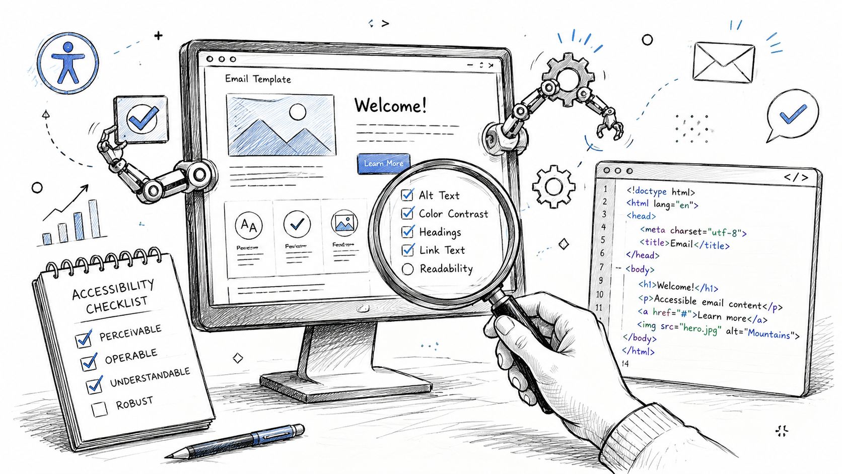
Testing email accessibility requires a hybrid method. Automation is useful, but it won’t tell you whether the message is understandable in a real inbox with assistive technology running.
What automation is good at
Automated checks are efficient for catching repeatable issues early in the pipeline. They can flag missing alt attributes, weak color contrast in some contexts, heading misuse, and code patterns that frequently create assistive technology problems.
They also help enforce consistency across a template library. If your team uses Litmus, Email on Acid, or built-in ESP validations, use them as gatekeepers for obvious failures, not as a final certification step. A broader review of accessibility testing tools can help teams choose the right mix for design, QA, and engineering.
What manual testing still has to catch
Litmus highlights a key issue in real-world email accessibility. Client-level transformations such as image blocking and dark mode inversion can leave an email unusable even if it passed an editor-based check, as noted in its guidance on accessible email rendering earlier in this article.
Manual testing should cover the scenarios automation routinely misses:
- Screen reader review: Use NVDA on Windows and VoiceOver on Apple devices to hear the message in reading order.
- Keyboard checks: Move through links and controls without a mouse where the client supports interaction patterns.
- Image-off state: Confirm that the email still communicates its purpose when images don’t load.
- Dark mode review: Look for lost logos, inverted buttons, and low-contrast text after client rendering.
- Link review: Verify that every action is clear when announced by itself.
A template that passes an automated scan but fails in dark mode or image-off conditions isn’t production-ready.
Expert review continues to be essential. A manual WCAG compliance audit can evaluate emails, templates, and related assets against actual user impact rather than checker output alone. ADA Compliance Pros, for example, performs manual and automated testing with assistive technologies and maps findings to WCAG and Section 508 requirements. That’s the kind of documentation compliance teams usually need when they want more than a pass/fail screenshot.
For internal QA, create a short signoff sheet. One screen reader pass. One image-off pass. One dark mode pass. One link-list review. That process catches many of the expensive mistakes before send time.
Integrating Accessibility Into Your Email Workflow
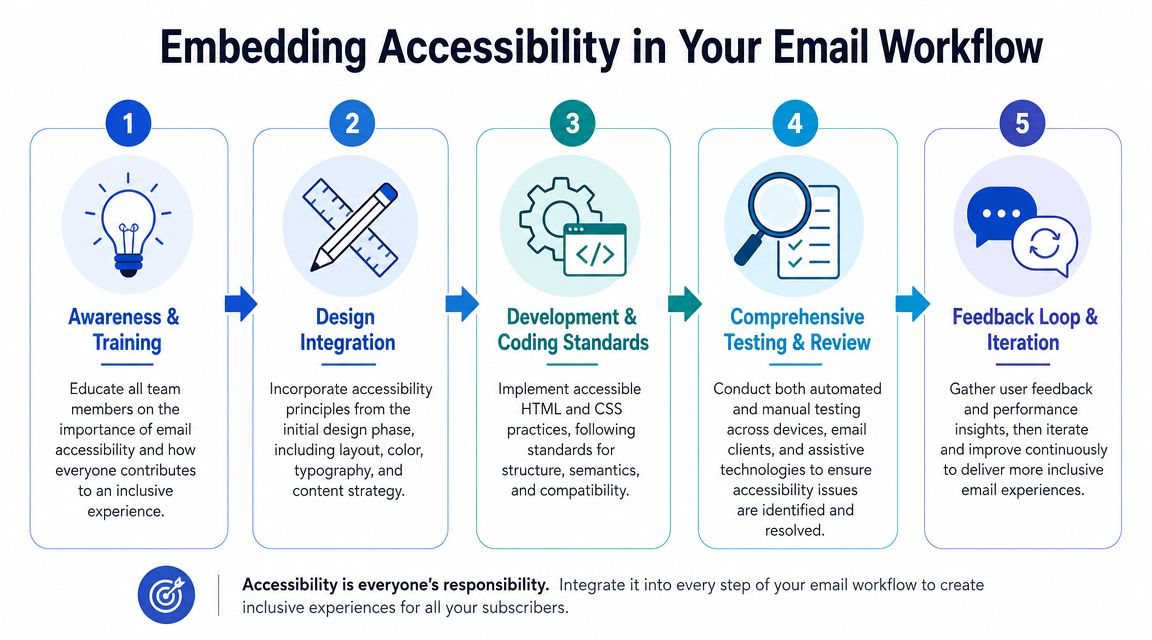
The fastest way to improve email accessibility is to stop treating it as campaign-by-campaign heroics. Build it into the system your team already uses.
Build accessibility into templates and approvals
Starting with a controlled template set is advisable. Pre-vet the major patterns you send most often, such as newsletters, product notices, invoices, renewal reminders, and event emails. Once those base templates are reviewed, campaign production becomes less risky because marketers aren’t rebuilding structure from scratch each time.
A workable operating model includes:
- Template standards: Approved heading patterns, CTA styles, contrast-safe color tokens, and image rules.
- Role-specific guidance: Copywriters need link and heading rules. Designers need contrast and image rules. Developers need code and reading-order rules.
- Pre-send checkpoints: Accessibility review should happen before legal approval and launch scheduling, not after creative signoff.
- Vendor controls: If an agency or ESP partner builds templates, require your standards in writing.
For teams building modular systems, resources like AI-ready email blocks can help by giving developers structured starting points instead of one-off coded layouts. The important part isn’t the source of the block. It’s whether your team reviews and governs what gets reused.
Extend the standard beyond email
Email rarely travels alone. Campaigns often link to landing pages, PDFs, webinars, demos, and recorded content. If those downstream assets are inaccessible, the email may be compliant in form but still fail in function.
Keep your standards connected across channels:
- Documents: Use accessible attachments or provide a conforming alternative. This guide on how to make a PDF accessible step by step is a practical reference.
- Video content: If the email promotes recorded material, apply caption and transcript requirements consistently. See video accessibility for captions and transcripts.
- Linked destinations: The email may be fine, but the conversion path still fails if the landing page or CMS output isn’t accessible. Teams working in common platforms should also review issues like WordPress ADA compliance.
Accessibility works better as an operating standard than as a campaign requirement. Once the workflow enforces it, legal risk drops and launch quality gets more predictable.
Frequently Asked Questions About Email Accessibility
Does the ADA apply to email communications
If email is part of how your organization delivers information, services, account access, or commercial communications, it belongs in your digital accessibility risk analysis. Treating the website as covered while ignoring email is a weak compliance posture, especially when the email contains essential steps or time-sensitive notices.
Is email accessibility the same as web accessibility
No. The principles overlap, but implementation is harder in email because rendering is less predictable and clients can transform the message after send. Web teams usually have better standards support and stronger debugging tools. Email teams need stricter constraints and more real-device testing.
Can an ESP make emails accessible automatically
Not by itself. An ESP can help with templates, previews, and basic checks, but it can’t guarantee that your content choices, reading order, contrast, attachments, and real inbox rendering are accessible. Accessibility depends on copy, design, code, QA, and governance working together.
Are image-only emails accessible if they have alt text
Usually not in any dependable way. Alt text helps, but it doesn’t replace live structure, readable hierarchy, and usable calls to action in HTML. If the message only works when images render perfectly, it’s fragile for accessibility and risky for compliance.
What should a CTO require from the marketing team
Require a documented standard, pre-approved templates, a pre-send accessibility review, and periodic manual audits. Also require teams to test the inbox experience, not just the builder preview. That’s how email accessibility moves from good intentions to defensible execution.
If your team needs a defensible process for email accessibility, website accessibility, Section 508 support, or WCAG-based audits, ADA Compliance Pros can help you evaluate templates, document issues, and build remediation plans that fit engineering and compliance workflows.