
A Guide to Flawless Checkout Accessibility: Fix Forms, Errors, and Payment Flows
Of all the places on your website where a transaction can fail, the checkout flow is the most critical. This is the final step, the moment a user becomes a paying customer. Yet, it’s where countless sales are lost due to accessibility barriers that make it difficult or impossible for users with disabilities to complete their purchase.
When we talk about “checkout accessibility,” we’re discussing the process of ensuring that anyone, including people using assistive technologies like screen readers or keyboard-only navigation, can successfully navigate your forms, enter payment details, and finalize their order. This isn’t a niche technical concern; it’s a fundamental business requirement that directly impacts revenue and legal standing. An inaccessible checkout doesn’t just create friction—it builds a wall, blocking sales and inviting legal action under the Americans with Disabilities Act (ADA).
The Business Case for Checkout Accessibility
The checkout process is a high-stakes, multi-step journey. Customers are asked to trust your business with sensitive personal and financial information, and any hiccup can cause them to abandon their cart. For users with disabilities, these hiccups are often hard-coded barriers, effectively denying them service.
This is precisely why checkout accessibility has become a primary focus of ADA-related web accessibility lawsuits. A failure at this stage isn’t a minor UX issue; it’s a denial of equal access, which is the core of many legal claims. An inaccessible checkout flow is a direct liability.
The numbers bring the issue into sharp focus. A Baymard Institute study found that complex or lengthy checkout processes are a major cause of cart abandonment. When these complexities are due to accessibility issues, the financial impact is significant. On the flip side, businesses that prioritize accessibility see higher conversion rates and tap into a market with substantial spending power.
Common Checkout Failures and Their Business Impact
This table connects common checkout accessibility failures with their direct consequences, translating technical WCAG violations into tangible revenue and legal risks for decision-makers.
| Failure Point | WCAG Violation (Example) | Impact on Users | Business Consequence |
|---|---|---|---|
| Ambiguous Form Labels | 3.3.2 Labels or Instructions | Screen reader users cannot identify which information to enter into a field (e.g., “First Name,” “Card Number”). | User gives up; cart is abandoned. |
| Keyboard Traps | 2.1.2 No Keyboard Trap | A keyboard-only user gets stuck in a date-picker or third-party payment widget and cannot proceed or exit. | Purchase cannot be completed, leading to lost revenue and legal risk. |
| Vague Error Messages | 3.3.1 Error Identification | A user is told “Invalid entry” but not which field is wrong or how to fix it. | Frustration leads to cart abandonment and brand damage. |
| Unannounced Updates | 4.1.3 Status Messages | A screen reader user doesn’t know their shipping cost updated or that an item was removed, causing confusion. | Increased customer support calls and potential for chargebacks. |
| Inaccessible Payment Widgets | 2.1.1 Keyboard | Third-party iframes (e.g., PayPal, Stripe) are not keyboard-operable, blocking the final payment step. | Direct revenue loss and high probability of an ADA lawsuit. |
Ignoring these issues is a choice to turn away willing customers and expose your company to litigation. A proactive approach, however, turns a compliance requirement into a competitive advantage. Fixing accessibility gaps in your checkout isn’t just about meeting WCAG 2.2 compliance; it’s about ensuring every person who wants to buy from you can.
While automated scanners can provide a preliminary report, they cannot replicate the experience of a real person navigating a complex, multi-step checkout. Only a manual accessibility audit can uncover the critical barriers that frustrate users and create serious legal liability.
How to Build High-Converting, Accessible Forms
Think of your checkout forms as the final handshake of a sale. If they are confusing or unusable, the entire deal falls apart at the finish line. Implementing accessible forms is a direct investment in your conversion rate by ensuring every potential customer can complete the transaction.
The absolute bedrock of an accessible form is programmatically linking a <label> to its input field. A common and critical mistake is using placeholder text as a label. This placeholder text disappears as soon as a user starts typing and is often ignored by screen readers, leaving users with disabilities guessing what information is required. Every input field needs a visible <label> that’s programmatically tied to it using the for and id attributes. There are no exceptions.
Grouping and Structure for Clarity
Checkout forms can get complicated, especially with separate shipping and billing sections. This is where logical grouping becomes essential for clarity. By wrapping related fields—like the components of an address—in a <fieldset> and providing context with a <legend> tag, you transform a jumble of inputs into a clear, understandable section for screen reader users.
And what about dynamic features like date pickers or address auto-complete widgets? For these to be accessible, keyboard navigation is non-negotiable. A user must be able to navigate all options and make a selection using only their keyboard. If they can’t, a feature intended to be helpful becomes an impassable barrier.
This infographic paints a clear picture of how seemingly small technical oversights can lead to abandoned carts and serious legal risks.
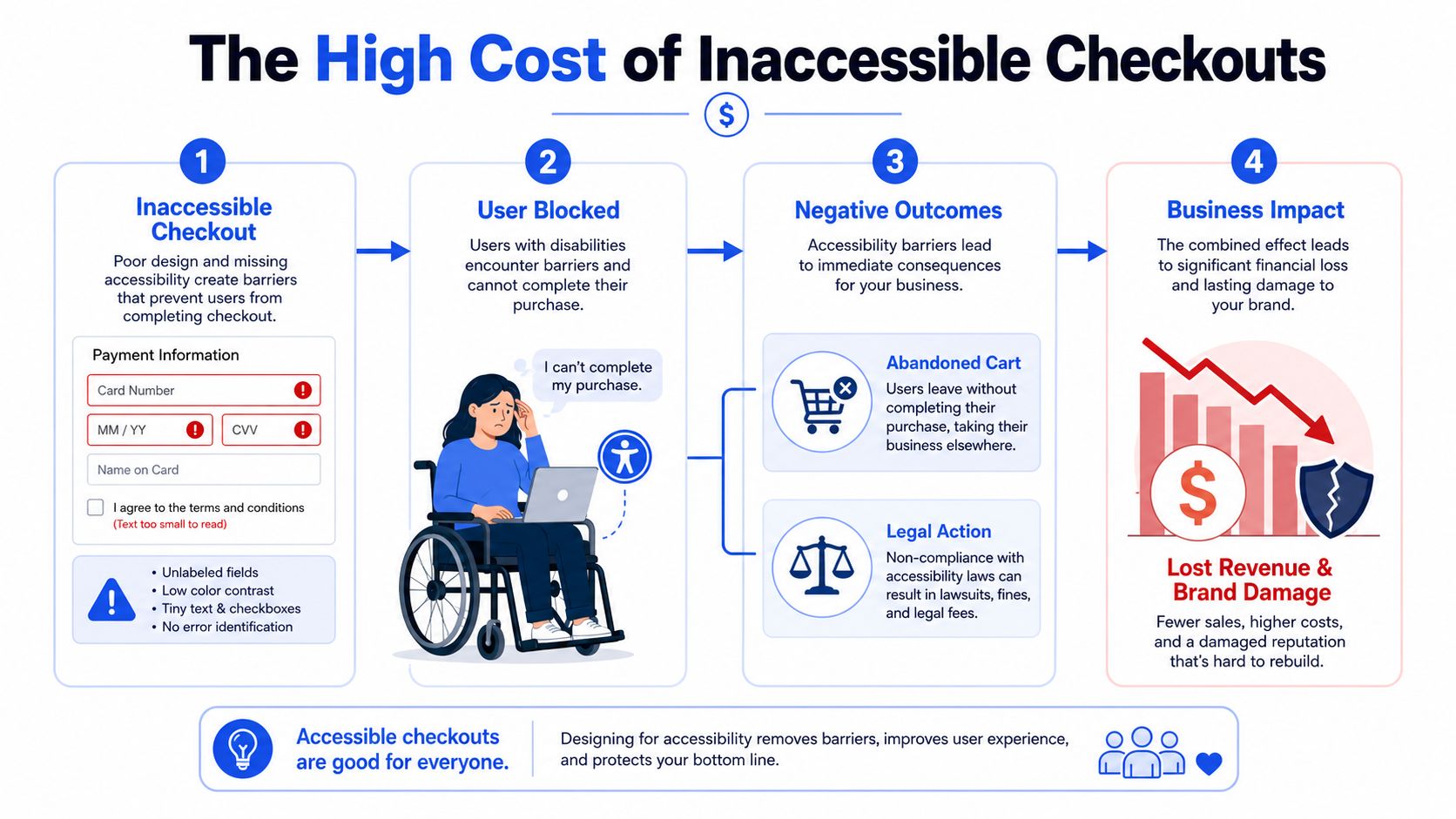
As you can see, poor labeling isn’t just a minor UX issue—it’s a direct cause of lost revenue. These are fundamental components for successful checkout accessibility, not just nice-to-haves. For a deeper technical guide, check out our post on accessible forms, labels, and error validation.
Building your forms correctly from the start is the most effective way to sidestep these problems. While automated tools are useful for catching basic issues, nothing replaces a manual audit to confirm that the experience is genuinely seamless for people who rely on assistive technology. Consider a professional audit to ensure your forms are not just compliant, but truly usable.
Handling Errors and Validation So You Don’t Lose Customers
A vague or confusing error message is one of the fastest ways to lose a sale. When a customer makes a mistake during checkout, your system’s response determines whether they fix it and complete the purchase or abandon their cart in frustration. This is a make-or-break moment for your checkout accessibility strategy.
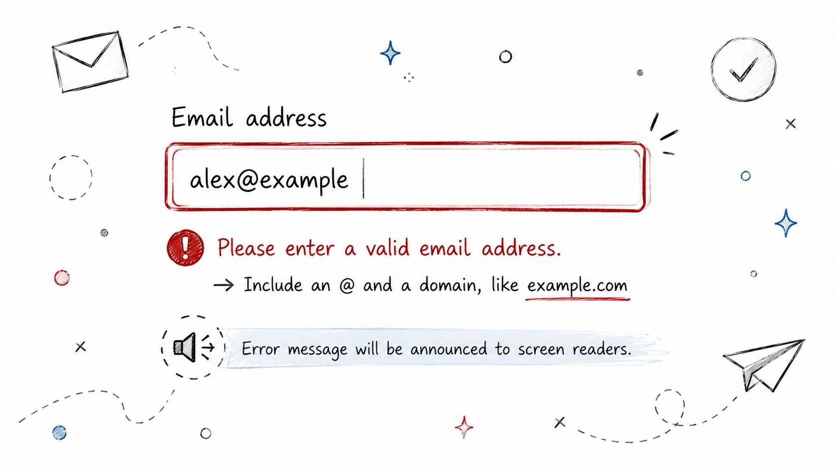
A simple red border around an input field might seem like an obvious error indicator, but for someone using a screen reader or who is colorblind, it is either invisible or insufficient. The user is left hitting “Continue” repeatedly, with no idea what’s wrong.
The solution is to ensure your validation messages are announced clearly and programmatically. This requires using ARIA attributes to communicate with assistive technologies:
aria-invalid=“true”: Programmatically marks the specific form field that contains an error.aria-describedby: Creates a programmatic link between the input and its specific error message, so a screen reader knows which text to read.aria-live=“assertive”: This is crucial for dynamic errors. It tells the screen reader to announce the error immediately, interrupting other output to alert the user to the problem.
Writing Error Messages That Actually Help
An effective error message does two things: it tells the user what’s wrong and, more importantly, how to fix it. Ditch generic phrases like “Invalid Entry.” Instead, provide clear, actionable instructions.
- Instead of: “Invalid ZIP code”
- Try: “Please enter a valid 5-digit ZIP code.”
For a deeper dive into crafting effective feedback, see our guide on creating accessible error messages that guide users toward a successful transaction.
By combining the right ARIA attributes with clear, helpful text, you turn a point of friction into a moment of guided correction. While automated accessibility checkers can spot a missing label, they can’t tell you if your error handling is genuinely helpful or just another roadblock. That’s where manual testing with real assistive technology becomes absolutely essential to verify usability.
Supporting Keyboard-Only and Screen Reader Users
For many users with motor disabilities, a mouse is not an option. A fully keyboard-operable checkout is therefore a foundational requirement of web accessibility and a core tenet of WCAG.
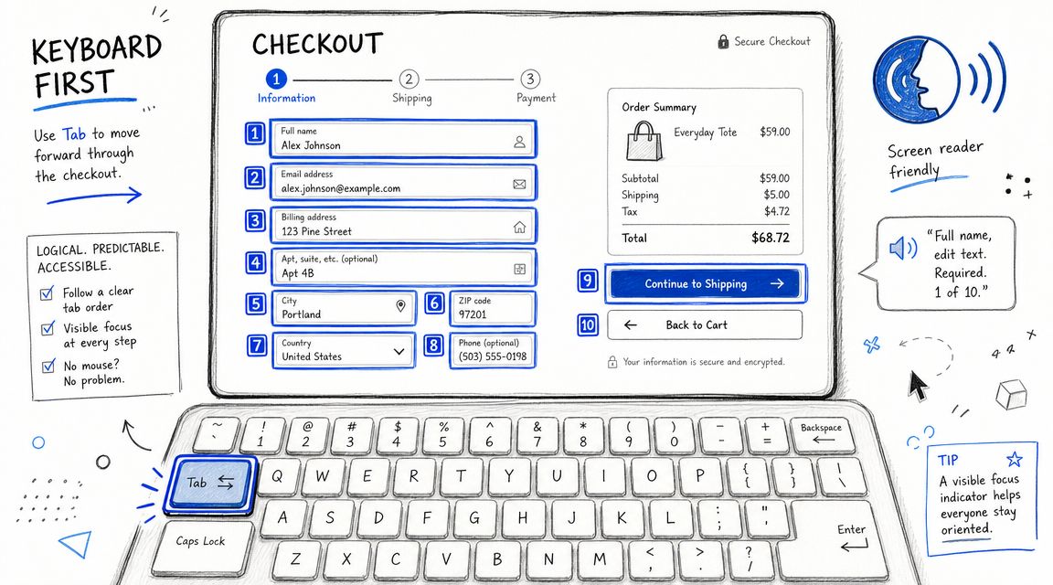
Every interactive element—from form fields and radio buttons to the final “Place Order” button—must be reachable and operable using only a keyboard. Users must be able to navigate smoothly using the Tab key to move forward, Shift+Tab to go back, and Enter or Spacebar to make a selection.
Crucially, the focus order must be logical and predictable, following the visual flow of the page. Nothing is more disorienting for a keyboard user than a tab order that jumps erratically from the shipping address to the site footer and then back to a coupon code field. This not only causes confusion but can make it impossible to complete the checkout process.
How to Manage Focus and Communicate With ARIA
The real challenge often arises with dynamic content, such as address verification pop-ups, modals, or expanding order summary sections. These elements can easily become “keyboard traps”—a situation where a user can tab into a widget but cannot tab back out to the main page. Their only option is to abandon the site.
Proper focus management is essential. When a modal window appears, focus must be programmatically moved into it. When the modal is closed, focus must be returned to the element that triggered it.
Beyond navigation, screen readers need to understand the purpose of different interface elements. A styled progress bar is meaningless to a screen reader if it’s just a series of <div> tags. ARIA roles provide this missing context:
- Use
role=“progressbar”to inform a user of their progress through a multi-step checkout. - Use
aria-liveregions to announce dynamic updates, such as shipping cost calculations or a “product added to cart” confirmation.
A checkout that looks perfect but can’t be navigated with a keyboard is fundamentally broken. It’s the digital equivalent of a storefront with a beautiful entrance but no ramp, effectively barring entry to a segment of your customers.
Automated tools often miss logical flow issues and sophisticated keyboard traps. The only way to be certain your checkout is truly usable is to perform manual testing. Unplug your mouse, fire up a screen reader, and try to complete a purchase. This process will quickly reveal critical accessibility barriers that automated tools miss. This is also why including accessible file upload options can be crucial.
Auditing Third-Party Scripts and Payment Gateways
Your checkout flow is rarely built entirely in-house. It’s a complex ecosystem of payment gateways like Stripe, fraud prevention tools, analytics scripts, and live chat widgets. While these tools are often essential, they inject third-party code at the most critical point of conversion, and any accessibility flaws they contain become your legal liability.
Your organization is legally responsible for the accessibility of the entire user experience on your domain. If a third-party payment widget traps a keyboard user, the resulting ADA lawsuit will be directed at your company, not the vendor.
Due Diligence Before You Integrate
This means your vendor vetting process must go beyond pricing and feature lists. Accessibility must be a primary requirement. Before signing any contract, demand to see a vendor’s Accessibility Conformance Report (ACR), typically based on a completed Voluntary Product Accessibility Template (VPAT). This is their official statement on how their product conforms to standards like WCAG.
However, a VPAT is only a starting point. It’s crucial to conduct your own manual testing before the script is integrated into your production environment. Key red flags include:
- Invisible Payment Fields: Payment forms are often served in an
<iframe>. If that iframe lacks a descriptivetitleattribute, a screen reader user has no idea what it contains. - Keyboard Traps: The most common and severe issue. Test if a user can tab into the credit card fields and then tab back out to complete the purchase.
- Lost Focus: When a payment modal appears, keyboard focus must move to it. If focus remains on the page behind the modal, assistive technology users are stranded.
Your company is liable for the accessibility of the entire user journey, including parts you didn’t code. Choosing a vendor with poor accessibility is choosing to inherit their legal risk.
If a critical tool has accessibility issues, you need a remediation plan. This may involve working with the vendor on a timeline for fixes or, in some cases, finding an alternative provider who prioritizes accessibility. The only way to be certain a third-party integration won’t break your checkout and expose you to significant legal risk is through a thorough, manual audit.
Frequently Asked Questions About Checkout Accessibility
What is the most common checkout accessibility mistake?
The most frequent—and damaging—mistake is a form field with a visual label that isn’t programmatically connected. Developers often place text next to an input box and assume the job is done. Without a <label> element properly linked to its corresponding <input> via for and id attributes, a screen reader simply announces “edit text,” leaving the user to guess its purpose. This single error violates core WCAG principles and can render a checkout unusable.
How do I make my e-commerce search and filter functions accessible?
Accessible search and filters are critical for a good user experience before the checkout. Ensure all filter controls (checkboxes, radio buttons, sliders) are keyboard navigable and have clear, associated labels. When filters are applied, use an ARIA Live Region to announce that the page results have been updated. This informs screen reader users that their action had an effect. For a detailed walkthrough, review our guide on e-commerce search and filter accessibility.
How should I test my checkout flow for accessibility?
A robust testing process combines automated scanning with essential manual testing. Automated tools can catch about 30% of WCAG issues, but they cannot assess true usability. Manual testing is non-negotiable and should include:
- Keyboard-Only Navigation: Attempt to complete a purchase using only the Tab, Shift+Tab, and Enter keys.
- Screen Reader Testing: Use a screen reader like NVDA, JAWS, or VoiceOver to navigate the entire checkout. Are labels, instructions, and dynamic updates announced clearly?
- Error Validation: Intentionally submit the form with errors. Check if the error messages are announced, clearly explain the problem, and guide you to the correct field.
Does using a platform like Shopify or BigCommerce guarantee an accessible checkout?
No. While platforms like Shopify and BigCommerce have improved the accessibility of their core checkout templates, your site’s overall accessibility depends on many other factors. The theme you choose, the third-party apps you install, and any custom code can all introduce significant accessibility barriers. Ultimately, your business is legally responsible for the accessibility of your live site. The only way to be sure your specific implementation is compliant is to have it audited by experts.
Making your checkout accessible isn’t just about compliance—it’s a critical business function that protects revenue and enhances your brand. At ADA Compliance Pros, we specialize in expert manual audits and VPAT creation that reduce your legal risk and ensure your checkout serves every customer. Schedule a consultation with our experts today to secure your revenue stream and build a more inclusive e-commerce experience.