A modal probably looks harmless in your backlog. It’s a signup prompt, a confirmation step, a billing warning, a settings panel. In audits, it’s often one of the fastest ways to make an otherwise usable site fail for keyboard and screen reader users.
That’s why an accessible modal dialog isn’t just a front-end detail. It’s a compliance control. If focus escapes, if the dialog opens without a usable name, or if the rest of the page stays exposed to assistive technology, users can lose context or get blocked from completing the task entirely. For ADA, WCAG, and Section 508 risk management, that’s not a cosmetic defect.
Teams also miss modal failures because automated scans only catch a slice of the problem. A scanner may flag missing ARIA. It usually won’t tell you whether focus returns to the right trigger after close, whether Escape works consistently, or whether a screen reader still reaches the underlying page. Those are manual test issues, and they matter.
Why Your Modal Dialog is a High-Risk Interaction
A modal is high risk because it interrupts everything else on the page. Harvard’s accessibility guidance treats accessible modals as interactions where keyboard focus and screen reader information must be managed correctly, and related national guidance describes modals as components users must interact with before continuing, with specific requirements for role, focus placement, Escape dismissal, focus return, and tab restriction inside the dialog, as outlined in Harvard’s accessible modal guidance.
That changes the risk profile. A broken link is a defect. A broken modal can lock a user out of checkout, consent, login, account recovery, or critical workflow steps. If your product uses modal dialogs for authentication, document signing, payment confirmation, or error recovery, the legal and operational impact grows fast.
Why modal failures are more severe
The common failure pattern is simple. The UI looks correct, but the interaction state is wrong.
- Keyboard users get stranded: Focus lands behind the overlay or escapes out of it.
- Screen reader users lose context: The dialog opens visually, but its name or purpose isn’t announced.
- The background still competes for attention: Users can reach hidden controls under the modal.
- Dismissal fails: Escape doesn’t work, or the close button isn’t reachable.
Practical rule: If the page becomes unusable when the modal opens, the modal is part of your core accessibility surface, not a secondary widget.
Automated tools often miss this because modal compliance depends on behavior over time. You have to test the opening state, the active state, and the closing state. You also have to test with a keyboard and at least one screen reader. A static DOM snapshot won’t tell you whether the user gets trapped in the wrong place or dropped on the wrong element after close.
What makes a modal compliant in practice
A compliant accessible modal dialog does more than display content in a layer. It creates a temporary interaction mode. While it’s open, the rest of the interface must stop behaving like the active page.
That means product teams need to treat modal acceptance criteria as strict requirements. If the component library ships a modal that only looks finished, QA needs to send it back. If the design system doesn’t define naming, focus order, and close behavior, engineering will improvise, and that’s where avoidable audit findings start.
Building the Foundation with ARIA and Semantics
The modern baseline for modals is well established. The WAI-ARIA Authoring Practices Guide says modal dialogs must contain their tab sequence and make outside content inert, and the U.S. Web Design System gives practical implementation guidance such as using aria-labelledby, managing focus, and placing the close button logically, as described in the WAI-ARIA modal dialog pattern.
Use semantics that communicate state
If you’re building a custom modal instead of using the native <dialog> element, your markup has to tell assistive technologies what just happened.
Start with these pieces:
role=“dialog”identifies the container as a dialog.aria-modal=“true”signals that this is a modal interaction.aria-labelledbygives the dialog its accessible name by pointing to a visible heading.aria-describedbycan attach supporting text when extra context helps.
For naming patterns, this guide on ARIA dialog accessible names is useful when teams keep shipping dialogs that open with no clear title announced.
Here is a solid baseline:
<button id="open-settings" aria-haspopup="dialog">
Open settings
</button>

<div
id="settings-dialog"
role="dialog"
aria-modal="true"
aria-labelledby="settings-title"
aria-describedby="settings-desc"
hidden
>
<div class="modal-panel">
<h2 id="settings-title">Settings</h2>
<p id="settings-desc">Update your notification preferences.</p>
<label>
<input type="checkbox" />
Email notifications
</label>
<button type="button" id="save-settings">Save</button>
<button type="button" id="close-settings">Close</button>
</div>

</div>
A baseline custom modal example
This markup alone doesn’t make the modal accessible, but it does establish the required semantics. Screen readers need a programmatic name. Auditors check this quickly because an unnamed dialog is one of the most obvious failures in manual testing.
A few implementation choices matter more than teams expect:
| Element | Why it matters |
|---|---|
| Visible heading | Gives aria-labelledby a stable, meaningful name target |
| Real button for close | Makes keyboard activation and semantics straightforward |
| Supporting text | Helps when the action needs context or consequences explained |
| Hidden state control | Prevents off-screen content from being exposed when closed |
A modal that only adds
role=“dialog”is not finished. If it has no accessible name, no managed focus, and no inert background behavior, it’s just a labeled failure.
Keep the close button obvious in both the UI and the DOM order. Don’t bury it behind non-interactive wrappers or icon-only controls without an accessible label. If the user can’t quickly identify how to exit, the modal becomes a usability and compliance problem at the same time.
Mastering Focus Traps and Keyboard Navigation
The most important part of an accessible modal dialog is not the overlay, the animation, or the ARIA attributes. It’s the focus lifecycle.
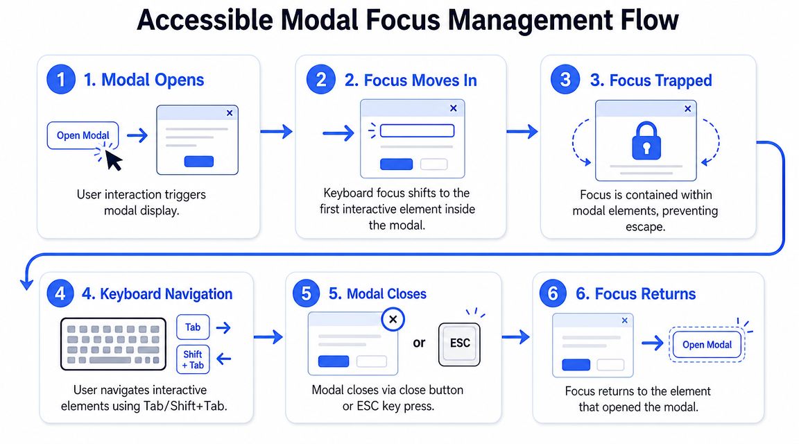
Authoring guidance is consistent on the sequence: store the invoking control, move focus into the dialog when it opens, trap Tab and Shift+Tab inside it, and return focus to the invoking control on close. It also warns against focusing the dialog container itself unless there’s a good reason, and notes that the background should be hidden from assistive technologies with aria-hidden=“true” on the inert layer, as explained in Yoast’s modal accessibility guidance.
The focus lifecycle that must work every time
When the user activates the trigger, your code should save a reference to that trigger before anything else changes. That reference is what lets you restore focus when the modal closes.
Then move focus into the dialog. In most business interfaces, the best target is one of these:
- First actionable control: Good for short confirmation dialogs.
- First form field: Good for data entry modals.
- Focusable title or static element: Useful when users need to read context before acting.
Avoid putting focus on the container by default. That often creates an awkward screen reader experience and can confuse keyboard users.
A short demonstration helps teams see the full flow:
A practical focus trap example
This example shows the basic mechanics for a custom modal.
<main id="page-content">
<button id="open-modal">Open profile editor</button>
</main>

<div
id="profile-modal"
role="dialog"
aria-modal="true"
aria-labelledby="profile-title"
hidden
>
<div class="modal-panel">
<h2 id="profile-title" tabindex="-1">Edit profile</h2>
<label for="display-name">Display name</label>
<input id="display-name" type="text" />
<button type="button" id="save-btn">Save</button>
<button type="button" id="close-btn">Close</button>
</div>

</div>
const openBtn = document.getElementById('open-modal');
const modal = document.getElementById('profile-modal');
const closeBtn = document.getElementById('close-btn');
const pageContent = document.getElementById('page-content');
const title = document.getElementById('profile-title');

let previousFocus = null;

function getFocusableElements(container) \{
return [...container.querySelectorAll(
'button:not([disabled]), [href], input:not([disabled]), select:not([disabled]), textarea:not([disabled]), [tabindex]:not([tabindex="-1"])'
)];
\}

function openModal() \{
previousFocus = document.activeElement;
modal.hidden = false;
pageContent.setAttribute('aria-hidden', 'true');
title.focus();
\}

function closeModal() \{
modal.hidden = true;
pageContent.removeAttribute('aria-hidden');

if (previousFocus && document.contains(previousFocus)) \{
previousFocus.focus();
\}
\}

function handleTabTrap(event) \{
if (event.key !== 'Tab') return;

const focusable = getFocusableElements(modal);
if (!focusable.length) return;

const first = focusable[0];
const last = focusable[focusable.length - 1];

if (event.shiftKey && document.activeElement === first) \{
event.preventDefault();
last.focus();
\} else if (!event.shiftKey && document.activeElement === last) \{
event.preventDefault();
first.focus();
\}
\}

function handleEscape(event) \{
if (event.key === 'Escape') \{
closeModal();
\}
\}

openBtn.addEventListener('click', openModal);
closeBtn.addEventListener('click', closeModal);
modal.addEventListener('keydown', handleTabTrap);
modal.addEventListener('keydown', handleEscape);
Teams that struggle with background focus usually also struggle with hidden but focusable controls. In such cases, ARIA hidden focusable elements become relevant. If content is supposed to be inactive, users shouldn’t still be able to tab into it.
What to test manually
Don’t sign off on a modal until someone runs a keyboard-only pass.
- Open with keyboard: The trigger should work with standard keyboard activation.
- Check initial placement: Focus should land inside the dialog immediately after open.
- Cycle with Tab and Shift+Tab: Focus should stay inside the modal.
- Dismiss with Escape: If the modal design allows dismissal, Escape should work.
- Confirm focus return: After close, users should land somewhere logical, usually the trigger.
For deeper verification, use a dedicated keyboard accessibility testing checklist. It catches issues that look minor in code review but become severe when users rely on keyboard control for every interaction.
Native HTML Dialog Element vs Custom Solutions
The native <dialog> element is often the safer choice because showModal() gives you browser-managed modal behavior, including focus management, backdrop behavior, and background inertness. Guidance also recommends using autofocus on the first element the user should interact with, or on the <dialog> itself as a fallback, while still requiring an accessible name and close mechanism, as described in Schalk Neethling’s guide to native dialog accessibility.
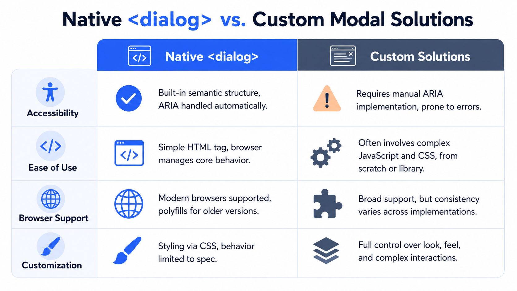
When native dialog is the safer choice
If your team doesn’t have strong front-end accessibility experience, native dialog usually reduces the number of ways you can break core modal behavior.
A simple example:
<button id="open-help">Open help</button>

<dialog id="help-dialog" aria-labelledby="help-title">

<h2 id="help-title">Help</h2>


<p>Review the instructions before continuing.</p>

<button autofocus id="close-help">Close</button>
</dialog>

<script>
const trigger = document.getElementById('open-help');
const dialog = document.getElementById('help-dialog');
const close = document.getElementById('close-help');

let opener = null;

trigger.addEventListener('click', () => \{
opener = document.activeElement;
dialog.showModal();
\});

close.addEventListener('click', () => \{
dialog.close();
if (opener && document.contains(opener)) opener.focus();
\});
</script>
This approach is usually cleaner than rebuilding modal behavior from nested divs, overlay layers, and custom event handlers.
Where custom modals still create risk
Custom modals still have valid use cases. Design systems may need highly specialized transitions, shared component APIs, or platform constraints that make <dialog> harder to adopt. But custom implementations create more room for failure.
Here’s the trade-off:
| Decision area | Native <dialog> | Custom modal |
|---|---|---|
| Core behavior | Browser handles much of it | Team must implement it |
| Accessible naming | Still required | Still required |
| Focus return | Must be tested | Must be coded and tested |
| Flexibility | Moderate | High |
| Audit risk | Lower when implemented carefully | Higher if behavior is improvised |
The common mistake is assuming native means automatic compliance. It doesn’t. You still need a meaningful name, visible close control, correct return focus, and manual testing with assistive technology.
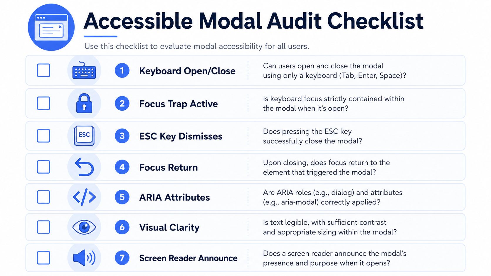
Your Essential Accessible Modal Audit Checklist
A modal audit should be ruthless. Don’t ask whether the component “mostly works.” Ask whether a user can open it, understand it, operate it, and exit it without losing orientation.
For broader compliance context beyond modals, a structured resource like this wcag 2.0 aa checklist helps teams see where dialog failures fit into overall conformance work.
Keyboard smoke test
Run this first with no mouse.
- Reach the trigger The button or link that opens the modal must be keyboard focusable and clearly labeled.
- Open the modal Activate it with the keyboard. Focus should move into the modal immediately.
- Tab through all controls Every interactive element in the modal should be reachable in a logical order.
- Try to escape the trap Keep tabbing. Focus shouldn’t move behind the dialog or to the browser chrome unexpectedly.
- Press Escape If the pattern is dismissible, the modal should close.
- Confirm return focus Closing should return focus to the original trigger or another logical target if that trigger no longer exists.
Screen reader and visual checks
Now test the dialog as announced content, not just visual layout.
- Name and role: Does the screen reader announce a dialog with a clear title?
- Description: If the dialog needs supporting context, is it exposed?
- Background silence: Can the user still reach content underneath the modal? They shouldn’t.
- Visible focus: Is the active control obvious at every step?
- Readable content: Text, labels, and buttons must remain legible and understandable.
A quick screen reader smoke test is often enough to expose issues that never appear in visual QA. Modal defects also show up alongside adjacent patterns such as accessible navigation menus and message handling patterns like ARIA live regions for notifications, especially in app-style interfaces where state changes stack together.
If your QA process only checks whether the modal opens and closes visually, it will miss the failures most likely to matter in an accessibility complaint.
Where simple checklists stop working
Complex interfaces break simplistic modal logic. In SPAs, embedded widgets, and multi-step flows, the trigger can disappear after the modal opens. In other cases, the modal is launched programmatically without a single obvious invoker. When that happens, returning focus to the trigger is no longer possible.
That’s why guidance on dynamic interfaces matters. The W3C pattern still requires inactive content to be inert, and practitioners have pointed out that if the activating control is gone, focus should move to a logical location instead of jumping to the top of the page, as discussed in Vispero’s review of modal accessibility edge cases.
When a product involves complex client-side state, manual review becomes necessary. A formal digital accessibility audit for ADA, WCAG, and Section 508 is often the point where these interaction defects become visible because the tester follows the user journey, not just the component spec.
Frequently Asked Questions About Modal Accessibility
The hardest modal issues usually aren’t about basic ARIA syntax. They’re about what happens in real browsers, with real assistive technology, after your app starts changing state.
Guidance has become more nuanced on one point in particular: aria-modal=“true” is not always enough by itself. Recent implementation guidance notes that authors may still need inert or aria-hidden on background content, plus manual focus management, because behavior can vary across browser and assistive technology combinations, as explained in Make Things Accessible on modal versus non-modal dialogs.
| Question | Answer |
|---|---|
Do I need aria-modal=“true” if I already trap focus? | Yes, when you’re using ARIA dialog semantics. Focus trapping controls keyboard movement. aria-modal communicates modal state to assistive technology. In practice, many teams still add layered background management because aria-modal alone may not fully hide underlying content in every setup. |
Is inert better than aria-hidden? | They solve related but different problems. inert helps block interaction and focus on the background. aria-hidden affects exposure to assistive technologies. Many robust implementations use a layered approach rather than treating one attribute as a universal fix. |
| Where should initial focus go? | Put focus on the first logical element inside the modal. That may be a close button, a primary field, or a focusable title when users need context before acting. Don’t default to the container unless you have a specific reason. |
| Should Escape always close the modal? | For most dismissible modal dialogs, yes. Users expect it. If you have a special case such as a critical interruption or a confirmation flow with unsaved work, document the behavior clearly and test the impact carefully. |
| What if the trigger disappears after the modal opens? | Return focus to a logical next location. Don’t dump focus at the top of the page or onto body. This often happens in dynamic interfaces after list refreshes, route updates, or step changes. |
| Can I stack modals? | You can, but the complexity rises quickly. Focus order, background inertness, and return logic become much harder to maintain. Most teams should avoid stacked modals unless there’s a strong product reason. |
Does a native <dialog> eliminate manual testing? | No. It reduces implementation burden, but you still need to verify naming, close behavior, focus return, and actual assistive technology behavior. |
| Can automated tools validate my modal fully? | No. They can help catch missing roles, names, or obvious attribute problems. They won’t reliably confirm focus lifecycle, reading order, or edge-case failures in dynamic applications. |
Robust modal accessibility comes from layered behavior, not one attribute.
If your organization is reviewing modal dialogs as part of ADA, WCAG, or Section 508 readiness, consider an accessibility assessment from ADA Compliance Pros. Their published service scope describes manual and automated testing, WCAG-mapped findings, remediation guidance, and verification work that’s relevant when modal issues involve focus logic, assistive technology behavior, and procurement documentation rather than simple linting.
An accessible modal dialog has to do more than look polished. It has to hold focus, announce itself clearly, block the background, support Escape where appropriate, and return users to a logical place when it closes. If your team isn’t testing those behaviors manually, you’re accepting unnecessary ADA and WCAG risk. When modal behavior is tied to core tasks like login, checkout, consent, or account management, it’s worth bringing in a professional review. ADA Compliance Pros provides manual accessibility audits, remediation guidance, and compliance documentation for teams that need defensible results.