
Mastering Accessible Tables: WCAG Compliance Guide
A product team ships a release with a clean pricing matrix, a reporting dashboard, and an export summary table. Design signs off. QA checks the layout. Then the accessibility audit fails, because the table only works visually.
That failure is common, and it creates a bigger problem than a single defect ticket. When data tables aren’t coded so assistive technologies can understand header and data relationships, users can lose the meaning of the content entirely. For organizations dealing with ADA compliance, WCAG conformance, Section 508 reviews, or VPAT documentation, that turns a routine UI pattern into legal and procurement risk.
The issue isn’t whether the table looks organized. The issue is whether the relationships inside the table are exposed programmatically. If they aren’t, your team may be blocking users from core information such as pricing, schedules, statements, comparison data, or eligibility criteria. That’s the kind of defect that gets flagged in audits, slows enterprise sales, and weakens your position when customers ask for accessibility evidence.
If you’re assessing your broader compliance posture, this overview of how to get ADA certified is useful context because it shows how organizations typically think about compliance readiness. For web products, though, readiness depends on whether your implementation holds up under technical review, not whether a page looks polished.
Introduction Why Your Data Tables Are a Compliance Risk
Most audit failures around accessible tables come from a simple assumption: if the grid is readable to a sighted user, the table must be accessible. That assumption doesn’t survive technical testing.
A screen reader user doesn’t interact with the visual grid the way your designer does. They rely on code that identifies which cells are headers, which cells are data, and how those cells relate to each other. If that structure is missing or inconsistent, the table stops being information and becomes a sequence of disconnected values.
That matters for compliance because tables often contain high-risk content. Product comparison grids, fee schedules, order summaries, financial statements, staffing rosters, and benefits tables aren’t decorative. They carry business-critical meaning. If a user can’t determine which label belongs to which value, the content isn’t just inconvenient. It’s functionally unavailable.
For teams managing audit exposure, accessibility defects become business defects:
- Procurement risk: Buyers reviewing accessibility claims often look closely at common failure points like data tables, documents, and forms.
- Legal risk: A broken table can support a claim that key information wasn’t made available in an accessible way.
- Operational risk: Developers lose time debating edge cases late in QA because the design system never defined a compliant table pattern.
- Revenue risk: Enterprise and public-sector customers may ask for documentation that maps issues to WCAG and shows a remediation path.
A mature response starts with standards-based implementation and defensible review. If your team needs that level of evidence, a manual review tied to WCAG compliance services is usually more useful than relying on an automated scan alone.
A visually correct table can still fail accessibility if assistive technology can’t identify the same relationships your eyes can.
The Foundation of Accessible Table Structure
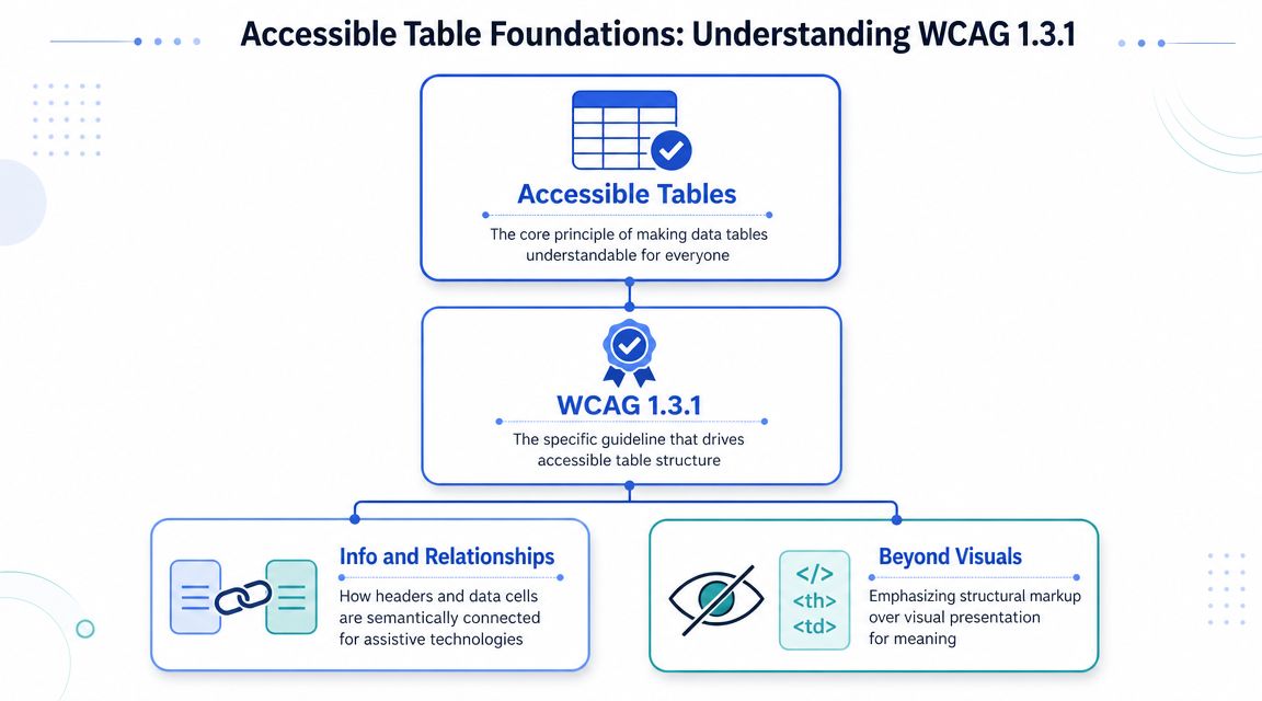
The core problem with inaccessible tables is structural, not cosmetic. A table isn’t accessible because it has borders, stripes, or sticky headers. It’s accessible when the code communicates the data model.
Why visual clarity is not enough
The W3C table tutorials state that accessible tables require HTML markup that distinguishes header cells from data cells with <th> and <td>, and more complex tables may need scope, id, and headers to preserve relationships. That guidance aligns with longstanding recommendations across WebAIM and university accessibility guidance. The key principle is straightforward: users who can’t see the visual grid still need a programmatic map of the table.
Think of a spreadsheet. The value in a cell doesn’t mean much until you know its row label and column label. HTML tables work the same way. If your code doesn’t expose those labels, assistive technology can’t reliably tell the user what a given value represents.
That’s why auditors don’t start by asking whether the table looks neat. They start by checking whether the relationships are expressed in the markup.
The semantic pieces that matter
A sound table usually includes several elements working together:
<table>identifies the structure as tabular data.<caption>gives the table a name or short description.<thead>groups header rows.<tbody>groups the data rows.<th>marks header cells.<td>marks data cells.
A caption matters more than many teams realize. When a screen reader user lands on a table, the caption often provides the context a sighted user would get from scanning the page layout or nearby headings.
Use tables for data only. Guidance from accessibility authorities consistently warns against layout tables because they confuse screen reader users. If you’re using a table to force columns in a marketing block or a card layout, that’s a different problem and it needs a layout solution, not table markup.
Audit lens: If a tester can’t identify row and column headers in the code within a few seconds, your table pattern probably isn’t ready for production.
A practical baseline for development teams:
| Table element | Why it matters |
|---|---|
<caption> | Gives users immediate context about the table’s purpose |
<th> | Identifies header cells instead of relying on bold styling |
<td> | Marks actual data values |
| Grouping elements | Help keep the structure organized and easier to audit |
| Predictable grid | Supports reliable interpretation by assistive technology |
Teams that document this baseline in their design system avoid a lot of recurring audit debt.
Building Simple Data Tables with the Scope Attribute
Most production tables don’t need advanced association logic. They need disciplined use of header cells and the scope attribute.
What scope does in practice
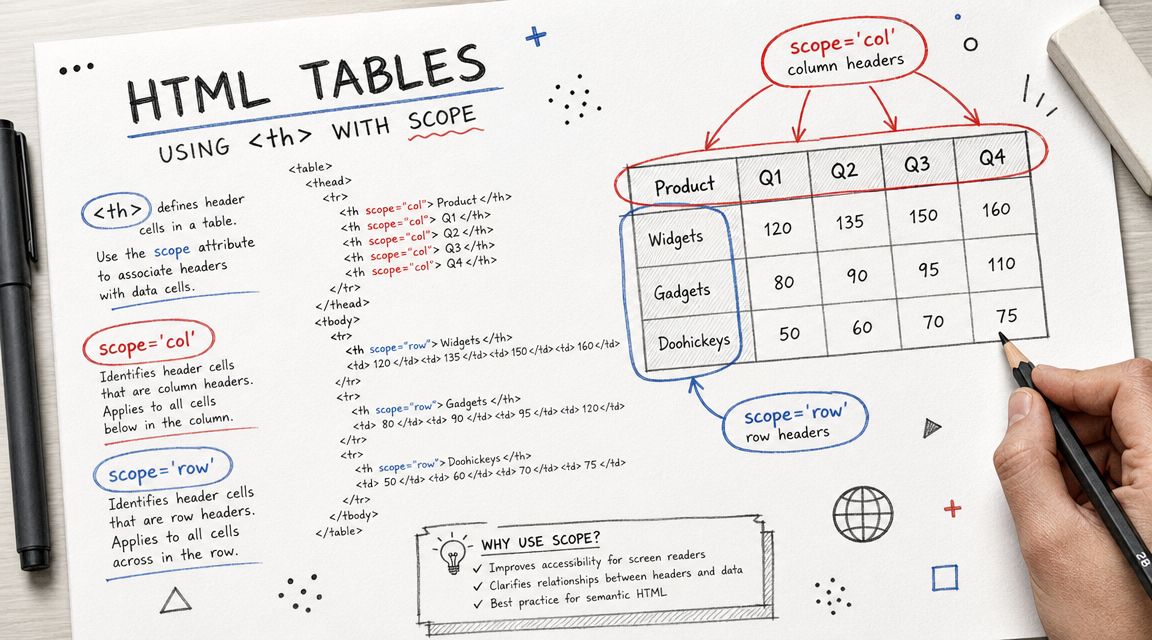
For simple data tables, the Pope Tech guide to accessible tables explains that every data table should identify header cells with <th> and define whether each header applies to a row or column using scope=“row” or scope=“col”. It also notes that scope is sufficient for most tables.
That makes scope the highest-value fix for many audit findings. It tells assistive technology how to apply each header. Without it, a user may hear values with weak or missing context. With it, navigation becomes understandable.
If your team needs implementation guidance, keep a reference for correct usage of the table scope attribute in your coding standards.
Before and after code
A common failure looks like this:
<table>
<tr>
<td>Plan</td>
<td>Users</td>
<td>Support</td>
</tr>
<tr>
<td>Starter</td>
<td>Up to 10</td>
<td>Email</td>
</tr>
<tr>
<td>Enterprise</td>
<td>Custom</td>
<td>Priority</td>
</tr>
</table>
It may look fine on screen, but the first row is only styled to look like a header. It isn’t marked as one.
A compliant version is much stronger:
<table>
<caption>Subscription plan comparison</caption>
<thead>
<tr>
<th scope="col">Plan</th>
<th scope="col">Users</th>
<th scope="col">Support</th>
</tr>
</thead>
<tbody>
<tr>
<th scope="row">Starter</th>
<td>Up to 10</td>
<td>Email</td>
</tr>
<tr>
<th scope="row">Enterprise</th>
<td>Custom</td>
<td>Priority</td>
</tr>
</tbody>
</table>
The improvement isn’t theoretical. It changes the user experience during navigation.
Without
scope, users may hear a value like “Custom” with little confidence about whether it refers to seats, support, or pricing. Withscope, the table has structure they can follow.
A few implementation rules help avoid repeat defects:
- Use real headers: Don’t style
<td>elements to imitate headers. - Mark both directions when needed: If the first column identifies each row, use
scope=“row”there. - Write a useful caption: “Table” isn’t enough. Name what the data covers.
- Keep wording plain: Clear labels improve comprehension for everyone, which is the same principle behind accessible content writing.
For a simple table, this is usually enough to move from audit failure to solid compliance.
Advanced Techniques for Complex Data Tables
Simple tables are manageable. Complex tables are where teams get into trouble.
The hard cases show up in pricing matrices with grouped categories, financial reports with multiple header levels, academic schedules, insurance summaries, and exported reports from BI tools. These often include merged cells, blank placeholders, or stacked headers that make visual sense but break under assistive technology.
When id and headers are appropriate
When a table has multi-level headers or associations that scope can’t express clearly, use explicit header mapping. Assign unique id values to relevant <th> elements, then reference those IDs from each <td> with a headers attribute.
A simplified example:
<table>
<caption>Quarterly revenue by region and channel</caption>
<tr>
<th id="region">Region</th>
<th id="online">Online</th>
<th id="partner">Partner</th>
</tr>
<tr>
<th id="north" scope="row">North</th>
<td headers="north online">Value</td>
<td headers="north partner">Value</td>
</tr>
</table>
This approach can be necessary, but it also increases maintenance cost. Every transformation, export, or CMS edit can break those associations. That’s one reason complex tables fail again after a redesign.
If your team needs a technical reference, this guide on associating data cells with table headers is the right place to standardize implementation.
When simplification is the better fix
The stronger compliance move is often not more markup. It’s less complexity.
The Bureau of Indian Affairs table guidance explicitly supports flattening tables or breaking them into smaller, simpler ones, and that principle shows up across accessibility practice. In audit work, that advice holds up well. A perfectly engineered complex table can still be hard to use, hard to test, and hard to defend.
Use these decision rules:
- Break one complex table into several simple tables when distinct sections don’t need to be compared simultaneously.
- Move explanatory notes outside the grid when cells are carrying too much narrative content.
- Replace dense visual grouping with headings and separate tables when grouped headers create ambiguity.
- Offer a summary plus downloadable file when the full dataset is better consumed in another format.
This issue often carries into documents. A table built in Word, Excel, or a reporting tool may look acceptable before export, then become far harder to remediate once it’s in PDF. If that workflow is part of your process, this guide on how to make a PDF accessible step by step is directly relevant.
More semantic markup doesn’t automatically produce a better result. If users need a map to understand the table, the structure is probably too complex.
Solving the Responsive Accessible Table Problem
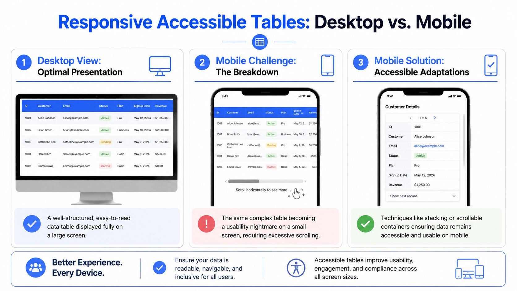
A table can be technically correct on desktop and still fail users on mobile or at high zoom. That’s one of the biggest gaps in real-world implementations of accessible tables.
Horizontal scrolling versus transformed layouts
The WebAIM guidance on data tables notes that relative sizing is preferable to fixed pixels so tables can adapt when low-vision users enlarge text. That point matters because many teams lock tables into rigid widths, then discover that zoom breaks readability or forces punishing horizontal scrolling.
The usual responsive patterns each have trade-offs:
| Pattern | What works | What tends to fail |
|---|---|---|
| Horizontal scroll container | Preserves table semantics and comparison across columns | Can be difficult for users with low vision or motor impairments |
| Stacked cards | Easier to read on narrow screens when designed carefully | Often loses true table relationships and cross-row comparison |
| Alternate mobile view | Can present the same information in a cleaner format | Requires careful parity so no user loses access to data |
A lot of teams reach for card transformations because they look cleaner in design review. The problem is that a card view isn’t automatically equivalent access. If the desktop table supports side-by-side comparison and the mobile version doesn’t, users may lose the very function the table was meant to provide.
A useful external perspective on expert responsive design solutions can help teams think through broader responsive patterns. For accessibility, the test is narrower: does the chosen pattern preserve meaning, operability, and readability under real conditions?
Decision rules for product teams
Use a simple decision model:
- Keep the native table with scrolling when column comparison is the main user task.
- Use relative widths instead of fixed pixels so the table can adapt under zoom.
- Transform to cards only when comparison isn’t the primary goal and each row can stand alone.
- Provide alternate access such as a downloadable file or filtered view when the dataset is too dense for small screens.
Test the chosen pattern on a phone, with enlarged text, and with keyboard interaction where applicable. Responsive behavior isn’t separate from accessibility. It’s part of whether users can consume the data.
A Practical Checklist for Testing Table Accessibility
Automated scans catch some table issues. They don’t tell you whether the table is understandable.
Manual checks that catch real failures
The SBA accessibility guidance for tables stresses that tables need a consistent grid structure. Each row should contain the same number of columns, and each column the same number of rows. Merged or split cells, nested tables, and empty top-left cells can break how assistive technologies infer relationships.
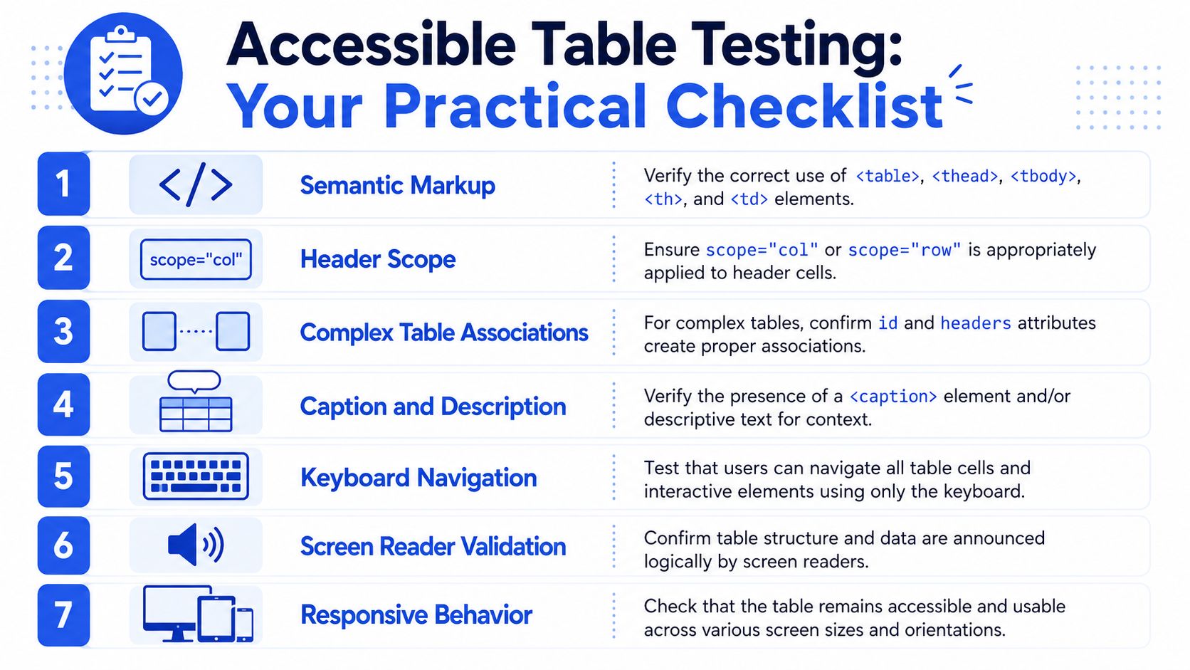
Use this checklist in QA:
- Check the grid first: Count cells. Uneven structures often reveal the problem before a screen reader does.
- Inspect the markup: Confirm the pattern uses
<th>for headers and<td>for data. - Review captions: Make sure the caption identifies the content, not just the format.
- Test keyboard behavior: If the table contains links, buttons, sort controls, or expandable details, verify logical focus order.
- Listen with a screen reader: Move through rows and columns and confirm headers are announced in a way that preserves meaning.
- Test at narrow widths and zoom: A compliant table that becomes unreadable under zoom still creates user barriers.
This walkthrough is also useful for teams that depend on CMS workflows or template builders. If your site runs on WordPress, governance around reusable table blocks matters just as much as front-end code, and this article on WordPress ADA compliance can help shape that process.
For teams that want a quick visual refresher, this video is worth reviewing during QA training:
Where automated tools help and where they stop
Automated tools are useful for detecting missing headers, empty captions, or obvious structural errors. They are not good at judging whether a complex table still makes sense when announced by assistive technology.
That’s why a tool should be your first pass, not your final decision. This roundup of accessibility testing tools is helpful for building a practical workflow, but teams should still plan manual verification for high-risk tables.
Practical rule: If the table contains critical business information, test it manually. The more complex the structure, the less you should trust automation alone.
Documenting Issues and Prioritizing Remediation
Finding a table defect is only useful if your team can document it clearly, assign it, and fix it in a way that holds up during re-test, procurement review, or legal scrutiny.
How to write findings developers can fix
Weak accessibility findings sound like this: “Table is not accessible.”
Useful findings map the issue to the user impact and the implementation defect. For example:
- Issue: Data table uses styled
<td>elements instead of header cells. - Impact: Screen reader users may not receive programmatic row or column context when navigating data.
- Remediation: Replace relevant cells with
<th>and apply direction usingscopewhere appropriate. - Compliance mapping: WCAG 1.3.1 Info and Relationships.
Another common example:
- Issue: Complex table uses merged cells and irregular structure that creates ambiguous associations.
- Impact: Users may not be able to determine which headers apply to each value.
- Remediation: Flatten the table, split it into smaller tables, or use explicit header associations if simplification isn’t possible.
- Compliance mapping: WCAG 1.3.1 and, where reading order is affected, WCAG 1.3.2 Meaningful Sequence.
If the table caption or surrounding label is vague, document that separately. Ambiguous labels can create usability and audit problems, especially when a page includes multiple tables.
How to prioritize table defects by risk
Not every table issue carries the same severity. Prioritize based on the function the user is blocked from completing.
Use this order:
- Critical data barriers
Tables containing pricing, account data, eligibility criteria, or transactional summaries should be fixed first. - Complex structural failures
Multi-level headers, merged cells, and broken associations deserve early remediation because they often affect entire datasets. - Responsive and zoom failures
If mobile or low-vision users can’t operate the layout, fix the pattern in the component library so the problem doesn’t spread. - Labeling and context issues
Weak captions or poor surrounding instructions matter, but they usually come after structural failures.
For teams preparing procurement documentation, a formal audit or Accessibility Conformance Report needs more than a defect list. It needs WCAG-mapped findings, rationale, and a remediation path that engineering can execute. In practice, that’s where a specialist review helps. ADA Compliance Pros provides manual audits, remediation guidance, and VPAT or ACR documentation for web products and ICT, which is the level of evidence many enterprise and government buyers expect.
FAQ
What makes a table accessible?
An accessible table uses semantic HTML so assistive technologies can identify headers, data cells, and their relationships. In practice, that usually means proper use of <table>, <caption>, <th>, <td>, and for many simple tables, the scope attribute.
Are captions required for accessible tables?
A caption is a strong practice because it gives users immediate context about what the table contains. It helps users orient themselves before moving through the data.
When should I use scope instead of headers and id?
Use scope for most simple data tables with clear row and column headers. Use id and headers only when the table has more complex relationships that scope can’t express cleanly.
Should I avoid merged cells?
Usually, yes. Merged and split cells can break the consistent grid structure assistive technologies rely on. If your design depends on them, it’s often a signal that the table should be simplified.
How do I make tables accessible on mobile?
Start by preserving meaning, not just fitting the layout into a smaller screen. Use relative sizing, test with zoom, and choose between horizontal scrolling or an alternate presentation based on whether side-by-side comparison is essential.
Can automated accessibility tools test tables completely?
No. They help detect obvious markup problems, but they can’t reliably confirm whether a user can understand a complex table. Manual testing is still necessary.
Do accessible table issues affect PDFs too?
Yes. Table problems often carry over from Word, Excel, or reporting tools into exported PDFs. If your process includes downloadable documents, test those separately.
Why do tables matter in a VPAT or accessibility audit?
Tables often contain high-value information and are a common source of structural accessibility failures. If they aren’t coded correctly, they can create visible gaps in WCAG conformance documentation.
If your team is shipping dashboards, comparison grids, statements, or document-heavy workflows, consider an audit with ADA Compliance Pros. A manual review can identify where table structure, responsive behavior, and documentation fall short, then map fixes to WCAG and procurement-ready reporting.