
Craft an Accessible Navigation Menu: WCAG 2.2 Guide
If your team is redesigning a header, launching a mega menu, or replacing an old CMS nav component, this is one of the highest-risk places to get accessibility wrong. Navigation sits on every page. If the menu breaks for keyboard users or screen reader users, the problem isn’t isolated. It becomes a site-wide barrier, a repeatable WCAG failure, and a very visible issue in any legal review.
That’s why an accessible navigation menu isn’t just a front-end detail. It’s a compliance control. It affects ADA risk, customer usability, and whether your accessibility audit will surface a clean, defensible result or a long list of interaction failures that automated tools barely understand.
Teams often learn this too late. The menu looks polished, passes a visual QA review, and maybe even gets a decent automated scan score. Then manual testing starts. Focus disappears into hidden panels. Hover-only dropdowns fail on keyboard. Screen readers announce state changes inconsistently. The result is technical debt in the one component every user depends on.
The Foundation of an Accessible Menu
Start with native structure
A compliant menu starts with HTML, not JavaScript and not ARIA. The safest order is to build semantic structure first, then add labeled landmarks, then keyboard support and state management, and only after that add visual behavior and pointer interactions. That sequence is not a stylistic preference — it follows the first rule of ARIA use in the W3C’s Using ARIA note: if a native HTML element already provides the semantics and behavior you need, use it instead of repurposing a div and adding a role.
That means using <nav>, a list structure such as <ul> and <li>, and real links with <a> for destinations. This gives assistive technology a sensible baseline before any enhancement code runs. If your scripts fail, users should still encounter recognizable navigation instead of a pile of generic containers and click handlers.
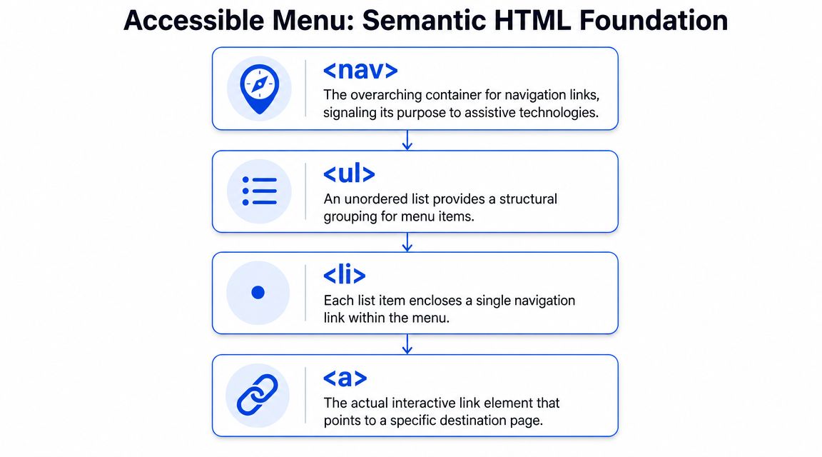
A surprising amount of menu debt starts when teams replace native elements with div and span to satisfy a design system. That usually creates extra work later: custom keyboard handlers, custom focus styles, custom announcements, and more places to regress.
Practical rule: If an item navigates, use a link. If it toggles visibility, use a button. Don’t make one element pretend to be both unless you’ve tested the interaction thoroughly.
Landmarks and bypass mechanisms
Most enterprise sites have more than one navigation region. Header navigation, breadcrumb navigation, utility links, footer navigation, and sidebars all compete for attention. Label those regions clearly with aria-label or aria-labelledby so assistive technology can distinguish them.
A few implementation basics matter more than teams expect:
- Use a real navigation landmark: Wrap the main menu in
<nav>so users can jump directly to it. - Label repeated nav areas clearly: Names like “Primary navigation” and “Footer navigation” reduce ambiguity.
- Add a skip link: A “Skip to main content” control lets keyboard users bypass large menus instead of tabbing through the same links on every page.
- Keep structure honest: If your menu is visually grouped like a list, code it like a list.
For teams working across markets, DesignStack’s guidance on making websites accessible for UK businesses is a useful cross-check because it ties practical implementation decisions back to broader accessibility obligations.
Accessible naming also matters inside the menu itself. If a toggle button opens a submenu, its accessible name needs to make sense out of context. In this regard, many teams should review patterns for accessible names on ARIA links, buttons, and menu items.
Keyboard Interaction and Focus Management
Expected keyboard behavior
If your menu can’t be used without a mouse, it’s already in a dangerous state from both a usability and legal standpoint. Keyboard support has to be intentional. It doesn’t happen automatically once you add dropdowns, animation, or custom triggers.
At a minimum, users need to be able to move through top-level controls with Tab and Shift+Tab, activate toggles with Enter or Space, and close open submenus with Escape. Focus must move predictably, and it must never land on content that is hidden from view.
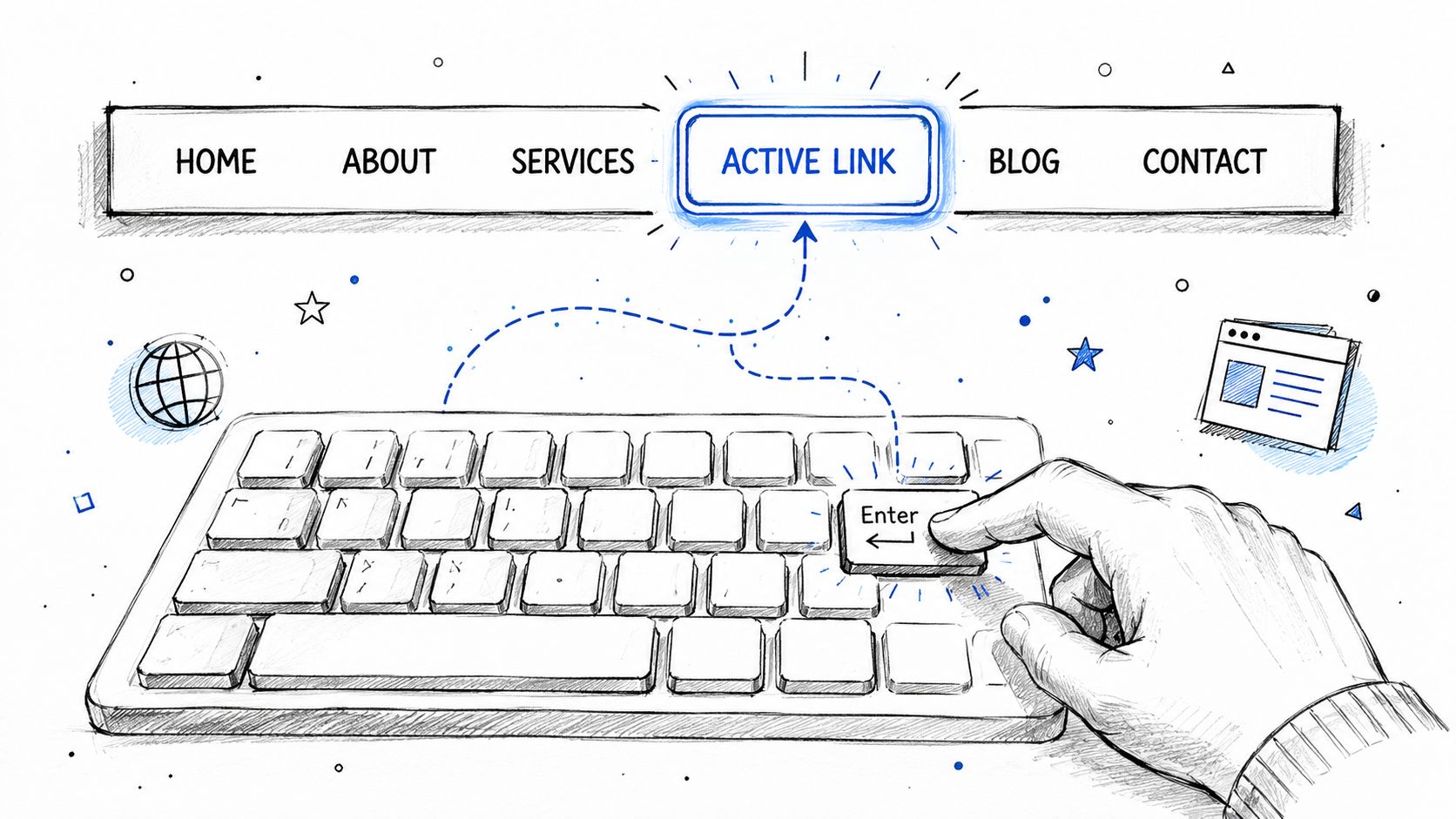
Common failures show up fast in manual testing:
- Hover-only disclosure: Keyboard users can reach the trigger but can’t open the submenu.
- Hidden but focusable items: Closed submenu links still receive focus, so users tab into invisible content.
- Focus loss on close: The submenu collapses and focus drops to the page body or disappears visually.
- No keyboard exit path: Users open a panel and have no reliable way to dismiss it.
A useful engineering check is to test the menu with your trackpad untouched. If a developer can’t complete a realistic navigation path by keyboard alone, the implementation isn’t finished. For a sharper QA workflow, use this keyboard accessibility testing checklist as part of release review.
Visible focus is a compliance issue
Teams still remove default browser outlines because they don’t match the design language. That’s one of the fastest ways to create an obvious failure. If you replace the browser default, the replacement has to be clearly visible.
A widely cited benchmark is that custom focus indicators should have at least a 3:1 contrast ratio against the background, as noted in AChecker’s guidance on developing accessible navigation menus. In practical terms, if users can’t tell where focus is while moving through a menu, the menu is not usable.
A menu can be technically keyboard operable and still fail in practice if users lose sight of focus during navigation.
This is especially damaging in large navigation systems with flyouts and layered panels. The user may still be pressing Tab, but they’re navigating blind. Designers and front-end teams should treat visible focus as a first-class component state, not a late-stage CSS patch. If you’re revisiting that pattern, this guide to focus indicator design is worth folding into your design system.
There’s one more issue that causes avoidable trouble: positive tabindex values. They create artificial focus order and usually make menu behavior less predictable, not more. If your component library still uses them, fix that early by reviewing why to avoid tabindex greater than 0.
ARIA for Dropdowns and Mega Menus
Choose the right pattern first
Most menu failures happen because teams pick the wrong interaction model, then try to patch it with ARIA. That’s backwards. Before adding attributes, decide whether you’re building a straightforward disclosure pattern or a true menu or menubar interaction.
The W3C’s ARIA Authoring Practices Guide provides a foundational pattern for a navigation menubar and defines expected keyboard interactions, roles, and states in its navigation menubar example. That reference is useful, but it isn’t a universal instruction to turn every site header into role=“menubar”.
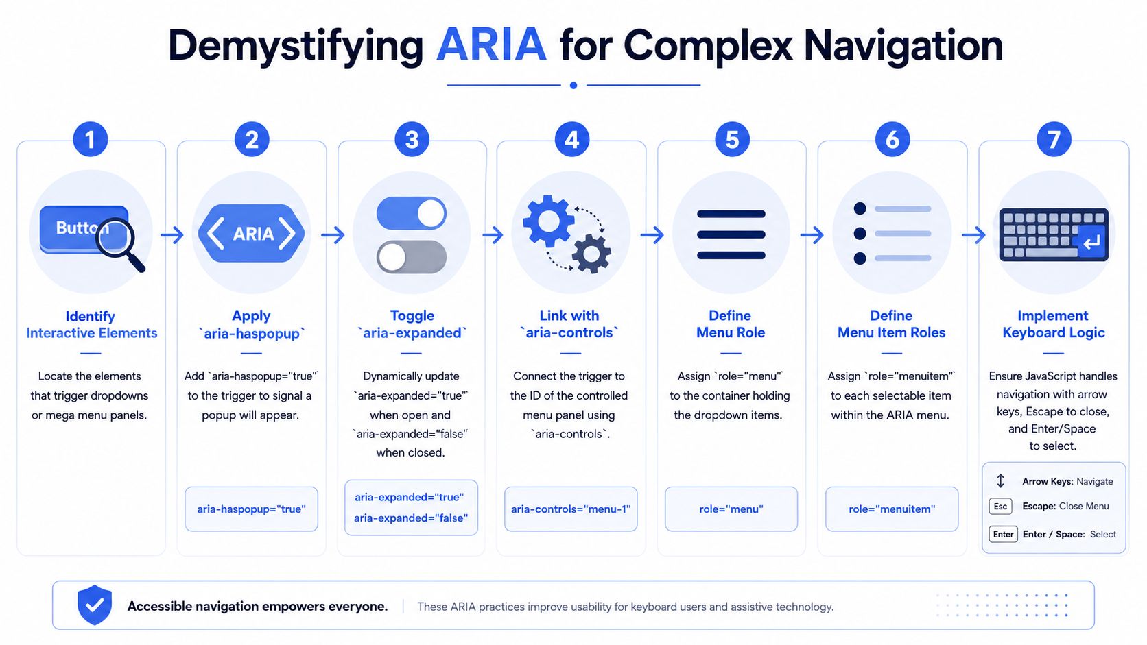
For many website headers, a disclosure approach is more stable:
- Use links for destinations: Top-level items that go somewhere should remain links.
- Use buttons for toggles: If an item only opens a submenu or panel, make it a button.
- Separate roles when needed: If a top-level item both goes somewhere and expands a panel, splitting link and toggle into separate controls usually reduces ambiguity.
- Keep expectations familiar: Website navigation doesn’t always need application-style arrow-key behavior.
A mega menu complicates this because it often contains headings, grouped links, promotional content, or search controls. That doesn’t always fit cleanly into a strict menu widget model.
Here’s a useful demo to compare against your implementation:
Where ARIA helps and where it causes damage
ARIA is valuable when it exposes the state and relationship of interactive elements. In dropdowns and mega menus, the most common attributes are aria-expanded, aria-haspopup, and sometimes aria-controls.
Use them carefully:
| ARIA attribute | Good use | Failure mode |
|---|---|---|
aria-expanded | Announces whether a submenu is open or closed | State doesn’t update when UI changes |
aria-haspopup | Signals that a trigger opens a popup or submenu | Added everywhere without matching behavior |
aria-controls | Associates a trigger with the controlled panel | IDs drift out of sync during refactors |
The worst pattern is adding ARIA to compensate for missing semantics. If a div behaves like a button, adding ARIA doesn’t make it a good button. It still needs keyboard support, focus behavior, and state changes that work consistently.
Don’t use ARIA as a shortcut around native HTML. Use it to clarify behavior that native HTML alone doesn’t express.
Why manual testing matters here
Automated scans prove less valuable for these specific scenarios. A scanner may detect missing attributes or obvious role misuse, but it won’t tell you whether focus returns to the right trigger after a panel closes, whether nested disclosures are understandable in screen reader browse mode, or whether a user can recover after opening the wrong branch in a mega menu.
A recent technical discussion highlighted a real gap between menus being merely keyboard accessible and being usable for screen reader users. Focus order, state announcements, and escape behavior are where many custom implementations fail, and those issues often need judgment rather than linting. That’s why teams should pair automated checks with a manual accessibility audit and a fast screen reader smoke test.
ADA Compliance Pros is one option for that work. Their audits cover keyboard navigation, focus handling, assistive technology behavior, and WCAG-mapped remediation guidance for interactive components such as menus.
Mobile and Responsive Navigation Patterns
Hamburger buttons need real semantics
Responsive navigation often introduces a second, separate accessibility problem. A desktop menu may work acceptably, then collapse into a mobile drawer that loses semantics, focus control, and state announcements.
The trigger for a hamburger menu should be a real <button>. It needs to be keyboard focusable, operable without touch, and it should communicate open and closed state with aria-expanded. If the control opens a menu container, that relationship should also be exposed in a consistent way.
Mobile design also raises a physical usability concern. Touch targets need enough size and spacing to work for users with limited dexterity or those operating on small screens. Product teams revising mobile navigation should account for touch target size and spacing as part of the component spec, not after QA files defects.
Off-canvas menus fail when focus logic is missing
The hardest part of mobile nav isn’t the icon. It’s focus behavior after the drawer opens.
When an off-canvas menu becomes active, users shouldn’t tab into content behind the overlay. Focus needs to move into the open menu in a predictable way, remain within the active interface while it is open, and return somewhere sensible when the user closes it. A close button and Escape support are both important because they give users an explicit exit path.
Two patterns tend to fail repeatedly in audits:
- Background content remains reachable: Users tab through hidden page controls while the mobile menu is visually on top.
- Closing the drawer drops focus unpredictably: Focus resets to the document instead of returning to the toggle.
Responsive navigation also deserves separate retesting. Teams sometimes assume a desktop pass means the mobile variant is covered. It isn’t. Different DOM structures, different event handlers, and different focus flows create different accessibility defects.
Prioritized Remediation Checklist for Your Menu
A CTO usually doesn’t need another abstract accessibility lecture. They need to know what to fix first. For an existing accessible navigation menu that may already carry debt, start with failures that block basic use, then move to issues that affect clarity and polish.
Navigation Menu Remediation Checklist
| Priority | Check | WCAG Guideline(s) | Common Failure |
|---|---|---|---|
| High | Use semantic navigation structure | WCAG principles for robust, understandable structure | div and span used instead of <nav>, lists, links, and buttons |
| High | Confirm all menu controls work by keyboard | Keyboard access requirements | Hover-only dropdowns or toggles that don’t open with keyboard input |
| High | Remove hidden items from focus order when closed | Focus order and operability expectations | Users tab into invisible submenu links |
| High | Add a visible focus style for every interactive item | Focus visibility requirements | Default outline removed with no equivalent replacement |
| Medium | Keep submenu state synchronized | Name, role, value expectations | aria-expanded says open while panel is closed |
| Medium | Provide a reliable close path | Keyboard operability and predictable interaction | No Escape handling or no close button in mobile nav |
| Medium | Return focus to the triggering control on close | Predictable focus management | Focus drops to body or jumps elsewhere |
| Lower | Label multiple navigation regions clearly | Landmark clarity | Screen reader users hear several unlabeled navigation landmarks |
| Lower | Review current-page indication and menu naming | Orientation and context | Users can’t tell where they are within a large site hierarchy |
The deeper issue is that keyboard accessibility alone is not enough. There is a significant gap between a menu being merely reachable in the tab order and being usable for screen reader users, especially around predictable focus order, announcement of state changes, and intuitive escape behavior, as discussed in this technical accessibility video.
When the checklist is not enough
If your menu includes nested flyouts, persistent panels, or a desktop mega menu that transforms into a mobile drawer, this checklist will find symptoms but not every root cause. Those patterns need hands-on testing with screen readers, keyboard-only input, and touch interactions.
That’s the point where a professional manual audit becomes less of a nice-to-have and more of a risk-control decision. If your self-review uncovers multiple failures in focus management or ARIA state handling, assume there are more interaction defects than the checklist shows.
Frequently Asked Questions about Accessible Navigation
Do I need ARIA roles on every site navigation menu?
No. Many site menus work better with native HTML and a disclosure pattern than with application-style menu roles. ARIA should support the interaction model you built, not decorate a standard list of links.
Should top-level menu items both link and open submenus?
That pattern can work, but it often confuses users. In practice, separating the landing-page link from the submenu toggle is usually easier to implement, easier to test, and easier for assistive technology users to understand.
Can automated accessibility tools validate a mega menu?
Only partially. They can catch some markup problems, but they won’t reliably judge focus return, nested reading order, announcement timing, or whether the interaction makes sense in real use.
What should happen when a user presses Escape in a menu?
Open submenu content should close, and focus should return somewhere predictable, usually the control that opened it. If Escape works inconsistently, users lose orientation quickly.
Does mobile navigation need separate accessibility testing?
Yes. Responsive breakpoints often change markup, event handling, and focus behavior. A desktop pass does not prove the hamburger menu or off-canvas drawer is accessible.
If your navigation is custom, heavily branded, or tied to a large design system, it’s worth getting a manual review before it becomes a site-wide compliance problem. ADA Compliance Pros provides accessibility audits, remediation guidance, and WCAG-focused testing for websites, web apps, and complex interactive components such as navigation menus.