
Accessible Tabs: Master WCAG Compliance 2026
Your team ships a polished dashboard. The tabs animate smoothly, the visual design passes review, and product signs off. Then a keyboard user lands on the component and can’t move between panels correctly. A screen reader user hears unlabeled controls or stale content. Legal sees a demand letter. Support sees churn from users who abandon the workflow.
That gap between visual completion and functional accessibility is where tab components become expensive. Accessible tabs are not a minor front-end detail. They affect ADA compliance, WCAG conformance, procurement reviews, and whether a core interface pattern is usable at all.
For CTOs, product managers, and compliance teams, tabs deserve more scrutiny than they usually get. They hide and reveal content, change state dynamically, and require custom keyboard behavior. That combination makes them one of the easier widgets to get wrong by copying code from a design system without validating how it behaves with assistive technology.
Why Seemingly Simple Tabs Create Major Compliance Risks
Tabs look simple because they are often judged by the screenshot. Compliance risk shows up in behavior, not appearance. If the active state isn’t exposed programmatically, if keyboard focus moves unpredictably, or if inactive content stays reachable, the component can fail users even when the UI looks finished.
Tabs often sit inside critical areas such as account settings, billing flows, healthcare portals, dashboards, and enterprise admin screens. When users can’t switch sections reliably, they can’t complete high-value tasks. That turns an implementation mistake into an operational issue for product, support, sales, and legal.
Visual quality doesn’t prove accessibility
A tab component can look organized and still be unusable. Native browser tabbing alone doesn’t satisfy the pattern. Users need state, relationships, and focus behavior that assistive technologies can interpret correctly.
Practical rule: If your tabs only work with a mouse, they are not production-ready.
Teams often borrow markup from a component library, add some ARIA, and assume the risk is covered. It usually isn’t. The failure modes are subtle: arrow keys don’t work, focus stays on a hidden control, or the selected tab and visible panel drift out of sync after a re-render.
For development teams building broader accessibility maturity, MTechZilla’s web accessibility blog is a useful companion read because it frames accessibility as part of implementation discipline, not a post-launch cleanup task.
Where business risk shows up
The cost of broken tabs isn’t limited to conformance language in a report. It affects real workflows.
- Procurement risk: Government buyers and enterprise customers often expect defensible accessibility evidence, not visual demos.
- Product risk: Hidden content that remains focusable creates confusion in setup flows and admin tools.
- Legal risk: A user blocked from navigation can form the basis of a complaint even if the rest of the page seems accessible.
- Engineering risk: Once a broken tab pattern lands in a design system, teams repeat the same defect across many screens.
A copied component can spread the same accessibility defect faster than any one-off bug.
That is why tabs shouldn’t be treated like decoration. They are an interactive widget with a defined behavioral contract. If your team doesn’t implement that contract precisely, the component becomes a compliance liability.
The Core Structure of Accessible Tabs with ARIA
The tab pattern starts with structure, not JavaScript. The modern pattern is grounded in the WAI-ARIA tab panel guidance summarized by Deque, which defines a tabset as a tablist containing tabs and associated tabpanels. The point isn’t just to style a row of buttons. The point is to communicate relationships and state to assistive technologies through tablist, tab, tabpanel, aria-controls, and aria-labelledby.
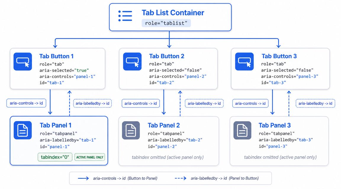
Why roles matter more than visual grouping
A visual tab strip tells sighted users that several controls belong together. A screen reader doesn’t infer that from CSS. You have to declare it.
Think of the component as three layers of meaning:
| Element | What it tells assistive tech | What developers must keep synchronized |
|---|---|---|
role=“tablist” | These controls belong to one tab system | The set of tabs is grouped intentionally |
role=“tab” | This control selects a panel | Selected state and keyboard focus |
role=“tabpanel” | This region contains the selected tab’s content | Visibility, label, and focusability |
The relationship also has to go both directions.
- From tab to panel:
aria-controlspoints from the tab to the panelid - From panel to tab:
aria-labelledbypoints back to the tabid - Selected state: Only the active tab should expose
aria-selected=“true”
If your team needs a broader reference for ARIA widgets, the ARIA widget roles and required attributes guide helps anchor this pattern in the larger set of interactive components.
A practical markup pattern
Use real buttons for tabs unless you have a specific reason not to. Buttons already support click and focus behavior. Then layer the ARIA semantics on top.
<div role="tablist" aria-label="Account settings sections">
<button
id="tab-profile"
role="tab"
aria-selected="true"
aria-controls="panel-profile"
tabindex="0">
Profile
</button>
<button
id="tab-security"
role="tab"
aria-selected="false"
aria-controls="panel-security"
tabindex="-1">
Security
</button>
<button
id="tab-notifications"
role="tab"
aria-selected="false"
aria-controls="panel-notifications"
tabindex="-1">
Notifications
</button>
</div>

<section
id="panel-profile"
role="tabpanel"
aria-labelledby="tab-profile"
tabindex="0">
...
</section>

<section
id="panel-security"
role="tabpanel"
aria-labelledby="tab-security"
hidden>
...
</section>

<section
id="panel-notifications"
role="tabpanel"
aria-labelledby="tab-notifications"
hidden>
...
</section>
What works here is the explicit contract. Each tab identifies its panel. Each panel identifies its tab. Only one panel is visible at a time, and the active tab exposes the selected state.
What doesn’t work is partial ARIA. A row of buttons with click handlers is not enough. A set of panels with CSS classes but no programmatic relationships is not enough. Compliance reviewers and assistive technology users both need the same thing: a component that exposes its structure clearly and consistently.
Mastering Keyboard Interaction and Focus Control
Most broken tab components fail on keyboard behavior before they fail anywhere else. Developers often leave tabs in the normal tab sequence, which forces users to tab through every trigger, or they wire arrow keys inconsistently and create a focus model no one expects.
The accepted pattern is more specific than that. The keyboard model described by The A11Y Collective aligns with WAI-ARIA Authoring Practices: left and right arrows move among horizontal tabs, up and down arrows do so for vertical tabs, Home and End jump to the first and last tab, Tab moves from the active tab into the active panel, and the active tab uses tabindex=“0” while inactive tabs use tabindex=“-1”.
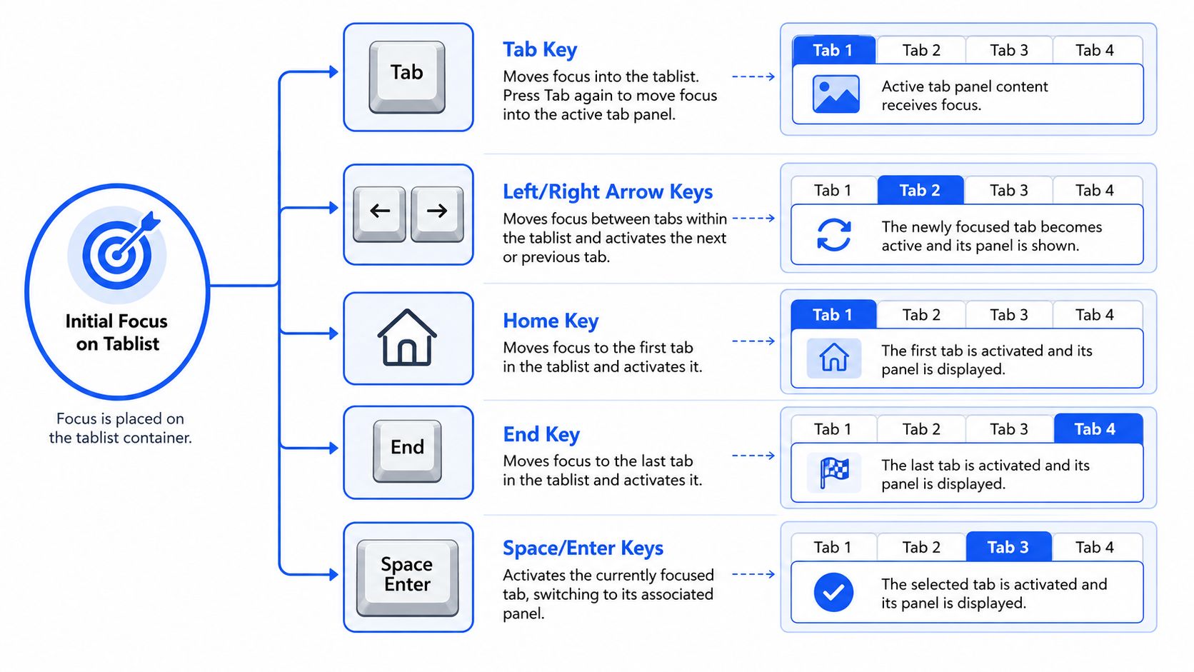
The keyboard model users expect
This is the model your component should implement.
- Arrow keys move within the tablist: Horizontal tabs use Left and Right. Vertical tabs use Up and Down.
- Home and End provide shortcuts: Focus jumps to the first or last tab.
- Tab leaves the tablist: It should move into the active panel, not walk through every inactive tab.
- Only one tab is in the tab order: The active tab gets
tabindex=“0”. The others gettabindex=“-1”.
This is why tabs don’t behave like a row of ordinary buttons. The interaction is composite. The user enters the widget once, moves within it using arrows, then tabs out of it into panel content.
A short demo helps teams grasp the rhythm of the interaction before they implement it:
That same focus discipline shows up in other complex widgets. If your team has already worked through an accessible modal dialog focus trap guide, the parallel is useful: focus behavior must be intentional, predictable, and bounded by the component’s logic.
Automatic activation versus manual activation
For many product teams, this is the design decision that gets missed.
Automatic activation means the panel changes as soon as a tab receives focus through arrow keys. Manual activation means focus moves first, then the user confirms with Enter or Space. The accessible tabs pattern commonly supports automatic activation because it keeps navigation fast and predictable for standard tab interfaces.
If content switching is lightweight and expected, automatic activation is usually the smoother choice.
Manual activation can still make sense when switching tabs launches something disruptive, such as media playback, heavy rendering, or a context change the user may not want on simple arrow navigation. The mistake is mixing the two models halfway, where some keys move focus and others change state inconsistently.
A practical implementation checklist:
- Store one active index and treat it as the single source of truth.
- Update focus and state together when users move inside the tablist.
- Change
aria-selectedimmediately for the newly active tab. - Update
tabindexvalues so only the active tab remains tabbable. - Reveal only the active panel and keep the inactive panels out of the user’s path.
Focus visibility matters too
Developers sometimes get the key handlers right and still fail usability by removing outlines. That creates a second accessibility defect. Keyboard users need to see where focus is after each movement.
For teams documenting requirements or reviewing acceptance criteria, the keyboard navigation glossary entry is useful because it gives product, design, QA, and engineering a shared vocabulary. That reduces the common situation where everyone agrees keyboard access matters but no one specifies what the tab component must perform.
Building Accessible Tabs with JavaScript and Frameworks
Once the semantics and keyboard model are clear, the implementation becomes a state management problem. Your script needs to keep the tabs, the panels, and the focus model synchronized. If any part lags, users get stale announcements, hidden focus targets, or mismatched selection states.
A useful benchmark from the City of Helsinki tab-list implementation notes is that exactly one tab should be open on render, with non-selected tabs set to tabindex=“-1” and the selected tab set to tabindex=“0”. That deterministic starting state prevents a surprising number of bugs.
A vanilla JavaScript implementation pattern
Start with a single activation function. Don’t scatter state updates across click handlers and keyboard handlers independently.
<div class="tabs">
<div role="tablist" aria-label="Billing sections">
<button id="tab-overview" role="tab" aria-controls="panel-overview" aria-selected="true" tabindex="0">Overview</button>
<button id="tab-invoices" role="tab" aria-controls="panel-invoices" aria-selected="false" tabindex="-1">Invoices</button>
<button id="tab-methods" role="tab" aria-controls="panel-methods" aria-selected="false" tabindex="-1">Payment methods</button>
</div>


<section id="panel-overview" role="tabpanel" aria-labelledby="tab-overview" tabindex="0">...</section>


<section id="panel-invoices" role="tabpanel" aria-labelledby="tab-invoices" hidden>...</section>


<section id="panel-methods" role="tabpanel" aria-labelledby="tab-methods" hidden>...</section>

</div>
const tabs = Array.from(document.querySelectorAll('[role="tab"]'));
const panels = Array.from(document.querySelectorAll('[role="tabpanel"]'));

function activateTab(nextTab, moveFocus = true) \{
tabs.forEach((tab) => \{
const selected = tab === nextTab;
const panel = document.getElementById(tab.getAttribute('aria-controls'));

tab.setAttribute('aria-selected', selected ? 'true' : 'false');
tab.setAttribute('tabindex', selected ? '0' : '-1');

if (panel) \{
panel.hidden = !selected;
if (selected) \{
panel.setAttribute('tabindex', '0');
\} else \{
panel.removeAttribute('tabindex');
\}
\}
\});

if (moveFocus) nextTab.focus();
\}

tabs.forEach((tab, index) => \{
tab.addEventListener('click', () => activateTab(tab, false));

tab.addEventListener('keydown', (event) => \{
let nextIndex = index;

if (event.key === 'ArrowRight') nextIndex = (index + 1) % tabs.length;
if (event.key === 'ArrowLeft') nextIndex = (index - 1 + tabs.length) % tabs.length;
if (event.key === 'Home') nextIndex = 0;
if (event.key === 'End') nextIndex = tabs.length - 1;

if (nextIndex !== index) \{
event.preventDefault();
activateTab(tabs[nextIndex]);
\}
\});
\});
What works here is centralization. One function updates aria-selected, tabindex, and panel visibility together. That reduces drift.
What changes in React and Vue
Frameworks introduce a different class of bug. The markup may look correct at first render, then a re-render leaves attributes stale or focus parked on a node that no longer exists. Such conditions lead teams to confuse component state with accessibility state. They are related, but they are not identical.
Watch for these framework-specific failure points:
- Conditional rendering: If you unmount and remount panels, test where focus goes after the switch.
- Derived props: Don’t compute
aria-selectedin one place and visibility in another if they can diverge. - Async updates: If panel content loads later, verify users still receive a coherent experience.
- Live changes inside a panel: Some updates may need announcement logic. That’s where patterns like ARIA live regions for notifications become relevant.
When teams need implementation verification beyond linting and automated checks, one option is a manual review from ADA Compliance Pros, which provides audits, remediation guidance, and WCAG-mapped findings for production interfaces. That matters most when your tabs live inside customer-facing flows, regulated products, or procurement-sensitive applications.
Avoiding Common Mistakes in Tab Implementation
A mechanically correct tab widget can still fail in production. The biggest problems tend to show up where product decisions meet layout constraints, especially on smaller screens, high zoom, and framework-driven interfaces.
One commonly missed issue, highlighted in Make Things Accessible on responsive and accessible tabbed interfaces, is responsiveness. Many examples explain roles and keyboard controls but don’t deal with tab strips that wrap, overflow, or stop feeling like tabs at narrow widths. If the layout changes, the hiding strategy and interaction model often need to change too.
Responsive tabs break in predictable ways
A horizontal tablist that works on desktop may become awkward or misleading on mobile and at high zoom. Wrapped tabs make arrow-key navigation less intuitive. Overflow containers can obscure the active item. In some products, an accordion or disclosure pattern is the better responsive fallback.
If you’re considering that change, accessible accordions and disclosures are often a more stable pattern for narrow screens because they match the reading order more naturally and reduce the need for hidden parallel content regions.
Good accessible UI work isn’t only about adding ARIA. It’s about choosing the pattern that still makes sense when the layout is stressed.
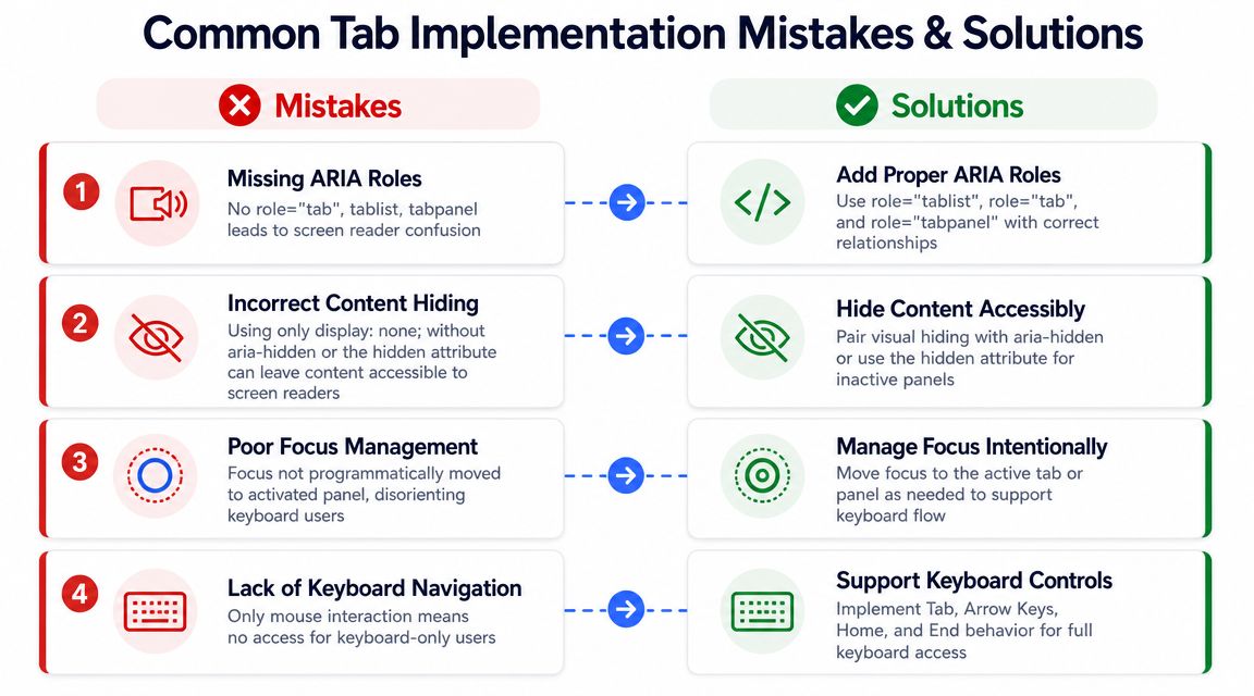
Another repeated mistake is leaving inactive panel content available to assistive technology or keyboard focus. A panel that’s visually hidden but still reachable is a common source of confusion during audits. Users encounter content that appears unavailable, or they tab into controls that seem disconnected from what they just selected.
Red flags that deserve manual review
Automated tools can catch missing roles and some attribute errors. They usually won’t tell you whether the experience is coherent.
Use this review list during code review and QA:
- Selection drift: A tab shows as selected visually, but
aria-selectedstill reports the old state. - Focusable hidden content: Users can tab into controls inside an inactive panel.
- Focus loss after switching: Focus jumps to the document body or disappears when a panel re-renders.
- Broken responsive behavior: The tablist wraps or overflows, but keyboard expectations remain unchanged.
- Inconsistent activation model: Arrow keys move focus on one screen and activate content on another.
A lot of teams stop when the scanner reports no ARIA errors. That isn’t enough. If the component behaves inconsistently across devices, zoom levels, or screen reader combinations, it still creates business risk.
How to Test Your Tabs for WCAG Compliance
The most important testing question isn’t whether the markup looks compliant. It’s whether a user can operate the component predictably from start to finish. MDN’s tab role guidance notes a key distinction: a component can be mechanically correct and still fail users if re-renders break keyboard behavior or leave inactive panels exposed to assistive technology, which is why hands-on testing matters so much in practice. See MDN’s tab role reference.
Manual checks your QA team should run
Run the tab component with only a keyboard first. Then repeat with a screen reader. Then test it under responsive conditions and zoom. If any one of those passes while another fails, the component isn’t done.
A simple workflow:
- Keyboard-only pass: Enter the tablist, move among tabs with the expected arrow keys, use Home and End, then Tab into the active panel.
- Screen reader pass: Confirm the selected state, tab names, and associated panel labeling are announced sensibly.
- Responsive pass: Check small viewports and high zoom to verify the pattern still works or degrades to a better alternative.
- Regression pass in framework builds: Trigger re-renders, lazy loading, and conditional states.
The testing stack shouldn’t rely on one tool category alone. Automated scans help find missing roles and obvious issues. Manual review catches the interaction defects that tools often miss. For teams comparing tool coverage and limits, this guide to accessibility testing tools is a useful starting point.
Here is a practical WCAG mapping your QA and compliance teams can use in audit documentation.
| Feature | WCAG Success Criterion | Level |
|---|---|---|
| Full operation by keyboard | 2.1.1 Keyboard | A |
| Visible focus indicator on tabs | 2.4.7 Focus Visible | AA |
| Programmatic state and role exposure for tabs and panels | 4.1.2 Name, Role, Value | A |
Manual testing is what tells you whether the component is usable, not just syntactically decorated.
For procurement, VPAT work, or internal compliance signoff, that distinction matters. A defensible accessibility position comes from observed behavior, documented findings, and retesting after remediation.
Frequently Asked Questions about Accessible Tabs
When should teams use accessible tabs instead of another pattern
Use tabs when the content is closely related, users benefit from staying in one context, and the tab labels remain short and clear. If content becomes long-form, highly sequential, or difficult to fit in a stable horizontal set, a disclosure or accordion pattern is often easier to use.
Do accessible tabs require ARIA if we use button elements
Yes. Native buttons help, but they don’t communicate the tab pattern on their own. The relationships between the tablist, each tab, and each tabpanel still need to be exposed programmatically.
Should inactive tab panels be hidden
Yes. Inactive panels shouldn’t remain available in the reading order or focus order while they are not active. Otherwise users can encounter content that appears hidden visually but is still reachable.
How many tabs should we place in one row
Keep the set compact. Practical guidance discussed by James Bateson notes that some recommendations advise keeping tab counts low, and Stanford advises fewer than 6 tabs so they fit on one desktop row in common implementations, as summarized in this article on making tab patterns accessible.
Are automated accessibility tools enough to validate tabs
No. They are useful for catching missing roles, attribute problems, and some structural issues. They won’t reliably detect broken focus flow, stale state after re-renders, or whether a screen reader user can understand the interaction.
What’s the most common implementation mistake
Treating the component like styled navigation instead of a synchronized widget. The failures usually come from state drift between the selected tab, the visible panel, and the actual focus target.
If your product relies on dashboards, settings screens, or account flows that use accessible tabs, a manual review can catch the interaction defects automated tools miss. ADA Compliance Pros helps teams audit web apps, map issues to WCAG and procurement requirements, and produce remediation guidance and VPAT-ready documentation grounded in hands-on testing.