
ARIA Best Practices for Web Accessibility in 2026
Most ARIA advice starts with the wrong instinct. Teams hear “make it accessible” and respond by adding attributes. That feels proactive, but it often creates more audit failures, not fewer.
ARIA is powerful when you use it for the problems HTML can’t solve on its own. It becomes risky when teams use it as a blanket fix for poor semantics, rushed component design, or missing keyboard support. For organizations concerned about ADA exposure, procurement reviews, WCAG conformance, or VPAT accuracy, that distinction matters. A broken ARIA implementation doesn’t just confuse screen readers. It creates evidence that accessibility was attempted carelessly.
The practical standard is simple. Use native HTML first. Use ARIA only where native behavior is insufficient. Then verify the result with keyboard and screen reader testing, not just a scanner.
Why ARIA Can Increase Your Accessibility Risk
ARIA can correlate with worse accessibility outcomes when teams use it incorrectly. The 2026 WebAIM Million found that home pages with ARIA present averaged 59.1 detected errors, against 42 on pages without ARIA — a gap of 17 errors per page.
That doesn’t mean ARIA is the problem. Misuse is the problem.
A development team usually gets into trouble when it treats ARIA as a repair kit for components that were never designed accessibly in the first place. A div becomes a “button” through role=“button”, but nobody adds keyboard support. A modal gets role=“dialog”, but focus still escapes behind it. An accordion gets aria-expanded, but the value never changes when the panel opens. In an audit, those are not edge cases. They’re common failures.
Practical rule: ARIA can expose intent, but it can’t supply missing semantics, keyboard interaction, or focus logic by itself.
From a compliance perspective, this matters because accessibility reviews don’t stop at whether an attribute exists. Reviewers test whether the component behaves correctly for keyboard users and assistive technology users. If it doesn’t, the presence of ARIA often makes the defect easier to identify, not easier to defend.
For product and engineering leaders, the takeaway is straightforward:
- More ARIA isn’t safer. Extra attributes don’t reduce risk if the underlying component is still inaccessible.
- Design system decisions matter early. Bad component primitives multiply ARIA errors across the product.
- Audit readiness depends on behavior. A screen reader user experiences interactions, not markup intentions.
Teams that follow solid aria best practices ship cleaner interfaces and spend less time on remediation during audits, procurement reviews, and legal response.
The Foundational Rules of ARIA Implementation
The W3C’s ARIA Authoring Practices Guide formalizes the first rule of ARIA: use native HTML semantics whenever they provide the needed behavior, and only add ARIA to supplement them, not replace them, as documented in the W3C ARIA Authoring Practices Guide.
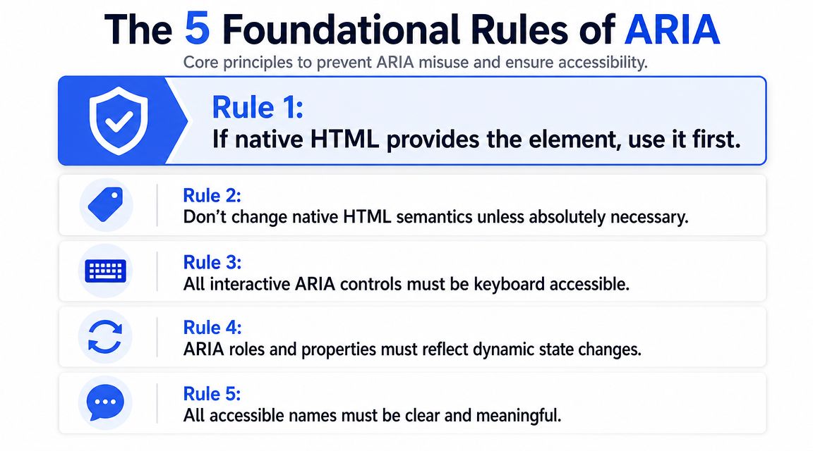
That single rule eliminates a large share of preventable ARIA defects. If you can use <button>, <a>, <input>, <select>, <dialog>, <nav>, or <main>, use them. They already expose roles, states, and keyboard behavior to browsers and assistive technologies more reliably than custom equivalents.
Start with native elements
Native HTML gives you a stronger baseline than custom controls with ARIA layered on top.
- Use a real button for actions. Don’t build clickable
divelements when a<button>already handles focus and keyboard activation. - Use a real link for navigation. If it changes location, it should usually be an
<a>. - Use structural HTML for landmarks.
<header>,<nav>,<main>, and<footer>usually beat generic containers with landmark roles.
If your team needs a broader baseline for semantic implementation, this guide to understand website accessibility best practices is a useful companion resource.
Treat ARIA as behavior plus semantics
ARIA isn’t just a set of labels. It’s a contract. If you add a role, users expect the interaction model that goes with it.
A role=“tab” isn’t valid in practice unless the component behaves like tabs. A role=“dialog” isn’t complete unless focus moves into it and stays managed while it’s open. A disclosure control with aria-expanded must update that state when the panel opens and closes.
That’s why teams should review valid ARIA attributes during component implementation, not after QA finds mismatches.
ARIA should describe what the interface actually is right now, not what the developer intended when they wrote the first version.
Name controls in ways users can understand
Accessible names are where many otherwise solid components fail. The safest pattern is visible text tied to the control. When a visible label exists, programmatic naming should align with it. For icon-only controls, an ARIA-based name may be necessary, but it should still be concise and specific.
Use this naming hierarchy in practice:
| Situation | Better approach | Riskier approach |
|---|---|---|
| Visible form field label | Native <label> association | aria-label replacing visible text |
| Icon-only button | Short programmatic name | Vague label like “Click here” |
| Complex widget label | aria-labelledby to visible text | Detached custom naming with no visual match |
Good aria best practices produce simpler code. That’s the hidden benefit. Teams maintain native controls more easily, test them faster, and create fewer regressions when design systems evolve.
Common ARIA Mistakes That Fail Audits
The most expensive ARIA issues aren’t exotic. They’re ordinary component mistakes that repeat across forms, navigation, modals, filters, and dashboards.
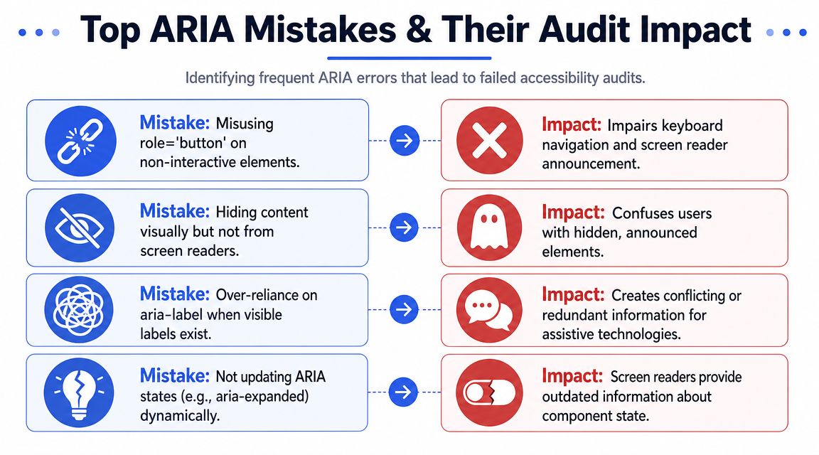
Redundant roles and fake controls
Some failures are easy to spot because the markup fights itself.
Bad
<button role="button">Save</button>Better
<button>Save</button>The extra role adds no value. It increases complexity and signals that the team may be applying ARIA without understanding the native element.
More dangerous is the fake control pattern.
Bad
<div role="button" onclick="openMenu()">Menu</div>
Better
<button type="button" aria-expanded="false">Menu</button>The first version often fails keyboard access unless developers add focusability and keyboard event handling. The second starts from the correct control type.
Broken relationships and hidden content problems
Relationship attributes are another common audit failure. If aria-controls, aria-labelledby, or aria-describedby points to a missing or incorrect element, assistive technology users get incomplete context.
Reviewers also frequently find visible content hidden from screen readers by mistake.
Bad
<p aria-hidden="true">Payment failed. Try another card.</p>
Better
<p>Payment failed. Try another card.</p>
aria-hidden=“true” should not sit on meaningful, visible content. If a user can see the message, there needs to be a strong reason before you remove it from the accessibility tree.
Here’s another common naming error.
Bad
<button aria-label="Submit form">Submit</button>Better
<button>Submit</button>If visible text already names the control, adding aria-label can create unnecessary conflict. In audits, that often triggers questions around consistency and maintenance discipline.
State changes that never update
Dynamic states are where many single-page applications break down. Developers add aria-expanded, aria-selected, or aria-hidden in the initial render, then forget to keep those values synchronized with the UI.
If the screen says “open” and the accessibility tree still says “collapsed,” the component is broken even if it looks fine in the browser.
A quick review table helps teams catch recurring failures:
| Mistake | Why it fails |
|---|---|
| Redundant role on native element | Adds noise without improving accessibility |
| Custom button on non-semantic element | Requires manual keyboard and focus handling |
aria-hidden=“true” on visible content | Removes meaningful content from assistive tech users |
Stale aria-expanded or aria-selected | Announces the wrong state |
These defects are one reason automated results can look cleaner than the actual user experience. A scanner may flag syntax. It often won’t tell you whether the component interaction makes sense in real use.
Using ARIA for Custom and Dynamic Components
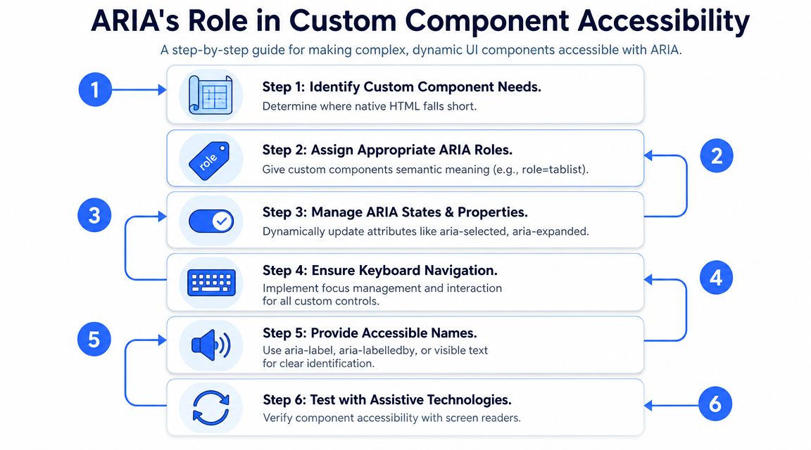
ARIA becomes necessary when your product uses interactions that native HTML doesn’t fully express on its own. That’s common in modern front ends. The W3C APG stresses that custom widgets like tabs, sliders, and menus must follow specific interaction patterns and focus management rules, as detailed in the W3C APG design patterns guidance.
Tabs, disclosures, and dialogs
Three component families create repeat issues in audits.
Tabs need more than visual styling. The tab list, each tab, and each panel must have the right relationships. Selected state has to update as users move between panels. Keyboard support matters just as much as the attributes. For implementation details, use this guide to accessible tabs.
Accordions and disclosures usually need a control that exposes expanded and collapsed state. The trigger should be a real button, not a generic container. If your team is standardizing this pattern, review the guidance on accessible accordions and disclosures.
Modal dialogs need explicit focus management. Naming the container as a dialog doesn’t stop keyboard users from tabbing into background controls. That’s why teams should pair semantics with a tested focus trap pattern, as covered in this article on accessible modal dialog focus trap.
What custom widgets need beyond attributes
Teams usually succeed when they treat each custom component as a bundle of requirements:
- Semantic role: What is this control or container?
- Accessible name: How will assistive technology identify it?
- Current state: Is it expanded, selected, checked, busy, hidden?
- Keyboard model: How does a keyboard user operate it?
- Focus behavior: Where does focus move on open, close, or selection?
- Announcement strategy: What changes need to be exposed without moving focus?
That last item matters in dynamic interfaces. Notifications, inline validation, and loading changes often need dedicated announcement handling through ARIA live regions and notifications.
Custom UI can be compliant. But once you replace native behavior, you own every part of the accessibility model.
That’s the trade-off many product teams underestimate. Design flexibility goes up. So does implementation responsibility.
Implementing ARIA Live Regions for User Notifications
Live regions solve a specific problem. Content changes on the page, but focus shouldn’t move. A screen reader still needs to know something important happened.
Choose polite or assertive based on interruption cost
Use aria-live=“polite” when the update matters, but it can wait until the user is idle. Search result counts, autosave confirmations, and background status updates are common examples.
Use aria-live=“assertive” when the update is urgent and should interrupt current speech. Form submission failures, security session warnings, or blocking payment errors often fit here.
The wrong choice creates friction. If every update is assertive, users get interrupted constantly. If everything is polite, urgent failures may be missed.
A practical shorthand helps:
| Need | Common pattern |
|---|---|
| Non-urgent update | aria-live=“polite” or role=“status” |
| Urgent error | aria-live=“assertive” or role=“alert” |
Common live region patterns that work
Two patterns are dependable in production.
- Status messages after async actions: “Profile saved” or “3 filters applied” can be announced without moving focus.
- Inline validation that appears dynamically: If an error is injected after submission, a live region can announce it while the user remains in context.
Keep the message short. Keep the region stable in the DOM when possible. Don’t flood it with repeated updates.
A common failure looks like this: the visual UI updates, but the screen reader hears nothing because the text appeared inside a container that wasn’t configured to announce changes. Another failure is the opposite: teams put entire page regions inside live areas, and users hear too much.
Good aria best practices for live regions stay narrow. Announce the change that matters, once, in the least disruptive way possible.
How to Test and Verify ARIA Implementation
Automated scanners are useful, but they don’t prove ARIA works. W3C WAI states the limit without a percentage attached: “no tool alone can determine if a site meets accessibility standards”, and knowledgeable human evaluation is required. ARIA is where that bites hardest, because a scanner can confirm an attribute is present and spelled correctly while the announcement it produces is still wrong, missing, or contradicted by the visual state. Dynamic ARIA has to be tested by listening to it in NVDA, JAWS, and VoiceOver.
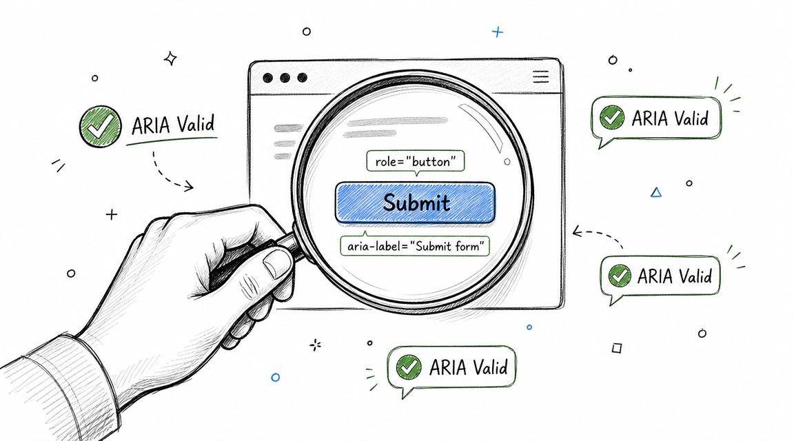
That limitation changes how teams should validate compliance. A linter can tell you an attribute exists. It often can’t tell you whether focus order makes sense, whether a live region announces at the right moment, or whether a custom tab interface behaves correctly with a screen reader.
A verification process teams can repeat
Use a repeatable review process for every custom component and every regression cycle.
- Test with keyboard only. Tab through the interface, activate controls with expected keys, and verify visible focus.
- Test with screen readers. Check names, roles, states, and announcements with NVDA, JAWS, and VoiceOver where relevant to your support matrix.
- Inspect the accessibility tree. Browser tooling can reveal whether the component exposes the expected semantics.
- Re-test dynamic changes. Open and close dialogs, expand disclosures, switch tabs, trigger validation, and confirm ARIA states update.
If your team wants a broader operational baseline, this comprehensive guide to web accessibility is a useful overview of audit and remediation workflow.
For tool-assisted triage, this review of accessibility testing tools helps teams understand where automation fits and where it falls short.
A short walkthrough can help teams visualize what manual verification looks like in practice:
Why manual audits still matter
An accessibility audit should evaluate user outcomes, not just markup presence. That’s especially true for ARIA-heavy design systems and SPAs, where many failures are behavioral.
For organizations preparing for procurement reviews, VPAT work, or remediation planning, manual review is the defensible layer. ADA Compliance Pros provides audits with WCAG-mapped findings, remediation guidance, and re-test verification for web products that need documented accessibility review.
Frequently Asked Questions About ARIA
Should I use aria-label or aria-labelledby?
Use visible text and native labeling methods first. When you need ARIA naming, aria-labelledby is usually more maintainable because it references visible text already in the interface. aria-label is more suitable for edge cases like icon-only buttons.
Does ARIA improve SEO?
ARIA’s purpose is accessibility, not search ranking. Better semantics can improve clarity for assistive technologies, but ARIA shouldn’t be treated as an SEO tactic.
Is role=“application” a good way to improve screen reader support?
Usually no. It changes how some assistive technologies interact with content and can create a worse experience if used without a very specific reason and a fully tested interaction model.
When should I use aria-hidden=“true”?
Use it for content that should be ignored by assistive technologies, such as decorative icons or duplicated visual elements. Don’t use it on focusable elements or visible, meaningful content users need to understand or operate the interface.
Can ARIA fix a bad custom component?
No. ARIA can expose semantics and state, but it can’t repair missing keyboard support, poor focus management, or broken interaction logic.
Is native HTML always enough?
Not always. Native HTML covers many controls well, but complex widgets and dynamic updates often need ARIA. The safest approach is to start native, then add only the ARIA required for the pattern.
If your team is relying on ARIA in a design system, SPA, or enterprise web app, consider an expert review before the next audit cycle. ADA Compliance Pros helps organizations evaluate WCAG conformance, identify ARIA failures that scanners miss, and document remediation work for ADA, Section 508, and procurement requirements.