

A city’s communications office publishes council agendas, utility notices and a weekly email. A software vendor’s marketing team answers a procurement questionnaire that asks whether its website meets WCAG 2.1 AA. A design lead receives an audit report full of contrast and alt text findings. None of these teams writes code, and each has been told to publish accessible content: pages, emails and documents that conform to WCAG.
For state and local governments the requirement is in the regulation. 28 CFR 35.200 requires WCAG 2.1 Level A and AA from April 26, 2027 for public entities with a total population of 50,000 or more, other than special district governments. Smaller entities and special district governments follow on April 26, 2028.
Both dates come from an interim final rule of April 20, 2026 that moved each deadline back a year, and in it the Justice Department says it “plans to engage in future rulemaking processes related to the substantive requirements of the 2024 final rule.” Federal agencies work to WCAG 2.0 Level A and AA under Section 508. This guide sets out the criteria that turn on what the people who write and design a page decide, what each one says, and how to test it without a developer.
Thirty-one of WCAG’s 50 Level A and AA criteria turn on what writers and designers choose
WCAG 2.1 has 50 success criteria at Level A and AA: 30 at A and 20 at AA, counted in the W3C Recommendation. Thirty-one of them turn on choices a writer, editor or designer makes: the words of a heading, link, label or error message, the text behind an image, the media a team publishes, and the colors, type and layout of a design system. The other 19 sit mainly with developers: keyboard operation, focus order, names and roles, timing and status messages. Developers will find what each UI component must pass under WCAG 2.2 in a separate index.
Title II’s definition of web content in 28 CFR 35.104 lists “text, images, sounds, videos, controls, animations, and conventional electronic documents,” so accessible web content under the rule starts with these decisions. The thirty-one have the same wording in WCAG 2.1, the edition Title II incorporates, and in WCAG 2.2, a W3C Recommendation since October 5, 2023 whose current version is dated December 12, 2024, according to its publication history.
Four of them, 1.4.10, 1.4.11, 1.4.12 and 2.5.3, arrived in WCAG 2.1 and are not in the WCAG 2.0 standard that Section 508 applies. A contract that names WCAG 2.2 adds three more that land on designers, 2.4.11 Focus Not Obscured (Minimum), 2.5.8 Target Size (Minimum) and 3.2.6 Consistent Help, covered in what WCAG 2.2 AA adds to 2.1. Three Level AAA criteria come up below, 1.4.6, 2.4.9 and 3.1.5, and no rule discussed here requires them; the guide to WCAG’s levels and versions explains the difference.
| Criterion and level | What the content or design team decides | First test |
|---|---|---|
| 1.1.1 Non-text Content, A | Alt text for each image that carries meaning; empty alt for decoration | Hide the images: the page still says everything |
| 1.2.1 Audio-only and Video-only (Prerecorded), A | A transcript for audio; a transcript or audio track for a silent video that carries information | Ask what a person who cannot hear, or cannot see, would miss |
| 1.2.2 Captions (Prerecorded), A | Captions with every word, speaker and meaningful sound | Compare two minutes of captions with the audio |
| 1.2.3 Audio Description or Media Alternative (Prerecorded), A | Description of what is only seen, or a full text alternative | Listen without watching and list what you missed |
| 1.2.4 Captions (Live), AA | Captions on live audio in a video stream | Watch the stream with captions on |
| 1.2.5 Audio Description (Prerecorded), AA | Narrated description of what is only seen | The same list; a transcript no longer counts |
| 1.3.1 Info and Relationships, A | Real headings, lists and tables, not bold lines that look like them | Open the headings list |
| 1.3.2 Meaningful Sequence, A | A reading order that keeps its meaning without the layout | Read the page with its styles turned off |
| 1.3.3 Sensory Characteristics, A | Instructions that do not depend on shape, color, size, position or sound | Search the copy for “red”, “green”, “left”, “right”, “below” |
| 1.4.1 Use of Color, A | A second cue beside every color that means something | View the page in grayscale |
| 1.4.2 Audio Control, A | A pause, stop or volume control for sound that plays by itself for more than 3 seconds | Load the page and time any sound |
| 1.4.3 Contrast (Minimum), AA | Text colors at 4.5:1, or 3:1 for large text | Measure every text color against its background |
| 1.4.4 Resize Text, AA | Layouts that hold at 200 percent text | Zoom the browser to 200 percent |
| 1.4.5 Images of Text, AA | Live text instead of words baked into images | Try to select the words |
| 1.4.10 Reflow, AA, new in 2.1 | Layouts that work at 320 CSS pixels wide without scrolling sideways | Zoom a 1280-pixel window to 400 percent |
| 1.4.11 Non-text Contrast, AA, new in 2.1 | 3:1 for icons, input borders and chart parts that carry meaning | Measure each against the color next to it |
| 1.4.12 Text Spacing, AA, new in 2.1 | Text boxes that grow with the reader’s spacing | Apply the four spacing values |
| 2.2.2 Pause, Stop, Hide, A | A pause control for carousels, background video and anything else that moves by itself | Time anything that moves for more than 5 seconds |
| 2.3.1 Three Flashes or Below Threshold, A | No flashing more than three times a second, unless below the flash thresholds | Watch every animation and video for strobes |
| 2.4.2 Page Titled, A | A title that names the page | Read the browser tab |
| 2.4.4 Link Purpose (In Context), A | Link text that says where the link goes | Read the links list |
| 2.4.6 Headings and Labels, AA | Headings and field labels that describe what follows | Read only the headings |
| 2.4.7 Focus Visible, AA | A visible focus style for every link, button and field | Press Tab through the page and watch the focus |
| 2.5.3 Label in Name, A, new in 2.1 | Button and link names that contain the words on screen | Compare each visible label with the name a screen reader reads |
| 3.1.1 Language of Page, A | The page language set in the template | Check the lang attribute in the page source |
| 3.1.2 Language of Parts, AA | A language marked on any passage in another language | Find each foreign passage and check its lang attribute |
| 3.2.3 Consistent Navigation, AA | Menus in the same order on every page | Compare the menus on three templates |
| 3.2.4 Consistent Identification, AA | One name for one function across the site | Look for two labels on the same action, such as Search and Find |
| 3.3.1 Error Identification, A | Error messages that name the field and the problem in text | Submit a form with a required field empty |
| 3.3.2 Labels or Instructions, A | A visible label or instruction for every field | Read the form without its placeholder text |
| 3.3.3 Error Suggestion, AA | Error messages that say how to fix the input, when the fix is known | Enter a wrong format and read the message |
Paste the table into the style guide: each row is one rule and the first test for it.
A blind reader meets the page as a title, a list of headings and a list of links
W3C’s page on visual disabilities describes the tool: “People who are blind use assistive technology on computers and mobile phones called screen readers. These software tools can read the information on the screen out loud, or they can present it in Braille.” A screen reader does not have to read a page from top to bottom.
The Understanding document for 2.4.4 notes that assistive technology “has the ability to provide users with a list of links that are on the web page,” and W3C’s headings tutorial says assistive technologies use headings “to provide in-page navigation.”
In one of W3C’s illustrative user stories, Lakshmi, a senior accountant who is blind, says what that means in practice: “When sites are laid out using properly marked up headings and paragraphs, I can use hot keys in my screen reader to quickly jump from one heading or paragraph to another, stopping at anything that sounds interesting.”
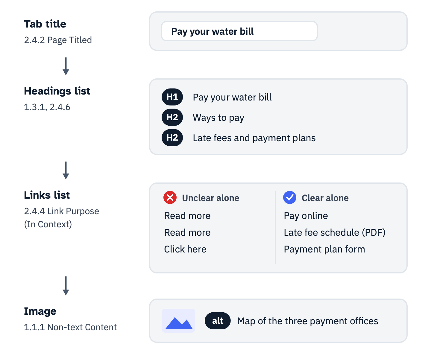
View the data as a list
- Tab title (2.4.2 Page Titled): “Pay your water bill”.
- Headings list (1.3.1, 2.4.6): H1 Pay your water bill; H2 Ways to pay; H2 Late fees and payment plans.
- Links list (2.4.4 Link Purpose (In Context)): unclear on their own, “Read more”, “Read more”, “Click here”; clear on their own, “Pay online”, “Late fee schedule (PDF)”, “Payment plan form”.
- Image (1.1.1): read as its alt text, “Map of the three payment offices”.
Start with the title. 2.4.2 requires that “Web pages have titles that describe topic or purpose,” and the Understanding document explains why it matters: “Titles identify the current location without requiring users to read or interpret page content.” The page language matters for the same listener. Under 3.1.1, a language set in the code means “Screen readers can load the correct pronunciation rules.”
Headings come next. Under 1.3.1, structure shown visually has to exist in the code. A heading made only of large bold type falls under failure F2 in the Understanding document: “using changes in text presentation to convey information without using the appropriate markup or text.” The headings list does not show it. 2.4.6 then asks that “Headings and labels describe topic or purpose.” The tutorial adds that skipping ranks “can be confusing and should be avoided where possible,” as when an H2 is followed directly by an H4.
The test needs no screen reader. Read the browser tab, then only the headings, then only the link texts, in that order. If the three lists do not tell a stranger what the page is for and where to go next, the page fails before anyone opens assistive technology. The rest of what blind visitors need from a site, keyboard access, skip links and labeled forms, sits with developers.
Plain language is written for the audience, and WCAG’s reading level rule is AAA
Writing accessible content starts with a reader, not a grade level. For federal agencies plain language is a statute: the Plain Writing Act of 2010 defines plain writing as “writing that is clear, concise, well-organized, and follows other best practices appropriate to the subject or field and intended audience.” It covers documents about federal benefits, services, taxes and compliance, but not regulations.
The government’s own guide ties reading level to the audience. Digital.gov’s plain language principles say “The first rule of plain language is: write for your audience,” and add: “Don’t write for an 8th-grade class if your readers are PhD candidates, small business owners, or working parents.” WCAG’s only reading level criterion, 3.1.5, sits at Level AAA.
It asks for supplemental content when text needs more than “lower secondary education level,” which the Understanding document glosses as “more than nine years of school.” No rule above requires it. The same page still states the principle every writer can use: “Content should be written as clearly and simply as possible.”
W3C’s Working Group Note on cognitive and learning disabilities turns that principle into patterns. It is guidance, not a standard, and its advice is concrete: “Keep paragraphs short. Have only one topic in each paragraph.” It asks for “the tense and the voice that is easiest to understand,” which in English “is usually the present tense and active voice.” Uncommon “acronyms, abbreviations, and jargon” are removed or explained, and metaphors stay out “unless you include an explanation.”
Digital.gov’s writing guide gives an example of active voice: “Not ‘It must be done,’ but ‘You must do it.’” The same choices decide how dyslexia, ADHD, brain injury and other cognitive disabilities change what a page asks of a reader.
One criterion here is binding at Level A. 1.3.3 bars instructions that “rely solely on sensory characteristics of components such as shape, color, size, visual location, orientation, or sound.” Its Understanding document fails a schedule whose key reads “Events marked with a blue diamond are played on field A.”
Social posts have their own version of the problem. Section508.gov notes that screen readers “will individually describe each emoji,” advises against “using several emojis in a row,” and asks writers to capitalize each word in a multiword hashtag, as in #FourthOfJuly. Under Title II, the exception for a city’s social media covers only older posts: 35.201(e) excepts posts “posted before the date the public entity is required to comply with this subpart.”
Sentences to paste into the style guide:
- Write for the reader named in the brief, and put the point of each paragraph in its first sentence.
- Use the present tense and active voice: “Submit the form by May 1,” not “The form must be submitted.”
- Spell out each acronym on first use, and explain any term the reader has not met.
- Name controls by their visible label, never by color, shape or position alone.
- Put emoji at a natural stopping point, such as the end of a paragraph, avoid several in a row, and capitalize each word in a multiword hashtag.
Link text, alt text and captions pass when a person wrote what they say
2.4.4 asks that “The purpose of each link can be determined from the link text alone or from the link text together with its programmatically determined link context.” WCAG’s definition of that context gives, for HTML, “text that is in the same paragraph, list item, or table cell as the link,” and a note adds the current sentence. So “read the report” inside a sentence that names the report can pass at Level A.
The AAA criterion 2.4.9 asks for the link text alone, and W3C lists “click here” or “more” as its failure F84 when nothing on the page can change the link text. The links list strips the sentence away. Write to the stricter test, because it is the one the links list applies.
The blog index of a dental practice, measured on October 28 and 29, 2026, shows what a template can do to both lists. Eleven links on the page read “Read More,” each to a different post. Ten of the post titles above them are links to the same posts, nine of them cut off mid-phrase with an ellipsis. Those titles sit in span elements styled like headings, so the page’s headings list holds one H1 and one H2.
In the links list each of those posts appears at least twice, once as part of a title and once as “Read More,” and the eleven “Read More” entries cannot be told apart. The link color, #FEB645 on white, measures 1.75:1 against the 4.5:1 that 1.4.3 asks of text.
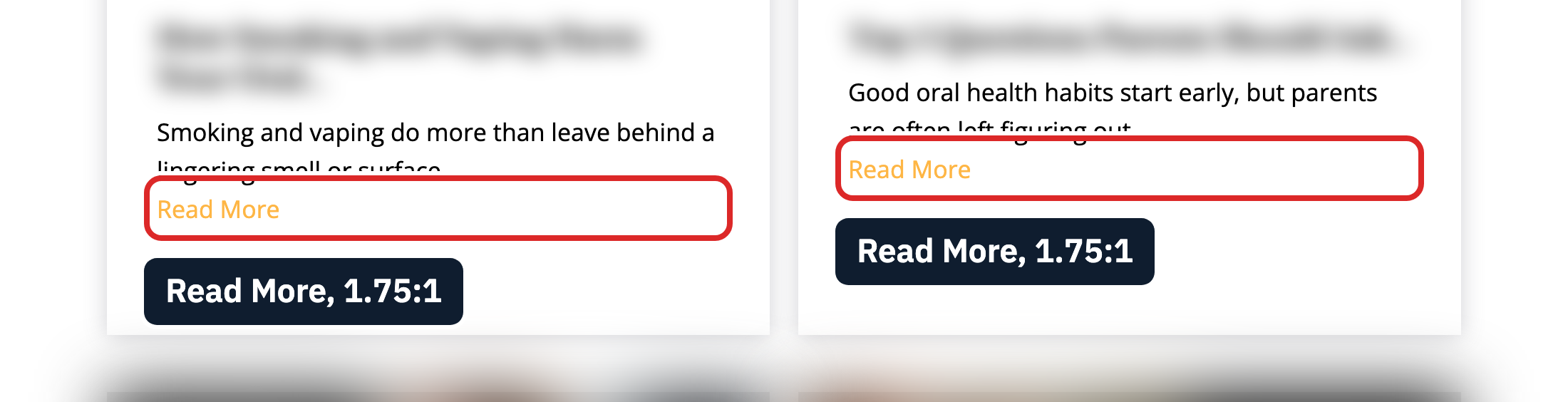
The fix is in the template: make each card’s full title a real heading and a link, and drop the “Read More” that repeats it. Link text patterns for cards, icons and repeated links cover the cases a template cannot.
Images follow the same logic. 1.1.1 requires “a text alternative that serves the equivalent purpose.” Decoration has to be “implemented in a way that it can be ignored by assistive technology.” W3C’s alt decision tree settles each image in a few questions: a linked image gets alt text that communicates “the destination of the link or action taken,” a photo that adds meaning gets “a brief description,” a chart gets its information “elsewhere on the page,” and decoration gets an empty alt.
An alt of “image” on a decorative picture is failure F39 under the Understanding document. Words inside a picture fall under 1.4.5, which asks for live text where the technology can show it. The detail is in alt text for informative, functional, complex and decorative images and in eight worked examples, from charts to product galleries.
Google reads the same words. Its image documentation says it “uses alt text along with computer vision algorithms and the contents of the page to understand the subject matter of the image,” and its link guide asks for anchor text that is “descriptive, reasonably concise, and relevant.” Still, accessibility work does not lift rankings on its own.
WCAG’s definition of captions includes “sound effects, music, laughter, speaker identification and location.” W3C’s captions guide is direct about machine output: “Automatically-generated captions do not meet user needs or accessibility requirements, unless they are confirmed to be fully accurate.” At Level AA, 1.2.5 adds narrated description of what is only seen. W3C’s transcripts page notes that “Descriptive transcripts are required to provide video content to people who are both Deaf and blind.” A separate guide checks one video against the WCAG 2.1 AA criteria that apply to it.
The question of how to make content accessible comes down to one rule. Before publishing, read each link out of context, each alt text with its image hidden, and two minutes of captions against the audio. Anything a stranger could not act on goes back to the person who knows what the content means.
Contrast is a measured ratio, and color can never be the only signal
1.4.3 asks that text and images of text have “a contrast ratio of at least 4.5:1,” with 3:1 for large-scale text, which WCAG defines as “at least 18 point or 14 point bold.” The Understanding document converts that for the web: “14pt and 18pt are equivalent to approximately 18.5px and 24px.” It also explains the number: 4.5:1 “compensated for the loss in contrast sensitivity usually experienced by users with vision loss equivalent to approximately 20/40 vision.”
Ratios run from 1:1 to 21:1, and the ratio is calculated so that “color (hue) is not a key factor.” In a style guide, accessible color contrast is a number for each pair of colors, not an adjective. The thresholds are exact: “4.499:1 would not meet the 4.5:1 threshold.” Logos have no requirement, and words inside images do.
1.4.11 sets 3:1 for the parts of controls and graphics a person needs to see, such as an input border or a line in a chart, and its Understanding document adds that “2.999:1 would not meet the 3:1 threshold.” Disabled controls are exempt from both criteria, and seven common contrast and color mistakes have fixes that keep a brand recognizable.
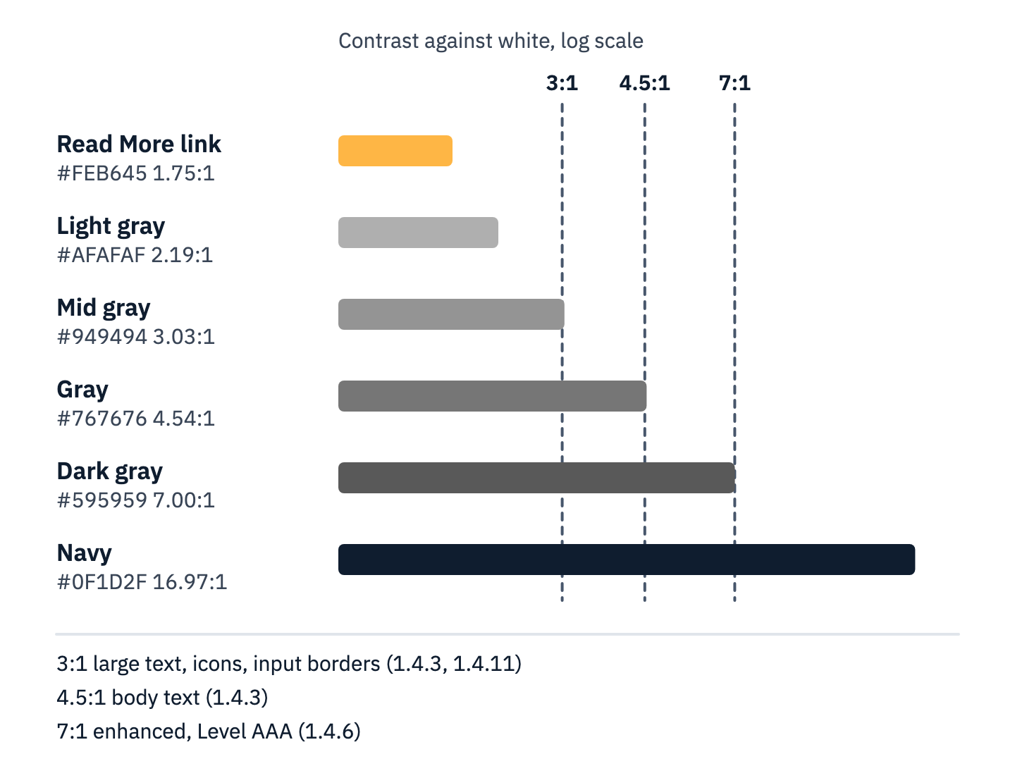
View the data as a table
| Color on white | Contrast ratio | Meets |
|---|---|---|
| #FEB645 (Read More link) | 1.75:1 | none |
| #AFAFAF | 2.19:1 | none |
| #949494 | 3.03:1 | 3:1 for large text and non-text parts only |
| #767676 | 4.54:1 | 4.5:1 for body text (AA) |
| #595959 | 7.00:1 | 7:1 enhanced (AAA) |
| #0F1D2F | 16.97:1 | 7:1 enhanced (AAA) |
Contrast does not settle color. 1.4.1 says “Color is not used as the only visual means of conveying information, indicating an action, prompting a response, or distinguishing a visual element.” Its Understanding document gives examples a content team will recognize: “required fields are red” and “error is shown in red.”
The National Eye Institute puts color vision deficiency at “About 1 in 12 men” and says the most common type makes red and green hard to tell apart. Section508.gov adds that a screen reader “will only relay words, not the colors used to display them.”
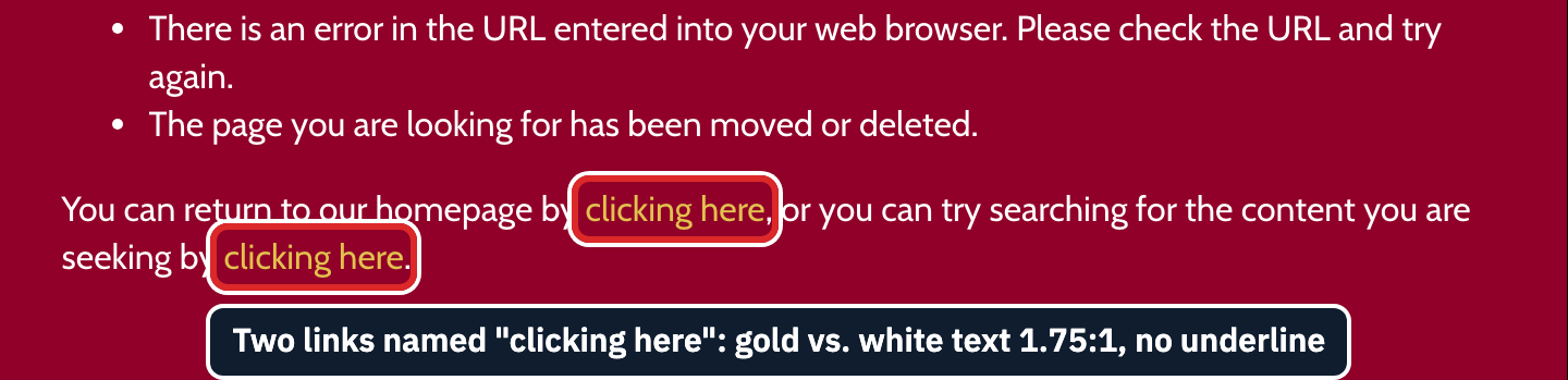
Links inside body text are where this fails quietly. W3C lists “creating links that are not visually evident without color vision” as failure F73, and names a 3:1 contrast between link and surrounding text as technique G183. On a vineyard’s “page not found” message, measured on October 28, 2026, two links read “clicking here.” They are gold, #E2C14E, inside white text, with no underline. Against the dark red background they reach 5.40:1 and pass 1.4.3; against the words around them they measure 1.75:1.
The values to specify: body text at 4.5:1 or more against its background; text of at least 24 pixels, or at least 19 pixels bold (14 point is about 18.7 pixels), at 3:1 or more; icons, input borders and chart parts at 3:1 against their neighbors; links in body text underlined; every color that means something paired with a word, an icon or a pattern. Charts, status badges and error states that need a second cue show the pairing in practice.
Two dyslexia fonts did no better than Arial in trials, and WCAG measures size and spacing instead
A list of accessible fonts is not part of WCAG: no success criterion names a typeface. The criteria that touch accessible typography are 1.4.3 for contrast, 1.4.4 for text that “can be resized without assistive technology up to 200 percent without loss of content or functionality,” and 1.4.12 for spacing. Each one measures what happens to the text, not which font it is set in.
Wery and Diliberto tested OpenDyslexic against Arial and Times New Roman with 12 elementary students who have dyslexia, reading letters, words and nonsense words rather than connected text, and found “no improvement in reading rate or accuracy for individual students with dyslexia, as well as the group as a whole.” None reported preferring it. Kuster and colleagues tested the Dyslexie font with 170 Dutch children with dyslexia, aged 7 to 12, who “did not read text written in Dyslexie font faster or more accurately than in Arial font”; most preferred Arial.
Spacing has a positive result, though not a settled one. Zorzi and colleagues had 74 Italian and French children with dyslexia, aged 8 to 14, read printed text with normal spacing and with letter spacing widened by 2.5 points, word and line spacing widened with it. They found that “a simple manipulation of letter spacing substantially improved text reading performance on the fly.” The study used paper, not screens.
The Kuster paper also reports a Dutch study of word lists in which “none of the groups benefitted from extra, that is, above default interletter spacing.” W3C cites Zorzi in the Understanding document for 1.4.12, which says “People with dyslexia may increase space between lines, words, and letters to increase reading speed.” The criterion leaves that choice to the reader. 1.4.12 reads:
In content implemented using markup languages that support the following text style properties, no loss of content or functionality occurs by setting all of the following and by changing no other style property: Line height (line spacing) to at least 1.5 times the font size; Spacing following paragraphs to at least 2 times the font size; Letter spacing (tracking) to at least 0.12 times the font size; Word spacing to at least 0.16 times the font size.
Its note adds: “Content is not required to use these text spacing values.” Text in a fixed-height card or a fixed-width button cannot grow with those settings. Words baked into an image never could, which is why 1.4.5 asks for live text.
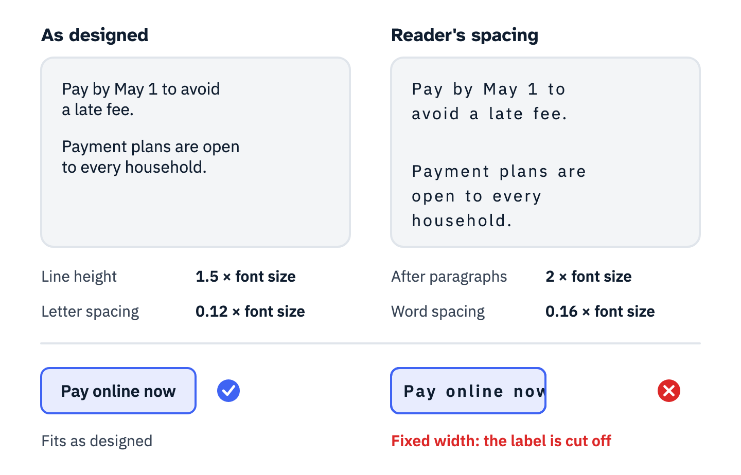
View the data as a list
- Line height: at least 1.5 times the font size.
- Spacing after paragraphs: at least 2 times the font size.
- Letter spacing: at least 0.12 times the font size.
- Word spacing: at least 0.16 times the font size.
- The failure: a fixed-width button whose label is cut off once the reader’s spacing is applied.
Choose a typeface for the brand, then test the layout, not the font. Apply the four spacing values with a bookmarklet or a user style sheet, zoom to 200 percent, and look for text that is cut off, overlapped or hidden on the templates that carry the most text. The rest is in the longer case for spacing and alignment over a dyslexia typeface.
An email or a PDF is a document, and WCAG still applies to it
W3C’s WCAG2ICT Group Note, endorsed by the Accessibility Guidelines Working Group but not by W3C itself, applies WCAG to content outside the web. A note to its definition of a document reads: “Letters, spreadsheets, emails, books, pictures, presentations, and movies are examples of documents.” Section 508 says the same in its own definitions: E103.4 lists “letters, email messages, spreadsheets, presentations, podcasts, images, and movies” as examples of documents.
E205.4 applies WCAG 2.0 Level A and AA to electronic content and excuses non-web documents from four criteria: Bypass Blocks, Multiple Ways, Consistent Navigation and Consistent Identification. The four WCAG 2.1 rows of the table do not apply either. E205.3 extends the requirement to official communications that are not public facing, such as “An emergency notification” and “A notice of benefits, program eligibility, employment opportunity, or personnel action.”
Section508.gov’s email guidance reads like a short style guide. The subject and body “should clearly and concisely state the purpose of the message.” The default black text on white should stay unless contrast can be tested, and any change must reach 4.5:1. Color is never “the only method of meaning or emphasis,” and “All images must have alt text or be marked as decorative.”
Its list of things to avoid includes “Images in the signature block, other than required by policy” and email stationery. On links it notes that “users of screen readers will often skip from one link to another, skipping the text in between.” Before a campaign or a notice goes out, check the subject line, the heading styles, the link text and the alt text.
PDFs, Word files, slide decks and spreadsheets on a public entity’s site are web content under Title II, which calls them “conventional electronic documents.” A file posted before the compliance date is excepted by 35.201(b) “unless such documents are currently used to apply for, gain access to, or participate in the public entity’s services, programs, or activities.” W3C’s Understanding document for 1.4.12 notes that, currently, the criterion “does not apply to PDF.”
Which legacy documents the Title II and Section 504 rules cover, and how to route each one, has its own guide, and the full email checklist, from live-text headings to the plain-text part, covers templates and testing.
Your next step
Copy the thirty-one rows into the style guide and make the content system ask for them: an alt text field with a decorative option, heading levels in the editor’s menu instead of font sizes, and link text reviewed before publishing. Write the measured ratio next to every color token.
Then run five tests on the templates with the most traffic: the tab title, the headings list, the links list, the measured contrast of every color pair, and 200 percent zoom with the spacing values applied. Log each failure with the criterion, the element and the fix in a bug report that names all three.
Two questions stay with counsel: which rule and which WCAG edition reaches each channel, from Title II web pages to agency email under Section 508 and the edition a vendor contract names, and whether an archive, preexisting-document or third-party exception covers older content.
ADA Compliance Pros starts this part of its web accessibility work in the design file. The team reviews wireframes, mock-ups and design systems before the build, with comments inside Figma, Miro, Adobe XD or Sketch that say what to change and why. After launch, or during staged testing, it tests usability by simulating the use of assistive technologies and navigating with a keyboard alone, and it creates repeatable design patterns (components, content templates and design decisions) so a redesign does not reset accessibility. Book a free consultation to scope an accessible design review for your pages and design system.