

Someone has asked whether the website is ADA compliant: a customer’s vendor form, a board member, a lawyer’s letter. Before answering, an owner may want to look first, and a web accessibility checklist that stops at “add alt text” and “check contrast” tests 2 of 50 criteria. This ADA compliance checklist for websites covers all 50 Level A and AA success criteria in WCAG 2.1, the version the Title II rule names, plus the six that WCAG 2.2 adds: 56 checks in all.
For each check it gives a test a non-specialist can run in a browser and notes whether an automated scanner has a rule for it. It also takes apart one real small-business website, a roofing contractor’s, so each failure has a picture or a line of code. Its results are WCAG test results, not a finding about the business’s legal position. Why WCAG 2.1 AA is the benchmark for both governments and businesses is set out in what the ADA requires of a website. This page is the test plan.
Scope the standard, the pages and the complete processes before the first check
Write down three things before the first check. The first is the standard. State and local governments must meet WCAG 2.1 Level A and AA under 28 CFR 35.200, from April 26, 2027 or April 26, 2028 depending on population (special district governments: 2028). No ADA regulation sets a technical web standard for businesses, and WCAG 2.1 AA is the working benchmark. WCAG 2.2, the newest version of the standard, adds six A and AA criteria. Testing to 2.1 AA plus those six covers both, as the guide to which WCAG version each US rule requires explains.
The second is the pages. WCAG does not grade a site, it grades pages, and a page passes only as a whole. The standard’s conformance requirements say conformance “is for full Web page(s) only, and cannot be achieved if part of a Web page is excluded.” They add that when a page is part of a process, “all Web pages in the process conform at the specified level or better.” A clean home page means little if one step of checkout fails.
The third is everything the pages pull in. Embedded booking tools, chat windows, payment frames, maps, videos and the documents the pages link to are all part of what a visitor uses. The Title II rule says so in terms, covering content a government provides “directly or through contractual, licensing, or other arrangements”, subject to exceptions in 35.201, among them archived content, older documents no longer used to reach a service, and some third-party postings. The guide to third-party content and conformance claims covers who fixes what when the code belongs to a vendor. A mobile app is a separate scope; the WCAG2ICT guide for native apps shows how the same checks apply there.
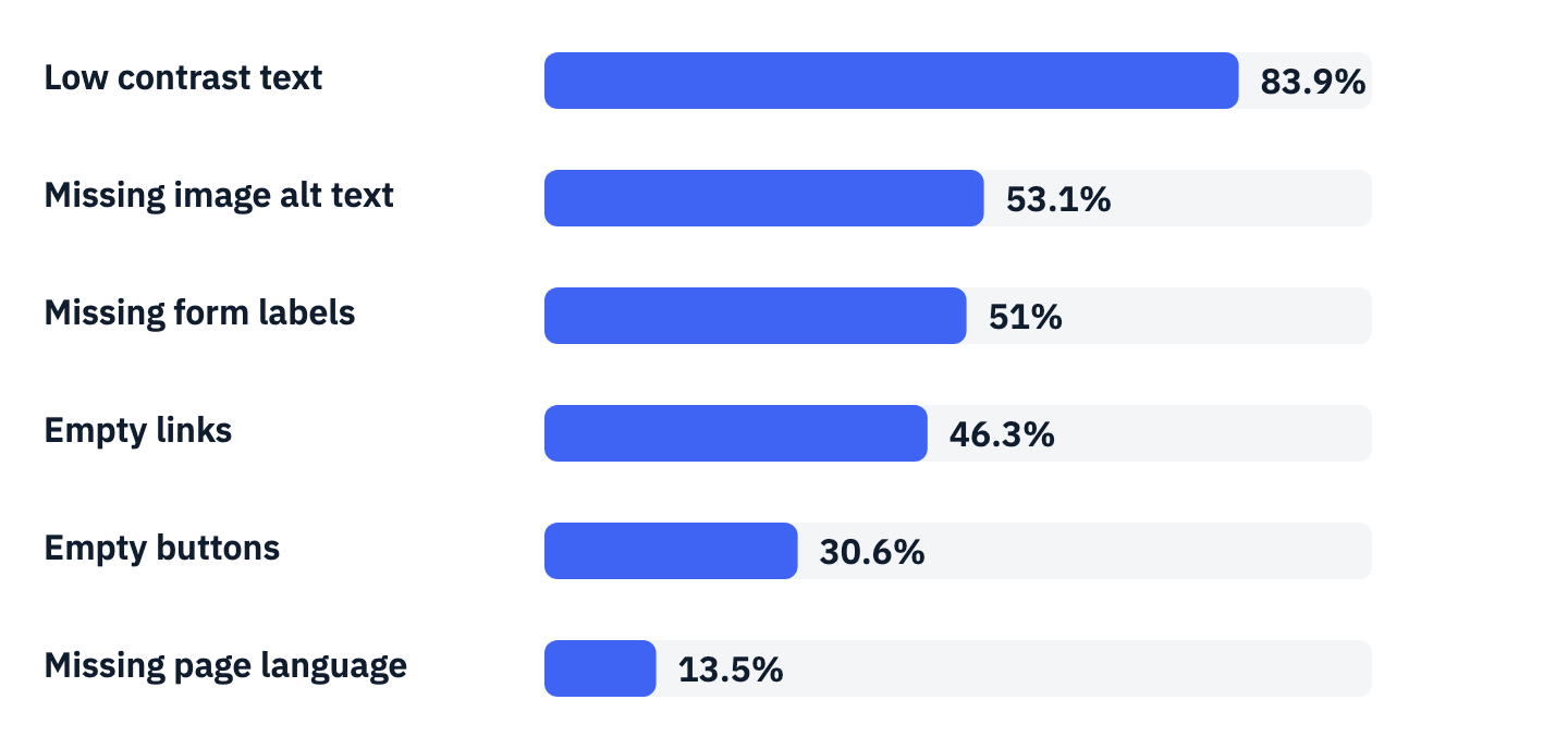
Start the test pass with a scanner, because it is fast and it finds the failures that turn up most in the WebAIM Million, an annual automated check of the top one million home pages. It tested the home pages of the top one million sites in February 2026 and found detected WCAG failures on 95.9% of them. Six kinds of error made up 96% of everything it detected.
View the data as a table
| Failure | Share of home pages |
|---|---|
| Low contrast text | 83.9% |
| Missing alternative text for images | 53.1% |
| Missing form input labels | 51% |
| Empty links | 46.3% |
| Empty buttons | 30.6% |
| Missing document language | 13.5% |
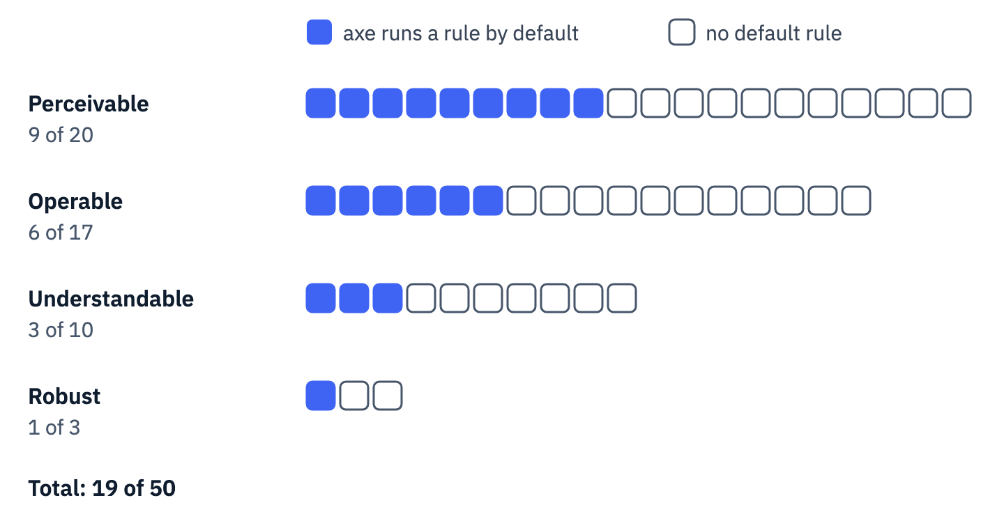
Then do the part a scanner cannot. WebAIM itself notes that it counted “only automatically detectable WCAG failures”, so the true rate of full conformance “was certainly lower than 4.1%.” axe-core 4.11.4, an open-source rule engine, runs a rule by default for 19 of the 50 WCAG 2.1 A and AA criteria; two more, 1.2.1 and 4.1.1, have only deprecated rules that are switched off. For the other 29 it has no rule at all, and a rule that exists catches some failures of its criterion, not all. The guide to accessibility testing tools compares the engines.
View the data as a table
| Principle | Criteria at A and AA | With a rule axe-core 4.11.4 runs by default |
|---|---|---|
| Perceivable | 20 | 9 |
| Operable | 17 | 6 |
| Understandable | 10 | 3 |
| Robust | 3 | 1 |
| Total | 50 | 19 |
The same limit applies to overlay widgets, scripts that try to identify or repair problems as a page loads. The Justice Department’s web guidance says “automated accessibility checkers and overlays” can be helpful tools but need to be used carefully, and that “A ‘clean’ report does not necessarily mean everything is accessible.” No government body certifies a website as ADA compliant either, as the guide to accessibility certifications explains. What an owner can show is the test log this checklist produces.
The tools for the manual pass are free: a browser, its zoom, the Tab key, a contrast checker and one screen reader (NVDA on Windows, VoiceOver on a Mac or iPhone). Put the scope in one sentence at the top of the test log: “WCAG 2.1 Level A and AA plus the WCAG 2.2 additions, on these pages and these complete processes, including embedded third-party tools, tested on these dates.”
Contrast, color, images and media fail in ways a contrast checker and the page source reveal
These checks need eyes, a contrast checker and the page source. Several of them failed on the example site.
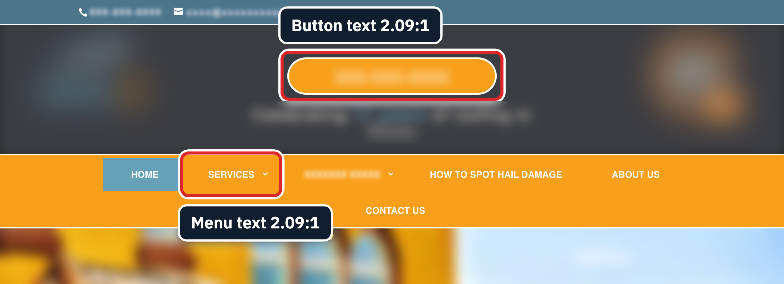
- 1.4.3 Contrast (Minimum), AA. Text needs “a contrast ratio of at least 4.5:1”; large text, at least 18 point (24 CSS pixels) or 14 point bold (about 18.7 CSS pixels bold), needs 3:1. Logos and purely decorative text are exempt. Test: pick the lightest text on each template, including text on buttons, menus and photos, and measure it. A scanner measures plain text on a flat background; text over a photo or gradient needs a person with a color picker.
-
1.4.1 Use of Color, A. Color must not be “the only visual means of conveying information.” Test: find every place color carries meaning (required fields in red, links set apart only by color, a status shown as green or red) and check that a word, icon or underline carries it too. The Justice Department’s own example is to “include the word ‘required’ in addition to red text for required form fields” (DOJ guidance).
-
1.1.1 Non-text Content, A. Every image, icon and image button needs a text alternative “that serves the equivalent purpose.” Test: switch images off or read the alt text with a screen reader, and ask whether the alt says what the image does. Purely decorative images take an empty
alt=""so screen readers skip them. A scanner finds missing alt, not wrong alt. On the example site, an image of a five-star rating is coded<img src="Review-stars-1.png" alt="Reviews">: the alt names the section, not the rating, so a screen reader user never hears the stars. The guide to writing alt text covers the cases. -
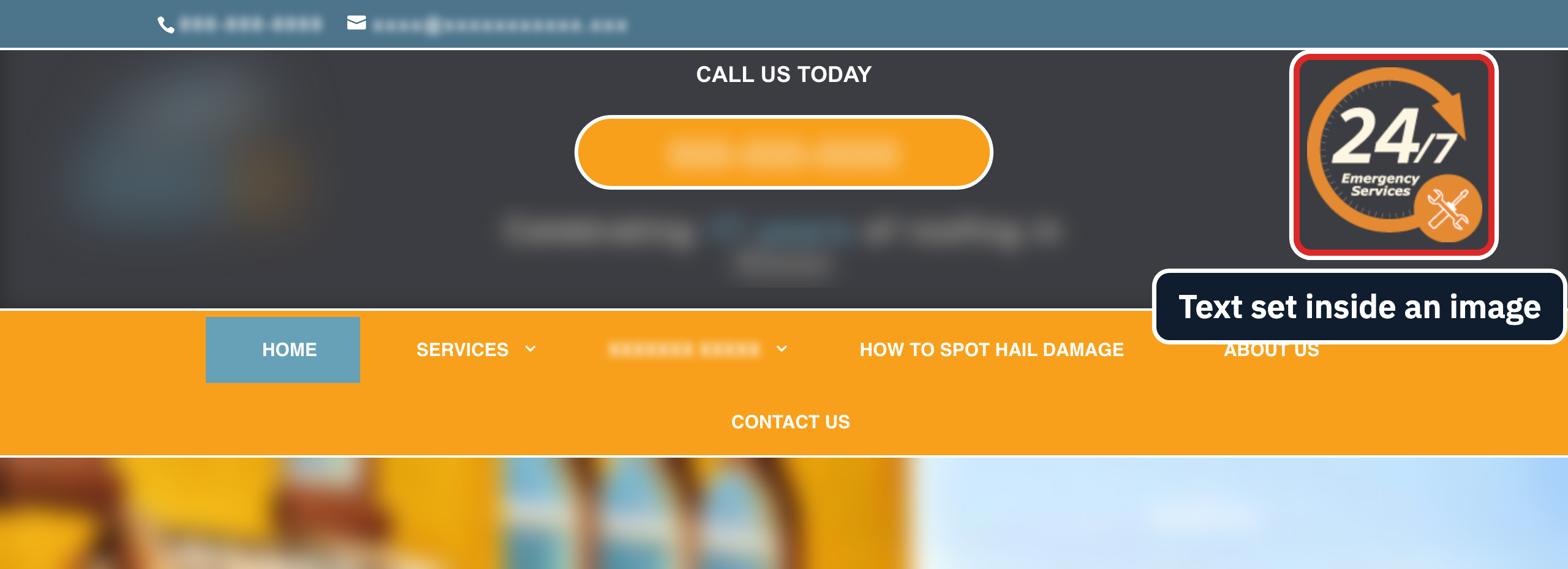
1.4.5 Images of Text, AA. Where styled text can do the job, use text, not a picture of it; logotypes are exempt. Test: zoom to 200% and look for words that blur, or try to select them.
- 1.4.11 Non-text Contrast, AA. Visual information needed to identify controls and states, and the parts of graphics needed to understand them, need 3:1 against what sits next to them. Test: measure input borders, icon buttons, checkbox outlines and the focus indicator. Disabled controls and unstyled browser defaults are exempt. The example site’s contact form draws its field borders in a pale gray that measures 1.47:1 on white.
- 1.2.2 Captions (Prerecorded), A, and 1.2.4 Captions (Live), AA. Video with sound needs accurate, synchronized captions. Test: turn captions on and read along for a minute. The DOJ guidance says videos can be made accessible with captions “that are accurate and identify any speakers in the video”, so unchecked automatic captions are a risk. The example home page has a self-hosted video with a soundtrack and no captions file, so the
<video>element holds a source and no<track kind="captions">; unless captions are burned into the picture, it has none:
<video controls>
  <source type="video/mp4" src="/wp-content/uploads/[video].mp4">
</video>- 1.2.3 Audio Description or Media Alternative (Prerecorded), A, and 1.2.5 Audio Description (Prerecorded), AA. When the picture carries information the soundtrack does not, such as on-screen text or a demonstration, it needs description. Test: listen to the video without watching it. The guide to video accessibility covers captions and description in more depth.
- 1.2.1 Audio-only and Video-only, A, and 1.4.2 Audio Control, A. Podcasts need transcripts, and any audio that plays on its own “for more than 3 seconds” needs a pause or stop control, or a volume control separate from the system volume.
Record each failure with the page, the element and the measured value, for example “Services menu, white on #F8A01B, 2.09:1”. That line is what a developer needs to fix it, and the guide to color contrast covers how to pick colors that pass.
Keyboard checks find what scanners cannot
Put the mouse away and use Tab, Shift+Tab, Enter, Space, the arrow keys and Escape. This pass covers criteria that have almost no automated rules.
- 2.4.1 Bypass Blocks, A. There must be a way to skip blocks repeated on every page. Test: press Tab once on a fresh page load and look for a skip link, then check for a main landmark with a browser extension. Either one is a sufficient technique. WebAIM found a skip link on 17.1% of home pages, and “one out of every ten” of those was broken.
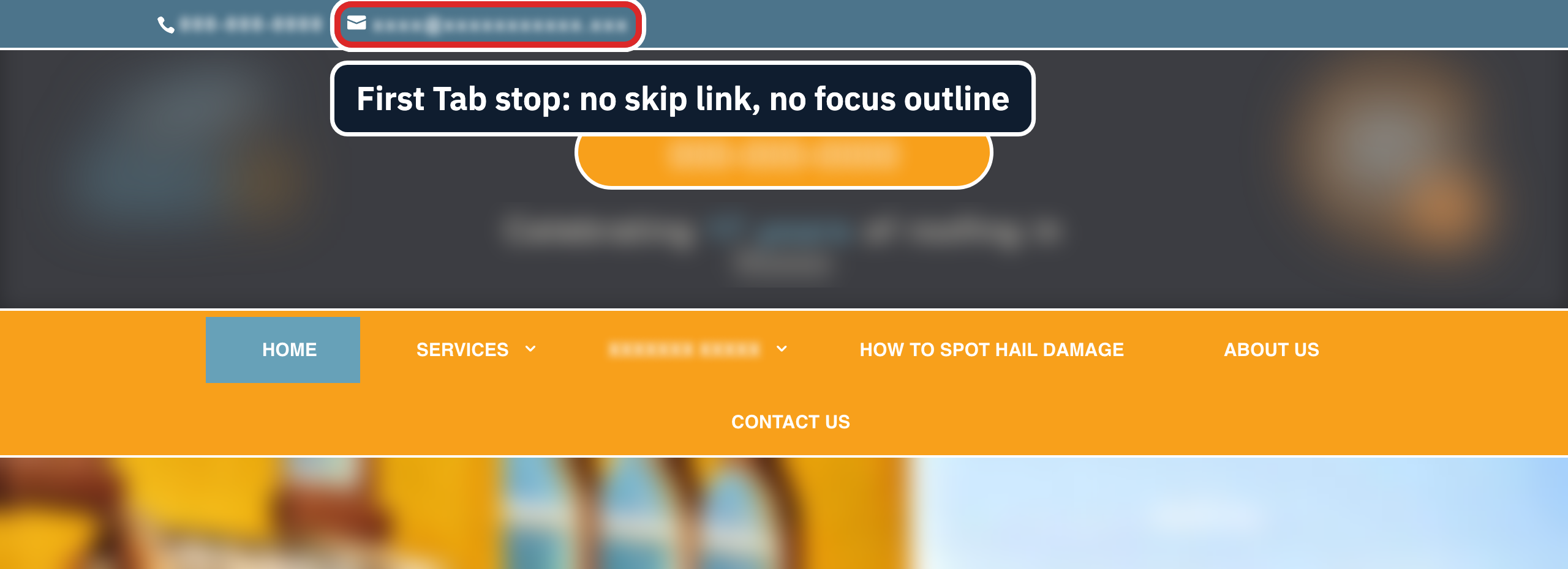
- 2.4.7 Focus Visible, AA. The keyboard focus indicator must be visible. Test: Tab through the page and point at the focused item each time. On the example site, the first Tab stop is the email link in the top bar, with no skip link before it and nothing on screen to show it has focus. Of the first 20 Tab stops, 19 showed no outline or shadow.
- 2.1.1 Keyboard, A. Every function works from the keyboard: menus, dropdowns, sliders, modals, tabs, maps, the date picker and the payment form. Test: complete each process with the keyboard alone.
- 2.1.2 No Keyboard Trap, A. Focus must always be able to leave a component. Test: Tab into each embedded frame (chat, video, map, payment) and try to Tab out; a modal that keeps focus inside while open and returns it on close is correct, as the accessible modal guide explains.
- 2.4.3 Focus Order, A. Focus moves in an order that preserves meaning. Test: watch for jumps from the header to the footer, or into hidden menus.
- 2.4.11 Focus Not Obscured (Minimum), AA, new in 2.2. A focused item must not be “entirely hidden due to author-created content.” Test: Tab down the page with a sticky header, cookie banner or chat button showing.
- 1.4.13 Content on Hover or Focus, AA. Tooltips and dropdowns that appear on hover or focus must be dismissable without moving the pointer or focus (W3C’s example is the Escape key), hoverable, and persistent.
- 2.1.4 Character Key Shortcuts, A. Shortcuts that use a single character key must be possible to turn off or remap, or work only while their control has focus.
A test log line for this section reads: “Home, Tab stops 1 to 20: no outline or shadow on 19; no skip link before the first stop.” Add a line for each menu, embedded frame and modal tested, with the key used and the result. The skip link guide has the markup for the first fix.
A screen reader hears the code, so test structure and names with one running
A screen reader reads the code, not the design. These checks compare what the page looks like with what it says, so run them with NVDA or VoiceOver, or with a browser extension that lists headings and landmarks.
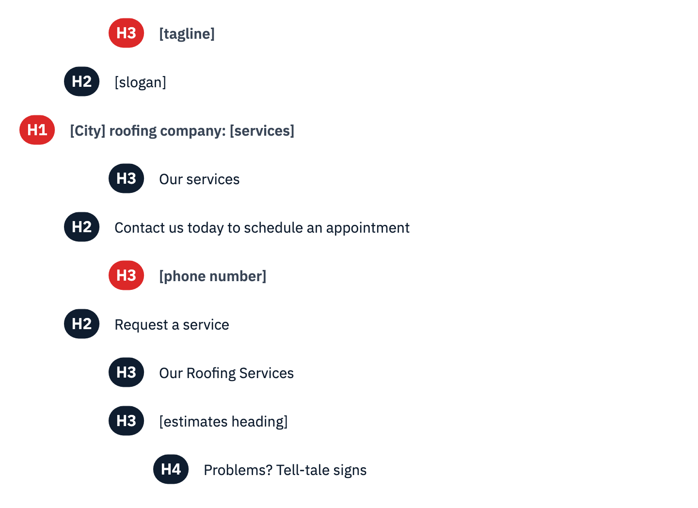
- 1.3.1 Info and Relationships, A, and 2.4.6 Headings and Labels, AA. Headings, lists, tables and form labels must exist in the markup, and headings must describe their sections. Test: list the headings in order. On the example home page the outline starts with an H3 tagline, then an H2 slogan, and only then the H1; the phone number is coded as a heading.
View the data as a list
- H3: [tagline]
- H2: [slogan]
- H1: [City] roofing company: [services]
- H3: Our services
- H2: Contact us today to schedule an appointment
- H3: [phone number]
- H2: Request a service
- H3: Our Roofing Services
- H3: [estimates heading]
- H4: Problems? Tell-tale signs
- 4.1.2 Name, Role, Value, A. Every link, button and control needs a name, a role and its current state. Test: Tab to each icon and listen. On the example site, the slider’s arrow links, the video play link and a social icon have no accessible name, so a screen reader has nothing meaningful to announce.

- 2.4.4 Link Purpose (In Context), A. Link text, alone or read with its sentence, paragraph, list item or table cell, must say where the link goes. A scanner catches empty links but cannot judge “Read more”. On the example home page a link styled as a button sits alone under an “About us” heading:
<a href="/about-us">Read more</a>The paragraph it refers to is a separate block, and W3C lists a preceding heading only as advisory context for 2.4.4 (technique H80), so this link is a likely failure; text such as “More about our company” fixes it. Test: read each link with its sentence, paragraph, list item or table cell; a link that still says nothing fails. Reading the list of links with no context is the stricter Level AAA test, 2.4.9. The guide to accessible link text covers the rewrites.
- 2.5.3 Label in Name, A. A control’s accessible name must contain its visible text, so a voice user who says “click Submit” reaches the Submit button.
- 2.4.2 Page Titled, A, and 3.1.1 Language of Page, A. Each page needs a descriptive title and a
langattribute; the example site’s own pages pass both, though its embedded form document has neither. 3.1.2 Language of Parts, AA, covers passages in another language. - 1.3.2 Meaningful Sequence, A, and 1.3.3 Sensory Characteristics, A. The reading order must match the meaning, and instructions must not depend on shape, position or color alone (“click the green button on the right”).
- 3.2.3 Consistent Navigation, AA, 3.2.4 Consistent Identification, AA, and 3.2.6 Consistent Help, A, new in 2.2. Menus, repeated controls and help links stay in the same order and keep the same names on every page. 2.4.5 Multiple Ways, AA, asks for two ways to find a page, such as the menu plus search or a site map, except for pages that are a step in a process.
- 3.2.1 On Focus, A, and 3.2.2 On Input, A. Moving focus must never open a new page, submit a form or move focus elsewhere. Changing a setting, such as picking from a dropdown, may do so only if the user was told beforehand.
The index of accessible UI components gives the expected names, roles and keyboard behavior for 22 common components. A log line for this section reads: “Home, slider: previous, next and play links have no accessible name; headings start at H3, H1 is the third heading.”
Forms carry the money, so test every field, error and time limit
The contact, quote, booking, sign-up and checkout forms are where a visitor becomes a customer, and the Justice Department lists “Labels, keyboard access, and clear instructions” among what forms need. Test each form twice: once filled in correctly, once with every mistake you can think of.
- 3.3.2 Labels or Instructions, A, with 1.3.1. Every field needs a visible label tied to it in the code; placeholder text that disappears on typing is not a label. Test: click each label and see whether the cursor moves into its field, then Tab through the form with a screen reader running and check that each field announces its visible label.
- 1.3.5 Identify Input Purpose, AA. Fields that collect the user’s own details need the right
autocompletevalue (name,email,tel,street-address), so browsers and assistive tools can fill them in. Test: inspect the field, or check whether the browser offers to autofill.
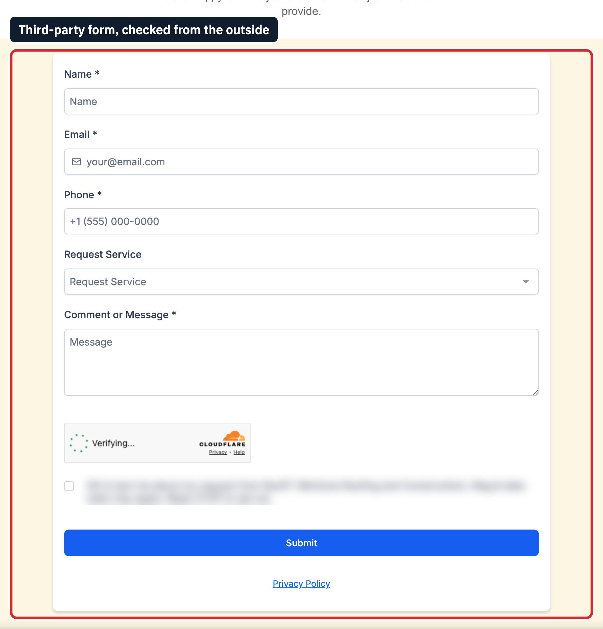
The example form ties four of its five visible labels to their fields in the code. The fifth, a “Request Service” dropdown, also carries an aria-label generated from the field’s ID, which overrides the label, so a screen reader announces a string of random characters: a 2.5.3 Label in Name failure that the label-click test does not catch. Two more things fail the checks around it, and one is weak. The name and email fields have no autocomplete value, and the phone field sets autocomplete="off". The pale field borders measure 1.47:1; where a border is what shows a field is there, 1.4.11 asks for 3:1. Required fields carry an asterisk inside the label, but nothing on the form says what the asterisk means and no field has aria-required; explaining the asterisk before the first field fixes that, and adding aria-required="true" lets a screen reader announce the required state as well. Because the form is a vendor’s widget, each fix is a request to that vendor.
- 3.3.1 Error Identification, A, and 3.3.3 Error Suggestion, AA. When an error is detected, the field in error must be identified and “the error is described to the user in text,” with a suggested fix where one is known. Test: submit the form empty and with a bad email address, and listen for the errors with a screen reader.
- 4.1.3 Status Messages, AA. Messages such as “Added to cart” or “Thank you, we will call you” must reach a screen reader without moving focus. Test: submit a form or add an item with the screen reader running. The live region guide has the markup.
- 3.3.4 Error Prevention (Legal, Financial, Data), AA. Payments, contracts and account changes must be reversible, checked or confirmed before they go through. Test: look for a review step before the order is placed.
- 2.2.1 Timing Adjustable, A. A time limit must be possible to turn off, adjust to at least ten times the default, or extend; an extend option must warn before time runs out and give at least 20 seconds to extend it “with a simple action”, at least ten times. Test: leave a booking or checkout page idle and see what happens. The session timeout guide covers the warning dialog.
- 3.3.8 Accessible Authentication (Minimum), AA, new in 2.2. A login step may not require “a cognitive function test (such as remembering a password or solving a puzzle)” unless the step offers an alternative method, a mechanism to help, object recognition or personal content. Test: confirm that a password manager can fill the login and that paste works in every field, then try any CAPTCHA by keyboard and screen reader. The guides to accessible authentication and CAPTCHA accessibility cover the options. The example contact form’s verification widget is not a login, so it is tested under 1.1.1 and 2.1.1 instead: try it by keyboard and with a screen reader.
- 3.3.7 Redundant Entry, A, new in 2.2. Information already given in the same process must be filled in again automatically or offered for selection. Test: in checkout, see whether the billing address can reuse the shipping address. The redundant entry guide lists the exceptions.
Write each form finding as field, action and result: “Quote form, submit empty: errors appear in red under each field, not announced by NVDA, focus stays on the button.” The guides to accessible forms and error messages turn those lines into fixes.
Zoom, reflow, motion and touch decide whether low-vision and mobile users can stay
These checks need a desktop browser, a phone and a stopwatch.
- 1.4.4 Resize text, AA. Text must enlarge to 200 percent “without loss of content or functionality.” Test: zoom the browser to 200% and pinch-zoom on a phone. The example site tells phone browsers to block pinch-zoom with one line:
<meta name="viewport" content="width=device-width, initial-scale=1.0, maximum-scale=1.0, user-scalable=0">Removing maximum-scale=1.0 and user-scalable=0 restores zoom. An automated rule, axe’s meta-viewport, flags this line directly.
- 1.4.10 Reflow, AA. At a width “equivalent to 320 CSS pixels”, which equals 1280 pixels at 400% zoom, content must fit without scrolling sideways. Test: set the browser to 1280 pixels wide, zoom to 400%, and look for cut-off text or a horizontal scroll bar. Maps, data tables and video that need two-dimensional layout are exempt. On the example home page at that width, the page scrolls sideways by 2 pixels and the large “Testimonials” heading is cut off at “Testimonia”: the kind of loss this test finds.
- 1.4.12 Text Spacing, AA. Nothing may be lost when line height is set to 1.5 times the font size, paragraph spacing to 2 times, letter spacing to 0.12 times and word spacing to 0.16 times. Test: apply those values with a text-spacing bookmarklet and look for clipped buttons and overlapping text.
- 1.3.4 Orientation, AA. The site must work in both portrait and landscape unless one orientation is essential. Test: rotate the phone.
- 2.2.2 Pause, Stop, Hide, A. Moving content that starts on its own, “lasts more than five seconds” and runs alongside other content needs a way to pause, stop or hide it. On the example home page the hero slider moved to the next slide about every seven seconds, kept moving with the pointer over it, and had no pause control. Test: time any carousel, ticker or background video. The carousel guide shows a compliant pattern.
- 2.3.1 Three Flashes or Below Threshold, A. Nothing may flash “more than three times in any one second period” unless the flash is below the general and red flash thresholds.
- 2.5.8 Target Size (Minimum), AA, new in 2.2. Pointer targets must be “at least 24 by 24 CSS pixels” unless spaced so that a 24-pixel circle around each does not touch another. The example slider’s four dots measure 7 by 7 pixels with centers 17 pixels apart, so the spacing exception fails; axe flags them when its WCAG 2.2 rules are switched on (the
wcag22aatag). Other exceptions cover inline links, browser-drawn controls, and a target whose function a full-size control on the same page also offers; the example’s 48-pixel arrows appear only on hover. - 2.5.1 Pointer Gestures, A, 2.5.2 Pointer Cancellation, A, 2.5.4 Motion Actuation, A, and 2.5.7 Dragging Movements, AA, new in 2.2. Swipes, pinches and drags need a single-tap alternative, actions should fire on release so they can be cancelled, and shake or tilt features need an on-screen control.
A log line here reads: “Mobile, home, contact and service templates: pinch-zoom blocked by the viewport meta tag; home slider auto-advances about every 7 seconds with no pause; slide dots 7 by 7 px.”
All 56 WCAG 2.1 and 2.2 A and AA criteria fit in one ADA compliance checklist
Used as a WCAG checklist, the table lists every Level A and AA criterion in WCAG 2.1, which the Title II rule names, and the six that WCAG 2.2 adds. 4.1.1 Parsing is “Obsolete and removed” in WCAG 2.2, and the current edition of WCAG 2.1 says it “should be considered as always satisfied for any content using HTML or XML”; the 2018 edition that the Title II rule incorporates does not carry that note. The last column shows whether axe-core 4.11.4 runs a rule for the criterion by default; “No” means every failure of it has to be found by a person.
| Criterion | Level | Version | What to check | Scanner rule |
|---|---|---|---|---|
| 1.1.1 Non-text Content | A | 2.1 | Images, icons and image buttons have alt text that serves their purpose | Yes |
| 1.2.1 Audio-only and Video-only (Prerecorded) | A | 2.1 | Transcripts for audio; a transcript or audio track for silent video | No (deprecated rule, off) |
| 1.2.2 Captions (Prerecorded) | A | 2.1 | Recorded video with sound has accurate captions | Yes |
| 1.2.3 Audio Description or Media Alternative (Prerecorded) | A | 2.1 | Visual-only information in video is described or transcribed | No |
| 1.2.4 Captions (Live) | AA | 2.1 | Live video with sound is captioned | No |
| 1.2.5 Audio Description (Prerecorded) | AA | 2.1 | Recorded video has audio description where the picture carries meaning | No |
| 1.3.1 Info and Relationships | A | 2.1 | Headings, lists, tables and labels exist in the code | Yes |
| 1.3.2 Meaningful Sequence | A | 2.1 | The code’s reading order matches the meaning | No |
| 1.3.3 Sensory Characteristics | A | 2.1 | Instructions do not rely only on shape, color, position or sound | No |
| 1.3.4 Orientation | AA | 2.1 | Works in portrait and landscape | No |
| 1.3.5 Identify Input Purpose | AA | 2.1 | Fields about the user carry the right autocomplete value | Yes |
| 1.4.1 Use of Color | A | 2.1 | Color is never the only signal | Yes |
| 1.4.2 Audio Control | A | 2.1 | Audio over 3 seconds can be paused or muted | Yes |
| 1.4.3 Contrast (Minimum) | AA | 2.1 | Text 4.5:1, large text 3:1 | Yes |
| 1.4.4 Resize text | AA | 2.1 | Text zooms to 200% without loss; zoom not blocked | Yes |
| 1.4.5 Images of Text | AA | 2.1 | Words are text, not pictures of text (logos excepted) | No |
| 1.4.10 Reflow | AA | 2.1 | No sideways scrolling at 320 CSS pixels wide | No |
| 1.4.11 Non-text Contrast | AA | 2.1 | Field borders, icons and focus indicators 3:1 | No |
| 1.4.12 Text Spacing | AA | 2.1 | Nothing breaks with increased line, letter and word spacing | Yes |
| 1.4.13 Content on Hover or Focus | AA | 2.1 | Pop-ups can be dismissed, hovered and stay visible | No |
| 2.1.1 Keyboard | A | 2.1 | Everything works from the keyboard | Yes |
| 2.1.2 No Keyboard Trap | A | 2.1 | Focus can always move away by keyboard | No |
| 2.1.4 Character Key Shortcuts | A | 2.1 | Single-character shortcuts can be turned off, remapped or limited to focus | No |
| 2.2.1 Timing Adjustable | A | 2.1 | Time limits can be turned off, adjusted or extended | Yes |
| 2.2.2 Pause, Stop, Hide | A | 2.1 | Motion over 5 seconds can be paused | Yes |
| 2.3.1 Three Flashes or Below Threshold | A | 2.1 | Nothing flashes more than 3 times a second, or flashes stay below the thresholds | No |
| 2.4.1 Bypass Blocks | A | 2.1 | A working skip link or landmarks | Yes |
| 2.4.2 Page Titled | A | 2.1 | Each page has a descriptive title | Yes |
| 2.4.3 Focus Order | A | 2.1 | Tab order follows the meaning | No |
| 2.4.4 Link Purpose (In Context) | A | 2.1 | Link text, with its sentence, says where it goes | Yes |
| 2.4.5 Multiple Ways | AA | 2.1 | Two ways to find each page | No |
| 2.4.6 Headings and Labels | AA | 2.1 | Headings and labels describe the content | No |
| 2.4.7 Focus Visible | AA | 2.1 | Keyboard focus is always visible | No |
| 2.5.1 Pointer Gestures | A | 2.1 | Multi-finger and path gestures have a single-pointer option | No |
| 2.5.2 Pointer Cancellation | A | 2.1 | Actions fire on release and can be aborted | No |
| 2.5.3 Label in Name | A | 2.1 | The accessible name contains the visible label | No |
| 2.5.4 Motion Actuation | A | 2.1 | Shake or tilt features have a control and can be disabled | No |
| 3.1.1 Language of Page | A | 2.1 | The page language is set | Yes |
| 3.1.2 Language of Parts | AA | 2.1 | Passages in other languages are marked | Yes |
| 3.2.1 On Focus | A | 2.1 | Focus alone never changes the page | No |
| 3.2.2 On Input | A | 2.1 | Changing a setting does not change the page without warning | No |
| 3.2.3 Consistent Navigation | AA | 2.1 | Repeated menus keep their order | No |
| 3.2.4 Consistent Identification | AA | 2.1 | The same function has the same name everywhere | No |
| 3.3.1 Error Identification | A | 2.1 | Errors are identified and described in text | No |
| 3.3.2 Labels or Instructions | A | 2.1 | Every field has a label or instructions | Yes |
| 3.3.3 Error Suggestion | AA | 2.1 | Known corrections are suggested | No |
| 3.3.4 Error Prevention (Legal, Financial, Data) | AA | 2.1 | Payments and account changes can be reviewed or reversed | No |
| 4.1.1 Parsing | A | 2.1 (removed in 2.2) | Always satisfied for HTML under the current 2.1 note; duplicate IDs that break ARIA references fall under 4.1.2 | No (deprecated rule, off) |
| 4.1.2 Name, Role, Value | A | 2.1 | Controls expose a name, role and state | Yes |
| 4.1.3 Status Messages | AA | 2.1 | Status updates are announced without moving focus | No |
| 2.4.11 Focus Not Obscured (Minimum) | AA | 2.2 | Sticky headers and banners never fully hide the focused item | No |
| 2.5.7 Dragging Movements | AA | 2.2 | Drag actions have a single-pointer alternative | No |
| 2.5.8 Target Size (Minimum) | AA | 2.2 | Targets 24 by 24 CSS pixels, or spaced apart | Only with WCAG 2.2 rules switched on |
| 3.2.6 Consistent Help | A | 2.2 | Help links keep the same order on every page where they repeat | No |
| 3.3.7 Redundant Entry | A | 2.2 | Information already given is not asked for again | No |
| 3.3.8 Accessible Authentication (Minimum) | AA | 2.2 | Login offers a way past memory or puzzle tests, such as a password manager and paste | No |
Copy the table into a spreadsheet, add a column per template or process, and mark each cell pass, fail or not applicable. A criterion that does not apply, such as live captions on a site with no live video, is marked as such rather than as a pass.
Your next step
- Run the pass in order. A scanner on every template, then the keyboard pass, then the screen-reader pass on each complete process, then zoom and mobile. Log every failure as page, element, criterion and measured value.
- Fix by impact. Put the failures that stop a task first: a form that cannot be submitted, a checkout that traps focus, a login that blocks paste. The accessibility remediation plan sets out an order.
- Publish and keep the record. Publish an accessibility statement with a contact that a person answers, and retest after every redesign or new template, with ongoing monitoring between full passes.
A website ADA compliance checklist like this one shows where a site stands; it is not a conformance claim, and whether a business’s site falls under the ADA at all is a question for counsel, set out in the ADA website requirements guide. ADA Compliance Pros starts where a self-check stops: it scopes the pages and flows a claim is most likely to touch, tests them manually with keyboards, screen readers and magnification, maps every finding to a WCAG success criterion with evidence, ranks fixes by user impact and legal exposure, retests your developers’ changes, and documents the result in a record that supports an accessibility statement. To find out where your own site stands against WCAG 2.1 AA, start with an ADA website compliance review.